The Future of Web Dev
The Future of Web Dev
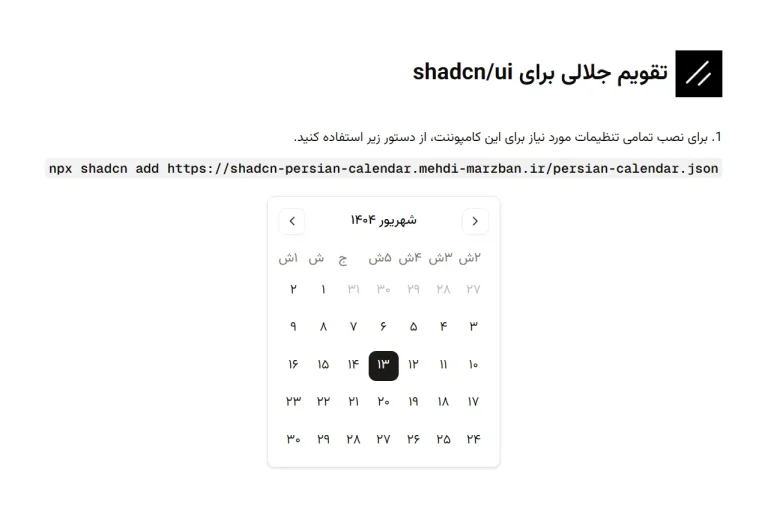
Enhanced shadcn/ui Date Picker with Month/Year Select
Enhanced shadcn/ui Date Picker component with month/year dropdowns. Perfect for birth dates and historical data entry.

This is an enhanced date picker UI component built on top of shadcn/ui’s DatePicker. It integrates month and year selection dropdowns directly into the calendar popover.
This modification allows you to jump to a specific month and year without tedious navigation. It retains the clean aesthetic and functionality of the original shadcn/ui component.
Features
📅 Month dropdown selection – Jump directly to any month without clicking through calendars
📆 Year dropdown selection – Navigate to any year within a configurable range
⚙️ Configurable year range – Set custom start and end years for the year dropdown
📱 Responsive design – Works smoothly across desktop and mobile devices
🎯 Accessible interface – Follows ARIA guidelines for screen reader compatibility
🔄 Synchronized state – Calendar and dropdowns stay perfectly synchronized
Use Cases
- User registration forms – Collect birth dates without forcing users to click through decades
- Historical data entry – Input dates for archival systems, genealogy applications, or research databases
- Financial applications – Select transaction dates, account opening dates, or historical reporting periods
- Event management systems – Choose dates for recurring events or historical event logging
- Medical record systems – Enter patient birth dates, medical history dates, or appointment scheduling
How To Use It
FAQs
Q: Can I customize the styling of the dropdown menus?
A: Yes, the component uses shadcn/ui’s Select component for the dropdowns, so you can modify the styling by updating your shadcn/ui theme configuration or by applying custom CSS classes to the Select components.
Q: How do I handle the selected date value in my form?
A: You can modify the component to accept an onChange callback prop that receives the selected date. Then lift the state up to your parent component or integrate it with form libraries like React Hook Form.
Q: Does this component work with different date formats?
A: The component uses date-fns for formatting and displays dates in “PPP” format by default. You can customize the display format by modifying the format() function call in the component code.
Q: Can I limit the selectable date range beyond just years?
A: Yes, you can extend the component to accept minDate and maxDate props and add validation logic to disable dates outside your desired range in both the dropdowns and calendar.