The Future of Web Dev
The Future of Web Dev
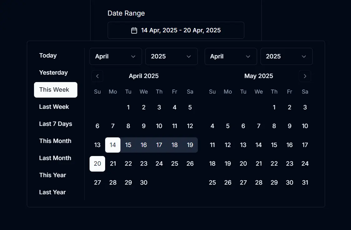
Modern Calendar Date Picker Component for Next.js
Clean, modern date/range picker component for Next.js applications, built with shadcn/ui.
Calendar Date Picker is a modern, customizable, user-friendly shadcn/ui date picker component for Next.js apps.
You can use it to add date selection functionality to forms, dashboards, or any part of your web application requiring date input.
Features
📅 Interactive Calendar UI – Clean and responsive calendar interface for intuitive date selection.
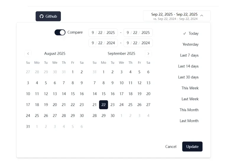
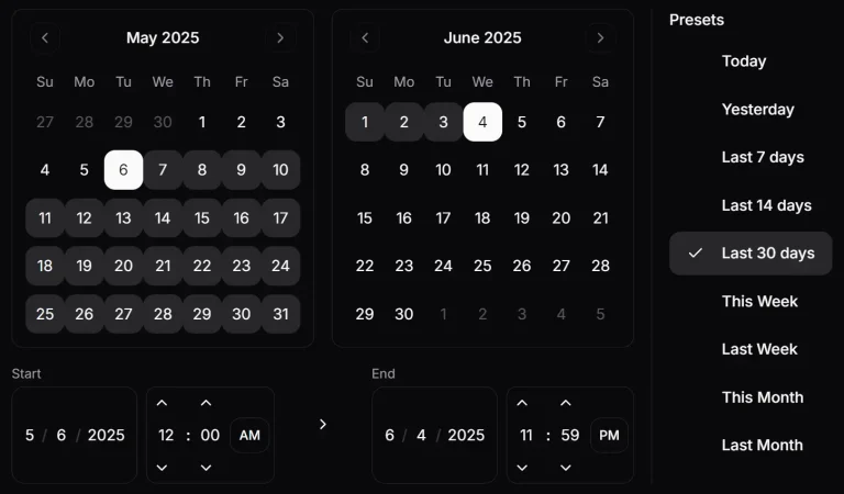
⚡ Predefined Date Ranges – Quick selection options like Today, Yesterday, Last Week, This Month, etc.
🖱️ Advanced Interaction – Hover and scroll wheel support for rapid date adjustments.
🗓️ Date Range Support – Select either a single date or a complete date range.
🌐 Timezone Support – Automatically handles date conversions across different timezones.
💫 Keyboard Navigation – Full keyboard accessibility for inclusive user experience.
See It In Action
Use Cases
- Event Planning – Select start and end dates for events, conferences, or promotional campaigns with an intuitive date range picker.
- Analytics Dashboards – Filter data visualizations by specific date ranges to analyze performance metrics or user behavior trends over different time periods.
- Booking Systems – Enable users to select arrival and departure dates for hotel reservations, rental services, or appointment scheduling.
- Financial Reporting – Generate reports for specific accounting periods, allowing users to select custom date ranges for financial analysis.
- Content Management – Schedule content publication or filter content archives by date ranges in blog platforms or content management systems.
How to use it
1. You need an existing Next.js project. Create one if necessary:
npx create-next-app my-app --typescript
cd my-app
2. Add the required libraries to your project:
npm install date-fns date-fns-tz react-day-picker
npx shadcn-ui@latest init
npx shadcn-ui@latest add button calendar popover select
3. Create the Component
Create a file named calendar-date-picker.tsx inside your components directory. Paste the component code provided in the input section into this file.
// src/components/calendar-date-picker.tsx
// (Paste the full component code here from the input)
"use client";
import * as React from "react";
// ... rest of the component code
4. Integrate into Your Page
Import and use the CalendarDatePicker component within your Next.js page, for example, in src/app/page.tsx. Manage the selected date range using React state.
// src/app/page.tsx
"use client";
import React, { useState } from "react";
import { CalendarDatePicker } from "@/components/calendar-date-picker"; // Adjust path if needed
function Home() {
  const [selectedDateRange, setSelectedDateRange] = useState({
    from: new Date(new Date().getFullYear(), 0, 1), // Default to start of year
    to: new Date(), // Default to today
  });
  return (
    <div className="p-4 max-w-xl">
      <h1 className="text-2xl font-bold mb-4">
        Calendar Date Picker Example
      </h1>
      <CalendarDatePicker
        date={selectedDateRange}
        onDateSelect={setSelectedDateRange}
        numberOfMonths={2} // Show two months for range selection
      />
      <div className="mt-4">
        <h2 className="text-md font-semibold">Selected Date Range:</h2>
        <p className="text-sm">
          {selectedDateRange.from.toDateString()} -{" "}
          {selectedDateRange.to.toDateString()}
        </p>
      </div>
    </div>
  );
}
export default Home;
5. Run the Project
Start your Next.js development server:
npm run devRelated Resources
- For forms where users need to jump directly to a month or year, add this shadcn date picker with month and year selection.
- shadcn/ui: The component library used to build this date picker. Offers reusable components for React/Next.js. https://ui.shadcn.com/
- React DayPicker: The underlying library for the calendar functionality. Highly customizable date picker component. https://react-day-picker.js.org/
- date-fns: A modern JavaScript date utility library used for date manipulations and formatting. https://date-fns.org/
FAQs
Q: Can I use this component for selecting single dates only?
A: Yes, you can configure the component to function as a single date picker by setting the numberOfMonths prop to 1 and adjusting the onDateSelect logic if needed.
Q: How can I change the appearance of the date picker?
A: Since it uses shadcn/ui, you can customize the appearance by modifying the underlying Button, Calendar, Popover, and Select components according to shadcn/ui theming documentation. You can also pass custom class names via the className prop.
Q: Are the predefined date ranges customizable?
A: Yes, the dateRanges array within the calendar-date-picker.tsx file can be modified to add, remove, or change the predefined range options.
Q: Does this component handle time zones?
A: Yes, it uses date-fns-tz to handle time zone conversions, making sure dates are interpreted correctly based on the user’s local time zone.
Q: Can I change the number of months displayed?
A: Yes, the numberOfMonths prop controls this. You can set it to 1 for a single month view or 2 (default) for a dual month view, suitable for range selection.