The Future of Web Dev
The Future of Web Dev
Shadcn Date Range Picker: Presets, Comparison & Mobile Support
Build user-friendly date range selection with this Shadcn/ui component. Includes 9 presets, comparison mode, and mobile-responsive calendar interface.

This is a reusable Date Range Picker component built for shadcn/ui that uses components from Radix UI and Tailwind CSS.
It provides a user-friendly dropdown calendar for your users to select or enter a range of dates.
The component also includes options for preset date ranges and a date comparison feature.
Features
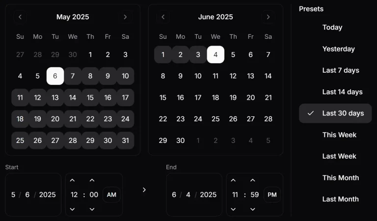
📅 Interactive calendar widget with dual-month display for easy range selection.
⚡ Nine predefined date range presets including Today, Yesterday, Last 7/14/30 days, and monthly options.
🔄 Optional date comparison mode for selecting two separate date ranges simultaneously.
⌨️ Direct date input fields for precise date entry alongside calendar selection.
🎨 Full integration with Shadcn UI design system and Tailwind CSS styling.
🌍 Locale support for international date formatting and display preferences.
⚙️ Configurable popover alignment and customizable initial date values.
🎯 TypeScript support with prop definitions and type safety.
Use Cases
- Analytics Dashboards: Filter data within a specific period and compare it to a previous period to track performance.
- Booking and Reservation Systems: Select check-in and check-out dates for hotels, rentals, or appointments.
- E-commerce Admin Panels: Review sales data, filter orders, or schedule promotional campaigns within a certain timeframe.
- Project Management Tools: Set start and end dates for tasks, milestones, or project sprints.
How to Use It
1. The DateRangePicker requires several components from Shadcn UI. You can install them using the Shadcn CLI.
npx shadcn-ui@latest add button calendar label popover switch2. This component also uses icons from Radix UI. Install the icon library with the following command.
npm install @radix-ui/react-icons3. Copy the code for DateInput and DateRangePicker from the source repository into your project’s components directory.
4. Import and use the DateRangePicker component.
import { DateRangePicker } from '@/components/ui/date-range-picker';
export default function MyDashboard() {
  return (
    <div>
      <h2>Select A Date Range</h2>
      <DateRangePicker
        onUpdate={(values) => console.log(values)}
      />
    </div>
  );
}
5. Customize the DateRangePicker component with the following props to control its initial state and behavior.
onUpdate: A callback function that runs when the date range is updated. It receives an object with the selectedrangeand an optionalrangeCompare.initialDateFrom: Sets the initial start date for the main range. It accepts a Date object or a string and defaults to the current date.initialDateTo: Sets the initial end date for the main range. It accepts a Date object or a string.initialCompareFrom: Sets the initial start date for the comparison range. It accepts a Date object or a string.initialCompareTo: Sets the initial end date for the comparison range. It accepts a Date object or a string.align: Controls the alignment of the popover. The options are'start','center', or'end'. The default value is'end'.locale: Defines the locale for formatting dates. The default is'en-US'.showCompare: A boolean value to show or hide the date comparison feature. It defaults totrue.
Related Resources
- Shadcn/UI: The foundational component library that provides the base components used by DateRangePicker.
- Radix UI: The headless UI primitives that power the accessibility and behavior of the underlying components.
- React Day Picker: The calendar component library that provides the core date selection functionality.
FAQs
Q: Can I customize the preset date ranges?
A: Yes, you can modify the PRESETS array in the component code to add, remove, or change the available preset options. Each preset requires a name, label, and corresponding logic in the getPresetRange function.
Q: How do I handle timezone considerations?
A: The component includes a getDateAdjustedForTimezone function that handles string date inputs by creating dates in the local timezone. For more complex timezone handling, consider integrating libraries like date-fns-tz or moment-timezone.
Q: Is it possible to disable specific dates in the calendar?
A: The current implementation doesn’t include date disabling functionality. You would need to modify the Calendar component configuration to add disabled dates using the disabled prop from React Day Picker.
Q: Can I use this component without the comparison feature?
A: Yes, set the showCompare prop to false to completely hide the comparison toggle and related functionality. The component will operate as a standard single date range picker.
Q: How do I style the component to match my design system?
A: The component uses Tailwind CSS classes and follows Shadcn UI styling patterns. You can customize the appearance by modifying the Tailwind classes in the component code or by overriding styles through your CSS framework.