Credenza is a responsive modal component for Shadcn/ui that adapts to different screen sizes.
It automatically switches between a dialog modal on desktop and a bottom drawer on mobile devices. This ensures optimal user experience across all device types without requiring the management of separate components.
Features
🎯 Built-in Mobile Detection – Uses a custom hook to detect mobile breakpoints
🔧 Complete Component Set – Includes all necessary subcomponents for modal construction
🎨 shadcn/ui Integration – Works with existing shadcn/ui components
🎮 State Management Support – Supports both trigger-based and state-controlled modal opening
📏 Customizable Styling – Accepts className props for custom styling
🔄 Consistent API – Same component names and props across desktop and mobile
Preview

Use Cases
- E-commerce Product Details – Display product information in a modal on desktop while using a drawer on mobile for better touch interaction
- Form Overlays – Present complex forms that need more space on mobile devices through the drawer interface
- Settings Panels – Create settings interfaces that slide up from the bottom on mobile but appear as centered dialogs on desktop
- Image Galleries – Show image details and actions in a format optimized for each device type
- Confirmation Dialogs – Implement confirmation flows that feel native to each platform while maintaining code simplicity
Installation
1. Install Credenza through the shadcn registry using pnpm:
pnpm dlx shadcn@latest add https://credenza.rdev.pro/r/credenza.jsonor NPM
npx shadcn@latest add https://credenza.rdev.pro/r/credenza.json2. For Manual Installation, add the dialog and drawer components from shadcn/ui to your project.
npx shadcn@latest add dialog drawerIf you add the drawer component code manually, you must also install its dependency, vaul.
npm install vaul2.1. Copy the use-mobile.ts hook into your project’s hooks directory.
import * as React from "react"
const MOBILE_BREAKPOINT = 768
export function useIsMobile() {
  const [isMobile, setIsMobile] = React.useState<boolean | undefined>(undefined)
  React.useEffect(() => {
    const mql = window.matchMedia(`(max-width: ${MOBILE_BREAKPOINT - 1}px)`)
    const onChange = () => {
      setIsMobile(window.innerWidth < MOBILE_BREAKPOINT)
    }
    mql.addEventListener("change", onChange)
    setIsMobile(window.innerWidth < MOBILE_BREAKPOINT)
    return () => mql.removeEventListener("change", onChange)
  }, [])
  return !!isMobile
}
2.2. Copy the credenza.tsx component code into your components directory. You can find the full code in the official repository.
2.3. Update the import paths within the credenza.tsx file to match your project’s file structure.
2.4. For an optional background scaling effect on mobile, wrap your application layout with vaul-drawer-wrapper.
<div vaul-drawer-wrapper="" className="bg-background">{children}</div>Usage
1. Import and use the Credenza components just like any other shadcn/ui component. Here is a basic example using a trigger to open the modal.
import {
Credenza,
CredenzaBody,
CredenzaClose,
CredenzaContent,
CredenzaDescription,
CredenzaFooter,
CredenzaHeader,
CredenzaTitle,
CredenzaTrigger,
} from "@/components/ui/credenza"
<Credenza>
<CredenzaTrigger asChild>
<button>Open modal</button>
</CredenzaTrigger>
<CredenzaContent>
<CredenzaHeader>
<CredenzaTitle>Credenza Modal</CredenzaTitle>
<CredenzaDescription>
A responsive modal for shadcn/ui.
</CredenzaDescription>
</CredenzaHeader>
<CredenzaBody>
This component uses shadcn/ui's dialog and drawer.
</CredenzaBody>
<CredenzaFooter>
<CredenzaClose asChild>
<button>Close</button>
</CredenzaClose>
</CredenzaFooter>
</CredenzaContent>
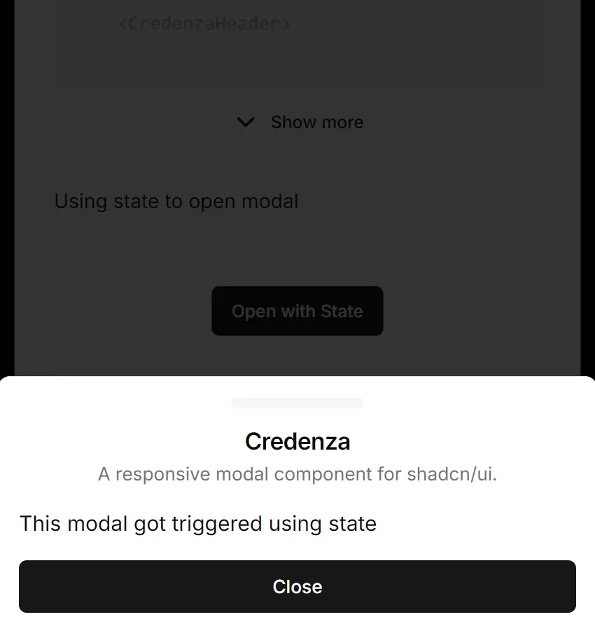
</Credenza>2. You can also control the modal’s visibility with React state.
function StateControlledModal() {
  const [open, setOpen] = React.useState(false)
  return (
    <>
      <button onClick={() => setOpen(true)}>Open with State</button>
      <Credenza open={open} onOpenChange={setOpen}>
        <CredenzaContent>
          <CredenzaHeader>
            <CredenzaTitle>Credenza Modal</CredenzaTitle>
          </CredenzaHeader>
          <CredenzaBody>This modal is controlled by component state.</CredenzaBody>
          <CredenzaFooter>
            <CredenzaClose asChild>
              <button>Close</button>
            </CredenzaClose>
          </CredenzaFooter>
        </CredenzaContent>
      </Credenza>
    </>
  )
}
Related Resources
- shadcn/ui – The component library that Credenza is built for, providing the foundation dialog and drawer components
- Vaul – The drawer library that powers the mobile drawer functionality in Credenza
FAQs
Q: Can I use Credenza without shadcn/ui?
A: No, Credenza is an extension of shadcn/ui. It requires the Dialog and Drawer components from that library to function correctly.
Q: How does Credenza decide when to show a dialog or a drawer?
A: It uses a custom React hook named useIsMobile. This hook adds an event listener that checks if the browser’s viewport width is less than 768 pixels.
Q: Is it possible to change the mobile breakpoint?
A: Yes. If you perform a manual installation, you can edit the MOBILE_BREAKPOINT constant directly inside the use-mobile.ts file you copied into your project.
Q: Do I need to install vaul myself?
A: The shadcn CLI handles the vaul installation automatically when you add the drawer component. You only need to install vaul manually if you copy the drawer component’s code into your project without using the CLI.
Q: How do I style the Credenza components?
A: You can pass className props to any Credenza component to apply custom styles. The components accept the same styling props as their underlying shadcn/ui counterparts.