The Future of Web Dev
The Future of Web Dev
Multi-Timezone Booking Calendar for React and shadcn/ui
A shadcn/ui calendar component with multi-timezone slot booking, recurring weekly availability windows, and Month/Week/Day/Agenda views for React/Next.js projects.
Calendar Scheduler is a multi-view scheduling component that creates timezone-aware slot booking inside your React projects built with shadcn/ui.
It runs on date-fns and date-fns-tz for all date arithmetic, and draws on shadcn/ui’s component primitives for the rendered UI.
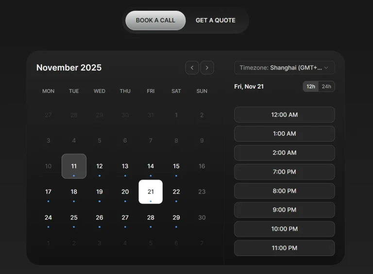
You can define weekly availability with weekday rules, and the component turns those windows into slot-based booking choices.
Booked entries close matching times on the calendar and keep the schedule readable for viewers in different time zones.
Features
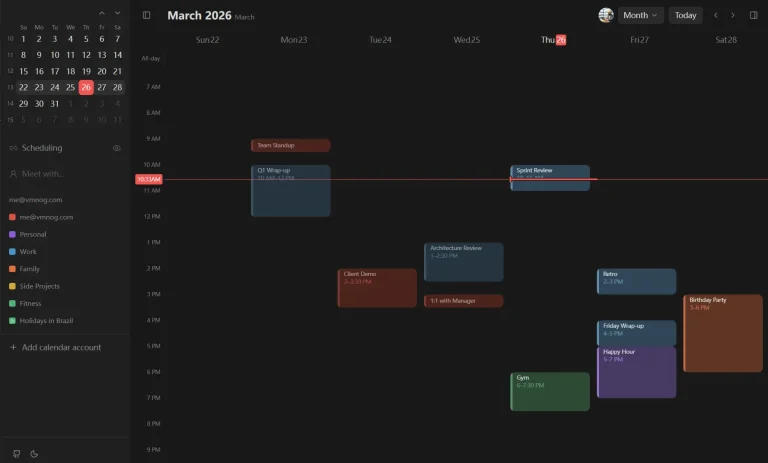
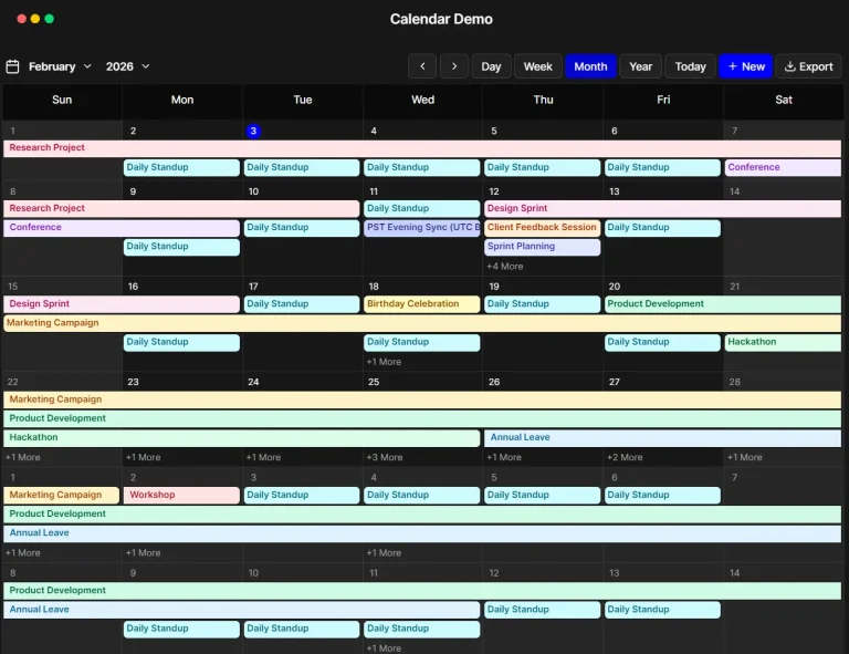
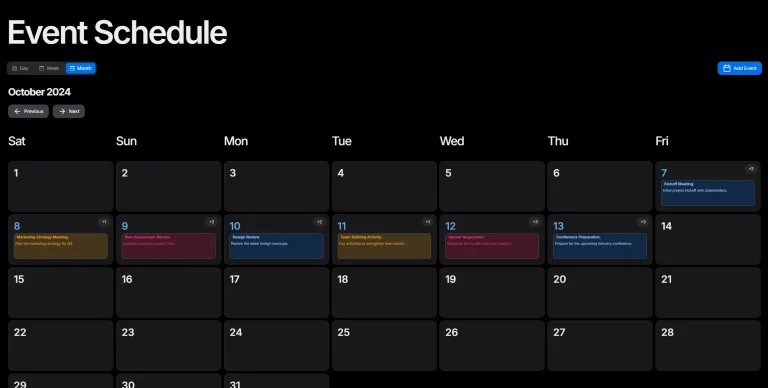
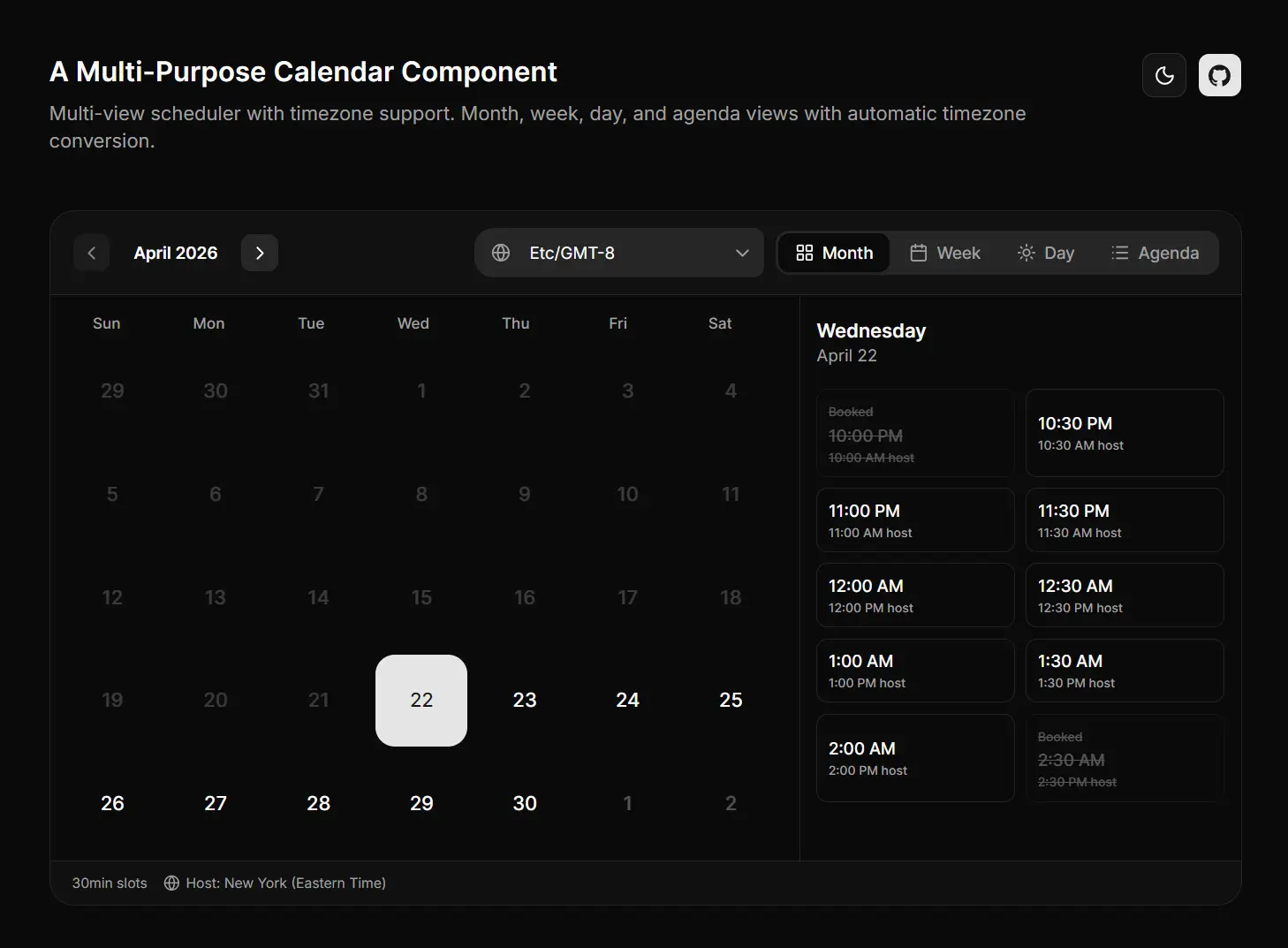
📅 Multiple Calendar Views: Switches between Month, Week, Day, and Agenda display modes.
🗓️ Recurring Weekly Availability: Availability windows repeat by weekday name and apply across all future weeks.
⏱️ Configurable Slot Durations: Slot lengths run at 15, 30, or 60 minutes.
🚫 Booked Slot Tracking: The UI marks specific date-time slots as unavailable based on a passed-in array of booked entries.
🌍 Admin-to-Viewer Timezone Conversion: Admin availability windows convert automatically to each viewer’s local timezone on render.
How to Use It
1. Install the calendar component via shadcn CLI. This copies all calendar component files into src/components/calendar/ in your project.
npx shadcn@latest add https://raw.githubusercontent.com/gluer-space/calendar/main/public/r/registry.json2. Or install it manually as follows:
Your project must have Tailwind CSS configured, the
@/components/ui/path alias pointing to your shadcn/ui components, andlucide-reactinstalled as a package.
npm install date-fns date-fns-tz lucide-reactnpx shadcn@latest add button select command popover tooltipcp -r src/components/calendar your-project/src/components/3. Import CalendarScheduler from the component directory and pass in your availability config, booked slots, slot duration, and callback handlers:
import { CalendarScheduler } from "@/components/calendar";
export default function BookingPage() {
  const [selectedDate, setSelectedDate] = useState<Date | null>(null);
  function handleBooking(date: Date, time: string) {
    console.log("Booked:", date, time);
    // Call your booking API here
  }
  return (
    <CalendarScheduler
      availability={[
        { day: "monday", startTime: "09:00", endTime: "17:00", enabled: true },
        { day: "tuesday", startTime: "10:00", endTime: "16:00", enabled: true },
        { day: "friday", startTime: "09:00", endTime: "13:00", enabled: true },
      ]}
      bookedSlots={[
        { date: "2024-04-10", time: "11:00" },
        { date: "2024-04-12", time: "14:30" },
      ]}
      slotDuration={30}
      adminTimeZone="America/Chicago"
      defaultViewerTimeZone="Europe/London"
      selectedDate={selectedDate ?? undefined}
      onDateSelect={(date) => setSelectedDate(date)}
      onSlotSelect={(date, time) => handleBooking(date, time)}
    />
  );
}
4. Available component props
| Prop | Type | Required | Description |
|---|---|---|---|
availability | Availability[] | Yes | Array of weekly availability windows. Each entry defines a weekday, start time, end time, and enabled flag. |
bookedSlots | BookedSlot[] | No | Array of date-time pairs that mark specific slots as already taken. |
slotDuration | number | Yes | Length of each bookable slot in minutes. Accepts 15, 30, or 60. |
adminTimeZone | string | No | IANA timezone string for the admin’s availability definition (e.g., "America/New_York"). |
defaultViewerTimeZone | string | No | IANA timezone string for the viewer’s display. Falls back to browser locale if omitted. |
selectedDate | Date | No | Pre-selected date shown on initial render. |
onDateSelect | (date: Date) => void | Yes | Fires when the user selects a date. |
onSlotSelect | (date: Date, time: string) => void | Yes | Fires when the user clicks an open time slot. |
5. Available components:
All components live in
src/components/calendar/:
| Component | File | Description |
|---|---|---|
CalendarScheduler | calendar.tsx | Main entry point. Renders all views and manages state. |
MonthView | month-view.tsx | Full month grid with day-level slot indicators. |
WeekView | week-view.tsx | Weekly column layout with hourly time slots. |
DayView | day-view.tsx | Single-day detail view. |
AgendaView | agenda-view.tsx | Chronological list view of upcoming available slots. |
Related Resources
- shadcn/ui: Copy-paste React component library built on Radix UI and Tailwind CSS.
- date-fns: Modular JavaScript date utility library that handles all date arithmetic in this component.
- date-fns-tz: Timezone-aware extension for date-fns built on the IANA timezone database.
FAQs
Q: What happens if adminTimeZone is not set?
A: The component treats availability times as-is with no conversion. Set adminTimeZone to an IANA string like "America/New_York" whenever your admin and viewers are in different time zones.
Q: Can I change slot duration at runtime?
A: Yes. The slotDuration prop controls slot length at the component level. Update the value passed to the prop and the component re-renders with the new slot grid.
Q: Does the component handle recurring blocked times, or only individual booked slots?
A: The bookedSlots prop marks specific date-time pairs as taken. For recurring blocks, generate the blocked entries from your backend and pass the full array on each render.
Q: Does this work with Next.js App Router?
A: Yes. Add "use client" at the top of any file that renders CalendarScheduler.