The Future of Web Dev
The Future of Web Dev
Modern Google Places Autocomplete for Next.js – shadcn-google-maps
Build address search in Next.js with shadcn-google-maps: Places API (New) autocomplete with typed results, keyboard nav, and country filtering.
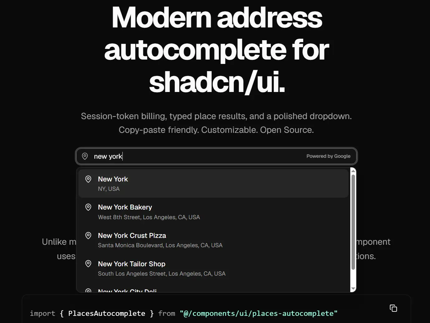
shadcn-google-maps is a modern PlacesAutocomplete component for shadcn/ui that adds Google Places address autocomplete to Next.js projects using the new Places API.
Embed it into any form, pass an onPlaceSelect callback, and get back a typed SelectedPlace object with the formatted address, latitude, longitude, and place ID.
No global google.maps.* types leak into your application code. No fighting with legacy widget styles.
Features
- Adds address autocomplete to shadcn/ui forms.
- Matches existing shadcn/ui input styles.
- Returns typed address data for form state and backend payloads.
- Supports keyboard selection for suggestion lists.
- Debounces user input before remote lookups.
- Restricts suggestions to a selected country.
- Shows Google attribution for address suggestions.
- Supports controlled and uncontrolled input patterns.
- Accepts a custom API key through props.
- Installs through the shadcn CLI or manual file copy.
Use Cases
- Building a checkout form with address autocomplete.
- Adding a location search to a store finder.
- Capturing a shipping address during user onboarding.
- Creating a geolocation picker for delivery radius selection.
How to Use It
Installation
Enable the required Google services before adding the component to your app.
- Create or select a project in Google Cloud Console.
- Enable Maps JavaScript API.
- Enable Places API (New).
- Create an API key under APIs & Services.
- Restrict the key by HTTP referrer.
- Restrict the key to Maps JavaScript API and Places API (New).
Add the key to .env.local:
NEXT_PUBLIC_GOOGLE_MAPS_API_KEY=your_key_hereThe NEXT_PUBLIC_ prefix exposes the key to browser code. Referrer restrictions protect the key from use on unrelated domains.
Install the component through the shadcn CLI:
bunx shadcn@latest add https://shadcn-google-maps.vercel.app/r/places-autocomplete.jsonInstall the required dependency and shadcn/ui components:
bun add lucide-react
bun add -d @types/google.maps
bunx shadcn@latest add input button
You can also copy the component files manually into your project, usually under components/ui/ and hooks/.
Basic Usage
Add the component inside a client component. The onPlaceSelect callback receives the selected address data.
"use client"
import { PlacesAutocomplete } from "@/components/ui/places-autocomplete"
export function AddressField() {
  return (
    <PlacesAutocomplete
      placeholder="Search for an address"
      countryCode="us"
      onPlaceSelect={(place) => {
        console.log(place.address)
        console.log(place.lat)
        console.log(place.lng)
        console.log(place.placeId)
      }}
    />
  )
}
The selected value follows this shape:
type SelectedPlace = {
  address: string
  lat: number | null
  lng: number | null
  placeId: string | null
}
Available Component Props
| Prop | Type | Default | Description |
|---|---|---|---|
onPlaceSelect | (place: SelectedPlace) => void | Required | Runs after the user selects a suggestion. |
value | string | Sets the controlled input value. | |
defaultValue | string | "" | Sets the initial uncontrolled value. |
onValueChange | (value: string) => void | Runs when the input text changes. | |
apiKey | string | Env key | Overrides NEXT_PUBLIC_GOOGLE_MAPS_API_KEY. |
countryCode | string | null | Limits suggestions to an ISO region code such as us. | |
debounceMs | number | 300 | Sets the delay before fetching suggestions. |
placeholder | string | "Start typing an address" | Sets the input placeholder text. |
disabled | boolean | false | Disables the input. |
className | string | Adds classes to the wrapper. | |
inputClassName | string | Adds classes to the input element. | |
showPoweredByGoogle | boolean | true | Shows Google attribution for suggestions. |
API Methods
PlacesAutocomplete does not expose imperative public methods. Use React props and callbacks to control the field, update state, and process selected place data.
<PlacesAutocomplete
  value={address}
  onValueChange={setAddress}
  onPlaceSelect={(place) => {
    setAddress(place.address)
  }}
/>
Events
The component exposes callback props instead of DOM style custom events.
<PlacesAutocomplete
  onValueChange={(value) => {
    // Runs whenever the user edits the input text.
    setAddress(value)
  }}
  onPlaceSelect={(place) => {
    // Runs after the user selects a suggestion.
    setSelectedPlace(place)
  }}
/>
Real-world Examples
Example 1: Controlled Address Field
Use a controlled value when the address must stay in sync with a parent form component.
"use client"
import { useState } from "react"
import { PlacesAutocomplete } from "@/components/ui/places-autocomplete"
export function ControlledAddressField() {
  const [address, setAddress] = useState("")
  return (
    <div className="space-y-2">
      <label className="text-sm font-medium">Address</label>
      <PlacesAutocomplete
        value={address}
        onValueChange={setAddress}
        placeholder="Start typing your address"
        countryCode="us"
        onPlaceSelect={(place) => {
          setAddress(place.address)
        }}
      />
      <p className="text-sm text-muted-foreground">
        Current value: {address || "No address selected"}
      </p>
    </div>
  )
}
Example 2: Checkout Form Address Capture
Use SelectedPlace data when a checkout form needs both a readable address and location coordinates.
"use client"
import { useState } from "react"
import { PlacesAutocomplete } from "@/components/ui/places-autocomplete"
type CheckoutPlace = {
  address: string
  lat: number | null
  lng: number | null
  placeId: string | null
}
export function CheckoutAddressForm() {
  const [shippingAddress, setShippingAddress] = useState("")
  const [place, setPlace] = useState<CheckoutPlace | null>(null)
  function submitAddress() {
    const payload = {
      shippingAddress,
      coordinates: place
        ? {
            lat: place.lat,
            lng: place.lng,
          }
        : null,
      googlePlaceId: place?.placeId ?? null,
    }
    console.log("Checkout payload", payload)
  }
  return (
    <div className="space-y-4">
      <PlacesAutocomplete
        value={shippingAddress}
        onValueChange={setShippingAddress}
        placeholder="Enter your shipping address"
        countryCode="us"
        debounceMs={400}
        onPlaceSelect={(selectedPlace) => {
          setPlace(selectedPlace)
          setShippingAddress(selectedPlace.address)
        }}
      />
      <button
        type="button"
        className="rounded-md bg-primary px-4 py-2 text-primary-foreground"
        onClick={submitAddress}
      >
        Save shipping address
      </button>
    </div>
  )
}
Example 3: Booking Form with Country Restriction
Set countryCode when your product only supports bookings in one region.
"use client"
import { useState } from "react"
import { PlacesAutocomplete } from "@/components/ui/places-autocomplete"
export function VenueBookingLocation() {
  const [venue, setVenue] = useState("")
  const [venuePlaceId, setVenuePlaceId] = useState<string | null>(null)
  return (
    <form className="space-y-4">
      <div className="space-y-2">
        <label className="text-sm font-medium">Venue</label>
        <PlacesAutocomplete
          value={venue}
          onValueChange={setVenue}
          placeholder="Search for a venue"
          countryCode="us"
          inputClassName="h-11"
          onPlaceSelect={(place) => {
            setVenue(place.address)
            setVenuePlaceId(place.placeId)
          }}
        />
      </div>
      <input type="hidden" name="venuePlaceId" value={venuePlaceId ?? ""} />
      <button
        type="submit"
        className="rounded-md border px-4 py-2"
      >
        Continue
      </button>
    </form>
  )
}
Example 4: Custom API Key per Component
Pass apiKey directly when a page needs a specific key instead of the shared environment variable.
"use client"
import { PlacesAutocomplete } from "@/components/ui/places-autocomplete"
export function PartnerLocationSearch() {
  return (
    <PlacesAutocomplete
      apiKey={process.env.NEXT_PUBLIC_PARTNER_GOOGLE_MAPS_API_KEY}
      placeholder="Search partner locations"
      countryCode="ca"
      showPoweredByGoogle={true}
      onPlaceSelect={(place) => {
        console.log("Partner place", place)
      }}
    />
  )
}
Alternatives and Related Resources
- Address Autocomplete Component For Shadcn/ui
- Next.js Leaflet Starter Template for Interactive Maps
- jQuery Location Autocomplete with Google Maps Places Library – Placepicker
- jQuery Geocoding and Places Autocomplete with Google Maps API – geocomplete
- Autocomplete Address Form Using jQuery And Google Places API – LightCheckout
FAQs
Q: Which Google APIs should I enable?
A: Enable Maps JavaScript API and Places API (New).
Q: Can I use it as a controlled form field?
A: Yes. Pass value and onValueChange to control the input from React state. Use onPlaceSelect to store the final selected address data.
Q: What data do I get after a user selects an address?
A: The callback returns a SelectedPlace object with address, lat, lng, and placeId. Latitude and longitude can be null when Google does not return coordinates.
Q: Can I limit suggestions to one country?
A: Yes. Pass an ISO region code to countryCode, such as us for the United States or ca for Canada.
Q: Does it work in server components?
A: Use the autocomplete field inside a client component. The component needs browser APIs, user input events, and Google Maps JavaScript loading.