The Future of Web Dev
The Future of Web Dev
60+ Copy-and-paste UI Components to Build Apps Faster – Reui
Copy-paste UI components with TypeScript, Motion animations, and Tailwind CSS. 60+ production-ready components extending shadcn/ui.
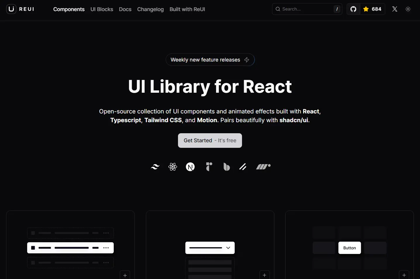
Reui is a collection of product-ready, copy-and-paste UI components and animated effects built with React, Framer Motion, shadcn/ui, and Tailwind CSS.
You can use it to build various parts of a complex modern web application, from simple buttons to complex data tables and interactive charts.
Features
🎨 60+ Components: Complete collection including data grids, calendars, charts, and form controls.
⚡ Copy-and-Paste: No runtime dependencies, full code ownership and customization freedom.
🎯 TypeScript-First: Strong type safety with intelligent autocompletion and error prevention.
🎭 Motion-Powered Animations: Smooth transitions and micro-interactions using the Motion library.
🌗 Dual Theme Support: Built-in light and dark mode with CSS variable-based theming.
♿ Accessibility: WCAG-compliant components with proper ARIA attributes and keyboard navigation.
🔧 Prop-Based API: Clean component interfaces designed for AI code generation and maintainability.
🎪 Advanced Component Variants: Multiple styling options and behavioral modes for each component.
Use Cases
- Building Interactive Dashboards: Use components like charts, tables, and data grids to construct data-heavy dashboards for analytics or monitoring applications.
- Developing E-commerce Platforms: Assemble product pages, shopping carts, and checkout forms using ReUI’s form inputs, cards, and carousel components.
- Creating Marketing Websites: Design landing pages and company websites with animated text effects, gradient backgrounds, and responsive navigation menus.
- Prototyping Web Applications: Quickly build and iterate on user interfaces for new web applications by leveraging the pre-built component collection.
How To Use It
1. ReUI is designed to be compatible with shadcn/ui. You can follow the shadcn/ui installation guide to set up your React project. If your project is already set up for shadcn/ui, you can proceed to the next step.
2. Add the necessary libraries to your project using npm.
Radix UI:
npm i radix-uiBase UI:
npm i @base-ui-components/reactMotion for animations:
npm i motion3. Add the following styles to your main CSS file, typically globals.css. This code block includes dark mode support, color variables for theming, and global styles.
@import 'tailwindcss';
@import 'tw-animate-css';
@custom-variant dark (&:is(.dark *));
:root {
  --background: var(--color-white);
  --foreground: var(--color-zinc-950);
  --card: var(--color-white);
  --card-foreground: var(--color-zinc-950);
  --popover: var(--color-white);
  --popover-foreground: var(--color-zinc-950);
  --primary: var(--color-blue-500);
  --primary-foreground: var(--color-white);
  --secondary: var(--color-zinc-100);
  --secondary-foreground: var(--color-zinc-900);
  --muted: var(--color-zinc-100);
  --muted-foreground: var(--color-zinc-500);
  --accent: var(--color-zinc-100);
  --accent-foreground: var(--color-zinc-900);
  --destructive: var(--color-red-600);
  --destructive-foreground: var(--color-white);
  --border: oklch(94% 0.004 286.32);
  --input: var(--color-zinc-200);
  --ring: var(--color-zinc-400);
  --radius: 0.5rem;
}
.dark {
  --background: var(--color-zinc-950);
  --foreground: var(--color-zinc-50);
  --card: var(--color-zinc-950);
  --card-foreground: var(--color-zinc-50);
  --popover: var(--color-zinc-950);
  --popover-foreground: var(--color-zinc-50);
  --primary: var(--color-blue-600);
  --primary-foreground: var(--color-white);
  --secondary: var(--color-zinc-800);
  --secondary-foreground: var(--color-zinc-50);
  --muted: var(--color-zinc-900);
  --muted-foreground: var(--color-zinc-500);
  --accent: var(--color-zinc-900);
  --accent-foreground: var(--color-zinc-50);
  --destructive: var(--color-red-600);
  --destructive-foreground: var(--color-white);
  --border: var(--color-zinc-800);
  --input: var(--color-zinc-800);
  --ring: var(--color-zinc-600);
}
4. Add Lucide and Remix Icon for icons.
npm i lucide-react
npm i @remixicon/react
5. You can now add UI components using the shadcn/ui CLI or by manually copying the code.
Install with CLI:
Add a button component to your component.
pnpm dlx shadcn@latest add https://reui.io/r/button.json
// OR
npx shadcn@latest add https://reui.io/r/button.json
// OR
npx shadcn@latest add https://reui.io/r/button.json
// OR
bunx --bun shadcn@latest add https://reui.io/r/button.json
Install Manually:
Copy the component’s code directly into your project. Here is an example of the code for a Button component:
import * as React from 'react';
import { cva, type VariantProps } from 'class-variance-authority';
import { ChevronDown, LucideIcon } from 'lucide-react';
import { Slot as SlotPrimitive } from '@radix-ui/react-slot';
import { cn } from '@/lib/utils';
const buttonVariants = cva(
  'cursor-pointer group whitespace-nowrap focus-visible:outline-hidden inline-flex items-center justify-center text-sm font-medium transition-colors disabled:pointer-events-none disabled:opacity-60',
  {
    variants: {
      variant: {
        primary: 'bg-primary text-primary-foreground hover:bg-primary/90',
        destructive: 'bg-destructive text-destructive-foreground hover:bg-destructive/90',
        outline: 'border border-input bg-background hover:bg-accent hover:text-accent-foreground',
        secondary: 'bg-secondary text-secondary-foreground hover:bg-secondary/80',
        ghost: 'hover:bg-accent hover:text-accent-foreground',
        link: 'text-primary underline-offset-4 hover:underline',
      },
      size: {
        default: 'h-10 px-4 py-2',
        sm: 'h-9 rounded-md px-3',
        lg: 'h-11 rounded-md px-8',
        icon: 'h-10 w-10',
      },
    },
    defaultVariants: {
      variant: 'primary',
      size: 'default',
    },
  }
);
export interface ButtonProps
  extends React.ButtonHTMLAttributes<HTMLButtonElement>,
    VariantProps<typeof buttonVariants> {
  asChild?: boolean;
}
const Button = React.forwardRef<HTMLButtonElement, ButtonProps>(
  ({ className, variant, size, asChild = false, ...props }, ref) => {
    const Comp = asChild ? SlotPrimitive : 'button';
    return (
      <Comp
        className={cn(buttonVariants({ variant, size, className }))}
        ref={ref}
        {...props}
      />
    );
  }
);
Button.displayName = 'Button';
export { Button, buttonVariants };
You can then import and use the Button component in your application.
import { Button } from '@/components/ui/button';
export default function MyComponent() {
  return <Button>Click Me</Button>;
}
Related Resources
- Shadcn/UI: The foundational component library that ReUI extends, providing the base architecture and design patterns.
- Radix UI Primitives: Unstyled, accessible component primitives that power many ReUI components with robust accessibility features.
- Motion Documentation: Animation library documentation covering advanced animation patterns and performance optimization techniques.
- Tailwind CSS Guide: Comprehensive styling framework documentation for customizing component appearances and responsive behavior.
FAQs
Q: How is ReUI different from shadcn/ui?
A: ReUI is built to work with and extend shadcn/ui. While shadcn/ui provides a base set of highly composable components, ReUI adds a broader range of components, layouts, and animated effects on top of that foundation.
Q: Do I have to install all the dependencies to use a single component?
A: No, the copy-and-paste approach means you only bring in the code for the components you need. This keeps your project lightweight as you avoid installing a large library.
Q: Can I customize the appearance of ReUI components?
A: Yes. Components are styled with Tailwind CSS and themed using CSS variables.