The Future of Web Dev
The Future of Web Dev
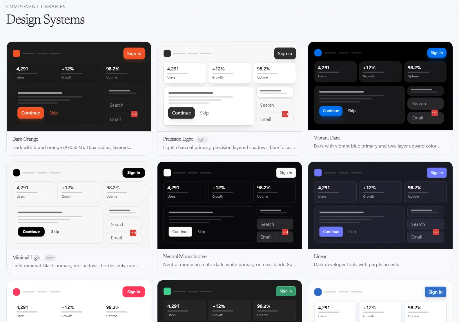
Better Design: 30+ shadcn/ui Design Systems for SaaS Dashboards & Landing Pages
An open-source collection of 30+ design systems for shadcn/ui, including Linear, Stripe, Vercel, Notion, and more.
Better Design is an open-source collection of 30+ themed design systems for shadcn/ui.
Each design system delivers approximately 87 pre-styled UI components that contain the full shadcn/ui component range, from accordions to typography blocks.
Feel free to use it to build SaaS dashboards, admin panels, settings pages, landing pages, and product UIs from themed shadcn/ui components.
Features
- Single-component installs via the shadcn CLI registry URL pattern.
- Automatic CSS variable and design token injection into
globals.csson each install. - Forkable
.tsxsource files for every component in every design system. - Matching
globals.cssper design system for accurate token resolution. - MIT license for personal, commercial, and client work.
Available Design Systems
| Design System | Slug | Visual Style | Best For |
|---|---|---|---|
| Airbnb | airbnb | Warm, approachable, light | Booking platforms, marketplace UIs, community apps |
| Apple | apple | Minimal, refined, light | Consumer-facing products, portfolio sites, mobile-first UIs |
| Beam Custom | beam-custom | Custom Beam variant | Teams already using Beam’s design language |
| Beam Lib | beam-lib | Library-standard Beam | Component library projects with Beam as a base |
| Cinematic Dark | cinematic-dark | Dark, high-contrast, film-inspired | Media platforms, video dashboards, content tools |
| Column (Corporate Fintech) | corporate-fintech | Formal, dense, business-grade | Fintech dashboards, banking UIs, data-heavy B2B apps |
| Dark Orange | dark-orange | Dark background with orange accent | Dev tools, games, alert-heavy monitoring UIs |
| Editorial Dark | editorial-dark | Dark, content-first, print-inspired | Publishing platforms, blogs, content management tools |
| Figma | figma | Tool-grade, design-system-aware | Design tools, collaborative editors, asset management UIs |
| Glassmorphic Dark | glassmorphic-dark | Dark, frosted glass effects | AI products, creative tools, premium SaaS landing pages |
| Inset Dark | inset-dark | Dark with inset panel treatment | Sidebars, split-layout dashboards, terminal-style apps |
| Light Marketplace | light-marketplace | Clean, product-forward, light | Ecommerce storefronts, product listing pages, checkout flows |
| Linear | linear | Dark, minimal, product-grade | SaaS dashboards, project management tools, issue trackers |
| Linear Quality | linear-quality | Higher-fidelity Linear variant | Teams who want Linear’s aesthetic with extra refinement |
| Lumen Dark | lumen-dark | Dark with glowing accent treatment | AI UIs, creative dashboards, futuristic product themes |
| Metal FX Gold | metal-fx-gold | Metallic gold finish | Premium products, finance, high-end SaaS pricing pages |
| Metal FX Silver | metal-fx-silver | Metallic silver finish | Enterprise tools, technical dashboards, neutral premium UI |
| Metal FX Chromatic | metal-fx-chromatic | Chromatic metallic with color shift | Landing pages, marketing sites, hero sections |
| Midnight Glass | midnight-glass | Deep dark with glass overlays | AI chat interfaces, data visualization, immersive apps |
| Minimal Light | minimal-light | Simple, clean, low-decoration | Documentation sites, startup MVPs, text-heavy layouts |
| Monochrome Industrial | monochrome-industrial | Grayscale, dense, utilitarian | Developer tools, CLI dashboards, admin panels |
| Neutral Monochrome | neutral-monochrome | Neutral gray tones throughout | Versatile base theme for teams that apply their own brand color |
| Notion | notion | Content-first, document-style | Note-taking apps, wikis, internal knowledge bases |
| Pillow Light | pillow-light | Soft, rounded, airy | Consumer apps, onboarding flows, wellness products |
| Precision Light | precision-light | Technical, sharp, light | SaaS tools, analytics dashboards, data-dense interfaces |
| Stripe | stripe | Professional, clean, financial-grade | Payment forms, billing dashboards, subscription management |
| Supabase | supabase | Dev-tool green accent, dark | Backend dashboards, database UIs, developer portals |
| Tactile Minimal | tactile-minimal | Minimal with subtle depth cues | Forms, settings pages, clean onboarding UIs |
| TV Style | tv-style | Bold, screen-optimized | TV apps, large-display UIs, media players |
| Vercel | vercel | Dark, sharp, developer-focused | Deployment dashboards, CI/CD UIs, developer portals |
| Vibrant Dark | vibrant-dark | Dark with rich color accents | Creative tools, marketing dashboards, feature-rich apps |
Use Cases
- SaaS founders who need a production-grade dashboard UI and want to ship the Linear or Vercel aesthetic immediately.
- Frontend teams prototyping internal tools and admin panels where Stripe or Supabase-styled components match the product’s technical brand.
- Freelancers building client projects who need every component themed consistently from day one.
- Design-focused developers evaluating multiple visual directions for a product who want live, component-level theme previews across 30+ options.
How to Use It
Table Of Contents
Installation
1. Better Design requires an existing shadcn/ui project. If you’re starting fresh, initialize one first:
# Create a new Next.js project with shadcn/ui configured
npx create-next-app@latest my-project --typescript --tailwind
cd my-project
npx shadcn@latest init
2. After that setup, every Better Design component becomes accessible through a single registry URL command.
npx shadcn@latest add https://www.better-design.com/registry/<design-system>/<component>.jsonReplace <design-system> with the design system slug (for example, linear, stripe, vercel) and <component> with the component name (for example, button, card, accordion).
Example 1: Install a Single Component from Linear
This is the fastest setup. Install Linear’s Button component into your project:
# Install the Button styled to Linear's clean, dark product design language
npx shadcn@latest add https://www.better-design.com/registry/linear/button.json
The CLI writes button.tsx to components/ui/ and patches globals.css with Linear’s CSS token set. Import and use it the same way you would a standard shadcn/ui component:
// app/dashboard/page.tsx
import { Button } from "@/components/ui/button";
export default function DashboardPage() {
  return (
    <main>
      <Button variant="default">Save Changes</Button>
      <Button variant="outline">Cancel</Button>
    </main>
  );
}
Example 2: Build a Stripe-Themed Settings Panel
Install multiple components from the Stripe design system to assemble a complete settings layout:
# Install the Card for wrapping settings sections
npx shadcn@latest add https://www.better-design.com/registry/stripe/card.json
# Install the Accordion for collapsible setting groups
npx shadcn@latest add https://www.better-design.com/registry/stripe/accordion.json
# Install the Button for save and cancel actions
npx shadcn@latest add https://www.better-design.com/registry/stripe/button.json
All three components share the same Stripe token set, so they render with consistent borders, typography, and spacing:
// app/settings/page.tsx
import { Card, CardContent, CardHeader, CardTitle } from "@/components/ui/card";
import { Button } from "@/components/ui/button";
import {
  Accordion,
  AccordionContent,
  AccordionItem,
  AccordionTrigger,
} from "@/components/ui/accordion";
export default function SettingsPage() {
  return (
    <Card className="max-w-2xl mx-auto">
      <CardHeader>
        <CardTitle>Account Settings</CardTitle>
      </CardHeader>
      <CardContent>
        <Accordion type="single" collapsible>
          <AccordionItem value="billing">
            <AccordionTrigger>Billing & Invoices</AccordionTrigger>
            <AccordionContent>
              Manage your plan and payment methods here.
            </AccordionContent>
          </AccordionItem>
          <AccordionItem value="notifications">
            <AccordionTrigger>Notification Preferences</AccordionTrigger>
            <AccordionContent>
              Choose which emails and alerts you receive.
            </AccordionContent>
          </AccordionItem>
        </Accordion>
        <div className="flex gap-2 mt-6">
          <Button>Save Settings</Button>
          <Button variant="outline">Discard</Button>
        </div>
      </CardContent>
    </Card>
  );
}
Example 3: Swap to a Vercel Theme for a Developer Tool
The Vercel design system is best for CLI dashboards and deployment UIs. Swap the registry slug to apply it:
# Install the same component set, now from the Vercel design system
npx shadcn@latest add https://www.better-design.com/registry/vercel/card.json
npx shadcn@latest add https://www.better-design.com/registry/vercel/button.json
Alternatives
- shadcn/ui Themes: The official shadcn/ui theme builder generates custom CSS variable sets for a single theme.
- Origin UI: A collection of copy-paste shadcn/ui components with a focus on interactive states and modern patterns.
- Radix Themes: A standalone design system built on Radix UI primitives with its own token layer.
- Tremor: A React component library focused on dashboard and data visualization components.
FAQ
Q: Do I need to install an entire design system at once?
A: No. The install command works per component. Install only the components your project needs. You can install a button from Linear, a card from Stripe, and nothing else.
Q: Can I mix components from two different design systems in the same project?
A: Technically yes, but each design system writes its own CSS variable values to globals.css. Installing from two systems overwrites the token values from the first. Pick one design system and install all components from that system to keep visual consistency.
Q: Does Better Design work with React projects outside of Next.js?
A: Yes. The install mechanism is the shadcn CLI, which works in any React project with Tailwind CSS and a compatible shadcn/ui setup. The components render as standard React .tsx files.
Q: Why do the installed components look unstyled?
A: Check the selected theme’s globals.css tokens. Confirm your app imports the global CSS file in the root layout.
