The Future of Web Dev
The Future of Web Dev
Async Select Component: Async Data Loading & Custom Rendering
A powerful, modern async select UI component. Built with shadcn/ui and TypeScript for full customization and type safety.
Async Select is a modern and accessible select component built on top of shadcn/ui’s Popover and Command components.
It allows you to fetch and display a list of options from an asynchronous source, like an API.
Features
🔍 Async Data Fetching – Real-time API calls with search query support
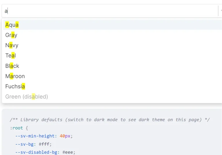
📦 Preload Mode – Load all data upfront with client-side filtering
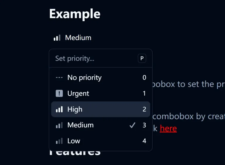
🎨 Custom Rendering – Flexible option and display value rendering
⌨️ Keyboard Navigation – Full keyboard accessibility support
🧹 Clearable Selection – Optional clear functionality for better UX
🔧 Customizable Styling – Custom classes and width options
⚡ Performance Optimized – Efficient rendering and data handling
🚫 Loading States – Custom loading skeletons and not found messages
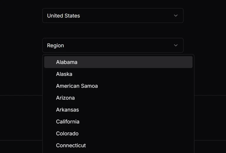
Preview

Use Cases
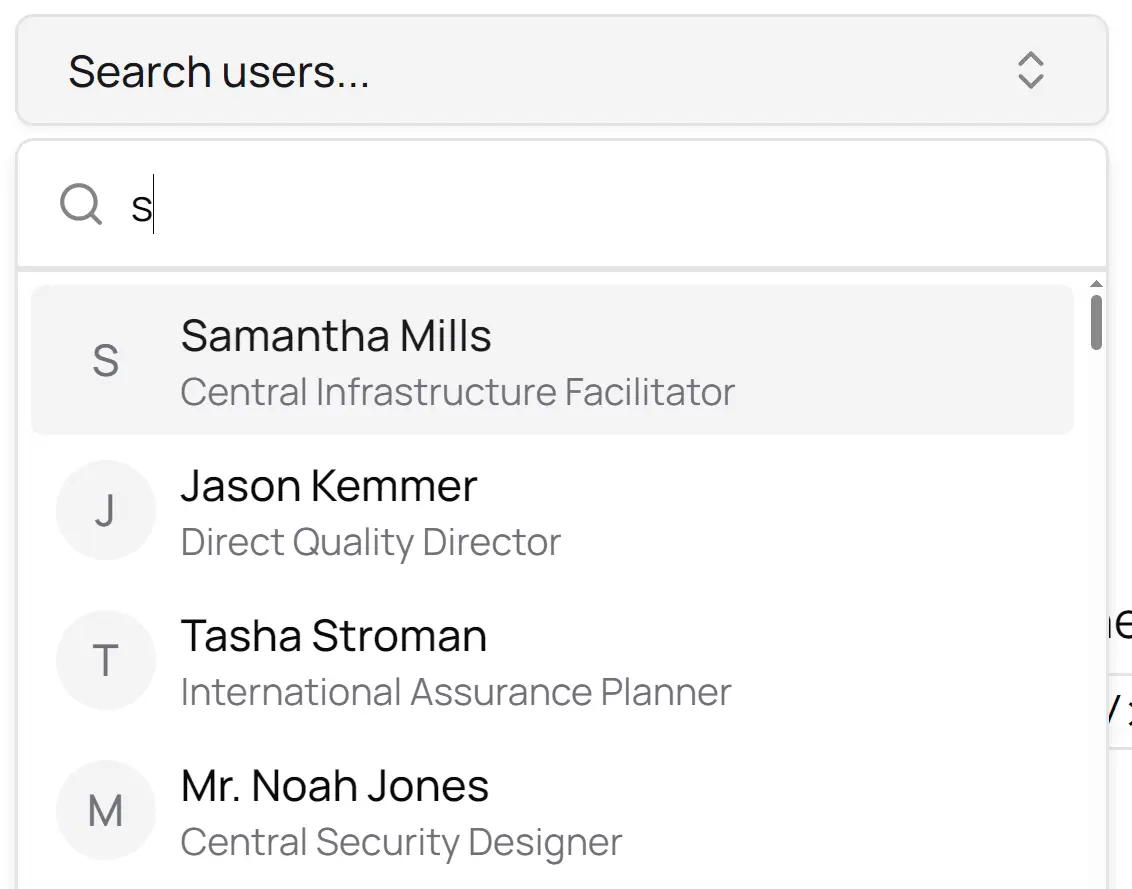
- User Search Fields: Implement an autocomplete input where users can search for and select a user from a large database. The component fetches matching users as the user types.
- E-commerce Product Finders: Create a product search in an online store. Customers can search the entire catalog, and the component will display relevant products dynamically.
- Dynamic Tagging Systems: Build a tagging input for a content management system. Authors can search for existing tags or add new ones, with the list of suggestions fetched from a server.
- Location or Address Autocomplete: Integrate with a mapping or address validation API. The component suggests addresses as a user types into a form field.
How To Use It
1. Install the required shadcn/ui components:
npx shadcn-ui@latest add popover
npx shadcn-ui@latest add command
2. Install & import AsyncSelect.
import { AsyncSelect } from "@/components/async-select";3. Basic usage.
function MyComponent() {
  const [value, setValue] = useState("");
  return (
    <AsyncSelect<DataType>
      fetcher={fetchData}
      renderOption={(item) => <div>{item.name}</div>}
      getOptionValue={(item) => item.id}
      getDisplayValue={(item) => item.name}
      label="Select"
      value={value}
      onChange={setValue}
    />
  );
}
4. The Async Mode is ideal for large datasets where options are fetched on-demand based on user input.
<AsyncSelect<User>
  fetcher={searchUsers}
  renderOption={(user) => (
    <div className="flex items-center gap-2">
      {/* Custom rendering for each option */}
    </div>
  )}
  getOptionValue={(user) => user.id}
  getDisplayValue={(user) => (
    <div className="flex items-center gap-2">
      {/* Custom rendering for the selected value */}
    </div>
  )}
  notFound={<div className="py-6 text-center text-sm">No users found</div>}
  label="User"
  placeholder="Search users..."
  value={selectedUser}
  onChange={setSelectedUser}
  width="375px"
/>
5. Use Preload Mode for smaller datasets. The component fetches all options initially and filters them on the client side as the user types.
<AsyncSelect<User>
  fetcher={searchAllUsers}
  preload
  filterFn={(user, query) => user.name.toLowerCase().includes(query.toLowerCase())}
  renderOption={(user) => (
     <div className="flex items-center gap-2">
      {/* Custom rendering for each option */}
    </div>
  )}
  getOptionValue={(user) => user.id}
  getDisplayValue={(user) => user.name}
  label="User"
  value={selectedUser}
  onChange={setSelectedUser}
/>
6. All possible component props.
fetcher:(query?: string) => Promise<T[]>– An async function that fetches and returns an array of options.renderOption:(option: T) => React.ReactNode– A function that defines how to render each individual option in the dropdown list.getOptionValue:(option: T) => string– A function that returns a unique string value for a given option.getDisplayValue:(option: T) => React.ReactNode– A function that defines how to render the currently selected value in the input.value:string– The currently selected value of the component.onChange:(value: string) => void– A callback function that is called when the selected value changes.label:string– The text label displayed for the select field.preload:boolean(Default:false) – If set totrue, it fetches all options on initial load for client-side filtering.filterFn:(option: T, query: string) => boolean– A custom function used to filter options whenpreloadis enabled.notFound:React.ReactNode– A custom component or message to display when no search results are found.loadingSkeleton:React.ReactNode– A custom component to show while options are being fetched.placeholder:string(Default:"Select...") – The placeholder text shown when no value is selected.disabled:boolean(Default:false) – Iftrue, the select component is disabled and cannot be interacted with.width:string | number(Default:"200px") – Sets a custom width for the component.className:string– A custom CSS class to apply to the main popover container.triggerClassName:string– A custom CSS class to apply to the trigger button.noResultsMessage:string– A message to display when the fetcher returns an empty array.clearable:boolean(Default:true) – Iftrue, allows the user to clear the current selection.
Related Resources
- shadcn/ui – Component library providing the foundation Popover and Command components
- React Hook Form – Form library that pairs well with this component for validation
- TanStack Query – Data fetching library for managing async state in React applications
FAQs
Q: How does this component differ from a native HTML <select> element?
A: This component is designed for dynamic data. Unlike a native <select>, it can fetch options from a server as the user types, which is ideal for long lists where loading all options at once is not practical.
Q: Is shadcn/ui a mandatory dependency?
A: Yes. This component is built by composing the Popover and Command components from shadcn/ui. It will not function without them.
Q: When should I use preload mode instead of the default async mode?
A: Use preload mode when your list of options is relatively small and can be fetched quickly in a single request. This allows for faster client-side filtering. Use the default async mode for very large datasets to avoid performance issues from loading too much data at once.
Q: Can I customize the appearance of the loading and empty states?
A: Yes. You can pass your own React components to the loadingSkeleton and notFound props to completely control the look and feel of these states.