The Future of Web Dev
The Future of Web Dev
React Billing UI Components Built on shadcn/ui – BillUI
Copy-paste billing UI components for React built on shadcn/ui. Add plan cards, pricing tables, invoice cards, and usage meters via the shadcn CLI.
BillUI is a React billing UI component registry built on top of shadcn/ui for pricing sections, subscription plan cards, payment method cards, invoice views, billing address forms, card inputs, and usage tracking panels.
Each component lands in your source directory as an editable TypeScript file you own and modify.
BillUI is great for SaaS teams that already use React, Tailwind CSS, and shadcn/ui and want billing screens that match the rest of their product.
It focuses on UI patterns and the local interaction state. You still need your own backend for subscriptions, invoices, tax logic, entitlements, and payment processing.
Features
🧩 Composable Architecture: Each billing component splits into independent sub-components (header, price, features list, action button) that you reconfigure or extend individually.
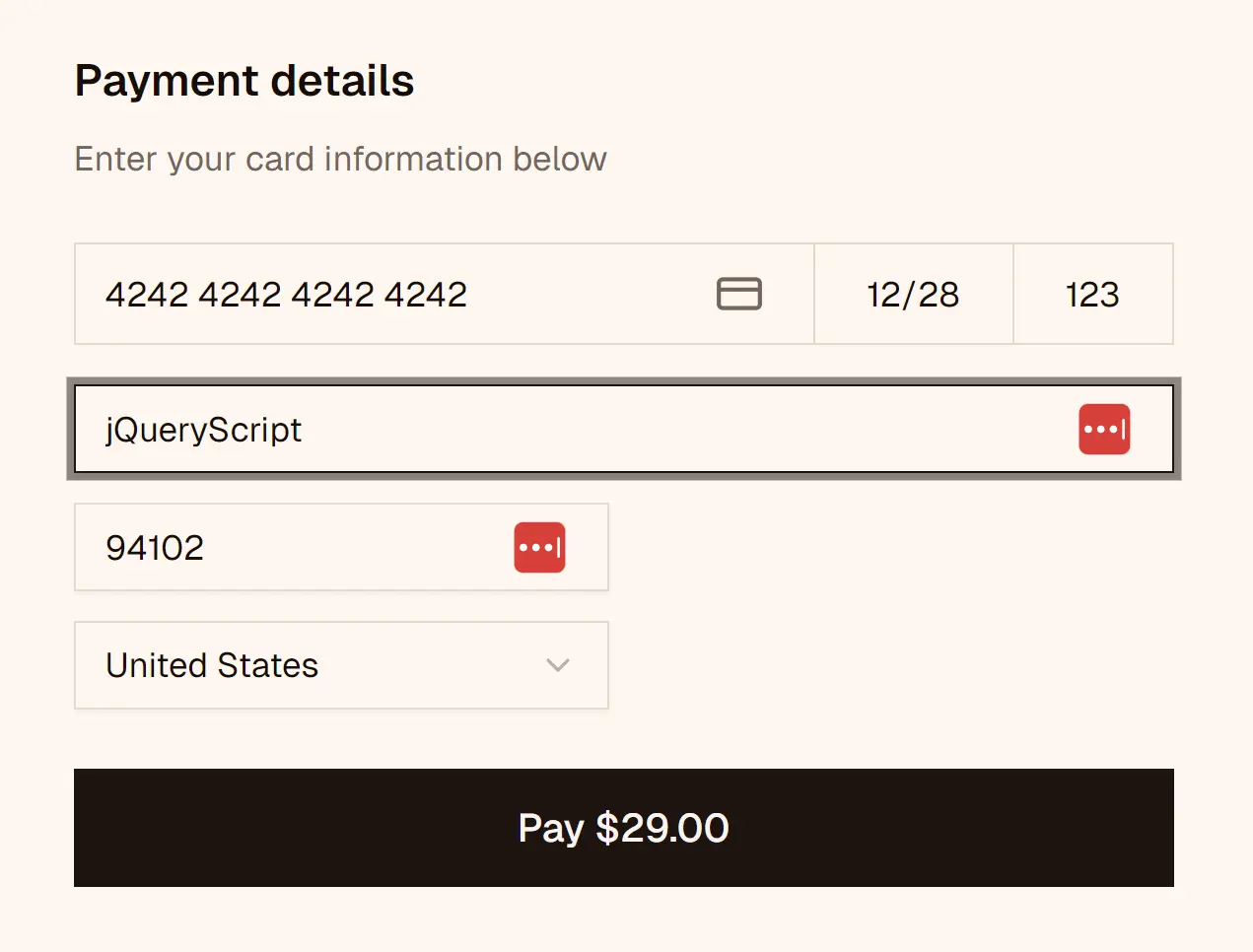
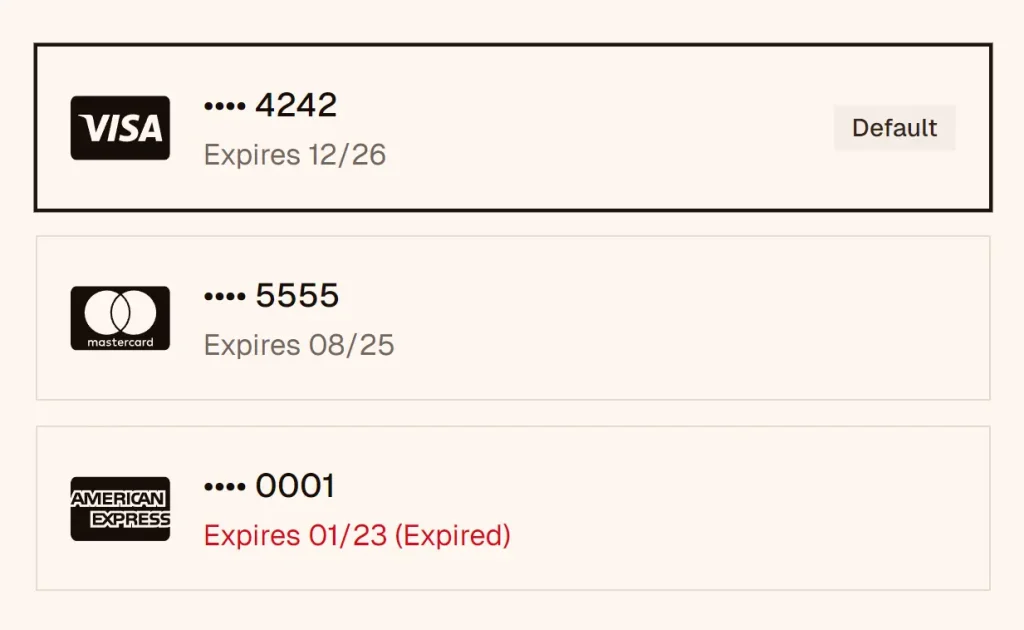
💳 Payment Method Cards: Render payment method cards with automatic brand detection, expiry date warnings, and action buttons compatible with Stripe, Braintree, or any processor.
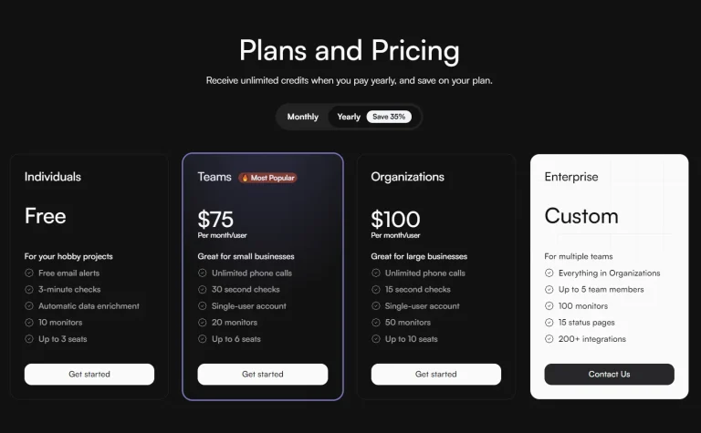
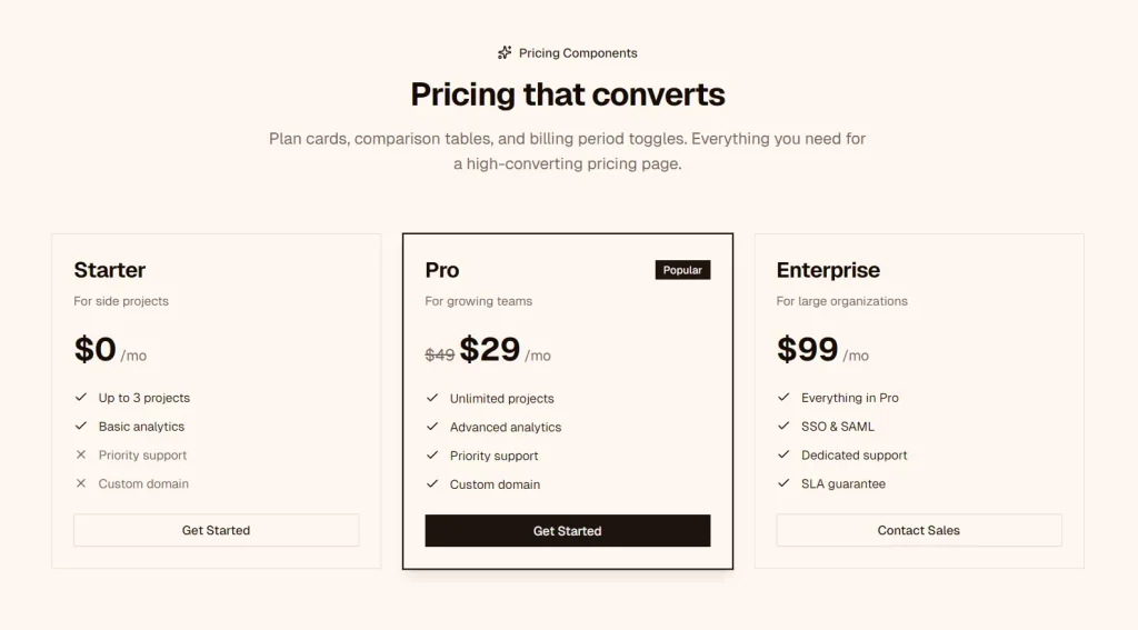
📊 Plan Cards and Pricing Tables: Render plan cards, comparison tables, and billing period toggles for pricing pages, including a highlighted variant for recommended tiers.
📈 Usage Tracking Cards: Display resource consumption with progress bars, metered breakdowns, and threshold-based color states for usage-based billing dashboards.
🧾 Invoice History Cards: Show invoice records with status indicators, amounts, and one-click actions for download, view, or payment.
🔴 Color-Coded Usage Meters: Shift progress bar color to amber at 80% consumption and to red at 95%.
✅ Feature Comparison Tables: Render side-by-side plan comparisons with checkmarks, partial indicators, and column highlighting.
🔷 Full TypeScript Support: Export typed interfaces for all component props.
♿ Accessible Markup: Build each component on semantic HTML elements.
🎛️ shadcn CLI Compatible: Add any component through the standard shadcn CLI in a single command.
Use Cases
- Build a SaaS pricing page with multiple plan tiers, a highlighted recommended option, and a monthly/yearly billing toggle.
- Display a customer’s saved payment methods in a billing settings panel with brand logos and expiry status.
- Track resource consumption in a usage-based product with metered cards that signal overage risk through color state.
- Render a filterable invoice history in a customer admin panel with status badges and quick-download actions.
How to Use It
1. Installation via shadcn CLI. Each component installs independently through the shadcn CLI. Run the add command with the billui registry URL for the component you want:
npx shadcn@latest add "https://billui.com/r/plan-card.json"
npx shadcn@latest add "https://billui.com/r/plan-group.json"
npx shadcn@latest add "https://billui.com/r/pricing-table.json"
npx shadcn@latest add "https://billui.com/r/card-input.json"
npx shadcn@latest add "https://billui.com/r/billing-address.json"
npx shadcn@latest add "https://billui.com/r/payment-method.json"
npx shadcn@latest add "https://billui.com/r/invoice-card.json"
npx shadcn@latest add "https://billui.com/r/usage-card.json"
2. Import the sub-components (Plan Card in this example) from your local file and compose them in your page or layout:
import {
  PlanCard,
  PlanCardHeader,
  PlanCardBadge,
  PlanCardTitle,
  PlanCardDescription,
  PlanCardPrice,
  PlanCardFeatures,
  PlanCardFeature,
  PlanCardAction,
} from "@/components/ui/plan-card";

export function StarterPlanCard() {
  return (
    <PlanCard className="max-w-sm">
      <PlanCardHeader>
        <PlanCardBadge variant="secondary">Starter</PlanCardBadge>
        <PlanCardTitle>Basic</PlanCardTitle>
        <PlanCardDescription>For solo projects and early testing</PlanCardDescription>
      </PlanCardHeader>

      <PlanCardPrice amount={9} currency="$" period="month" />

      <PlanCardFeatures>
        <PlanCardFeature>3 active projects</PlanCardFeature>
        <PlanCardFeature>Basic analytics</PlanCardFeature>
        <PlanCardFeature included={false}>Priority support</PlanCardFeature>
      </PlanCardFeatures>

      <PlanCardAction>Get Started</PlanCardAction>
    </PlanCard>
  );
}
3. You can also copy the component source directly into components/ui/plan-card.tsx to skip the CLI:
import { cva, type VariantProps } from "class-variance-authority";
import { Check, X } from "lucide-react";
import * as React from "react";
import { cn } from "@/lib/utils";
import { Badge } from "@/registry/shadcn/badge";
import { Button } from "@/registry/shadcn/button";

const planCardVariants = cva(
  "relative flex flex-col rounded-2xl border bg-card text-card-foreground transition-all duration-200 min-w-[280px]",
  {
    variants: {
      variant: {
        default: "border-border",
        highlighted:
          "border-primary shadow-lg shadow-primary/10 ring-1 ring-primary",
        compact: "border-border p-4",
      },
      size: {
        default: "p-6",
        lg: "p-8",
      },
    },
    defaultVariants: {
      variant: "default",
      size: "default",
    },
  },
);

interface PlanCardProps
  extends React.HTMLAttributes<HTMLDivElement>,
    VariantProps<typeof planCardVariants> {}

const PlanCard = React.forwardRef<HTMLDivElement, PlanCardProps>(
  ({ className, variant, size, ...props }, ref) => (
    <div
      ref={ref}
      className={cn(planCardVariants({ variant, size, className }))}
      {...props}
    />
  ),
);
PlanCard.displayName = "PlanCard";

const PlanCardHeader = React.forwardRef<
  HTMLDivElement,
  React.HTMLAttributes<HTMLDivElement>
>(({ className, ...props }, ref) => (
  <div ref={ref} className={cn("flex flex-col gap-2", className)} {...props} />
));
PlanCardHeader.displayName = "PlanCardHeader";

interface PlanCardBadgeProps
  extends React.ComponentPropsWithoutRef<typeof Badge> {}

const PlanCardBadge = React.forwardRef<HTMLDivElement, PlanCardBadgeProps>(
  ({ className, ...props }, ref) => (
    <Badge ref={ref} className={cn("w-fit", className)} {...props} />
  ),
);
PlanCardBadge.displayName = "PlanCardBadge";

const PlanCardTitle = React.forwardRef<
  HTMLHeadingElement,
  React.HTMLAttributes<HTMLHeadingElement>
>(({ className, ...props }, ref) => (
  <h3
    ref={ref}
    className={cn("text-2xl font-bold tracking-tight", className)}
    {...props}
  />
));
PlanCardTitle.displayName = "PlanCardTitle";

const PlanCardDescription = React.forwardRef<
  HTMLParagraphElement,
  React.HTMLAttributes<HTMLParagraphElement>
>(({ className, ...props }, ref) => (
  <p
    ref={ref}
    className={cn("text-sm text-muted-foreground", className)}
    {...props}
  />
));
PlanCardDescription.displayName = "PlanCardDescription";

interface PlanCardPriceProps extends React.HTMLAttributes<HTMLDivElement> {
  amount: number;
  currency?: string;
  period?: "month" | "year" | "once";
  originalAmount?: number;
}

const PlanCardPrice = React.forwardRef<HTMLDivElement, PlanCardPriceProps>(
  (
    {
      className,
      amount,
      currency = "$",
      period = "month",
      originalAmount,
      ...props
    },
    ref,
  ) => {
    const periodLabel = {
      month: "/mo",
      year: "/yr",
      once: "",
    };

    return (
      <div
        ref={ref}
        className={cn("my-6 flex items-baseline gap-1", className)}
        {...props}
      >
        {originalAmount && (
          <span className="text-lg text-muted-foreground line-through">
            {currency}
            {originalAmount}
          </span>
        )}
        <span className="text-4xl font-bold tracking-tight">
          {currency}
          {amount}
        </span>
        {period !== "once" && (
          <span className="text-muted-foreground">{periodLabel[period]}</span>
        )}
      </div>
    );
  },
);
PlanCardPrice.displayName = "PlanCardPrice";

const PlanCardFeatures = React.forwardRef<
  HTMLUListElement,
  React.HTMLAttributes<HTMLUListElement>
>(({ className, ...props }, ref) => (
  <ul
    ref={ref}
    className={cn("flex flex-col gap-3 text-sm", className)}
    {...props}
  />
));
PlanCardFeatures.displayName = "PlanCardFeatures";

interface PlanCardFeatureProps extends React.HTMLAttributes<HTMLLIElement> {
  included?: boolean;
}

const PlanCardFeature = React.forwardRef<HTMLLIElement, PlanCardFeatureProps>(
  ({ className, included = true, children, ...props }, ref) => (
    <li
      ref={ref}
      className={cn(
        "flex items-center gap-3",
        !included && "text-muted-foreground",
        className,
      )}
      {...props}
    >
      {included ? (
        <Check className="h-4 w-4 shrink-0 text-primary" />
      ) : (
        <X className="h-4 w-4 shrink-0 text-muted-foreground" />
      )}
      <span>{children}</span>
    </li>
  ),
);
PlanCardFeature.displayName = "PlanCardFeature";

interface PlanCardActionProps
  extends React.ComponentPropsWithoutRef<typeof Button> {}

const PlanCardAction = React.forwardRef<HTMLButtonElement, PlanCardActionProps>(
  ({ className, ...props }, ref) => (
    <Button ref={ref} className={cn("mt-6 w-full", className)} {...props} />
  ),
);
PlanCardAction.displayName = "PlanCardAction";

export {
  PlanCard,
  PlanCardHeader,
  PlanCardBadge,
  PlanCardTitle,
  PlanCardDescription,
  PlanCardPrice,
  PlanCardFeatures,
  PlanCardFeature,
  PlanCardAction,
  planCardVariants,
};

export type {
  PlanCardProps,
  PlanCardBadgeProps,
  PlanCardPriceProps,
  PlanCardFeatureProps,
  PlanCardActionProps,
};
What to pay attention to
BillUI solves presentation. It does not solve business logic. Keep these points in mind:
- Do not treat
CardInputas payment processing. You still need a real payment provider or tokenization workflow. - Do not trust client-side card or address state by itself. Validate data on the server.
- Do not hardcode invoice status rules into the UI layer. Drive those states from backend billing events.
- Do not let display totals drift from billing totals. Usage cards should read from the same data source as your invoicing logic.
- Plan for localization early. Currency symbols, date formats, postal code rules, and address fields change by region.
- Check your import paths after registry install. The BillUI docs site uses registry paths in examples, but your app should import from the generated local component files.
Related Resources
- shadcn/ui: The component distribution system and base UI primitives.
- class-variance-authority: The variant management library that handles component style variants.
- Lucide React: The icon library that renders checkmarks, X marks, and action icons inside billui components.
FAQs
Q: Does billui require a specific shadcn/ui version?
A: billui depends on the shadcn registry distribution model and imports from your local shadcn paths (e.g., @/registry/shadcn/badge). Run npx shadcn@latest init before adding any billui component if your project does not already have shadcn/ui configured.
Q: Can I apply custom design tokens to billui components?
A: Yes. Each component lands in your codebase as a plain TypeScript file. You can replace Tailwind classes, swap the imported Badge or Button components, and edit the CVA variant definitions directly.
Q: Do billui components work with the Next.js App Router?
A: Yes. The components are standard React components. For any component that attaches event handlers or holds local state, add "use client" at the top of the file where you import it.
Q: Can billui components sit alongside existing shadcn/ui components?
A: Yes. billui components import from the same shadcn registry paths your existing components use.