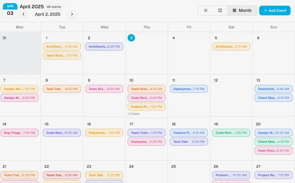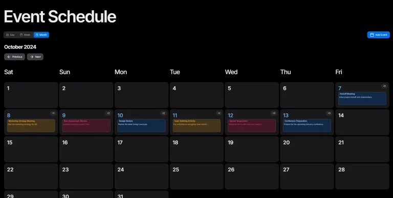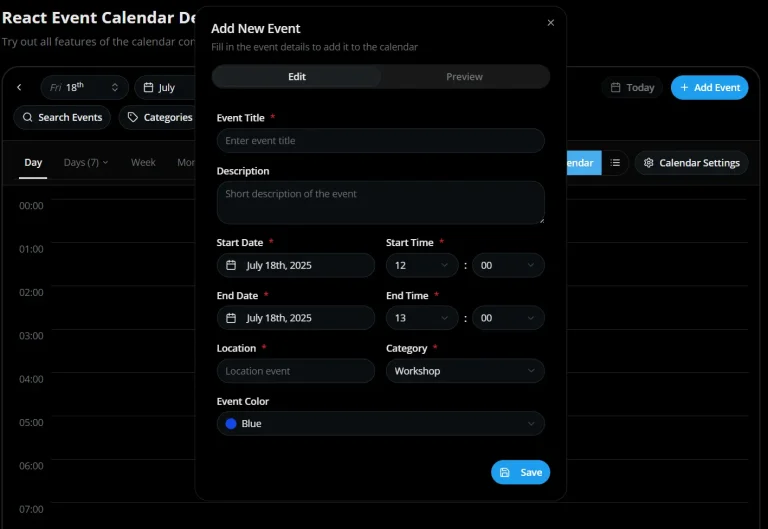
React/ShadCN Calendar is a calendar component built with Shadcn/ui and Tailwind CSS. It provides all the essential functionality needed for implementing calendar features in dashboards and applications.
The calendar offers multiple view modes, advanced event management, and a responsive design that works across devices. You can manage events, select time slots, and navigate between different calendar views with an interface that prioritizes both functionality and user experience.
Features
🎨 Fully customizable with Tailwind CSS
🎯 Accessible components using Radix UI
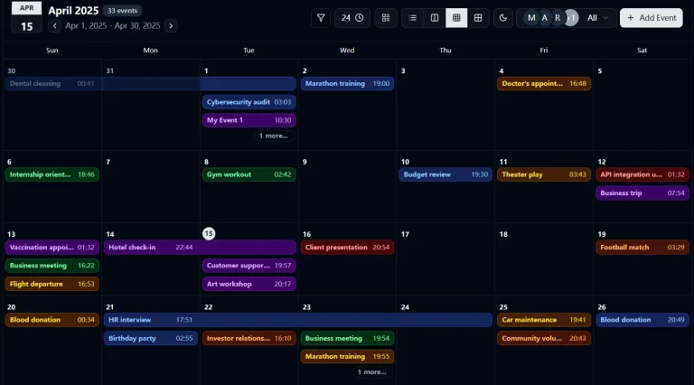
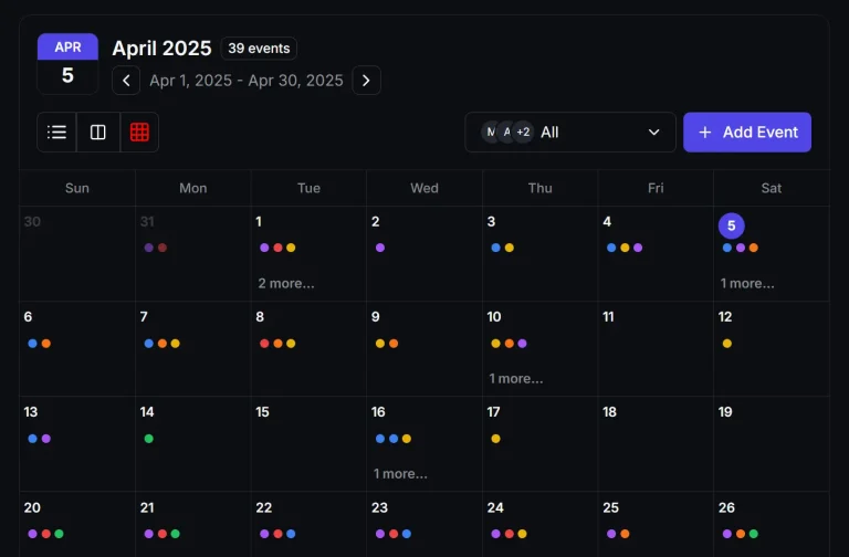
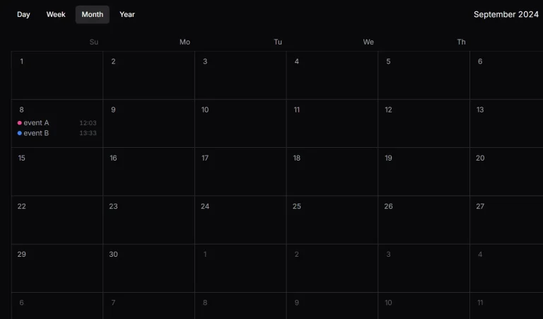
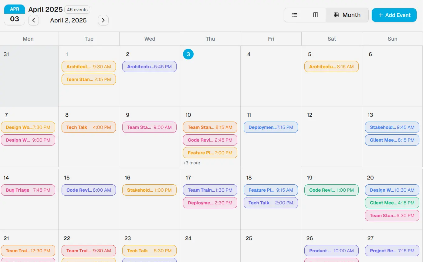
🔄 Multiple view modes (day, week, month)
⏰ Time-slot selection functionality
🎭 Color-coded event categorization
🌓 Dark mode support
📱 Responsive design for all screen sizes
📅 Advanced event management capabilities
🖱️ Quick date navigation controls
📆 Today highlighting feature
Use Cases
- Team Schedulers: Coordinate team availability and meetings through a shared calendar interface.
- Application Dashboards: Integrate a calendar to display upcoming tasks, deadlines, or scheduled events within user dashboards.
- Booking Systems: Use the calendar for selecting appointment dates and times in scheduling applications.
- Project Management Tools: Visualize project timelines, milestones, and task durations.
- Personal Information Managers: Allow users to organize personal schedules and events within a web application.
Related Resources
- Shadcn UI: https://ui.shadcn.com/ – The component library this calendar is built upon. Provides accessible and unstyled components.
- Tailwind CSS: https://tailwindcss.com/ – The utility-first CSS framework used for styling the calendar.
- Radix UI: https://www.radix-ui.com/ – Provides the underlying accessible primitives used by Shadcn UI.
- Original Inspiration (Synergy CRM): https://synergy-platform.vercel.app/calendar – The CRM application calendar that inspired this component.
Preview: