The Future of Web Dev
The Future of Web Dev
Full Calendar Component for shadcn/ui with Events
Integrate a sleek, customizable calendar into your React project with the shadcn/ui full calendar component.
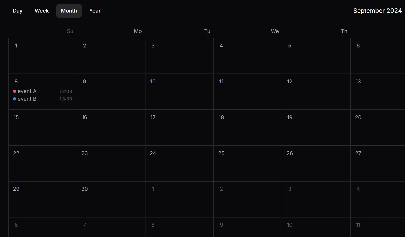
This is a fully functional calendar built with the popular shadcn/ui component library.
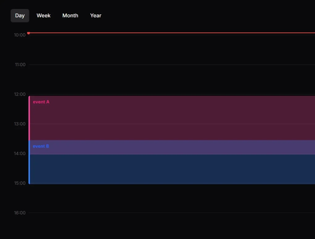
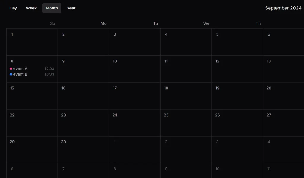
It provides various view modes (day, week, month, year), keyboard shortcuts, and a clean, customizable interface to help developers easily display and manage events within their applications.
Features
- Day, week, month, and year view modes.
- Previous, today, and next date controls.
- Event colors in default, blue, green, pink, and purple variants.
- Keyboard shortcuts for view switching and date navigation.
- Locale-aware weekday labels through date-fns locale objects.
- View state and event state access through
useCalendar().
Use Cases
- Project dashboards that display deadlines, milestones, and scheduled work across several calendar views.
- Internal scheduling screens that render event data from application state or an API.
- Personal planning screens with day-to-year navigation and keyboard controls.
Installation
The copied file imports @/components/ui/button, @/lib/utils, and class-variance-authority. Confirm those imports resolve in your shadcn/ui project.
1. Install the two external dependencies used by the calendar:
pnpm add date-fns react-hotkeys-hook2. Copy components/ui/full-calendar.tsx from GitHub into your project. Update the local import aliases if your project uses a different folder structure.
Usage
Pass events to Calendar, then render the view triggers, date controls, and four view components inside it.
'use client';
import {
  Calendar,
  CalendarCurrentDate,
  CalendarDayView,
  CalendarMonthView,
  CalendarNextTrigger,
  CalendarPrevTrigger,
  CalendarTodayTrigger,
  CalendarViewTrigger,
  CalendarWeekView,
  CalendarYearView,
} from '@/components/ui/full-calendar';
const events = [
  {
    id: '1',
    start: new Date('2026-09-08T09:30:00'),
    end: new Date('2026-09-08T10:30:00'),
    title: 'Design review',
    color: 'pink',
  },
  {
    id: '2',
    start: new Date('2026-09-09T13:00:00'),
    end: new Date('2026-09-09T14:30:00'),
    title: 'Sprint planning',
    color: 'blue',
  },
];
export default function CalendarExample() {
  return (
    <Calendar events={events}>
      <div className="flex h-dvh flex-col py-6">
        <div className="mb-6 flex items-center gap-2 px-6">
          <CalendarViewTrigger
            view="day"
            className="aria-[current=true]:bg-accent"
          >
            Day
          </CalendarViewTrigger>
          <CalendarViewTrigger
            view="week"
            className="aria-[current=true]:bg-accent"
          >
            Week
          </CalendarViewTrigger>
          <CalendarViewTrigger
            view="month"
            className="aria-[current=true]:bg-accent"
          >
            Month
          </CalendarViewTrigger>
          <CalendarViewTrigger
            view="year"
            className="aria-[current=true]:bg-accent"
          >
            Year
          </CalendarViewTrigger>
          <span className="flex-1" />
          <CalendarCurrentDate />
          <CalendarPrevTrigger aria-label="Previous">
            <span aria-hidden="true">‹</span>
          </CalendarPrevTrigger>
          <CalendarTodayTrigger>Today</CalendarTodayTrigger>
          <CalendarNextTrigger aria-label="Next">
            <span aria-hidden="true">›</span>
          </CalendarNextTrigger>
        </div>
        <div className="relative flex-1 overflow-auto px-6">
          <CalendarDayView />
          <CalendarWeekView />
          <CalendarMonthView />
          <CalendarYearView />
        </div>
      </div>
    </Calendar>
  );
}
Calendar Props
| Prop | Description |
|---|---|
children | Required React content rendered inside the calendar context provider. |
defaultDate | Initial Date. Defaults to new Date(). |
events | Initial CalendarEvent[] copied into internal state. Defaults to an empty array. Later prop changes do not synchronize that state. |
view | Initial view: day, week, month, or year. Defaults to month. |
locale | A date-fns Locale object used for date labels. Defaults to enUS. |
enableHotkeys | Turns the built-in keyboard shortcuts on or off. Defaults to true. |
onChangeView | Callback that receives the new view when a view trigger or view hotkey changes the calendar view. |
onEventClick | Stored in calendar context, but the built-in event renderers never call it. Custom event-click behavior requires editing full-calendar.tsx. |
Calendar Event Data
| Field | Description |
|---|---|
id | Required string identifier. |
start | Required JavaScript Date for the event start. |
end | Required JavaScript Date for the event end. |
title | Required event title. |
color | Optional style variant: default, blue, green, pink, or purple. An omitted value uses the default variant. |
Public Exports
| Export | Purpose |
|---|---|
Calendar | Calendar context provider with the props listed above. |
CalendarViewTrigger | Changes the active view. Requires view and accepts generic React HTML attributes. A passed onClick is overwritten by the built-in handler. |
CalendarCurrentDate | Renders the active day or month/year label. It accepts no props and does not apply the calendar locale value to its month name. |
CalendarPrevTrigger | Moves backward by the active view interval. Accepts generic React HTML attributes and runs a passed onClick after the date change. |
CalendarTodayTrigger | Moves the active date to today. Accepts generic React HTML attributes and runs a passed onClick after the date change. |
CalendarNextTrigger | Moves forward by the active view interval. Accepts generic React HTML attributes and runs a passed onClick after the date change. |
CalendarDayView | Renders a 24-hour day grid with events positioned from their start and end times. Accepts no props. |
CalendarWeekView | Renders a seven-day hourly grid. Weeks begin on Sunday. Accepts no props. |
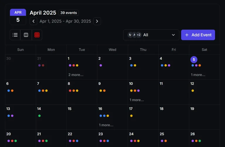
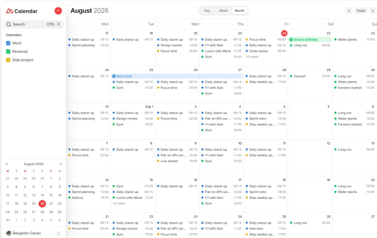
CalendarMonthView | Renders a six-row month grid with event title, color, and start time. Accepts no props. |
CalendarYearView | Renders twelve date grids without event entries. Accepts no props. |
CalendarEvent | Exported TypeScript type for event objects. |
useCalendar() | Returns the calendar context for custom controls or child components. |
useCalendar() Context
| Value | Description |
|---|---|
view | Active calendar view. |
setView | Updates the active view directly. Calling it does not run onChangeView. |
date | Active calendar date. |
setDate | Updates the active date directly. |
events | Calendar event array held by the provider. |
setEvents | Replaces the provider’s event array. |
locale | Active date-fns locale object. |
onChangeView | View-change callback passed to Calendar. |
onEventClick | Event-click callback value passed to Calendar. Built-in event renderers do not invoke it. |
enableHotkeys | Hotkey setting passed to Calendar. |
today | A Date created by the provider for today’s date. |
Keyboard Shortcuts
D, W, M, and Y are registered by Calendar. ArrowLeft, ArrowRight, and T work only when the previous, next, and today trigger components are mounted.
| Key | Action |
|---|---|
D | Switch to day view. |
W | Switch to week view. |
M | Switch to month view. |
Y | Switch to year view. |
ArrowLeft | Move to the previous day, week, month, or year. |
ArrowRight | Move to the next day, week, month, or year. |
T | Jump to today. |
Related Resources
- Next.js/Shadcn Calendar with Multiple Views & Event Management
- React/Shadcn/ui Calendar Component with Event Management – Mina Scheduler
- Modern Calendar App with Multiple Views & Event Management – Full-Calendar
- Feature-Rich Calendar UI with Next.js/TailwindCSS – Big Calendar
FAQs
Do updates to the events prop sync automatically?
No. The events prop initializes internal state on mount. Update events through useCalendar().setEvents or remount the provider when external event data changes.
Does the component include event creation, editing, or deletion?
No built-in forms or CRUD controls are included. Build those controls in your application and push event changes into the calendar through useCalendar().setEvents.
Which views display event data?
Day, week, and month views render events. Year view renders the twelve-month date grid without event entries.
Can the week start on Monday?
weekStartsOn is hard-coded to 0, which starts weeks on Sunday. Change the date-fns startOfWeek() calls in full-calendar.tsx for a Monday-first calendar.
Preview