The Future of Web Dev
The Future of Web Dev
Copy-Paste UI Components with Tailwind and Framer Motion – Cult UI
Get production-ready UI components without npm packages. Cult/UI offers copy-paste code with Tailwind CSS and Frame Motion.
Cult/UI is a collection of reusable, accessible, and customizable UI components with Tailwind CSS styling and Framer Motion animations.
The components work with any React-based framework, including Next.js, Astro, Remix, and Gatsby.
Features
🧩 Copy-paste components: Direct code implementation without npm dependencies.
🎨 Tailwind CSS styling: Utility-first CSS framework for design consistency.
🌀 Framer Motion animations: Advanced motion and interaction capabilities.
🔧 shadcn compatibility: Works alongside shadcn component ecosystems.
📱 Multiple variants: Components include size, intent, and state variations.
♿ Accessible defaults: Built with accessibility considerations.
Use Cases
- Custom Design Systems: Use the components to build a unique and fully-owned component library for your organization.
- Rapid Prototyping: Quickly add complex UI elements to your prototypes without installing and configuring a full component library.
- Targeted Integration: Add specific, highly-styled components to an existing application without inheriting an entire library’s styles.
How to Use It
1. Install the required dependencies in your project.
pnpm add -D tailwindcss@latest clsx tailwind-merge framer-motion2. Add a utility function to your project for merging CSS classes. Create a file at lib/utils.ts and add this code:
import clsx, { ClassValue } from "clsx"
import { twMerge } from "tailwind-merge"
export function cn(...inputs: ClassValue[]) {
  return twMerge(clsx(inputs))
}
This function combines the class merging capabilities of clsx with Tailwind’s conflict resolution from tailwind-merge.
3. Add UI components to your project using shadcn CLI.
pnpm dlx shadcn@latest add https://cult-ui.com/r/neumorph-button.json4. You can also copy components directly from the Cult/UI website. Visit any component page, copy the code, and paste it into your project.
"use client"
import type React from "react"
import { useState } from "react"
import NeumorphButton from "../ui/neumorph-button"
export function NeumorphButtonDemo() {
const [loading, setLoading] = useState(false)
const handleClick = () => {
setLoading(true)
setTimeout(() => setLoading(false), 2000)
}
return (
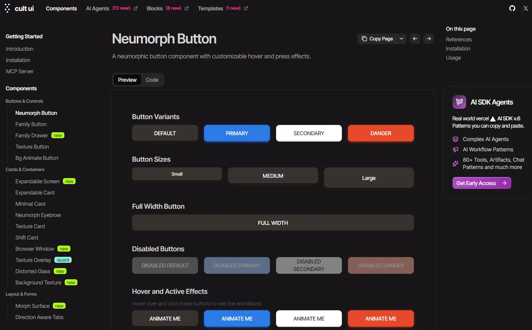
<div className="space-y-8 p-4 ">
<div>
<h2 className="text-lg font-semibold mb-2">Button Variants</h2>
<div className="grid grid-cols-2 gap-4 sm:grid-cols-4">
<NeumorphButton>Default</NeumorphButton>
<NeumorphButton intent="primary">Primary</NeumorphButton>
<NeumorphButton intent="secondary">Secondary</NeumorphButton>
<NeumorphButton intent="danger">Danger</NeumorphButton>
</div>
</div>
<div>
<h2 className="text-lg font-semibold mb-2">Button Sizes</h2>
<div className="grid grid-cols-2 gap-4 sm:grid-cols-3">
<NeumorphButton size="small">Small</NeumorphButton>
<NeumorphButton size="medium">Medium</NeumorphButton>
<NeumorphButton size="large">Large</NeumorphButton>
</div>
</div>
<div>
<h2 className="text-lg font-semibold mb-2">Full Width Button</h2>
<div>
<NeumorphButton fullWidth>Full Width</NeumorphButton>
</div>
</div>
<div>
<h2 className="text-lg font-semibold mb-2">Disabled Buttons</h2>
<div className="grid grid-cols-2 gap-4 sm:grid-cols-4">
<NeumorphButton disabled>Disabled Default</NeumorphButton>
<NeumorphButton intent="primary" disabled>
Disabled Primary
</NeumorphButton>
<NeumorphButton intent="secondary" disabled>
Disabled Secondary
</NeumorphButton>
<NeumorphButton intent="danger" disabled>
Disabled Danger
</NeumorphButton>
</div>
</div>
<div>
<h2 className="text-lg font-semibold mb-2">Hover and Active Effects</h2>
<p className="text-sm text-gray-600 mb-2">
Hover over and click these buttons to see the animations.
</p>
<div className="grid grid-cols-2 gap-4 sm:grid-cols-4">
<NeumorphButton>Animate Me</NeumorphButton>
<NeumorphButton intent="primary">Animate Me</NeumorphButton>
<NeumorphButton intent="secondary">Animate Me</NeumorphButton>
<NeumorphButton intent="danger">Animate Me</NeumorphButton>
</div>
</div>
<div>
<h2 className="text-lg font-semibold mb-2">Loading State</h2>
<p className="text-sm text-gray-600 mb-2">
Click the button to see the loading animation.
</p>
<div className="grid grid-cols-2 gap-4 sm:grid-cols-4">
<NeumorphButton
intent="primary"
loading={loading}
onClick={handleClick}
>
{loading ? "Loading..." : "Click to Load"}
</NeumorphButton>
</div>
</div>
</div>
)
}
All UI Components Included
Buttons & Controls
- Neumorph Button: A button with a soft, extruded visual style.
- Family Button: A group of related action buttons.
- Family Drawer: A slide-out panel containing a set of controls.
- Texture Button: A button featuring a textured background.
- Bg Animate Button: A button with an animated background effect on interaction.
Cards & Containers
- Expandable Screen: A container that expands to fill the viewport.
- Expandable Card: A card that reveals more content when clicked.
- Minimal Card: A card with a clean and simple design.
- Neumorph Eyebrow: A small decorative element with a neumorphic style.
- Texture Card: A card component with a textured surface.
- Shift Card: A card that animates its position on hover.
- Browser Window: A container styled to resemble a web browser window.
- Texture Overlay: An overlay that applies a texture effect to the content beneath it.
- Distorted Glass: A container that creates a distorted glass effect.
- Background Texture: A component for applying various background textures.
Layout & Forms
- Morph Surface: A container that can animate its shape.
- Direction Aware Tabs: A tab component with animations that respond to the user’s navigation direction.
- Side Panel: A panel that slides in from the edge of the screen.
- Floating Panel: A panel that appears to float above the main content.
- Popover: A small overlay that appears next to a trigger element.
- Popover Form: A form displayed inside a popover.
- Sortable List: A list with items that can be reordered through drag and drop.
- Toolbar Expandable: A toolbar that can be expanded to show additional options.
- Code Block: A formatted container for displaying code snippets.
Onboarding & Tours
- Feature Carousel: A carousel designed to showcase product features.
- Intro Disclosure: A component for progressively revealing introductory information.
- Loading Carousel: A carousel displayed during a loading state.
Interactive Elements
- Dynamic Island: An interactive component for displaying alerts and live activities.
- Color Picker: A UI control for selecting colors.
- Timer: A component for displaying a countdown or stopwatch.
- MacOS Dock: An interactive dock menu inspired by macOS.
- Squiggle Arrow: An animated, hand-drawn style arrow for pointing to elements.
Media
- Stripe Bg Guides: A background with animated guide lines.
- Logo Carousel: A carousel for displaying a series of client or partner logos.
- 3D Carousel: A carousel with three-dimensional transition effects.
- Hover Video Player: A video that begins playing when the user hovers over it.
- Bg Media Hero: A hero section that supports a video or image background.
- Tweet Grid: A grid layout for displaying a collection of tweets.
- YouTube Video Player: A component for embedding a YouTube video player.
Typography & Text
- Text Gif: A component that animates text to resemble a GIF.
- Gradient Heading: A heading with a gradient applied to the text color.
- Text Animate: A component for applying various animations to text.
- Typewriter: A component that reveals text with a typewriter effect.
- Animated Number: A component that animates a number counting up or down.
Visual Effects
- LightBoard: A visual effect that simulates glowing elements on a board.
- Fractal Grid: A grid that generates a fractal pattern.
- Canvas Fractal Grid: A performant fractal grid rendered using the HTML canvas.
- Shader Lens Blur: A visual effect that applies a lens blur using shaders.
Related Resources
- shadcn/ui: The ecosystem that Cult/UI integrates with.
- Tailwind CSS Documentation: Official guide for the utility-first CSS framework used to style Cult/UI components.
- Framer Motion: Animation library documentation for understanding and customizing component animations.
FAQs
Q: Can I use Cult/UI components without shadcn?
A: Yes. Cult/UI components function independently of shadcn. The Shadcn integration provides CLI convenience, but you can copy components manually from the website and use them in any React project.
Q: How do I customize component styles?
A: Modify the Tailwind classes directly in the component code after copying it to your project.
Q: Do I need to credit Cult/UI in my projects?
A: No attribution is required. You can use Cult/UI components in personal and commercial projects without any licensing restrictions.
Q: What happens when Cult/UI releases component updates?
A: You control when and how to update. Since components live in your codebase, you can check the Cult/UI website for new versions and manually copy any improvements you want to incorporate.