The Future of Web Dev
The Future of Web Dev
Modern Vue/Nuxt Component Library with TailwindCSS & v-motion
A Vue/Nuxt UI component library with TypeScript, Tailwind CSS, and animations. Build production-ready interfaces faster with pre-styled and headless components.
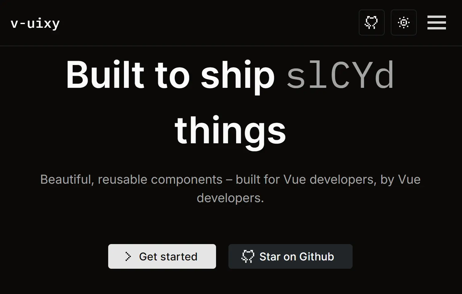
v-uixy is a modern UI component library for Vue and Nuxt applications. It provides a collection of reusable UI components and animations built with TypeScript, Tailwind CSS, and v-motion.
The library ships with both headless and pre-styled components, a unified design system, and built-in utilities including icon sets, animation helpers, and style merge utilities.
You can use it to build complex, modern, professional application interfaces while maintaining a consistent development experience.
Features
🎨 Pre-styled and headless components. Components come configured with Tailwind CSS styling but can be easily customized or used unstyled to match your design requirements.
📦 TypeScript-first development. Full type safety across all components and utilities ensures fewer runtime errors and better IDE support.
🎭 Animation support via Motion. Built-in animation utilities powered by Motion for v-motion allow you to add smooth, performant transitions without extra dependencies.
🎯 CLI-driven workflow. The v-uixy command-line tool automates initialization, component installation, file organization, and export management.
🔧 Composable architecture. Shared logic lives in composables that can be reused across components, reducing duplication and keeping code organized.
📱 Responsive design system. All components adapt automatically to different screen sizes using Tailwind’s responsive utilities.
🎨 Theme-aware components. Components respect your design system and configuration, making it simple to adjust colors, typography, and spacing globally.
✨ Icon integration. Built-in SVG icon loading via Vite plugin provides a clean way to use icons throughout your application.
🧹 Style conflict resolution. Tailwind merge utilities prevent conflicting CSS classes in complex component compositions.
⚙️ Zero-config setup. The initialization command prepares your entire project environment, installing dependencies and creating necessary configuration files automatically.
Use Cases
- Building a complex administration dashboard with consistent form elements, tables, and modals.
- Developing a multi-brand design system where components can be themed and customized for different products.
- Prototyping a new Nuxt application that requires a complete set of UI components from the start.
- Creating an interactive marketing website with pre-built animations and responsive elements.
- Refactoring an existing Vue 3 project to use a standardized and maintainable component architecture.
How to Use It
1. Install the v-uixy package.
npx v-uixy
2. Run the init command from your project’s root directory. This command prepares your project by configuring Tailwind CSS, Nuxt, and TypeScript. It also installs the necessary development dependencies.
v-uixy init
3. Add UI components to your project. Use the add command followed by the component name. You can also add the entire component suite at once.
v-uixy add <component>v-uixy add all
This command copies the component’s source folder into components/ui/ and any shared logic into composables/. It automatically updates the main export files to keep your imports clean. If the component requires any npm packages, the CLI will install them.
4. See which components are available and which are already installed in your project:
v-uixy list
5. If you need to remove a component, use the remove command. This action deletes the component’s directory from components/ui/ and cleans up its corresponding export statement.
v-uixy remove <component>
6. Here’s an example on how to add an accordion component to your project:
<template>
  <div class="w-[420px]">
    <uixy-accordion>
      <uixy-accordion-item header="Accordion 1">
        <p>
          Lorem ipsum dolor sit amet consectetur adipisicing elit. Suscipit
          facere ut dignissimos quae est voluptatem similique, sequi accusamus!
          Cupiditate fugiat deleniti dolorem officiis vel, perspiciatis iure
          nulla alias. Neque, accusantium?
        </p>
      </uixy-accordion-item>
      <uixy-accordion-item header="Accordion 2">
        <p>
          Lorem ipsum dolor sit amet consectetur adipisicing elit. Suscipit
          facere ut dignissimos quae est voluptatem similique, sequi accusamus!
          Cupiditate fugiat deleniti dolorem officiis vel, perspiciatis iure
          nulla alias. Neque, accusantium?
        </p>
      </uixy-accordion-item>
      <uixy-accordion-item header="Accordion 3">
        <p>
          Lorem ipsum dolor sit amet consectetur adipisicing elit. Suscipit
          facere ut dignissimos quae est voluptatem similique, sequi accusamus!
          Cupiditate fugiat deleniti dolorem officiis vel, perspiciatis iure
          nulla alias. Neque, accusantium?
        </p>
      </uixy-accordion-item>
    </uixy-accordion>
  </div>
</template>

<script setup lang="ts">
  import { UixyAccordion, UixyAccordionItem } from "../ui";
</script>
7. All available UI components
- Accordion: A vertically stacked set of interactive headings that each contain a title, content, and a chevron icon.
- Alert: A component for displaying important messages that attract the user’s attention without interrupting their task.
- Avatar: An image element that typically represents a user, with support for fallbacks.
- Badge: A small component used to highlight information like counts or statuses.
- Button: A standard button component for triggering actions.
- Calendar: A component that allows users to select a date from a calendar view.
- Card: A container for grouping related content and actions.
- Checkbox: A control that allows a user to select one or more options from a set.
- Command: A command menu for searching and performing actions, often triggered by a keyboard shortcut.
- Icon: A component for displaying SVG icons.
- IconButton: A button that contains only an icon, typically for compact actions.
- Input: A standard text input field for forms.
- InputOTP: A specialized input for one-time passcodes.
- Link: A styled anchor tag for navigation.
- Loader: A visual indicator that content is being loaded.
- Modal: A dialog that overlays the main content to display information or require user interaction.
- Popover: A floating element that appears near a trigger element to display additional content.
- Radio: A control for selecting a single option from a list.
- Scale: A component for selecting a value from a range.
- Select: A dropdown list for selecting one option from a set.
- Separator: A line used to visually separate content.
- Sheet: A dialog that slides in from the side of the screen.
- Skeleton: A placeholder that mimics the shape of content while it is loading.
- Slider: A control for selecting a value from a continuous or discrete range.
- Switch: A toggle control for switching between two states, such as on or off.
- Table of Contents: A component that generates a navigation menu from the headings on a page.
- Tabs: A component for organizing content into different sections that can be switched between.
- Textarea: A multi-line text input field.
- Theme: Components and utilities for managing application color schemes.
- TimePicker: A control for selecting a specific time.
- Toast: A non-intrusive notification that appears briefly to provide feedback.
- Toggle: A button that can be switched between two states.
- Tooltip: A small pop-up that displays information when a user hovers over an element.
Related Resources
- Nuxt Documentation Official Nuxt documentation providing comprehensive guides for building applications with the Nuxt framework.
- Tailwind CSS Documentation Official reference for Tailwind utility classes and configuration options for styling your components.
- Vue 3 Guide Official Vue 3 documentation covering reactive components, composition API, and best practices for modern Vue development.
FAQs
Q: What makes v-uixy different from other Vue UI libraries?
A: v-uixy uses a CLI to copy component source code directly into your project. This approach provides you with full control over the components’ code for complete customization, rather than importing them from an external npm package.
Q: How do I customize component appearance?
A: Components use Tailwind CSS for styling, so you can customize appearance by modifying your Tailwind configuration. You can also edit component files directly after installation to adjust layouts, spacing, colors, and other properties to match your design requirements..
Q: Can multiple team members use v-uixy on the same project?
A: Yes, the consistent file organization, shared composables structure, and centralized component registry make v-uixy well-suited for multi-team development. Team members can work on different features while maintaining a unified component library and consistent developer experience.
Q: How does v-uixy handle component updates?
A: Components remain as local files in your project. Updates require re-running the add command for specific components.