The Future of Web Dev
The Future of Web Dev
Copy-Paste Video Components with Editframe and Shadcn – framecn
Copy-paste video components for React built on Editframe. Add animated scenes, transitions, and text effects with one CLI command.
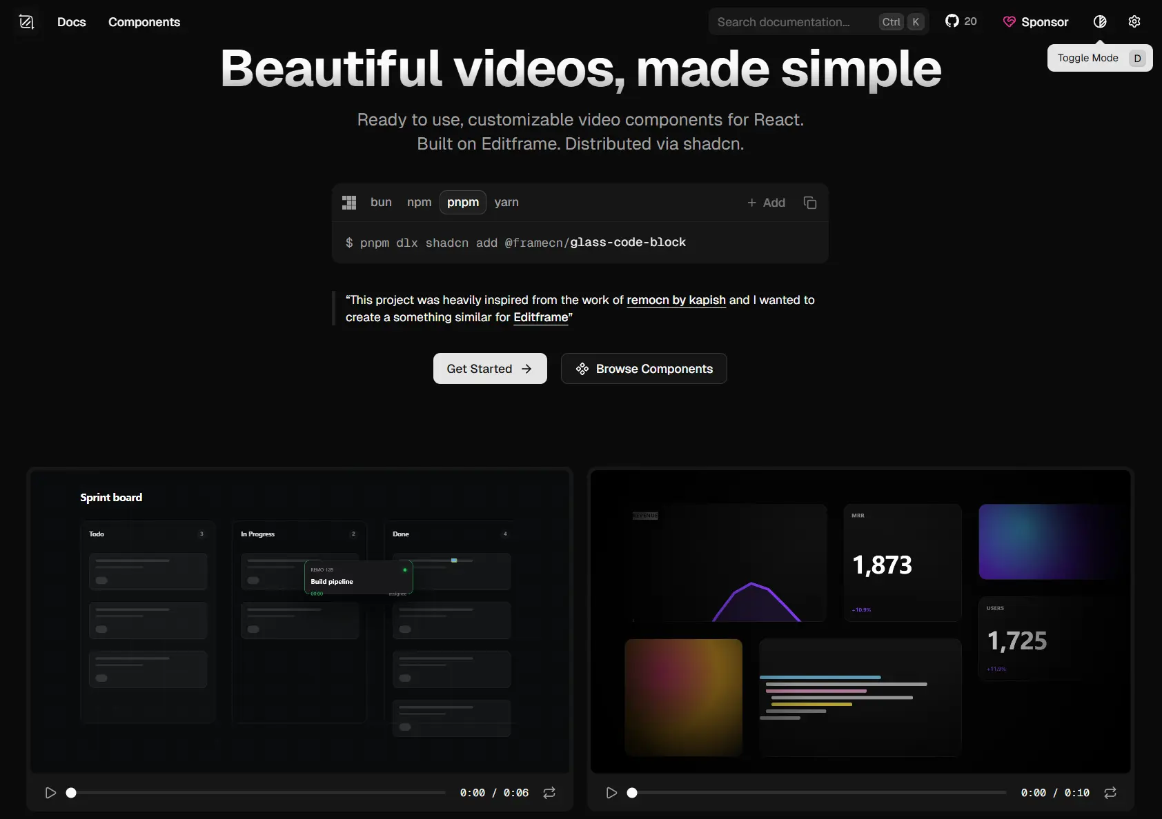
framecn is a React video component registry that creates code-based product videos, UI demos, launch trailers, and animated interface scenes with the shadcn CLI.
The library is built on top of Editframe, a cloud rendering infrastructure that converts your React compositions into exported MP4 files.
You write the scene in JSX, combine primitives and transitions the same way you compose UI, and Editframe handles the render pipeline.
Features
- 6 component categories: Primitives, Compositions, Transitions, Typography, UI Blocks, and Environment & Lighting.
- Exports rendered scenes to MP4 via Editframe’s cloud rendering pipeline.
- Installs individual components via the shadcn CLI registry format.
- Full TypeScript support across all components and props.
- Timeline-based composition model for precise frame-level sequencing.
- Supports multi-layer stacking of video, images, text, and animated effects.
- MCP server registration support for IDE-driven scene assembly.
- No runtime lock-in; all component code lives in your own project after install.
Use Cases
- Build a product launch trailer with hero device assembly, animated line charts, and staggered typography.
- Generate AI demo videos that simulate live code compilations, terminal output, or chat-to-preview layouts.
- Render dashboard populate sequences for feature tour videos and investor demos.
- Programmatically create social media clips from React components for every new changelog entry.
How to Use It
Table Of Contents
Prerequisites
framecn requires a project with Editframe configured. Set up an Editframe account and connect it to your project before adding components.
Your project also needs the shadcn CLI available. If your stack uses Next.js with shadcn/ui already, you’re set.
Installing Components
framecn uses the shadcn registry format. You add components one at a time with a single command:
# Install a specific primitive
npx shadcn@latest add @framecn/cursor-flow
# Install a full composition scene
npx shadcn@latest add @framecn/dashboard-populate
# Install a transition component
npx shadcn@latest add @framecn/zoom-through-transition
Each command copies the component source into your project at @/components/framecn/. You edit those files directly. There is no package version to pin or update for the component logic itself.
Example 1: Minimal Working Scene with a Primitive
This example animates a simulated cursor moving across a defined path and requires no additional props to produce output.
// app/videos/intro-demo/page.tsx
import { CursorFlow } from "@/components/framecn/cursor-flow";
// This component renders a self-contained animated cursor scene.
// Drop it into any page or route to preview the animation in the browser.
export default function IntroDemoVideo() {
  return (
    <div className="w-full aspect-video bg-neutral-950 rounded-xl overflow-hidden">
      {/* CursorFlow handles its own timing and path animation internally */}
      <CursorFlow />
    </div>
  );
}
Once this renders correctly in your browser, your Editframe connection and component setup are working. The MP4 export path goes through Editframe’s render API.
Implementation tip: If the component renders a blank frame, check that your Editframe API credentials are present in your environment variables. The render pipeline calls Editframe’s API on export, not on preview.
Example 2: Product Launch Composition
For a full scene with multiple animated layers, use one of the ready-made Compositions. ProductLaunchTrailer sequences a hero reveal, a feature highlight beat, and a closing text card. Install it first:
npx shadcn@latest add @framecn/product-launch-trailerThen compose it into a video route:
// app/videos/launch/page.tsx
import { ProductLaunchTrailer } from "@/components/framecn/product-launch-trailer";
export default function LaunchVideoPage() {
  return (
    // Wrap in a fixed aspect ratio container so the composition scales correctly
    <div className="max-w-4xl mx-auto">
      <div className="relative w-full" style={{ paddingBottom: "56.25%" }}>
        <div className="absolute inset-0">
          {/* Pass your product name and tagline as props after copying the component */}
          <ProductLaunchTrailer
            productName="Orion Analytics"
            tagline="Your data. Instantly clear."
            accentColor="#6366f1"
          />
        </div>
      </div>
    </div>
  );
}
The prop names above reflect what you’ll find inside the copied component file. Because framecn components live in your project, you can rename props, adjust timing values, or rework the color palette without any library constraints.
Example 3: Composing a Scene with Transitions and Typography
This is where framecn’s composable model starts to pay off. You can stack a typography animation, a transition, and a UI block into a single multi-beat sequence. The example below builds a short dashboard reveal scene that cuts to a code diff.
npx shadcn@latest add @framecn/staggered-fade-up
npx shadcn@latest add @framecn/zoom-through-transition
npx shadcn@latest add @framecn/dashboard-populate
npx shadcn@latest add @framecn/code-diff-wipe
// app/videos/feature-reveal/page.tsx
import { StaggeredFadeUp } from "@/components/framecn/staggered-fade-up";
import { ZoomThroughTransition } from "@/components/framecn/zoom-through-transition";
import { DashboardPopulate } from "@/components/framecn/dashboard-populate";
import { CodeDiffWipe } from "@/components/framecn/code-diff-wipe";
export default function FeatureRevealVideo() {
return (
<div className="w-full aspect-video bg-zinc-900">
{/*
Beat 1 (0s - 2s): Headline text fades up in staggered word intervals.
Adjust `delay` and `stagger` props inside the copied component file.
*/}
<StaggeredFadeUp
lines={["Shipping faster.", "With full visibility."]}
/>
{/*
Beat 2 (2s - 4s): Zoom transition moves from the headline into the dashboard.
Controls entry timing relative to the previous scene beat.
*/}
<ZoomThroughTransition startAt={2} />
{/*
Beat 3 (4s - 7s): Dashboard chart data populates row by row.
Uses Editframe's timeline sequencing to stagger each row's appearance.
*/}
<DashboardPopulate startAt={4} />
{/*
Beat 4 (7s - 10s): Code diff wipes in to show the change that
produced the dashboard data. Good for developer-focused product videos.
*/}
<CodeDiffWipe startAt={7} />
</div>
);
}Available Components
Compositions
Ready-to-render full scenes. Each one combines multiple layers and handles its own internal timing.
hero-device-assemble— Assembles a device mockup frame by frame.ecosystem-constellation— Animates a connected node graph of technologies.infinite-bento-pan— Pans continuously across a bento grid layout.product-launch-trailer— Full product launch sequence with reveal beats.browser-flow— Simulates browser navigation with animated URL and page content.ai-generation-canvas— Visualizes an AI generation process on a canvas surface.ai-generate-overlay— Overlay animation for AI output streaming.live-code-compilation— Animates a code compilation and success state.terminal-to-browser-deploy— Sequences a terminal session through to a live browser view.image-expand-to-fullscreen— Expands a thumbnail to fullscreen with motion.dashboard-populate— Fills a dashboard with chart and metric data row by row.pipeline-journey— Animates a multi-step data or CI/CD pipeline.pricing-tier-focus— Highlights a pricing tier with zoom and highlight effects.landing-code-showcase— Animates a code snippet beside a rendered UI output.changelog-bite— Short-form changelog announcement clip.
Core Primitives
Time-based building blocks for use inside larger compositions.
spring-pop-in— Spring physics entrance for any element.pulsing-indicator— Looping status pulse dot.success-confetti— Confetti burst timed to a success state.cursor-flow— Animated simulated cursor following a defined path.simulated-cursor— Static-start cursor for click demonstration sequences.bounding-box-selector— Animated selection box for UI annotation scenes.toast-notification— Timed toast that appears and dismisses on the timeline.
Transitions
Scene-to-scene motion cuts.
zoom-through-transition— Zoom into the center of one scene and out into the next.device-mockup-zoom— Zooms into a device mockup frame.morphing-modal— Modal expands to fill the frame.directional-wipe— Classic left, right, up, or down wipe.spatial-push— One scene pushes the previous off screen.frosted-glass-wipe— Frosted glass sweep across the cut.kinetic-type-mask— Text mask that reveals the next scene.swipe-transition-wipe— Mobile-style swipe cut.grid-pixelate-wipe— Grid pixelation dissolve.chromatic-aberration-wipe— RGB split glitch transition.
Typography
Animated text components for headlines, labels, and captions.
blur-reveal— Text sharpens in from a blur state.staggered-fade-up— Words or lines fade up in sequence.masked-slide-reveal— Text slides up from behind a mask.tracking-in— Letter spacing compresses in on entry.inline-highlight— Highlight sweeps across a word or phrase.marker-highlight— Marker-style highlight draw animation.shimmer-sweep— Shimmer light sweeps across text.typewriter— Character-by-character typewriter entry.text-fade-replace— One text string fades out, a new one fades in.slot-machine-roll— Slot-machine character roll to a final value.infinite-marquee— Continuously scrolling text ticker.perspective-marquee— Marquee with 3D perspective tilt.matrix-decode— Matrix-style character decode to final text.rgb-glitch-text— RGB channel split glitch on text entry.strikethrough-replace— Strikes through old text and types a replacement.
UI Blocks
Animated product UI scenes.
glass-code-block— Frosted glass code snippet with syntax coloring.terminal-simulator— Typing terminal with command and output sequence.code-accordion— Accordion that expands to reveal code.code-diff-wipe— Before/after code diff that wipes across the frame.staggered-bento-grid— Bento layout cells that appear in staggered sequence.chat-to-preview-layout— Chat input panel animates to a rendered preview panel.animated-line-chart— Line chart that draws itself on the timeline.animated-bar-chart— Bar chart bars grow up from the baseline.data-flow-pipes— Animated data packets moving through a pipeline diagram.progress-steps— Step indicator that advances through completion states.drag-and-drop-flow— Drag-and-drop interaction demo animation.
Environment & Lighting
Background and atmospheric layer components.
mesh-gradient-bg— Animated mesh gradient that shifts over time.dynamic-grid— Perspective grid that moves or pulses.spotlight-card— Spotlight that tracks across a card surface.
Alternatives
- Remotion: A React video rendering library that renders to MP4 via Node.js, with no cloud dependency.
FAQ
Q: Does framecn work in a Next.js App Router project?
A: Yes. Components are standard React functional components. Import them into any server or client page. Add "use client" at the top of any file that uses Editframe’s render hooks if you hit a client boundary error.
Q: Do I need an Editframe account to preview components in the browser?
A: Browser preview works through React rendering and does not require an active Editframe API call. The Editframe account and credentials are required only when you trigger an MP4 export.
Q: Can I customize timing and animation values after installing a component?
A: Yes. The component source lives in your project after install. Open the file at @/components/framecn/[component-name].tsx and edit timing values, easing curves, colors, and copy directly.
Q: My MP4 export is returning an error. Where do I start debugging?
A: Check that your Editframe API key is set in your .env.local file and that the variable name matches what the component expects. The most common issue is a missing or misnamed environment variable.
Q: Can I use framecn components outside a shadcn/ui project?
A: The CLI installer works on any React project. The shadcn CLI is the install mechanism, not a runtime dependency. Your project does not need shadcn/ui components installed for framecn to function.