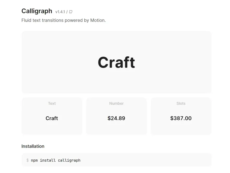
The Future of Web Dev
The Future of Web Dev
Interactive Glow Card Effects using Shadcn/ui
build customizable glow card effects in your React projects with Shadcn and Tailwind CSS. Simple, reusable, and dynamic.
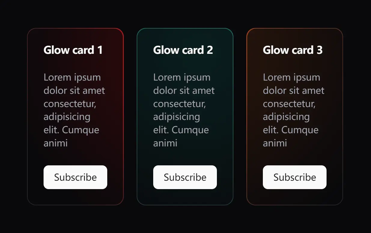
The Glow Cards component combines React, Tailwind CSS, and shadcn/ui to create interactive glow card effects.
It provides two core elements – GlowArea for container management and Glow for effect customization – through a 4.3KB package optimized for modern web projects.
Features
🔄 Reusable Components: GlowArea and Glow components simplify the process of creating glowing cards.
⚡ Performance-Optimized: Built with Tailwind CSS utility classes, the component maintains high performance while delivering smooth animations and transitions.
🎨 Customizable Glow: Modify the glow color, size, and position to match your design requirements.
🔧 Flexible Integration: The component structure allows for easy integration with existing shadcn card components and other UI elements in your React application.
Use Cases
- Interactive Portfolio: Showcase your projects with glowing cards that react to user interactions.
- E-commerce Highlights: Use glow effects to emphasize featured products or special offers on an e-commerce site.
- Blog Post Features: Highlight key articles or announcements on a blog with cards that have a subtle glow.
- Dashboard Metrics: Draw attention to important metrics or alerts in a dashboard application.
- Gaming UI: Incorporate glowing cards to represent special items, achievements, or in-game rewards.
Usage
Start by importing the required components:
import { GlowArea, Glow } from './components/Glow';
import { Card } from './components/ui/card';
Create a basic glowing card and control glow spread via inline styles:
<GlowArea className="flex gap-5">
  <Glow color="var(--color-rose-800)" className="rounded-xl">
    <Card className="max-w-lg">
      Your content here
    </Card>
  </Glow>
</GlowArea>
The GlowArea component serves as the container for your glowing elements. It manages the positioning and animation of the glow effects.
GlowArea({ className, size = 300, children, ...props })| Prop | Type | Default | Description |
|---|---|---|---|
className | string | "" | Use this to add any additional Tailwind CSS classes for custom styling. This allows you to further refine the appearance of the container beyond the default styles. |
size | number | 300 | Controls the size (in pixels) of the glow effect’s area. A larger value creates a more expansive glow. |
children | ReactNode | null | This is where you place the content that will be contained within the GlowArea. This typically includes one or more Glow components and the content you want to have the glow effect. |
...props | HTMLAttributes | {} | Any other standard HTML attributes you provide will be passed directly to the underlying HTML element. This offers flexibility for accessibility attributes or other customizations. |
The Glow component wraps individual elements and applies the actual glow effect to them.
Glow({ color, className, children, ...props })| Prop | Type | Default | Description |
|---|---|---|---|
color | string | #ffffff | Defines the color of the glow. You can use any valid CSS color value, such as named colors (e.g., red), hex codes (e.g., #ff0000), or RGB values (e.g., rgb(255, 0, 0)). |
className | string | "" | Add extra Tailwind CSS classes to customize the styling of the glowing element. |
children | ReactNode | null | The content you want to apply the glow effect to. This is typically a Card component or other UI elements. |
...props | HTMLAttributes | {} | Standard HTML attributes that are passed down to the underlying element. |
Related Resources
FAQs
Q: Can I customize the size of the glow effect?
A: Yes, you can adjust the glow area size through the size prop on the GlowArea component, with a default value of 300 pixels.
Q: Does this work with dark mode?
A: Yes, the glow effect is compatible with dark mode and can be customized to match your color scheme.
Q: Can I use this with existing shadcn components?
A: Yes, the Glow Card Effect integrates directly with shadcn’s component library, including cards, buttons, and other UI elements.
Q: Can the glow effect trigger on scroll instead of hover?
A: Yes. Wrap the GlowArea in a scroll observer component and pass intersection states via props.
Preview