The Future of Web Dev
The Future of Web Dev
Tailwind CSS Animation Pack: 80+ Ready-to-Use Motion Effects
Add 80+ performance-optimized animations to your Tailwind CSS project. Zero dependencies, simple copy-paste implementation, and full responsive support.
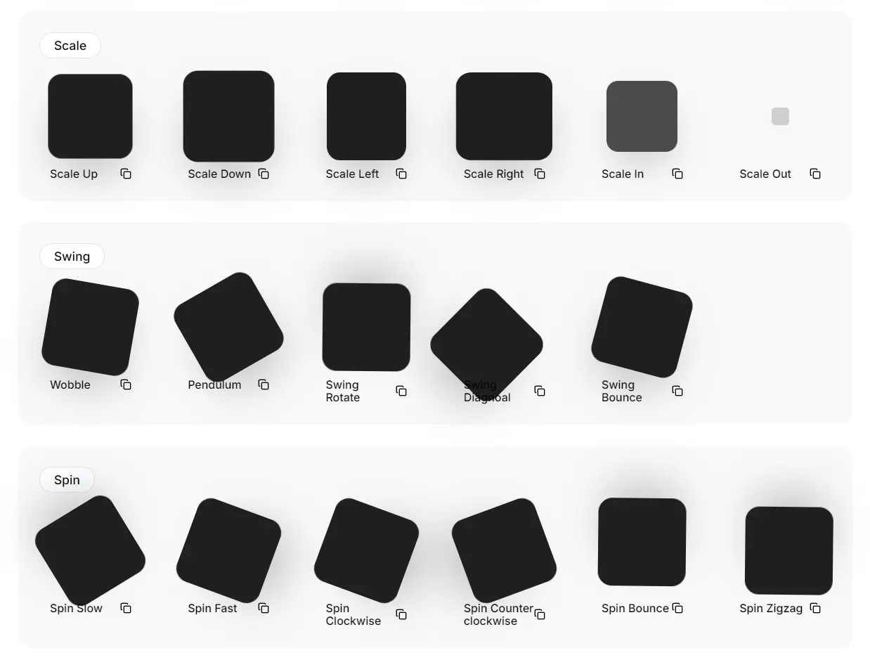
Tailwind Animations Starter Pack is a collection of over 80 pre-built animation classes ready to integrate into your Tailwind CSS projects. provides precise control over web animations without requiring additional dependencies or complex configuration.
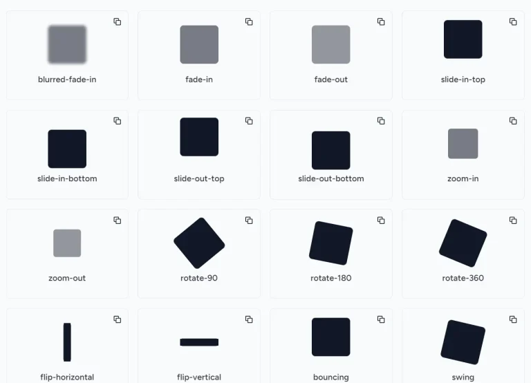
The package includes essential animation categories like fade, bounce, slide, scale, and zoom effects. Each animation class follows Tailwind’s utility-first approach so that you can easily apply motion effects to any HTML element.
Features
🎯 80+ Pre-built Animation Classes: A wide selection of ready-to-use animations covering various effects.
🎨 Customizable Animation Properties: Fine-tune animation behavior by adjusting Tailwind CSS configuration options.
⚡ Performance Optimized: Crafted for efficiency to ensure minimal impact on page load times and performance.
💻 Simple Installation Process: Quickly add the necessary configuration to your project.
📋 Easy Copy-Paste Implementation: Integrate animations by simply copying and pasting class names into your HTML.
📱 Responsive Design Support: Animations are designed to function smoothly across different screen sizes.
📦 Zero Additional Dependencies: No need to install extra libraries; it works seamlessly with your existing Tailwind CSS setup.
Use Cases
- Interactive Elements: Animate buttons or interactive icons on hover to provide visual feedback to users, confirming their actions and making the interface feel more responsive. For example, apply a subtle
animate-bounceto a call-to-action button on hover. Addressing the need for interactive feedback without complex coding. - Content Transitions: Introduce new sections or elements on a page with smooth transitions like
animate-slide-uporanimate-fade-in. This can improve user experience by making content updates less abrupt and more visually appealing. This helps developers create smoother page transitions, a common requirement. - Visual Emphasis: Use attention-grabbing animations like
animate-pulseoranimate-shakesparingly to highlight critical information, such as error messages or important notifications. This helps draw the user’s eye to key information. - Loading Indicators: Implement subtle animations like
animate-spinfor loading spinners or progress bars, providing users with clear feedback that a process is underway. This provides a simple solution to a common UI challenge. - Dynamic Text Effects: Employ text-specific animations like
animate-text-blur-reveal-by-characteroranimate-scramble-textto add unique and engaging introductions or reveals for headings or important text elements. This caters to the need for visually interesting text displays.
Usage
- Visit the Tailwind Animations Starter Pack’s website.
- Copy and paste the code into your
tailwind.config.jsfile under the theme section. - Copy the animation classes for the animations and paste them directly into your code.
FAQs
Q: Can I Customize The Duration Or Easing Of These Animations?
A: Yes, Tailwind CSS’s customization options allow you to modify the animation duration, easing functions, and other properties within your tailwind.config.js file.
Q: Are These Animations Responsive?
A: Yes, the animations are designed to work responsively across different screen sizes without requiring additional configuration.
Q: Does this work with server-side rendering?
A: Yes, the animations are compatible with SSR frameworks like Next.js and Nuxt.js without additional configuration.
Q: How do I optimize the performance of the animations?
A: The animations are already performance-optimized. However, you can further optimize by using hardware acceleration and minimizing the number of animated elements on the page.