The Future of Web Dev
The Future of Web Dev
Scroll-Driven Image and Caption Animations – shadcn-scroll-reveal
Add sticky scroll stories to shadcn/ui with directional image reveals, four caption motions, and adjustable scene heights and sticky offsets.
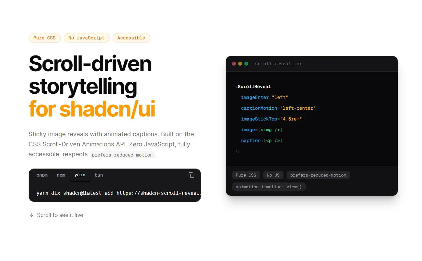
shadcn-scroll-reveal is a UI component for shadcn/ui that creates sticky, scroll-driven image reveals with optional animated captions.
Images enter the viewport from different directions as the page scrolls, and captions can slide into position or travel across the scene.
CSS view timelines drive both animations, with no JavaScript scroll listeners.
Features
- Four image entrance directions: left, right, top, and bottom, plus a
noneoption that removes directional translation. - Four caption motions: left to center, right to center, left to right, and right to left.
- Sticky image positioning with configurable height and top offset.
- Adjustable scroll scene duration, caption spacing, caption travel distance, and starting image scale.
- Optional captions that accept React elements, including headings, text, and links.
- Reduced-motion and scroll-animation fallbacks in the supplied CSS.
- TypeScript props and editable component source installed through the shadcn registry.
Use Cases
- Product pages: Hold a product photograph in place while a short feature caption moves across the image.
- Photography portfolios: Reveal landscape and portrait photographs as visitors move through a collection.
- Editorial stories: Present a sequence of image chapters with animated headings and descriptions.
How To Use It
1. Install ScrollReveal
npx shadcn@latest add https://shadcn-scroll-reveal.vercel.app/r/scroll-reveal.json2. Copy the Required CSS
The registry item contains only scroll-reveal.tsx. It does not install the animation CSS. Copy the complete @layer vanilla-scroll-sky block from the project’s src/app/globals.css into your application’s global stylesheet (app/globals.css or src/app/globals.css in Next.js).
The registry JSON specifies components/scroll-reveal/scroll-reveal.tsx as its file destination. Check the installed location and your project’s @/ alias before using the import below. The component imports cn from @/lib/utils.
If the registry endpoint cannot be fetched, manually copy the component source to components/scroll-reveal/scroll-reveal.tsx and apply the CSS step above.
3. Basic Usage in Next.js
Put an image in your project’s public/images/ directory and render ScrollReveal in app/page.tsx or src/app/page.tsx.
import Image from "next/image"
import { ScrollReveal } from "@/components/scroll-reveal/scroll-reveal"
export default function PortfolioPage() {
  return (
    <main>
      <ScrollReveal
        imageEnter="left"
        image={
          <Image
            src="/images/coastal-home.jpg"
            alt="Modern coastal home overlooking the ocean"
            width={1600}
            height={1000}
          />
        }
      />
    </main>
  )
}
4. Create a Two-Scene Story with Animated Captions
Set imageStickTop to your fixed header height when the sticky image needs to sit below the navigation. Change captionMotion for each scene to control the text’s direction independently from the image.
import Image from "next/image"
import { ScrollReveal } from "@/components/scroll-reveal/scroll-reveal"
export default function CollectionStory() {
  return (
    <main>
      <ScrollReveal
        imageEnter="bottom"
        captionMotion="left-center"
        imageStickTop="4rem" // Match the fixed header height.
        sceneDuration="200svh"
        image={
          <Image
            src="/images/ceramic-workshop.jpg"
            alt="Handmade ceramic bowls in a pottery studio"
            width={1600}
            height={1000}
          />
        }
        caption={
          <div>
            <h2 className="text-2xl font-semibold">Inside the workshop</h2>
            <p>Each bowl starts on the potter's wheel.</p>
          </div>
        }
      />
      <ScrollReveal
        imageEnter="right"
        captionMotion="right-left"
        imageHeight="60svh"
        captionDelay="30svh"
        image={
          <Image
            src="/images/ceramic-collection.jpg"
            alt="Finished ceramic vases displayed on a shelf"
            width={1600}
            height={1000}
          />
        }
        caption={
          <h2 className="text-2xl font-semibold">The finished collection</h2>
        }
      />
    </main>
  )
}
ScrollReveal Props
| Prop | Type | Default | Description |
|---|---|---|---|
image | ReactNode | Required | Media inside the sticky container. Direct img, svg, and video children receive the supplied media styles. |
caption | ReactNode | None | Optional animated caption content. |
imageEnter | "left" | "right" | "top" | "bottom" | "none" | "bottom" | Image entrance direction. |
captionMotion | "left-center" | "right-center" | "left-right" | "right-left" | None | Caption travel direction. |
sceneDuration | string | "220svh" | Minimum scene height. |
imageHeight | string | "66svh" | Sticky image container height. |
imageStickTop | string | "0" | Sticky top offset. |
captionDelay | string | "40svh" | Top margin before the caption. |
captionMotionDistance | string | "80vw" | Horizontal travel distance of the caption. |
sceneExitSpace | string | "55svh" | Bottom padding in the scene. |
captionMaxWidth | string | "52rem" | Maximum caption width. |
imageFit | "cover" | "contain" | "cover" | object-fit on direct media children. |
imagePosition | string | "center" | object-position on direct media children. |
imageStartScale | string | ".96" | Initial image scale before the reveal. |
className | string | None | Extra CSS classes on the root <section>. |
Fix Theme Colors for Modern shadcn/ui
/* Replace the corresponding declarations in the existing rules. */
.vss__image {
  background: var(--muted);
}
.vss__caption {
  color: var(--foreground);
  background: var(--card);
  border: 1px solid var(--border);
}
Alternatives and Related Resources
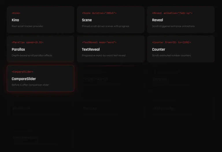
- Scroll-Driven Animation Library for React and Next.js – Kino
- Scroll-Triggered Animations with Spring Physics – Mochi Motion
- Simple Scroll Reveal Animation Library For React
- Vanilla Scroll Sky: Pure CSS Scrollytelling Library
FAQs
Q: Why does ScrollReveal render an image but no animation?
A: Check that you copied the full @layer vanilla-scroll-sky block, including its @scope and keyframes. Also check browser support for scroll-driven animations and any reduced-motion preference.
Q: Why are the caption’s colors missing in a Tailwind CSS 4 shadcn/ui theme?
A: The original stylesheet wraps theme variables in hsl(...). Use the complete var(--card), var(--foreground), var(--border), and var(--muted) color values in the existing CSS declarations.
Q: Does imageEnter="none" turn off the image reveal?
A: No. It removes the directional translation. Opacity and scale still animate. Edit the local vss-image-in keyframes when you need a different reveal.