The Future of Web Dev
The Future of Web Dev
SVG-Based Sci-Fi UI Components for Modern Web Apps – Cosmic UI
A collection of futuristic, open-source, TailwindCSS-based UI components for React, Vue, and Solid. Build your sci-fi UI.
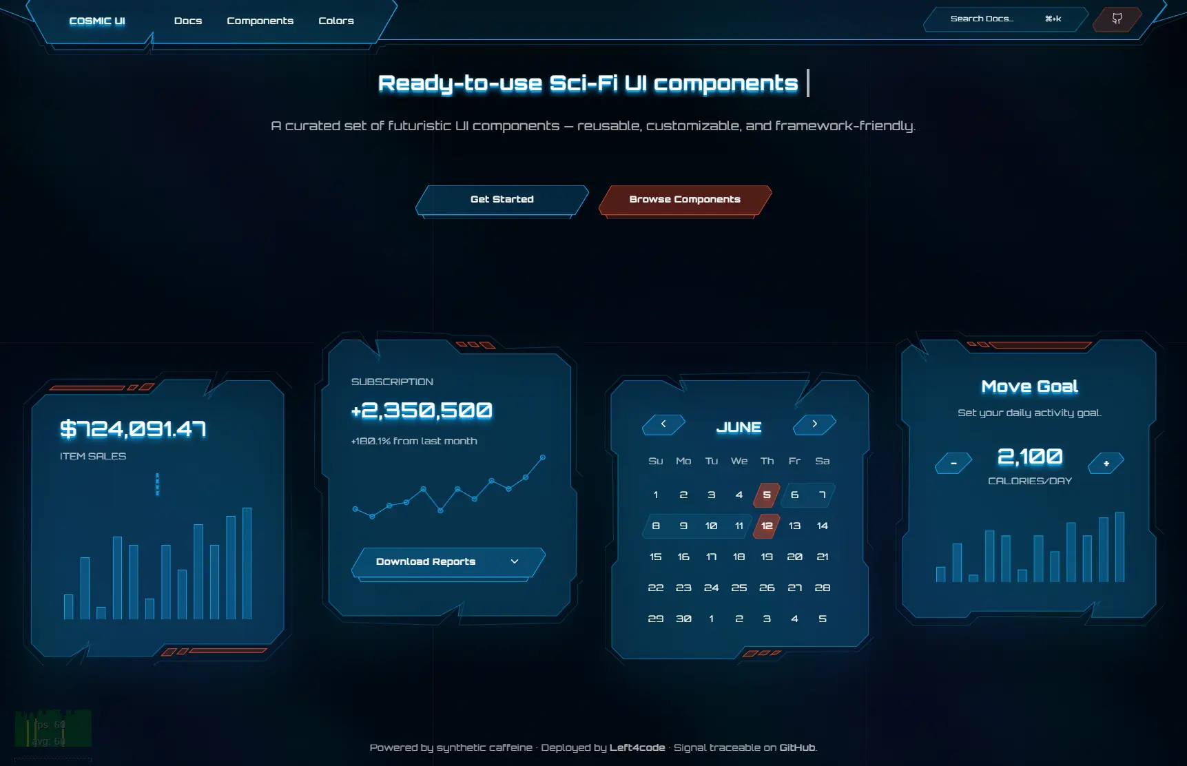
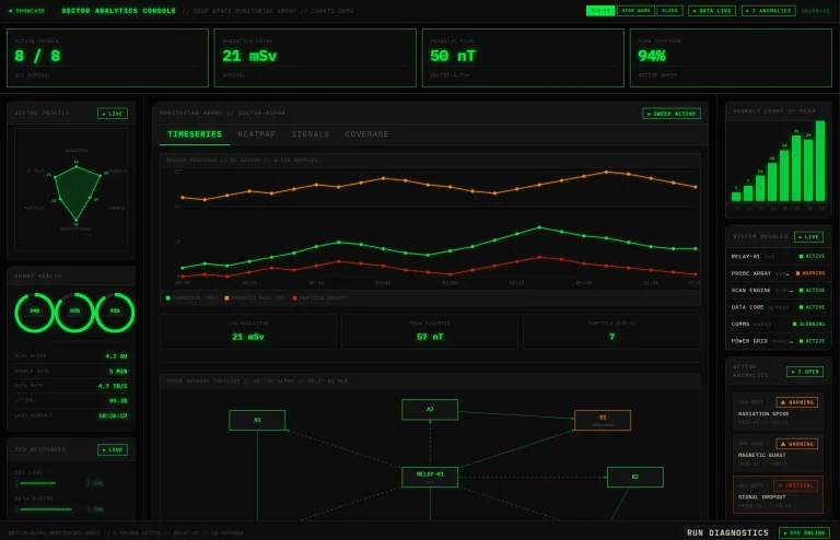
Cosmic UI is a TailwindCSS-based UI component library for creating futuristic and science-fiction-themed applications, dashboards, and games.
Features
🚀 SVG-First Architecture – Built around customizable SVG shapes for authentic sci-fi aesthetics
⚡ zag.js Integration – Interactive components powered by accessible state management
🎨 Full Design Control – Complete ownership over markup, SVG paths, and styling
🌟 Beautiful Sci-Fi Defaults – Pre-designed shapes, frames, and layouts optimized for futuristic interfaces
🔧 Framework Agnostic Logic – Compatible with React, Vue, Solid, and other supported frameworks
♿ Accessibility Built-in – Keyboard interactions and ARIA compliance through zag.js
🎯 Composable APIs – Consistent usage patterns across all interactive components
🖼️ Holographic Effects – Built-in glows, gradients, and visual effects for sci-fi authenticity
How To Use It
1. Create a new React project with Vite.
yarn create vite@latest2. Add Tailwind CSS to your project.
yarn add tailwindcss @tailwindcss/vite3. Import Tailwind’s base styles.
/* src/index.css */
@import "tailwindcss";
4. Add the baseUrl and paths properties to the compilerOptions section of both tsconfig.json and tsconfig.app.json.
// tsconfig.json
{
  "files": [],
  "references": [
    {
      "path": "./tsconfig.app.json"
    },
    {
      "path": "./tsconfig.node.json"
    }
  ],
  "compilerOptions": {
    "baseUrl": ".",
    "paths": {
      "@/*": ["./src/*"]
    }
  }
}
// tsconfig.app.json
{
"compilerOptions": {
// ...
"baseUrl": ".",
"paths": {
"@/*": [
"./src/*"
]
}
// ...
}
}5. Update vite.config.ts to resolve import paths correctly. You will need to install the Node.js types first.
yarn add -D @types/node6. Modify the Vite configuration file.
// vite.config.ts
import path from "path"
import tailwindcss from "@tailwindcss/vite"
import react from "@vitejs/plugin-react"
import { defineConfig } from "vite"
export default defineConfig({
  plugins: [react(), tailwindcss()],
  resolve: {
    alias: {
      "@": path.resolve(__dirname, "./src"),
    },
  },
})
7. You can now add components to your project. Import the desired component and use it within your application.
The example below shows how to add a Button to your main application component.
import { useRef, useEffect } from "react";
import { twMerge } from "tailwind-merge";
import { type Paths, setupSvgRenderer } from "@left4code/svg-renderer";
function Frame({
  className,
  paths,
  ...props
}: { paths: Paths } & React.ComponentProps<"svg">) {
  const svgRef = useRef<SVGSVGElement | null>(null);
  useEffect(() => {
    if (svgRef.current && svgRef.current.parentElement) {
      const instance = setupSvgRenderer({
        el: svgRef.current,
        paths,
      });
      return () => instance.destroy();
    }
  }, [paths]);
  return (
    <svg
      {...props}
      className={twMerge(["absolute inset-0 size-full", className])}
      xmlns="http://www.w3.org/2000/svg"
      ref={svgRef}
    />
  );
}
export { Frame };
8. All available UI components.
- Frame
- Menu
- Alert
- Accordion
- Dialog
- Tabs
- Button
- Input
- Switch
- Textarea
- Radio Group
- Checkbox
- Chart
Related Resources
- TailwindCSS – The CSS framework that powers Cosmic UI’s styling system. https://tailwindcss.com/docs
- zag.js – The headless UI library providing accessible interactive logic for complex components. https://zagjs.com/
- React – The primary framework for implementing Cosmic UI components. https://react.dev/
- Vite – The build tool recommended for optimal development experience with Cosmic UI. https://vitejs.dev/