The Future of Web Dev
The Future of Web Dev
ObsidianUI: React Components & Animated UI Blocks
Create dashboards, landing pages, and animated product UI with 52 UI components and 22 blocks.
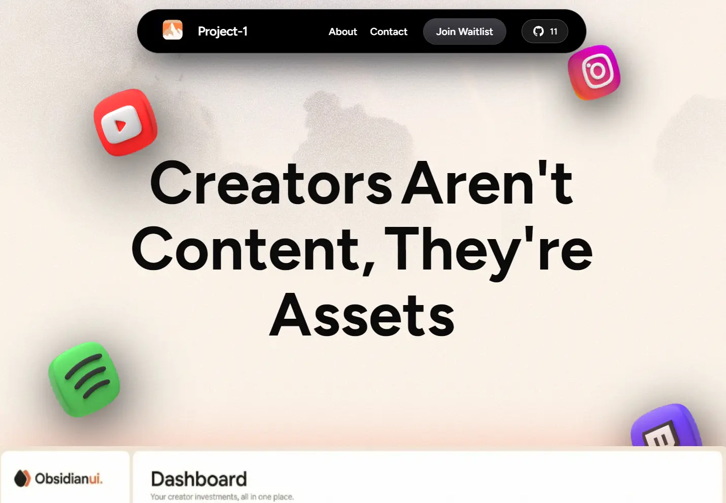
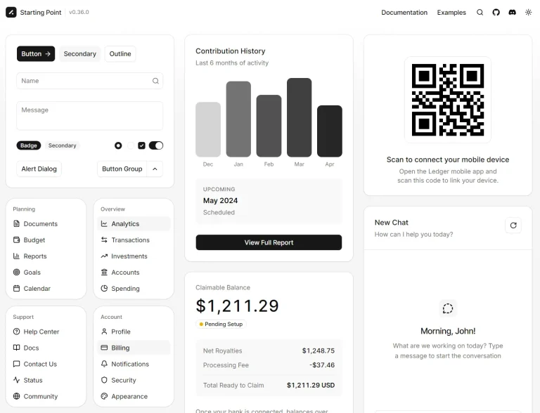
ObsidianUI is a React and Tailwind CSS component library for building animated websites and dashboard UIs.
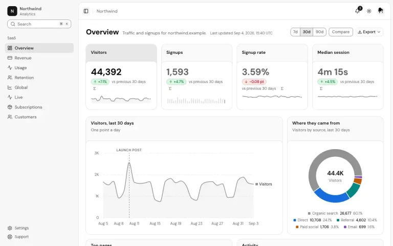
You can start with a ready-made dashboard layout, add interactive galleries to a portfolio, or build account settings with device sign-out controls.
The shadcn CLI installs the selected components as editable files in your project.
Features
- 50+ reusable UI components and 20+ blocks.
- Component-specific styles and utility files that you can edit locally.
- GSAP-based image and text effects, Motion animations, and Three.js graphics.
- Resizable dashboard navigation, responsive drawer, tabs, menus, and toolbar controls.
- Device-session management UI with loading, sign-out, and error states.
- Component-level CSS variables for colors and styling.
Available Components
Blocks
| Category | Blocks |
|---|---|
| Buttons and pointer effects | Click Spark, Interactive Hover Button, Liquid Metal, Playground Button |
| Navigation and layout | Footer, Playground Navbar, Sidebar Stackbits |
| Forms and content | File Input, Skeumorphic Music Card, Visitor Count |
| Scrolling | Smooth Scroll |
UI Components
| Category | Components |
|---|---|
| Forms and inputs | Button, Button Group, Calendar, Checkbox, Field, Form, Input, Input Group, Input OTP, Label, Radio Group, Select, Slider, Switch, Textarea, Toggle, Toggle Group |
| Navigation | Breadcrumb, Command, Menubar, Navigation Menu, Pagination, Sidebar, Tabs |
| Menus and overlays | Context Menu, Dialog, Drawer, Dropdown Menu, Hover Card, Popover, Sheet, Tooltip |
| Layout and content | Avatar, Card, Carousel, Chart, Collapsible, Empty, Item, Resizable, Scroll Area, Separator, Table |
| Feedback | Alert, Badge, Kbd, Gooey Blob Loaders, Progress, Raised Button, Skeleton, Sonner, Spinner |
How to Use ObsidianUI
1. Set Up shadcn/ui
In an existing React or Next.js project with Tailwind CSS, run the initializer if you do not already have components.json:
npx shadcn@latest initFor a new Next.js App Router project, use:
npx create-next-app@latest workspace-demo --typescript --tailwind --eslint --app --src-dir --import-alias '@/*'
cd workspace-demo
npx shadcn@latest init
2. Install Discover Button
npx shadcn@latest add "https://www.obsidianui.dev/r/discover-button.json"3. Basic Usage
Discover Button accepts href for links, onClick for button actions, and label for text. Import it in src/app/page.tsx:
import { DiscoverButton } from "@/components/block/discover-button";
export default function HomePage() {
  return (
    <main className="mx-auto max-w-5xl px-6 py-20">
      <h1 className="mb-8 text-4xl font-semibold">Explore our products</h1>
      <DiscoverButton href="/products" label="View Products" />
    </main>
  );
}
Example: Build an Admin Dashboard
Install Dashboard Shell:
npx shadcn@latest add "https://www.obsidianui.dev/r/dashboard-shell.json"Create src/app/dashboard/page.tsx as a Client Component because the navigation object passes React icon components. Give the wrapper a height so the dashboard fills the viewport.
"use client";
import { LayoutDashboard, Settings } from "lucide-react";
import { DashboardShell } from "@/components/block/dashboard-shell";
const navigation = [
  {
    id: "workspace",
    title: "Workspace",
    items: [
      { id: "overview", label: "Overview", icon: LayoutDashboard, href: "/dashboard" },
      { id: "settings", label: "Settings", icon: Settings, href: "/dashboard/settings" },
    ],
  },
];
export default function DashboardPage() {
  return (
    <div className="h-dvh">
      <DashboardShell
        brand={{ name: "Northstar" }}
        navigation={navigation}
        defaultActiveItemId="overview"
        title="Overview"
      >
        <section className="p-6">
          <h2 className="text-xl font-semibold">Workspace activity</h2>
          <p className="mt-2 text-sm text-muted-foreground">
            Review activity and manage team settings.
          </p>
        </section>
      </DashboardShell>
    </div>
  );
}
Dashboard Shell Props
The sidebar collapses into a drawer when the dashboard container is narrower than 672px. Items with href navigate to another page. Items with no href update the selected navigation item.
| Prop | Purpose |
|---|---|
brand, navigation, title | Brand information, sidebar sections, and page heading. |
activeItemId, onActiveItemChange | Controlled navigation selection. |
defaultActiveItemId | Initial selection when the parent does not control it. |
tabs, tab, onTabChange | Tabs and selected-tab state. |
filters, toolbarActions | Content for the two sides of the toolbar. |
sidebarWidth, onSidebarWidthChange | Controlled sidebar width in pixels. |
defaultSidebarWidth | Initial sidebar width. Default: 200. |
minSidebarWidth, maxSidebarWidth | Resize limits. Defaults: 180 and 400. |
Example: Manage Active Sessions
Install Active Sessions for an account settings page. Your backend must revoke the real session:
npx shadcn@latest add "https://www.obsidianui.dev/r/active-sessions.json"The component handles pending requests and errors after calling your DELETE /api/sessions/:id endpoint. Create src/app/settings/sessions/page.tsx:
"use client";
import {
  ActiveSessions,
  type ActiveSession,
} from "@/components/block/active-sessions";
const initialSessions: ActiveSession[] = [
  {
    id: "current-browser",
    device: "laptop",
    browser: "Chrome",
    os: "macOS",
    lastActiveAt: new Date(),
    current: true,
  },
  {
    id: "tablet-login",
    device: "tablet",
    browser: "Safari",
    os: "iPadOS",
    lastActiveAt: "2026-10-08T16:00:00Z",
  },
];
export default function SessionSettingsPage() {
  return (
    <main className="mx-auto max-w-3xl p-6">
      <ActiveSessions
        defaultSessions={initialSessions}
        onRevoke={async (session) => {
          const response = await fetch(
            `/api/sessions/${encodeURIComponent(session.id)}`,
            { method: "DELETE" },
          );
          if (!response.ok) throw new Error("Session revocation failed");
        }}
      />
    </main>
  );
}
Active Sessions Props
Each session needs an id, a device type (desktop, laptop, phone, or tablet), and lastActiveAt. Use current: true for the current login. That row stays at the top and cannot be signed out through the list.
| Prop | Purpose |
|---|---|
defaultSessions | Initial sessions managed inside the component. |
sessions, onSessionsChange | Controlled sessions and list updates. |
onRevoke | Async or synchronous callback for signing out one session. |
onRevokeOthers | Callback for signing out other sessions. Falls back to onRevoke for each session. |
loading | Skeleton state while session data loads. |
activeWithin | Minutes used to determine the active-now label. |
locale | Locale for date formatting. |
Optional Registry Namespace
For repeated installs, configure @obsidian in the registries section of components.json:
{
  "registries": {
    "@obsidian": "https://www.obsidianui.dev/r/{name}.json"
  }
}
Install File Input through the registry namespace:
npx shadcn@latest add @obsidian/file-inputAlternatives and Related Resources