Wireframe UI is a collection of reusable wireframe components that you can copy and paste into React and Next.js applications.
The UI kit allows you to build wireframe mockups directly within your IDE, using components built with shadcn/ui, Tailwind CSS, and React.
This removes the need for external design tools like Figma for initial prototyping stages.
Features
🎨 Wireframe-First Design: Components include visual helpers like placeholder text and simplified styling that communicate layout intent without final design decisions.
⚡ shadcn/ui Integration: Uses the shadcn CLI for component installation.
🔧 Customizable Components: Every component supports modification through standard React props and Tailwind CSS classes.
📱 Accessibility Built-In: Components use Radix UI primitives and include proper ARIA attributes and keyboard navigation support.
Use Cases
- Rapid Concept Validation: Quickly assemble interactive prototypes to test user flows
- Developer-Led Design: Technical teams can create functional mockups without design tools
- Client Demonstrations: Build presentable wireframes that closely resemble final products
- Component Foundation: Use wireframe components as starting points for production interfaces
How to Use It
1. Initialize shadcn/ui in your existing React or Next.js project.
pnpm dlx shadcn@latest init2. Browse the available components at the wireframe-ui documentation website to see previews and usage examples.
3. Install components individually using the shadcn CLI with the Wireframe-UI registry URL. For example, to add the Button component:
pnpm dlx shadcn@latest add https://wireframe-ui.vercel.app/r/button.json4. This command downloads the component code and places it in your project’s components directory. The JSON file contains metadata about dependencies, file paths, and the component implementation.
{
  "$schema": "https://ui.shadcn.com/schema/registry-item.json",
  "name": "button",
  "type": "registry:ui",
  "title": "Button",
  "description": "Displays a button or a component that looks like a button with multiple variants and sizes.",
  "dependencies": ["@radix-ui/react-slot", "class-variance-authority"],
  "registryDependencies": [],
  "files": [
    {
      "path": "registry/new-york/ui/button.tsx",
      "content": "import * as React from 'react'\r\nimport { Slot } from '@radix-ui/react-slot'\r\nimport { cva, type VariantProps } from 'class-variance-authority'\r\n\r\nimport { cn } from '@/lib/utils'\r\n\r\nconst buttonVariants = cva(\r\n  \"inline-flex items-center justify-center gap-2 whitespace-nowrap rounded-lg text-sm font-medium transition-colors disabled:pointer-events-none disabled:opacity-50 [&_svg]:pointer-events-none [&_svg:not([class*='size-'])]:size-4 shrink-0 [&_svg]:shrink-0 outline-none\",\r\n  {\r\n    variants: {\r\n      variant: {\r\n        default: 'bg-card text-foreground border hover:bg-accent',\r\n        destructive: 'bg-destructive text-destructive-foreground hover:bg-destructive/90',\r\n        outline: 'border border-input bg-background hover:bg-accent',\r\n        secondary: 'bg-secondary text-secondary-foreground hover:bg-secondary/80',\r\n        ghost: 'hover:bg-accent hover:text-foreground',\r\n        link: 'text-primary underline-offset-4 hover:underline',\r\n      },\r\n      size: {\r\n        default: 'h-10 px-6 py-2',\r\n        sm: 'h-8 rounded-lg px-4',\r\n        lg: 'h-12 rounded-lg px-8',\r\n        icon: 'size-10',\r\n      },\r\n    },\r\n    defaultVariants: {\r\n      variant: 'default',\r\n      size: 'default',\r\n    },\r\n  }\r\n)\r\n\r\nexport interface ButtonProps\r\n  extends React.ComponentProps<'button'>,\r\n    VariantProps<typeof buttonVariants> {\r\n  asChild?: boolean\r\n}\r\n\r\nfunction Button({ className, variant, size, asChild = false, ...props }: ButtonProps) {\r\n  const Comp = asChild ? Slot : 'button'\r\n\r\n  return (\r\n    <Comp\r\n      data-slot=\"button\"\r\n      className={cn(buttonVariants({ variant, size, className }))}\r\n      {...props}\r\n    />\r\n  )\r\n}\r\n\r\nexport { Button, buttonVariants }\r\n",
      "type": "registry:ui"
    }
  ]
}
5. Each component file includes TypeScript definitions and proper typing for props. Here’s what a basic Button implementation looks like:
import { Button } from '@/components/ui/button'
export default function Example() {
  return (
    <Button variant="default" size="md">
      Click Me
    </Button>
  )
}
6. Customize components by passing props for variants, sizes, and behavior.
7. You can override styles using Tailwind classes directly on the component:
<Button className="bg-blue-500 hover:bg-blue-600">
  Custom Styled Button
</Button>
8. All available wireframe components:
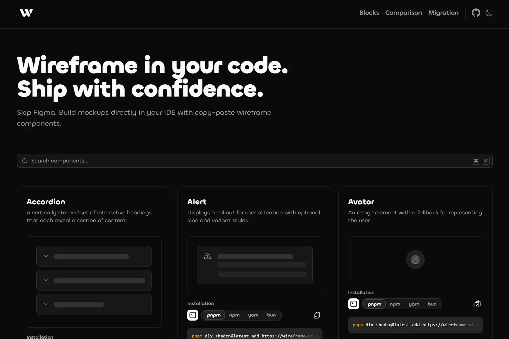
- Accordion: A vertically stacked set of interactive headings that each reveal a section of content.
- Alert: Displays a callout for user attention with optional icon and variant styles.
- Avatar: An image element with a fallback for representing the user.
- Badge: Displays a badge or a component that looks like a badge with multiple variants.
- Breadcrumb: Displays the path to the current resource using a hierarchy of links.
- Button: Displays a button or a component that looks like a button with multiple variants and sizes.
- Button Group: A button group component with wireframe helper for text labels.
- Card: A container for displaying content with header, footer, and action sections.
- Carousel: A carousel component with wireframe helper for slide content.
- Chart: Chart components with a wireframe placeholder helper.
- Checkbox: A control that allows the user to toggle between checked and not checked.
- Collapsible: An interactive component that expands and collapses a panel.
- Context Menu: A context menu component with wireframe helpers for menu items.
- Dialog: A modal dialog that interrupts the user with important content and expects a response.
- Drawer: A panel that slides out from the edge of the screen with support for multiple directions.
- Empty State: An empty state component with wireframe helpers.
- Heading: A composition component that renders appropriately sized text based on heading level.
- Hover Card: For sighted users to preview content available behind a link.
- Input: A text input field with support for various types and validation states.
- Input Group: An input group component for combining inputs with addons.
- Item: A flexible item component for lists with wireframe helpers.
- Kbd: Displays keyboard shortcuts or keys with proper styling.
- Label: Renders an accessible label associated with form controls.
- ListGroup: A composition component that renders list items with text placeholders.
- Media: A container for displaying images, videos, and audio with loading states.
- Menubar: A visually persistent menu common in desktop applications.
- Pagination: Pagination with page navigation, next, and previous links.
- Paragraph: A composition component that renders multiple text lines to simulate paragraph content.
- Section: A composition component with preset variants for common layout patterns.
- Select: Displays a list of options for the user to pick from.
- Separator: Visually or semantically separates content.
- Sheet: A slide-out panel component with wireframe helpers.
- Sidebar: A composable sidebar component with wireframe helpers for navigation.
- Slider: An input where the user selects a value from within a given range.
- Stack: A layout primitive for arranging wireframe elements.
- Switch: A control that allows the user to toggle between checked and unchecked states.
- Table: A data table component with wireframe helpers for headers and cells.
- Tabs: A set of layered sections of content with tab triggers.
- Text: A wireframe text placeholder with animation and emphasis variants.
- Textarea: A multi-line text input field.
- Toggle: A two-state button that can be either on or off.
- Tooltip: A popup that displays information related to an element when focused or hovered.
Related Resources
- shadcn/ui provides the underlying component architecture and CLI tooling that Wireframe-UI extends.
- Radix UI supplies the accessible primitives used in Wireframe-UI components for keyboard navigation and ARIA support.
- Tailwind CSS documentation covers the utility classes available for customizing component styles.
FAQs
Q: Can I use Wireframe-UI components in production applications?
A: Yes. The components are built on production-ready libraries like Radix UI and can be styled for final implementations. You own the component code after installation, so you can refine the wireframe aesthetic into polished UI elements.
Q: Do I need to install all components at once?
A: No. Each component installs independently through the shadcn CLI. You only add the components your project needs, which keeps your codebase lean.
Q: How does Wireframe-UI differ from regular shadcn/ui components?
A: Wireframe-UI components include additional helpers for rapid prototyping, such as placeholder text generators, simplified styling presets, and wireframe-specific variants. They’re designed for the prototyping phase while maintaining a path to production code.
Q: Can I modify the installed components?
A: Yes. Components are copied into your project’s source code, so you have complete control to modify them. There’s no package dependency to manage or upgrade.
Q: What happens when I install a component that depends on other components?
A: The shadcn CLI automatically installs component dependencies listed in the registry JSON file. For example, installing Accordion also installs the Text component it references.