The Future of Web Dev
The Future of Web Dev
Modern Dashboard Template Built with Next.js & shadcn/ui
A production-ready dashboard starter with Next.js and shadcn/ui. Perfect for admin panels and data visualization apps.
This is a modern, customizable, production-ready dashboard template built with Next.js, shadcn/ui, TailwindCSS, and TypeScript.
It combines Next.js’s server-side rendering capabilities with shadcn/ui’s customizable component library to create fast, accessible, and visually consistent dashboards.
The dashboard includes essential features like authentication flows, role-based access control, and a consistent layout system with sidebar navigation.
It follows industry best practices for code organization, type safety, and performance optimization.
You can extend the template to create custom dashboards while maintaining scalability and maintainability.
Features
⚡ Lightning Fast Performance: Built with Next.js App Router and optimized for speed.
🎨 Beautiful UI Components: Pre-configured shadcn/ui components with consistent design
🔐 Authentication Ready: Complete auth system with protected routes and user management.
🎯 Dashboard Layout: Professional sidebar navigation and layout components.
🎨 Customizable Theming: Easy theme modification through CSS variables.
📊 Chart Integration: Ready-to-use data visualization components.
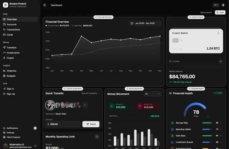
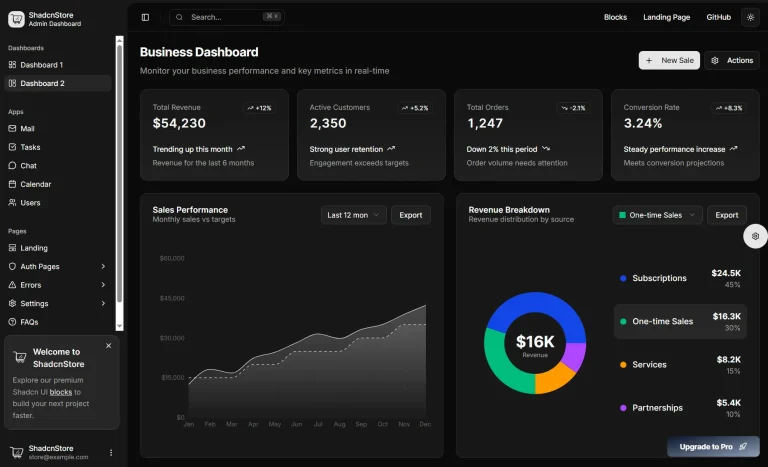
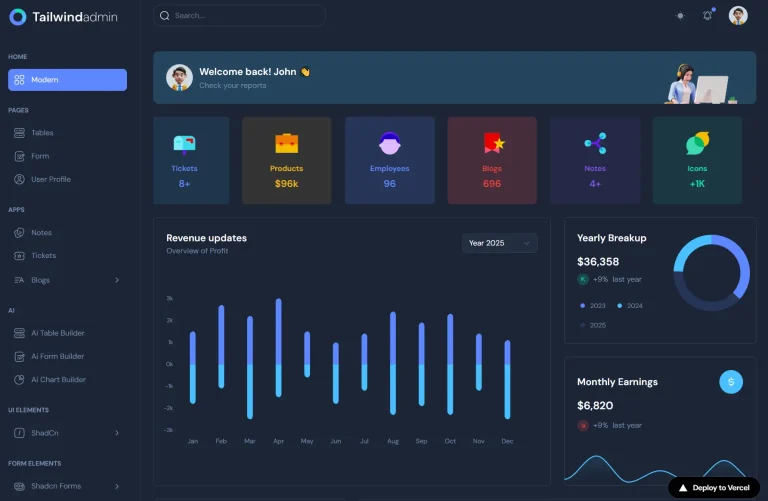
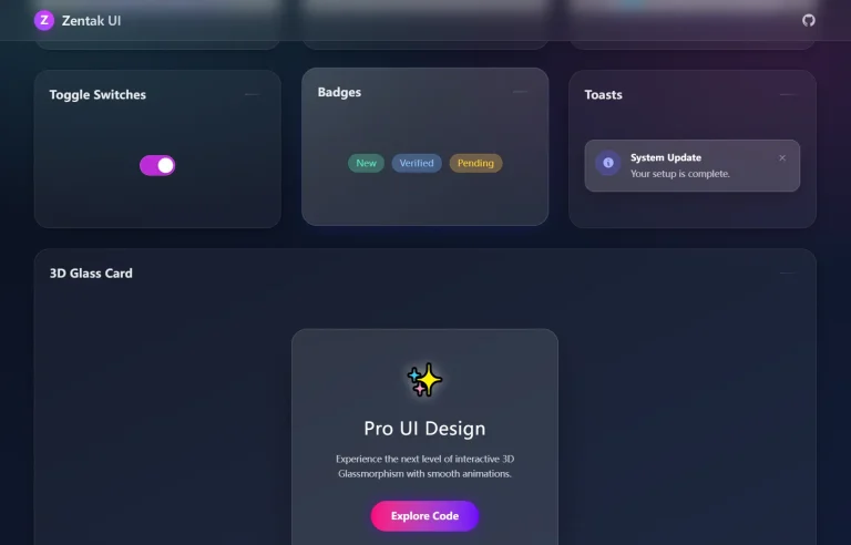
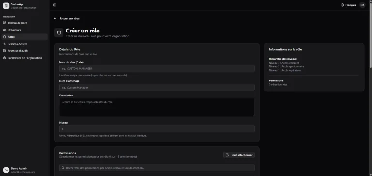
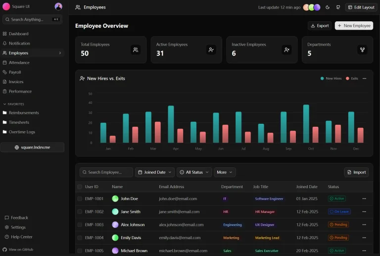
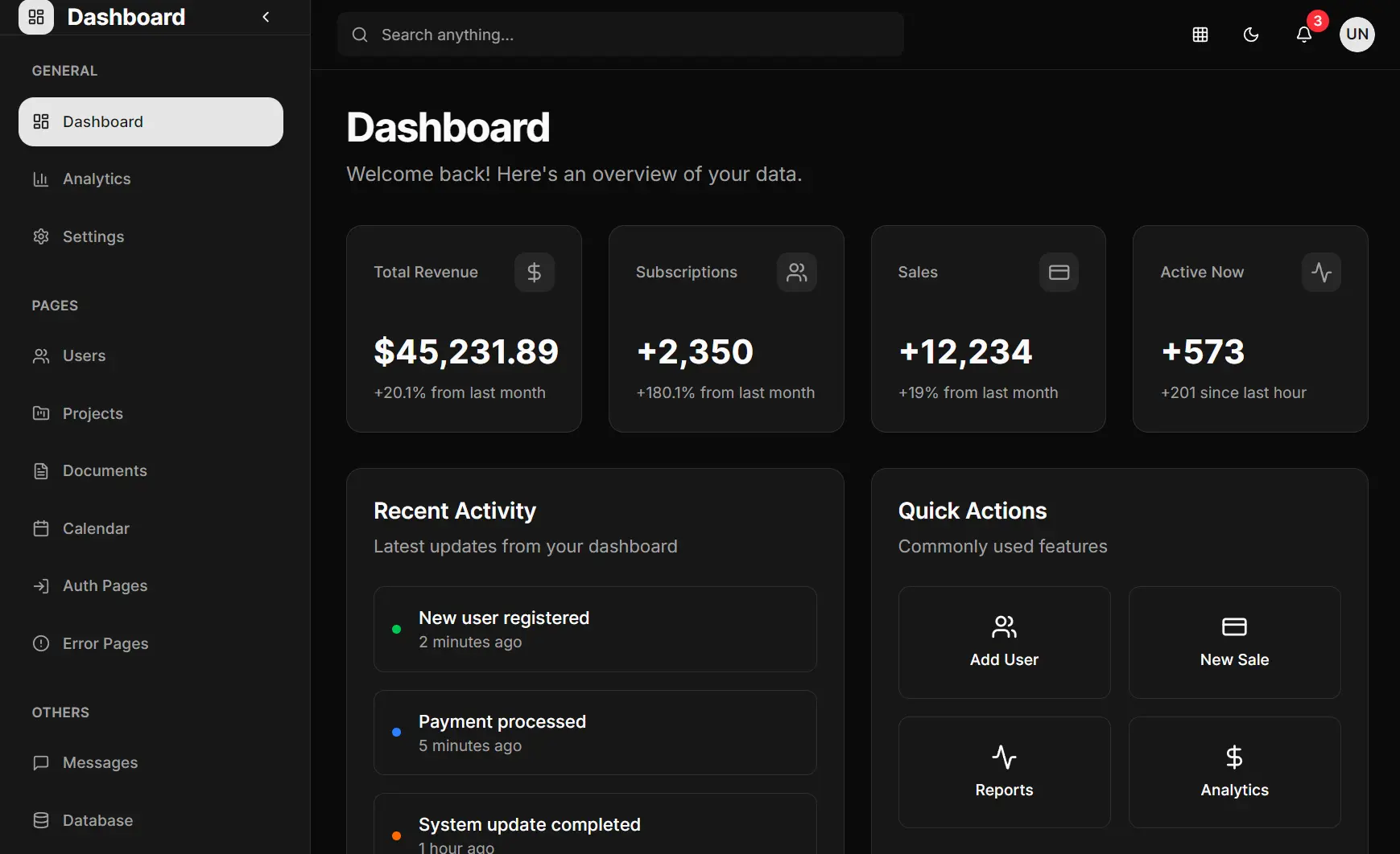
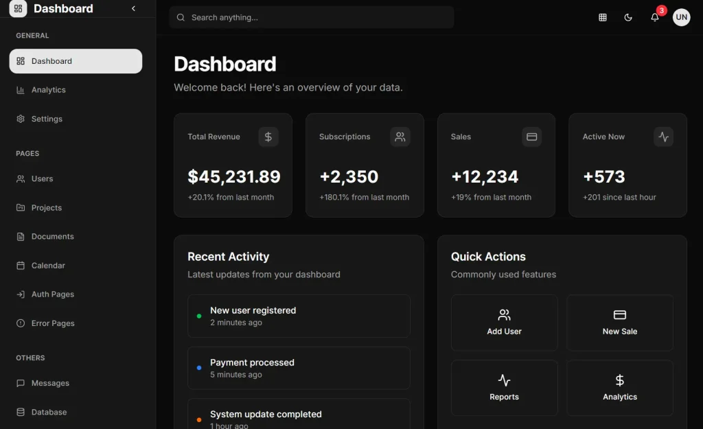
Preview
How to Use It:
1. Clone the repository from GitHub:
git clone https://github.com/naveenda/shacn-nextjs-dashboard.git
cd shacn-nextjs-dashboard
2. Install the project dependencies:
npm install
# or
yarn install
3. Run the development server. You can view the application by opening http://localhost:3000 in your browser.
npm run dev
# or
yarn dev
3. The project is organized into logical directories to separate concerns. The app directory contains all routes, split into (auth) for authentication pages and (dashboard) for the main dashboard layout and pages. Shared and UI-specific components are located in the components directory.
4. You can customize the application’s appearance through shadcn/ui. The global styles are defined in app/globals.css.
5. To configure the base theme and component settings, you can modify the components.json file. This file allows you to change the style, color theme, and aliases for component paths.
Here is an example of the components.json configuration:
{
  "$schema": "https://ui.shadcn.com/schema.json",
  "style": "new-york",
  "rsc": true,
  "tsx": true,
  "tailwind": {
    "config": "tailwind.config.ts",
    "css": "app/globals.css",
    "baseColor": "neutral",
    "cssVariables": true
  },
  "aliases": {
    "components": "@/components",
    "utils": "@/lib/utils"
  },
  "iconLibrary": "lucide"
}
Related Resources
- shadcn/ui: Component library used in this template for building accessible and customizable UI components.
- Next.js Documentation: Official documentation for the React framework powering this dashboard.
- Tailwind CSS: Utility-first CSS framework for rapid UI development.
FAQs
Q: How do I add a new page to the dashboard?
A: To add a new page, create a new folder inside the app/(dashboard)/ directory. Then, add a page.tsx file within that new folder to define the content of your new route.
Q: Can I use a different component library instead of shadcn/ui?
A: Yes. While the project is set up with shadcn/ui, you can replace it with another React component library. This would require removing the existing shadcn/ui components and integrating your chosen library.
Q: How are the UI components customized?
A: The components from shadcn/ui are not installed as a typical library dependency. Instead, their source code is added directly to your project in the components/ui directory. You can modify the code of these components directly to fit your needs.
Q: Can I use this template for commercial projects?
A: Yes, this is an open-source project that you can use for both personal and commercial applications without restrictions.