The Future of Web Dev
The Future of Web Dev
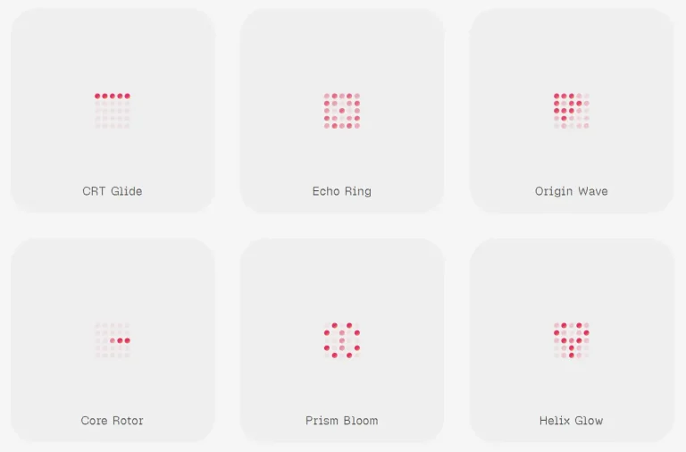
36+ Copy-paste Loading Components for React – loading-ui
A shadcn-compatible registry of 36 React loading components. Installs via CLI, lands as editable source, and works with Tailwind CSS and motion/react.
loading-ui is a custom shadcn registry of loading indicators for React/TailwindCSS/shadcn apps.
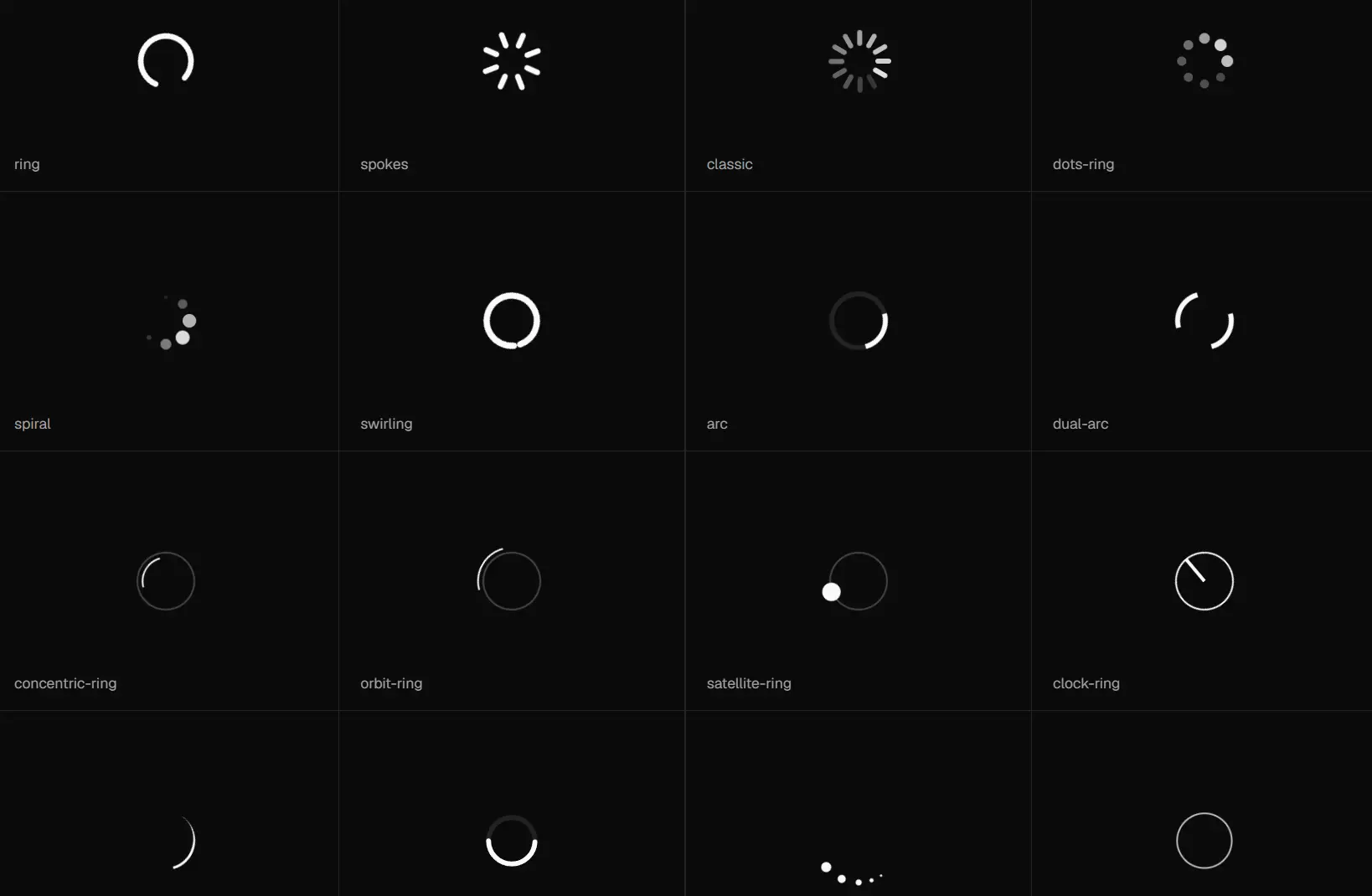
It currently provides a set of 36 loading animation components, including spinners, rings, dot sequences, text animations, orbital patterns, and skeleton-style indicators.
Each component handles a single pending state scenario.
Features
🧩 Focused Loading Components: Add pending state UI for React product screens.
🧱 shadcn Registry: Install components through the same CLI model as shadcn.
🎨 Tailwind Styling: Match spacing, size, color, and motion to your app.
🧾 Editable Code: Keep installed component files inside your project.
♿ Accessible Status Markup: Announce active loading states through screen reader text.
🧠 Motion Patterns: Communicate image analysis, typing, fetching, and waiting states.
Use Cases
- Image upload tools can show analysis progress during processing.
- Search panels can show compact loaders near updated results.
- Dashboard widgets can show section level data refresh states.
- Chat interfaces can show typing or terminal activity during response generation.
- Content editors can show skeletons during document fetches.
How to Use It
1. Your project needs React, Tailwind CSS, a components.json file, and path aliases configured for the shadcn CLI. Run the init command if components.json does not exist yet.
npx shadcn@latest init2. Add the @loading-ui registry entry to the registries section of components.json. The URL pattern is https://loading-ui.com/r/{name}.json, where {name} resolves to the component slug at install time.
{
  "$schema": "https://ui.shadcn.com/schema.json",
  "style": "base-nova",
  "tailwind": {
    "css": "app/global.css",
    "baseColor": "neutral",
    "cssVariables": true
  },
  "aliases": {
    "components": "@/components",
    "utils": "@/lib/utils",
    "ui": "@/components/ui",
    "lib": "@/lib",
    "hooks": "@/hooks"
  },
  "registries": {
    "@loading-ui": "https://loading-ui.com/r/{name}.json"
  }
}
3. Run the shadcn add command through your preferred package manager. The example below installs analyzing-image, but any available slug from the registry works the same way.
# pnpm
pnpm dlx shadcn@latest add @loading-ui/analyzing-image
# npm
npx shadcn@latest add @loading-ui/analyzing-image
# yarn
yarn dlx shadcn@latest add @loading-ui/analyzing-image
# bun
bunx --bun shadcn@latest add @loading-ui/analyzing-image
Available component slugs:
@loading-ui/arc@loading-ui/bars@loading-ui/bobbing-dots@loading-ui/bouncing-dots@loading-ui/classic@loading-ui/clock-ring@loading-ui/comet-spinner@loading-ui/concentric-ring@loading-ui/dash-ring@loading-ui/dots-ring@loading-ui/dots@loading-ui/dual-arc@loading-ui/infinity@loading-ui/orbit-ring@loading-ui/pulsating-dots@loading-ui/pulse-dot@loading-ui/pulse@loading-ui/quarter-ring@loading-ui/ring@loading-ui/ripple@loading-ui/satellite-ring@loading-ui/skeleton@loading-ui/spiral@loading-ui/spokes@loading-ui/swirling@loading-ui/terminal@loading-ui/text-blink@loading-ui/text-dots@loading-ui/text-shimmer-wave@loading-ui/text-shimmer@loading-ui/triple-dot-spinner@loading-ui/twin-orbit@loading-ui/typing@loading-ui/wandering-eyes@loading-ui/wave
4. Import the component from its installed path and drop it into any pending or loading state in your UI.
import { AnalyzingImage } from "@/components/loading-ui/analyzing-image";
export function AnalyzingImageDemo() {
  return <AnalyzingImage className="size-16" />;
}
5. Skip the CLI and copy the component source directly from the docs when your project structure differs from standard shadcn conventions. The full analyzing-image component looks like this:
// components/loading-ui/analyzing-image.tsx
"use client";
import { motion } from "motion/react";
import { cn } from "@/lib/utils";
import type { Transition } from "motion/react";
const transition: Transition = {
  duration: 2.5,
  ease: [0.175, 0.885, 0.32, 1],
  times: [0, 0.6, 0.6, 1],
  repeat: Infinity,
  repeatType: "mirror",
  repeatDelay: 0.2,
};
function AnalyzingImage({ className, ...props }: React.ComponentProps<"div">) {
  return (
    <div
      role="status"
      aria-label="Analyzing image"
      className={cn("relative isolate shrink-0", className)}
      {...props}
    >
      <motion.div
        initial={{ clipPath: "inset(0% 0% 0% 0%)" }}
        animate={{
          clipPath: [
            "inset(0% 0% 0% 0%)",
            "inset(0% 105% 0% 0%)",
            "inset(0% 105% 0% 0%)",
            "inset(0% 0% 0% 0%)",
          ],
        }}
        transition={transition}
        className="absolute inset-0 z-10 bg-[var(--loading-ui-analyzing-image-background,var(--background))]"
      >
        {/* SVG icon overlay — rendered dimmed during the scan animation */}
      </motion.div>
      <motion.div
        initial={{ transform: "translateX(1400%)" }}
        animate={{
          transform: [
            "translateX(1400%)",
            "translateX(-80%)",
            "translateX(-80%)",
            "translateX(1400%)",
          ],
        }}
        transition={transition}
        className="absolute z-10 h-full w-[7%] rounded-full bg-current"
      />
      {/* Base SVG frame — always visible */}
      <span className="sr-only">Analyzing image</span>
    </div>
  );
}
export { AnalyzingImage };
Update the import paths to match your project’s alias setup after pasting.
import { AnalyzingImage } from "@/components/loading-ui/analyzing-image";
<AnalyzingImage className="size-16" />
6. All available loading components:
| Component | Primary use |
|---|---|
| Analyzing image | Image processing and visual analysis states. |
| Arc | Curved spinner motion. |
| Bars | Bar based loading motion. |
| Bobbing dots | Soft dot movement for compact pending states. |
| Bouncing dots | Repeating dot movement for chat and inline waits. |
| Classic | Traditional spinner feedback. |
| Clock ring | Time based loading status. |
| Comet spinner | Circular motion with a moving lead point. |
| Concentric ring | Multi ring pending state motion. |
| Dash ring | Ring motion with segmented strokes. |
| Dots ring | Dot based circular loading motion. |
| Dots | Minimal dot loading state. |
| Dual arc | Two arc spinner motion. |
| Infinity | Loop shaped loading motion. |
| Orbit ring | Orbital ring motion. |
| Pulsating dots | Dots that expand and contract. |
| Pulse dot | Single dot pulse feedback. |
| Pulse | General pulse based loading feedback. |
| Quarter ring | Partial ring spinner motion. |
| Ring | Standard ring loader. |
| Ripple | Expanding ripple feedback. |
| Satellite ring | Ring motion with orbiting points. |
| Skeleton | Placeholder layout for content loading. |
| Spiral | Spiral motion for longer pending states. |
| Spokes | Radial spoke spinner. |
| Swirling | Swirl based loading motion. |
| Terminal | Command line or agent activity states. |
| Text blink | Blinking text loading feedback. |
| Text dots | Text based waiting indicator with dots. |
| Text shimmer wave | Wave shimmer text loading effect. |
| Text shimmer | Shimmer text loading effect. |
| Triple dot spinner | Three dot spinner motion. |
| Twin orbit | Dual orbit loading motion. |
| Typing | Chat and message composition state. |
| Wandering eyes | Playful visual wait state. |
| Wave | Wave based loading motion. |
Related Resources
- shadcn/ui: The registry-based component system that loading-ui builds on for CLI distribution and components.json configuration.
- motion/react: The animation library for motion primitives inside each loading-ui component.
- Tailwind CSS: The utility-first CSS framework used for all layout and color styling in loading-ui components.
- Best Loading Spinners: 15 Best Loading Spinner Plugins In JavaScript And Pure CSS
FAQs
Q: Can I use loading-ui in a project that does not use the shadcn CLI?
A: Yes. Copy the component source directly from the docs and paste it into your component directory. Update the import paths to match your project’s alias configuration.
Q: Do I need to install motion/react separately?
A: The shadcn CLI handles dependency resolution when you run the add command. Copy-paste installs need motion installed separately. Run npm install motion or the equivalent for your package manager before importing the component.
Q: How do I change the animation speed on a component?
A: Edit the transition object in the installed component file. Increase the duration value to slow the animation, or decrease it to speed it up. The ease array controls the acceleration curve through the keyframe sequence.
Q: Do loading-ui components work in the Next.js App Router?
A: Yes. Components with motion animations need the "use client" directive, and the source files ship with it already at the top. Place them inside client components or wrap them in a client boundary before use.
Q: Can I rename a component after installing it?
A: Yes. The installed file is plain source code in your project. Rename the file, update the exported function name, and update any import paths that reference the old name.