The Future of Web Dev
The Future of Web Dev
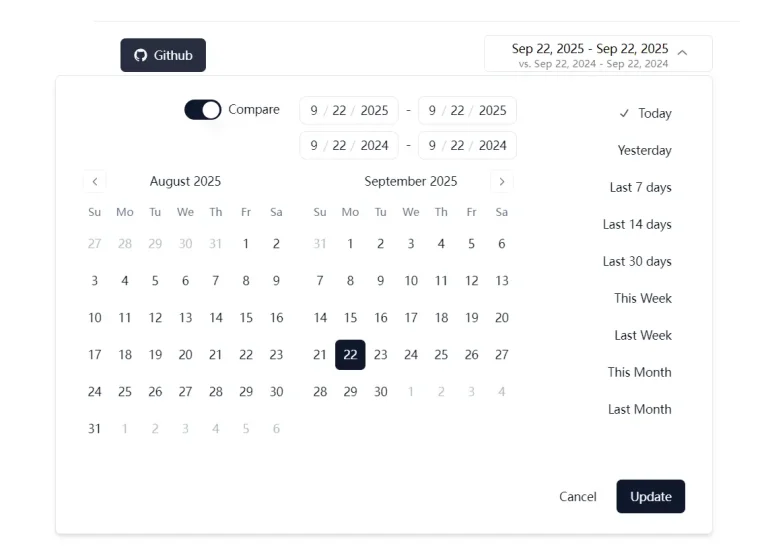
React Date Range Picker with Slider & TailwindCSS – RangeFlow
A drag-based React date range picker with quick preset tabs, a popover calendar, CSS variable theming, and TailwindCSS support.
RangeFlow is a React date range picker that creates a slider-based date selection UI with quick presets and a calendar popover.
It’s styled with the latest TailwindCSS and accepts plain JavaScript Date objects for all range values.
Features
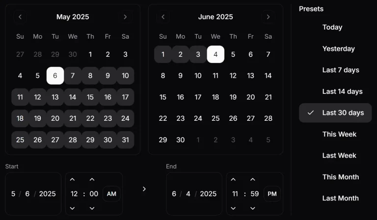
- Drag-based range slider with mouse, touch, and pointer event support.
- Quick preset tab buttons with an animated active pill indicator.
- Popover calendar with support for one or multiple visible months.
- Full color theming from a single accent CSS variable.
- Dark mode activated by a class or data attribute on the picker or any parent element.
- Slot-based customization for every visible region of the picker.
- Imperative control API for driving the picker from external buttons, forms, or URL state.
- Scoped styles contained to the picker component.
Use Cases
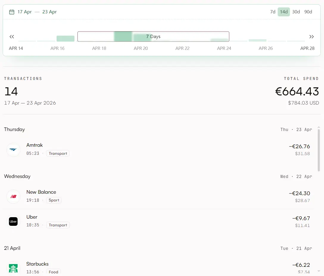
- Travel booking forms where users select check-in and check-out dates within a predefined window.
- Analytics dashboards where users filter chart data by a custom date range.
- Project management tools where teams set sprint start and end dates on a visible timeline.
- Billing or subscription forms where server submission requires hidden start and end date inputs.
How to Use It
Installation
Install RangeFlow with your preferred package manager:
npm install rangeflow
# or
yarn add rangeflow
# or
pnpm add rangeflow
Importing the Stylesheet
Import RangeFlow’s stylesheet at the root of your app, for example in main.tsx, _app.tsx, or layout.tsx:
// Import once at the application root
import 'rangeflow/style.css'
Basic Usage
Three props are required: defaultRange, defaultSelected, and onChange. Here is a minimal working picker:
import { RangeFlow } from 'rangeflow'
import 'rangeflow/style.css'
import dayjs from 'dayjs'
export function TripDatePicker() {
  return (
    <RangeFlow
      // The full visible window shown on the slider track
      defaultRange={{
        from: dayjs().subtract(2, 'week').toDate(),
        to: dayjs().add(2, 'week').toDate()
      }}
      // The initially selected range inside the window
      defaultSelected={{
        from: dayjs().toDate(),
        to: dayjs().add(5, 'day').toDate()
      }}
      // Fires on every selection change
      onChange={date => console.log('Selected range:', date.from, date.to)}
    />
  )
}
Understanding the Core Concepts
RangeFlow tracks two date layers. The range is the full visible window on the slider track. Think of it as the scale. The selected date is the range the user picks inside that window. onChange fires with the selected date, not the window.
When the user drags the slider, only the selected date changes. When the user clicks a preset tab, the window changes and the selection snaps to the new scale. Keeping these two layers separate is what makes the interaction feel natural on continuous ranges like analytics windows or booking calendars.
Props Reference
defaultRange ({ from: Date; to: Date }, required): Sets the starting visible window on the slider.
defaultSelected ({ from: Date; to: Date }, required): Sets the starting selected range. Must fit inside defaultRange.
onChange ((date: { from: Date; to: Date }) => void, required): Fires every time the selected range changes.
ranges (RangeListItem[], optional): Custom preset tabs. Each item takes { label, from, to }. Defaults to a built-in list if omitted.
duration ({ min: number; max: number }, optional): Restrictshow many days the user can select. Both min and max are day counts.
disabled ({ before?: Date; after?: Date }, optional): Disables dates before or after a given point. At least one of before or after is required.
calendar (boolean, optional, default true): Shows the popover calendar on the left side of the header. Set to false to hide it.
CalendarProps (DayPickerProps, optional): Props passed through to the inner react-day-picker calendar. Use this for multi-month display, locale settings, or custom modifiers.
Slots (Slots, optional): Replaces any visible region of the picker with your own component.
api (RangeFlowApi, optional): The object returned by useRangeFlow(). Pass it in to control the picker from outside.
Custom Preset Tabs
Pass a ranges array to replace the default tabs with your own:
import { RangeFlow } from 'rangeflow'
import dayjs from 'dayjs'
export function SprintPicker() {
  return (
    <RangeFlow
      defaultRange={{
        from: dayjs().subtract(45, 'day').toDate(),
        to: dayjs().add(45, 'day').toDate()
      }}
      defaultSelected={{
        from: dayjs().startOf('week').toDate(),
        to: dayjs().endOf('week').toDate()
      }}
      // Replace the built-in preset tabs with sprint-focused options
      ranges={[
        {
          label: 'This Week',
          from: dayjs().startOf('week').toDate(),
          to: dayjs().endOf('week').toDate()
        },
        {
          label: 'This Month',
          from: dayjs().startOf('month').toDate(),
          to: dayjs().endOf('month').toDate()
        },
        {
          label: 'This Quarter',
          from: dayjs().startOf('quarter').toDate(),
          to: dayjs().endOf('quarter').toDate()
        }
      ]}
      onChange={date => console.log('Sprint range:', date)}
    />
  )
}
Each tab click replaces the visible window with that tab’s date range. The selection then snaps to fit inside the new window.
Duration Constraints
The duration prop restricts the number of selectable days. This is useful for hotel booking UIs with minimum or maximum stay rules:
<RangeFlow
  defaultRange={{
    from: dayjs().toDate(),
    to: dayjs().add(90, 'day').toDate()
  }}
  defaultSelected={{
    from: dayjs().toDate(),
    to: dayjs().add(7, 'day').toDate()
  }}
  // Minimum 2 nights, maximum 14 nights
  duration={{ min: 2, max: 14 }}
  onChange={date => console.log('Stay duration:', date)}
/>
Disabling Dates
Pass a disabled prop to block dates before or after a boundary:
// Disable past dates — bookings from today forward only
<RangeFlow
  defaultRange={{
    from: dayjs().toDate(),
    to: dayjs().add(60, 'day').toDate()
  }}
  defaultSelected={{
    from: dayjs().toDate(),
    to: dayjs().add(7, 'day').toDate()
  }}
  disabled={{ before: dayjs().toDate() }}
  onChange={date => console.log('Future range:', date)}
/>
// Disable future dates — analytics up to today only
<RangeFlow
  defaultRange={{
    from: dayjs().subtract(60, 'day').toDate(),
    to: dayjs().toDate()
  }}
  defaultSelected={{
    from: dayjs().subtract(14, 'day').toDate(),
    to: dayjs().toDate()
  }}
  disabled={{ after: dayjs().toDate() }}
  onChange={date => console.log('Historical range:', date)}
/>
External Control with useRangeFlow
The useRangeFlow hook returns a control object. Pass it to the api prop to drive the picker from outside the component, such as from toolbar buttons, URL query params, or a parent form:
import { RangeFlow, useRangeFlow } from 'rangeflow'
import dayjs from 'dayjs'
export function AnalyticsPicker() {
  // Create the control handle outside the picker
  const rangeflow = useRangeFlow()
  return (
    <div>
      <div style={{ display: 'flex', gap: 8, marginBottom: 12 }}>
        <button
          onClick={() =>
            // Rescale the slider window to the last 30 days
            rangeflow.updateRange({
              from: dayjs().subtract(30, 'day').toDate(),
              to: dayjs().toDate()
            })
          }
        >
          Last 30 Days
        </button>
        <button
          onClick={() =>
            // Move the selection to this calendar week
            rangeflow.updateSelectedDates({
              from: dayjs().startOf('week').toDate(),
              to: dayjs().endOf('week').toDate()
            })
          }
        >
          This Week
        </button>
      </div>
      {/* Bind the control handle to the picker */}
      <RangeFlow
        api={rangeflow}
        defaultRange={{
          from: dayjs().subtract(2, 'week').toDate(),
          to: dayjs().add(2, 'week').toDate()
        }}
        defaultSelected={{
          from: dayjs().toDate(),
          to: dayjs().add(7, 'day').toDate()
        }}
        onChange={date => console.log('Analytics window:', date)}
      />
    </div>
  )
}
updateRange rescales the slider window. updateSelectedDates moves the selection inside the current window.
Slot Customization
The Slots prop accepts component overrides for every visible region of the picker. Any slot you omit keeps its default appearance:
import { RangeFlow } from 'rangeflow'
import dayjs from 'dayjs'
export function CustomSlotPicker() {
  return (
    <RangeFlow
      defaultRange={{
        from: dayjs().subtract(1, 'week').toDate(),
        to: dayjs().add(1, 'week').toDate()
      }}
      defaultSelected={{
        from: dayjs().toDate(),
        to: dayjs().add(4, 'day').toDate()
      }}
      Slots={{
        // Custom date label in the header
        SelectedDate: ({ from, to }) => (
          <span style={{ fontWeight: 700, color: '#4f46e5' }}>
            {from} → {to}
          </span>
        ),
        // Custom tab area — render your own tab component here
        RangeTabs: () => <div>My Custom Tabs</div>
      }}
      onChange={date => console.log('Selection:', date)}
    />
  )
}
The full slot interface:
RangeTabs: Replaces the quick preset tab row in the top-right of the header. Receives no props.
SelectedDate: Replaces the current selection label in the top-left of the header. Receives { from: string; to: string }.
DateTickers: Replaces the small tick marks on the slider track. Receives no props.
DateLabelsTrack: Replaces the labels shown below or above the slider. Receives no props.
SliderValueLabel: Replaces the label on the slider thumb during a drag. Receives { label: string }.
Theming
RangeFlow is themed with CSS variables. Set --rangeflow-accent on any parent element to re-skin the entire picker. Everything else derives from the accent automatically:
.analytics-dashboard {
  --rangeflow-accent: #4f46e5;
}
For finer control, override individual tokens. The full token list:
--rangeflow-accent (default #16433C): Brand color. Drives most other tokens.
--rangeflow-surface (default #ffffff light / #0a0f0c dark): Background of the picker.
--rangeflow-foreground (default #0a0f0c light / #ffffff dark): Base text color.
--rangeflow-on-accent: Text on solid accent fills. Auto-derived from the accent.
--rangeflow-bg: Inner background. Defaults to --rangeflow-surface.
--rangeflow-border: Default border. Derived from a mix of accent and surface.
--rangeflow-border-strong: Stronger border variant.
--rangeflow-shadow-color: Shadow tint.
--rangeflow-text: Main text color.
--rangeflow-text-muted: Secondary text.
--rangeflow-text-subtle: Label text.
--rangeflow-text-faint: Separators and faint labels.
--rangeflow-text-disabled: Disabled item text.
--rangeflow-hover-bg: Hover background. Derived from a light accent mix.
--rangeflow-range-bg: Background of the selected range on the slider.
--rangeflow-active-bg: Active tab pill background.
--rangeflow-accent-solid: Solid accent fills. Defaults to --rangeflow-accent.
--rangeflow-accent-solid-hover: Hover state for solid accent fills.
--rangeflow-accent-contrast: Text on solid accent. Defaults to --rangeflow-on-accent.
--rangeflow-accent-text: Tinted text, such as the selected date label.
--rangeflow-ring: Focus ring color. Defaults to --rangeflow-accent.
--rangeflow-separator: Separator lines. Derived from the accent with transparency.
--rangeflow-separator-active: Separator in the active state. Defaults to --rangeflow-accent.
--rangeflow-ticker: Tick marks on the slider. Derived from a light accent mix.
--rangeflow-today: The “today” marker on the calendar.
--rangeflow-font: Font family inside the picker. Defaults to the system font stack.
Dark Mode
Dark mode activates when the picker or any parent element carries the dark class or data-theme="dark":
// Via a Tailwind dark class on a wrapper
<div className="dark">
  <RangeFlow {...props} />
</div>
// Via a data attribute
<div data-theme="dark">
  <RangeFlow {...props} />
</div>
This works out of the box with Tailwind CSS dark mode and most theming libraries.
Form Integration
Capture the selected range as hidden inputs for standard form submission:
import { useState } from 'react'
import { RangeFlow } from 'rangeflow'
import dayjs from 'dayjs'
type DateRange = { from: Date; to: Date }
export function BookingForm() {
  const [range, setRange] = useState<DateRange>({
    from: dayjs().toDate(),
    to: dayjs().add(7, 'day').toDate()
  })
  return (
    <form onSubmit={() => submitBooking(range)}>
      <RangeFlow
        defaultRange={{
          from: dayjs().toDate(),
          to: dayjs().add(60, 'day').toDate()
        }}
        defaultSelected={range}
        // Keep local state in sync with picker changes
        onChange={setRange}
      />
      {/* Hidden inputs carry ISO date strings to the server */}
      <input type="hidden" name="checkIn" value={range.from.toISOString()} />
      <input type="hidden" name="checkOut" value={range.to.toISOString()} />
      <button type="submit">Confirm Booking</button>
    </form>
  )
}
Multi-Month Calendar
Pass CalendarProps to show two months in the popover calendar simultaneously:
<RangeFlow
  defaultRange={{
    from: dayjs().subtract(1, 'month').toDate(),
    to: dayjs().add(1, 'month').toDate()
  }}
  defaultSelected={{
    from: dayjs().toDate(),
    to: dayjs().add(10, 'day').toDate()
  }}
  // Show two calendar months side by side
  CalendarProps={{ numberOfMonths: 2 }}
  onChange={date => console.log('Extended stay:', date)}
/>
Alternatives