The Future of Web Dev
The Future of Web Dev
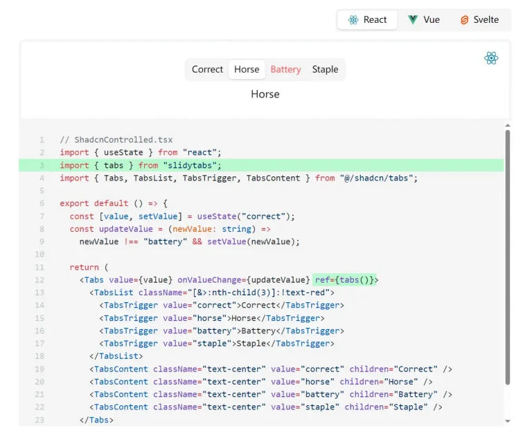
Animated shadcn/ui Tabs for Next.js Apps
Enhanced Shadcn tab component featuring smooth animations and dynamic theming. Perfect for Next.js projects with simple installation and customization.
The shadcn/ui Animated Tabs allows you to create smooth transitions when users switch between tabs in your Next.js apps.
You can use it to improve the visual feedback in your application’s tabbed interfaces. The animations provide a clear indicator of content change.
Features
🎛️ Theme Switcher Integration – Includes a complete theme switching component for easy mode toggling.
🔧 Customizable Animation Settings – Modify transition duration, easing, and effects to match your design requirements.
♿ Accessibility Maintained – Preserves keyboard navigation and screen reader support from the original Shadcn component.
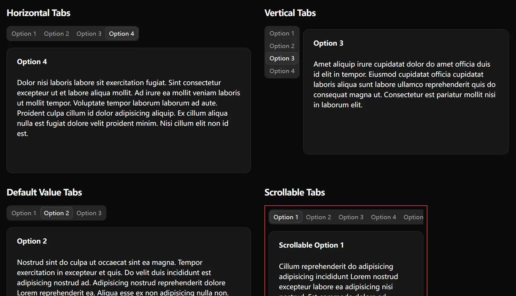
🎨 Smooth Tab Animations – Fluid transitions between tabs with customizable timing and easing functions.
🌓 Dynamic Theme Adaptation – Automatic styling adjustments for light and dark themes using CSS variables.
⚡ Next.js Optimized – Built specifically for Next.js with server-side rendering support.
Use Cases
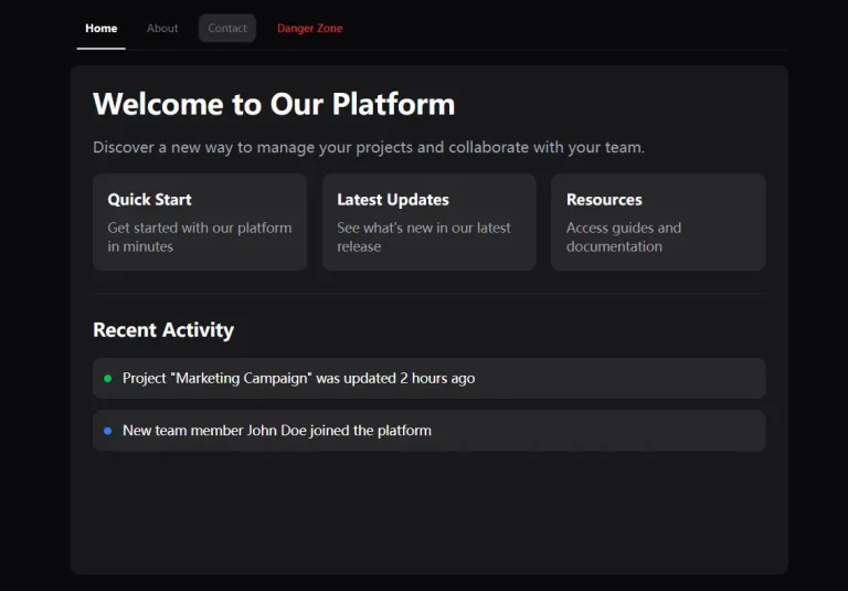
- User Dashboards You can organize different sections like profile information, settings, and notifications with clear, animated transitions.
- Product Details Pages It can separate content such as descriptions, technical specifications, and customer reviews into distinct, navigable tabs.
- Multi-Step Forms You can break down long forms into manageable sections, with animations indicating progress as a user moves from one step to the next.
- Project Management Interfaces It helps switch between different views like a Kanban board, a task list, or a calendar.
How to Use It
CLI Installation
The recommended method is to use the shadcn-ui CLI.
npx shadcn@latest add https://shadcn-ui-animated-tabs.vercel.app/r/animated-tabs.jsonThis command will add a new tabs.tsx file inside your components/ui directory.
Manual Installation
Copy the animated-tabs.tsx content into components/ui/tabs.tsx.
"use client";

import { cn } from "@/lib/utils";
import * as TabsPrimitive from "@radix-ui/react-tabs";
import * as React from "react";
import { useEffect, useRef, useState } from "react";

function Tabs({
  className,
  ...props
}: React.ComponentProps<typeof TabsPrimitive.Root>) {
  return (
    <TabsPrimitive.Root
      data-slot="tabs"
      className={cn("flex flex-col gap-2", className)}
      {...props}
    />
  );
}

const TabsList = React.forwardRef<
  React.ElementRef<typeof TabsPrimitive.List>,
  React.ComponentPropsWithoutRef<typeof TabsPrimitive.List>
>(({ className, ...props }, ref) => {
  const [indicatorStyle, setIndicatorStyle] = useState({
    left: 0,
    top: 0,
    width: 0,
    height: 0,
  });
  const tabsListRef = useRef<HTMLDivElement | null>(null);

  const updateIndicator = React.useCallback(() => {
    if (!tabsListRef.current) return;

    const activeTab = tabsListRef.current.querySelector<HTMLElement>(
      '[data-state="active"]'
    );
    if (!activeTab) return;

    const activeRect = activeTab.getBoundingClientRect();
    const tabsRect = tabsListRef.current.getBoundingClientRect();

    requestAnimationFrame(() => {
      setIndicatorStyle({
        left: activeRect.left - tabsRect.left,
        top: activeRect.top - tabsRect.top,
        width: activeRect.width,
        height: activeRect.height,
      });
    });
  }, []);

  useEffect(() => {
    // Initial update
    const timeoutId = setTimeout(updateIndicator, 0);

    // Event listeners
    window.addEventListener("resize", updateIndicator);
    const observer = new MutationObserver(updateIndicator);

    if (tabsListRef.current) {
      observer.observe(tabsListRef.current, {
        attributes: true,
        childList: true,
        subtree: true,
      });
    }

    return () => {
      clearTimeout(timeoutId);
      window.removeEventListener("resize", updateIndicator);
      observer.disconnect();
    };
  }, [updateIndicator]);

  return (
    <div className="relative" ref={tabsListRef}>
      <TabsPrimitive.List
        ref={ref}
        data-slot="tabs-list"
        className={cn(
          "bg-muted text-muted-foreground relative inline-flex h-9 w-fit items-center justify-center rounded-lg p-[3px]",
          className
        )}
        {...props}
      />
      <div
        className="absolute rounded-md border border-transparent bg-background shadow-sm dark:border-input dark:bg-input/30 transition-all duration-300 ease-in-out"
        style={indicatorStyle}
      />
    </div>
  );
});
TabsList.displayName = TabsPrimitive.List.displayName;

const TabsTrigger = React.forwardRef<
  React.ElementRef<typeof TabsPrimitive.Trigger>,
  React.ComponentPropsWithoutRef<typeof TabsPrimitive.Trigger>
>(({ className, ...props }, ref) => (
  <TabsPrimitive.Trigger
    ref={ref}
    data-slot="tabs-trigger"
    className={cn(
      "data-[state=active]:text-foreground focus-visible:border-ring focus-visible:ring-ring/50 focus-visible:outline-ring inline-flex h-[calc(100%-1px)] flex-1 items-center justify-center gap-1.5 rounded-md border border-transparent px-2 py-1 text-sm font-medium whitespace-nowrap transition-colors focus-visible:ring-[3px] focus-visible:outline-1 disabled:pointer-events-none disabled:opacity-50 [&_svg]:pointer-events-none [&_svg]:shrink-0 [&_svg:not([class*='size-'])]:size-4 z-10",
      className
    )}
    {...props}
  />
));
TabsTrigger.displayName = TabsPrimitive.Trigger.displayName;

const TabsContent = React.forwardRef<
  React.ElementRef<typeof TabsPrimitive.Content>,
  React.ComponentPropsWithoutRef<typeof TabsPrimitive.Content>
>(({ className, ...props }, ref) => (
  <TabsPrimitive.Content
    ref={ref}
    data-slot="tabs-content"
    className={cn("flex-1 outline-none mt-2", className)}
    {...props}
  />
));
TabsContent.displayName = TabsPrimitive.Content.displayName;

export { Tabs, TabsContent, TabsList, TabsTrigger };
Related Resources
- Shadcn/UI Official Documentation – Complete guide to the Shadcn component library with installation instructions and component examples.
- Framer Motion – Advanced animation library for React applications that can complement these tab animations.
- Radix UI Tabs – The underlying primitive component that powers Shadcn tabs with accessibility features.
- Next.js Documentation – Official Next.js documentation for understanding server-side rendering and optimization features.
FAQs
Q: Do the animations affect page performance or loading speed?
A: The animations use CSS transitions and transforms that are GPU-accelerated, so they have minimal impact on performance. The component respects user preferences for reduced motion and degrades gracefully on slower devices.
Q: Can I customize the animation duration and easing functions?
A: Yes, you can modify the transition properties in the component file. The animations are controlled through CSS custom properties that you can adjust to match your design requirements and timing preferences.
Q: Will this component work with existing Shadcn/UI themes and custom styling?
A: Absolutely. The animated tabs maintain full compatibility with Shadcn’s theming system and CSS variable architecture. Your existing themes and customizations will work without modification.
Q: Is keyboard navigation and accessibility support maintained in the animated version?
A: Yes, all accessibility features from the original Shadcn tabs component are preserved. Keyboard navigation, focus management, and screen reader support function exactly as expected.