The Future of Web Dev
The Future of Web Dev
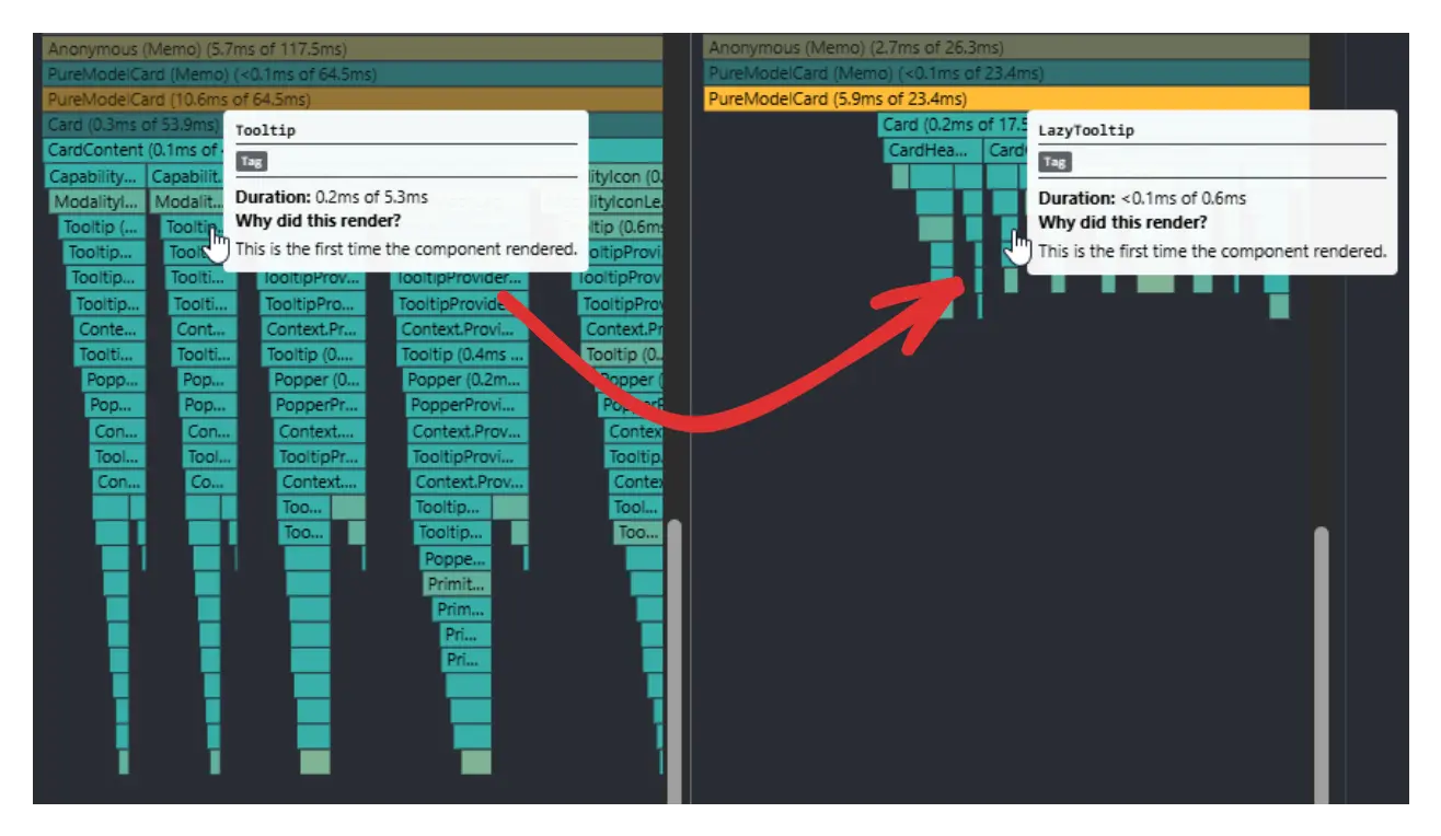
Optimize Tooltip Rendering in your App with Shadcn Lazy Tooltip Component
Optimize your app's performance with Shadcn Lazy Tooltip. Reduce initial render time by deferring tooltip mounting until user interaction.
Shadcn Lazy Tooltip is a performance optimization wrapper for the popular shadcn/ui Tooltip component.
It defers the mounting of the entire tooltip component tree until a user first interacts with the trigger element.
This optimization is useful when dealing with data-heavy interfaces like tables, grids, or lists where dozens of tooltips might be present on a single page.
Features
⚡ Lazy mounting prevents unnecessary DOM elements from rendering on initial page load.
🚀 Reduces initial render time significantly when multiple tooltips exist on the same page.
🔄 Zero behavior changes after the first user interaction with tooltip triggers.
📦 Drop-in replacement for existing shadcn/ui Tooltip implementations.
🎯 Maintains full compatibility with shadcn/ui Tooltip API and styling.
💡 Automatic event listener management for both hover and touch interactions.
How To Use It
1. To use this component, make sure you have shadcn/ui Tooltip component installed in your project.
npx shadcn-ui@latest add tooltip2. Create a new file named lazy-tooltip.tsx inside your components directory.
3. Copy and paste the following code into the components/lazy-tooltip.tsx file:
'use client';
import { useState } from 'react';
import {
  Tooltip,
  TooltipContent,
  TooltipTrigger,
} from '@/components/ui/tooltip';
export function LazyTooltip({
  children,
  content,
  asChild = true,
}: {
  children: React.ReactElement;
  content: React.ReactNode;
  asChild?: boolean;
}) {
  const [enabled, setEnabled] = useState(false);
  const triggerProps = {
    onPointerEnter: () => setEnabled(true),
    onTouchStart: () => setEnabled(true),
  } as const;
  if (!enabled) {
    return { ...children, props: { ...children.props, ...triggerProps } };
  }
  return (
    <Tooltip>
      <TooltipTrigger asChild={asChild}>
        {
          { ...children, props: { ...children.props, ...triggerProps } }
        }
      </TooltipTrigger>
      <TooltipContent>{content}</TooltipContent>
    </Tooltip>
  );
}
4. You can now import and use the LazyTooltip component in your application. It wraps a trigger element and displays the specified content upon the first hover or touch.
Here is an example of how to use it with a Button component:
import { Button } from '@/components/ui/button';
import { LazyTooltip } from '@/components/lazy-tooltip';
export function MyComponent() {
  return (
    <div className="p-8">
      <LazyTooltip content="This tooltip content appears on the first interaction.">
        <Button variant="outline">Hover Over Me</Button>
      </LazyTooltip>
    </div>
  );
}
5. Available props:
children: AReact.ReactElementthat will trigger the tooltip.content: TheReact.ReactNodeto be displayed inside the tooltip.asChild: Abooleanthat is passed to the shadcnTooltipTrigger. It defaults totrue.
Related Resources
- shadcn/ui Documentation – Official guide to shadcn/ui components and installation
- Radix UI Tooltip – The underlying primitive that powers shadcn/ui tooltips
- React Performance Optimization – Official React documentation on rendering optimization techniques
- Lazy Loading Patterns – Web.dev guide to implementing lazy loading in web applications
FAQs
Q: Does this component work with all shadcn/ui Tooltip features?
A: Yes, after the first hover interaction, the LazyTooltip behaves identically to the standard shadcn/ui Tooltip. All styling, positioning, and API features remain available.
Q: Will this break my existing tooltip implementations?
A: No, LazyTooltip is designed as a drop-in replacement. You only need to change the import statement and component name while keeping all existing props and usage patterns.
Q: How much performance improvement can I expect?
A: The improvement depends on the number of tooltips on your page. Applications with dozens of tooltips may see significant reductions in initial render time, while pages with few tooltips will see minimal impact.
Q: Is this component necessary for pages with only a few tooltips?
A: The performance benefit is most noticeable on pages with a large number of tooltips. For pages with just one or two, the standard Tooltip component is sufficient.
Q: Does this work on mobile devices?
A: Yes, the component includes touch event handling through the onTouchStart event. Mobile users can tap elements to activate tooltips just like desktop users can hover.
Q: Can I customize the tooltip content dynamically?
A: Absolutely. The content prop accepts any React node, so you can pass dynamic content, components with state, or computed values just like with regular shadcn/ui tooltips.
