The Future of Web Dev
The Future of Web Dev
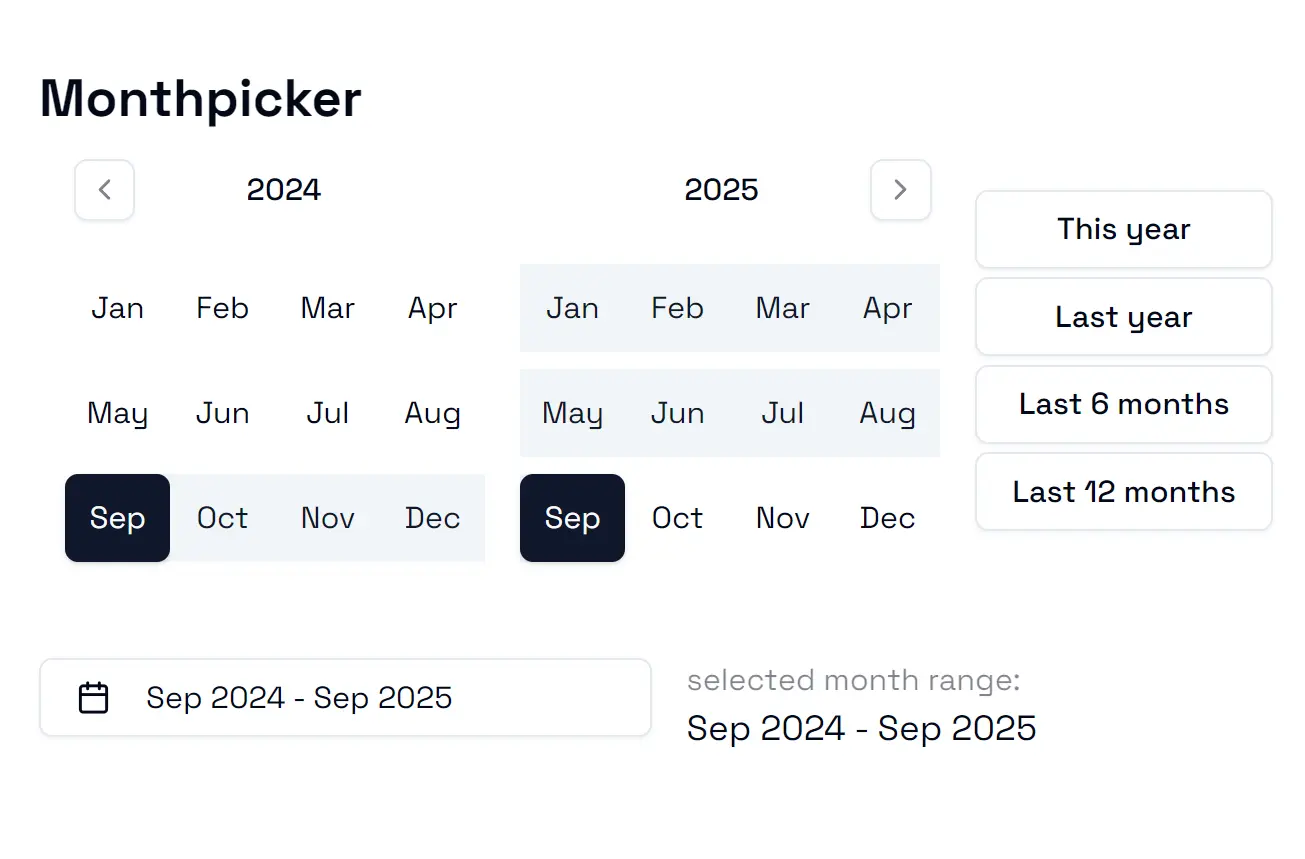
Customizable Month Picker & Month Range Picker for shadcn/ui
Add a fully customizable Month picker and Month range picker to your shadcn/ui project. Simple CLI install and extensive props for any use case.
This is a lightweight UI component library that brings month-based date selection functionality to the popular shadcn-ui design system.
The library offers two UI components: MonthPicker for selecting individual months and MonthRangePicker for choosing month ranges.
Both components use Radix primitives and Tailwind CSS for consistent styling and accessibility.
Features
⚙️ Customization options through props, callbacks, and variant styling.
🚫 Built-in date constraints with minDate, maxDate, and disabledDates support.
🔄 Navigation callbacks for year browsing with onYearForward and onYearBackward events.
⚡ Quick selection presets in MonthRangePicker for common date ranges.
♿ Accessibility features inherited from Radix UI components.
💾 State management compatibility with React hooks and form libraries.
Use Cases
- Financial reporting dashboards where users need to select reporting periods by month or quarter
- Subscription management systems for choosing billing cycles and plan duration periods
- Project management tools for setting project timelines and milestone date ranges
- Analytics platforms where users filter data by specific months or month ranges
- Content management systems for scheduling publication dates and content calendar management
How to Use It
You can add the components to your project through the shadcn-ui CLI or by manual installation. Both methods require you to have an existing shadcn-ui project.
Table Of Contents
CLI Installation
Monthpicker
npx shadcn@latest add "https://greenk.dev/r/monthpicker.json"Monthrangepicker
npx shadcn@latest add "https://greenk.dev/r/monthrangepicker.json"Add the Popover component if you do not have it already.
npx shadcn@latest add popoverManual Installation
To get started, make sure your project includes the Button and Popover components from shadcn-ui. You also need to install lucide-react for the icons.
npm install lucide-reactNext, copy the source code for the components into your project’s components folder.
Monthpicker Usage
Import Monthpicker and provide a state for the selected month. The onMonthSelect prop is a callback function that updates the state when a user selects a month.
import React from "react";
import { MonthPicker } from "@/components/ui/monthpicker";
export default function MyComponent() {
  const [month, setMonth] = React.useState<Date | undefined>();
  return <MonthPicker selectedMonth={month} onMonthSelect={setMonth} />;
}
Available Props:
onMonthSelect: A function that is called with the selectedDateobject when a user picks a month.selectedMonth: TheDateobject representing the currently selected month. This is used to initialize the component’s state.minDate: ADateobject that specifies the earliest selectable month. Any month before this date will be disabled.maxDate: ADateobject that specifies the latest selectable month. Any month after this date will be disabled.disabledDates: An array ofDateobjects. Each date in the array represents a month that will be disabled for selection.callbacks: An object containing functions to customize the display of labels. It includesyearLabelandmonthLabel.variant: An object used to apply different visual styles to the component’s buttons, such ascalendarandchevrons.onYearForward: A callback function that executes when the user navigates to the next year.onYearBackward: A callback function that executes when the user navigates to the previous year.
Monthrangepicker Usage
The Monthrangepicker requires a state object with start and end dates. The onMonthRangeSelect callback updates this state.
import React from "react";
import { MonthRangePicker } from "@/components/ui/monthrangepicker";
export default function MyRangeComponent() {
    const [dateRange, setDateRange] = React.useState<{ start: Date; end: Date } | undefined>();
    return <MonthRangePicker selectedMonthRange={dateRange} onMonthRangeSelect={setDateRange} />;
}
Available Props:
onMonthRangeSelect: A function that is called when a user completes the selection of a start and end month.onStartMonthSelect: A function that is called as soon as the user selects the first month (the start of the range).selectedMonthRange: A state object containingstartandendDateobjects for initializing the selected range.minDate: ADateobject that specifies the earliest selectable month.maxDate: ADateobject that specifies the latest selectable month.callbacks: An object containing functions to customize the display of labels, includingyearLabelandmonthLabel.variant: An object used to apply different visual styles to the component’s buttons.onYearForward: A callback function that executes when the user navigates to the next year.onYearBackward: A callback function that executes when the user navigates to the previous year.quickSelectors: An array of objects to define preset date ranges that users can select with one click.showQuickSelectors: A boolean value that toggles the visibility of the quick selectors section. It defaults totrue.
Form Integration
You can integrate both components into forms built with the shadcn-ui Form component and a validation library like Zod.
Define your schema to expect a Date for the Monthpicker or an object with start and end dates for the Monthrangepicker.
Here is a schema example for a form.
import { z } from "zod";
const FormSchema = z.object({
    single_month: z.date({
        required_error: "A month is required.",
    }),
    month_range: z.object({
        start: z.date(),
        end: z.date(),
    }),
});
You can then use the picker components inside a FormField from shadcn-ui.
Related Resources
- shadcn-ui Documentation – Official documentation for the shadcn-ui design system and component library
- Radix UI Primitives – Unstyled, accessible components that serve as the foundation for shadcn-ui components
- date-fns Documentation – Modern JavaScript date utility library for formatting and manipulating dates
- React Hook Form – Performant forms library with minimal re-renders and easy validation integration
FAQs
Q: How do I handle time zones when using these month picker components?
A: The components work with JavaScript Date objects, which include timezone information. You should handle timezone conversion in your application logic before passing dates to the components or when processing the selected dates.
Q: Can I customize the month names displayed in the picker?
A: Yes, you can customize month labels using the callbacks prop. Pass a monthLabel function that receives the month object and returns your preferred string format.
Q: Is it possible to disable specific months while keeping others selectable?
A: Yes, use the disabledDates prop with an array of Date objects representing the months you want to disable. The component will render these months as non-interactive.
