The Future of Web Dev
The Future of Web Dev
Retro Sci-Fi React Components with TailwindCSS – SCIFICN/UI
Terminal-style sci-fi React UI library with 30+ components, three runtime themes, and shadcn CLI support. Radix UI primitives handle full accessibility.
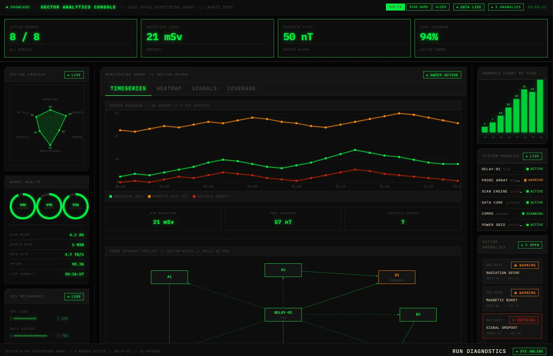
SCIFICN/UI is a retro sci-fi React UI component library that adds terminal-style panels, HUD widgets, charts, form controls, and feedback UI to your Tailwind CSS projects.
It uses Radix UI primitives for interaction logic, Tailwind CSS for styling, and the shadcn CLI for one command component import.
The design system stays consistent across hard edges, monospace typography, glow shadows, corner notches, all caps labels, and CRT-style effects.
Three built-in themes map the palette to phosphor green, holographic blue, or warm bone and amber, and the selected theme persists in localStorage.
Features
🖥️ Phosphor Terminal Aesthetic: Hard-edged panels, phosphor glow effects, CRT scanlines, and IBM Plex Mono typography replicate the visual style of 1970s and 1980s computer terminals.
🎨 Three Runtime Themes: SCI-FI (green phosphor), STAR WARS (blue holographic), and ALIEN (warm bone/amber).
🧱 30+ Copy-Paste Components: Alert, Badge, Bar Chart, Breadcrumb, Button, Card, Checkbox, Dialog, Grid, Heatmap, Input, KBD, Label, Line Chart, Node Graph, Panel, Progress, Progress Ring, Radar Chart, Select, Separator, Skeleton, Spinner, Stat Card, Status Grid, Switch, Tabs, Terminal, Textarea, Toast, Tooltip, and Typography.
🎨♿ Radix UI Accessibility: WAI-ARIA compliance, keyboard navigation, focus management, and screen reader support.
📦 shadcn CLI: Add any component with a single npx shadcn@latest add command.
🎨 Semantic Color System: Four colors map to specific states.
🔲 Zero Rounded Corners: border-radius: 0px applies globally. Panels use clip-path cutoffs at corners.
⚡ CSS-First Tailwind Config: The theme sets up through @theme {} blocks in CSS.
Use Cases
- Build a control room dashboard with status grids, charts, and alert panels.
- Style an admin console with terminal typography and hard-edge form controls.
- Create a game interface prototype with dialogs, badges, tabs, and toasts.
- Implement a monitoring screen with runtime theme switching for different visual moods.
How to Use It
Quick Start with the shadcn CLI
If shadcn is not yet initialized in your project, run this first:
npx shadcn@latest initOpen components.json and add the scificn registry entry under the registries key:
{
  "registries": {
    "scificn": "https://scificn.dev/r"
  }
}
Copy globals.css from the SCIFICN/UI repository into your project, then import it at the top of your main CSS entry point:
/* src/index.css */
@import './styles/globals.css';
Add the components you need:
npx shadcn@latest add @scificn/button
npx shadcn@latest add @scificn/panel @scificn/badge @scificn/alert
npx shadcn@latest add @scificn/dialog @scificn/toast @scificn/select
...
Import and use each component in your React code:
import { Button } from '@/ui/button'
export function MyPage() {
  return <Button variant="EXEC">INITIATE</Button>
}
Manual Installation (No shadcn CLI)
Install all required Radix UI primitives and utility packages:
npm install @radix-ui/react-slot @radix-ui/react-checkbox @radix-ui/react-select \
  @radix-ui/react-switch @radix-ui/react-dialog @radix-ui/react-tabs \
  @radix-ui/react-tooltip @radix-ui/react-toast @radix-ui/react-progress \
  @radix-ui/react-separator class-variance-authority clsx tailwind-merge
npm install -D vite-tsconfig-paths
Configure the Vite path alias in vite.config.ts so that @/* resolves to src/*:
import { defineConfig } from 'vite'
import react from '@vitejs/plugin-react'
import tsconfigPaths from 'vite-tsconfig-paths'
export default defineConfig({
  plugins: [react(), tsconfigPaths()],
})
Import globals.css into your project’s main CSS entry point. Then copy the component source file you need from src/ui/{name}/{name}.tsx into your own src/ui/ directory.
Available Themes
| Theme | Primary Color | Warning Color | Visual Style |
|---|---|---|---|
| SCI-FI (default) | #00ed3f green | #ff8800 amber | Phosphor terminal |
| STAR WARS | #1a6dff blue | #E0D5BE bone | Holographic readout |
| ALIEN | #E0D5BE bone | #ff8800 amber | Warm organic dark |
Related Resources
- shadcn/ui: The original copy-paste component system that SCIFICN/UI’s registry format builds on.
- Radix UI: The headless primitive library that backs every interactive component in SCIFICN/UI.
- Tailwind CSS: The utility-first CSS framework that SCIFICN/UI’s design token system configures through
@theme {}blocks. - class-variance-authority: The variant management library SCIFICN/UI uses to handle ALL CAPS component style variants.
FAQs
Q: Can I use SCIFICN/UI without Tailwind CSS?
A: No. The design tokens configure through CSS-first @theme {} blocks, a Tailwind CSS feature.
Q: Does the retro aesthetic compromise keyboard or screen reader accessibility?
A: No. Every interactive component builds on Radix UI primitives. These primitives handle WAI-ARIA compliance and keyboard navigation at the implementation level.
Q: Can I mix SCIFICN/UI components with standard shadcn/ui components in the same project?
A: You can, but expect style conflicts. SCIFICN/UI enforces border-radius: 0px globally via globals.css. This overrides the rounded corners that standard shadcn/ui components rely on by default.
Q: What happens when a component receives an upstream update?
A: Re-run npx shadcn@latest add @scificn/component-name to pull the latest version from the registry.
Q: Does this library work with Next.js App Router?
A: Yes. The components are client-side React primitives. Add the "use client" directive at the top of files where you import and use them.