The Future of Web Dev
The Future of Web Dev
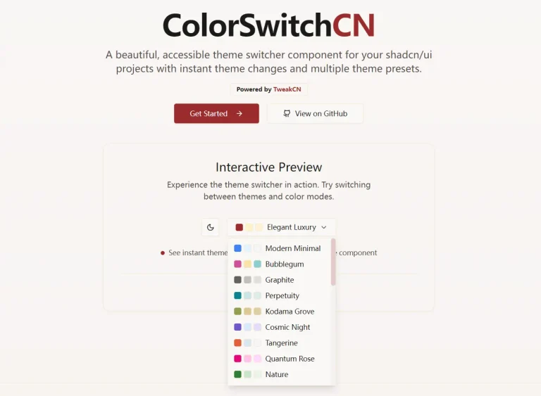
Terminal Style shadcn/ui Theme – SMUI
Add the SMUI terminal theme to any shadcn/ui project. Nord palette, zero border radius, and extended frost CSS tokens included.
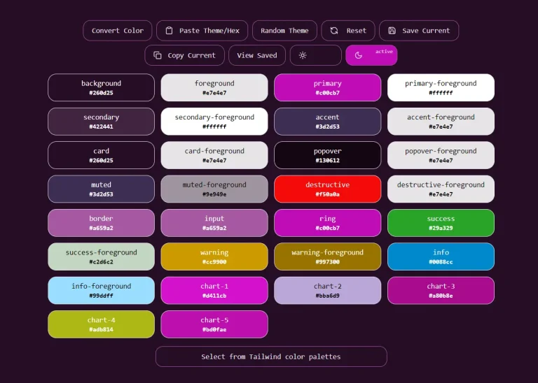
SMUI (Spacemolt UI) is a terminal-aesthetic theme for shadcn/ui that replaces the framework’s default CSS variable set with a Nord-inspired color palette, flat zero-radius borders, and JetBrains Mono as the base sans-serif font.
The theme rewires --background, --foreground, --primary, --card, and all other shadcn tokens to the Nord Snow Storm (light) and Polar Night (dark) color ranges.
Features
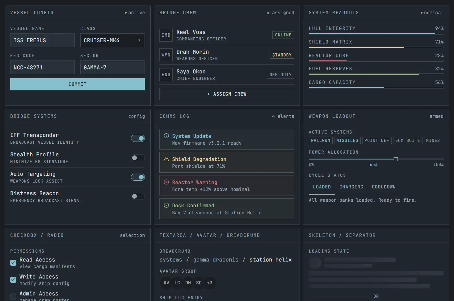
🧊 Terminal aesthetic: SMUI gives standard shadcn/ui components sharp corners, monospace typography, compact labels, and strong contrast.
🌗 Light and dark modes: It maps the theme to Snow Storm light mode and Polar Night dark mode with separate contrast tuned values.
🎨 Extended color system: You get frost blues, aurora status colors, and four surface levels for layered interfaces.
📊 Dashboard ready tokens: The theme styles chart colors and sidebar colors alongside the main semantic tokens.
✍️ Monospace first typography: JetBrains Mono becomes the default sans font, and SMUI adds label, UI, heading, stat, and hero text sizes.
📦 Fast installation: A single shadcn registry command applies the core theme tokens to your project.
🔁 Runtime accent switching: You can swap the active accent color by updating CSS variables at runtime.
🌙 Theme toggle support: SMUI works cleanly with a next-themes light and dark mode switcher.
⚡ Low visual noise: Zero border radius, no decorative softness, and clear token hierarchy keep dense layouts readable.
🆓 Public domain license: The project uses the Unlicense, so it fits commercial and personal work without license friction.
Use Cases
- Developer dashboards and admin panels where a terminal-style aesthetic fits the product design.
- Internal tools built on Next.js that need a consistent dark-mode-first visual system.
- Portfolio sites or project showcases targeting a developer audience.
- Side projects and prototypes where a pre-built theme replaces manual color tuning.
How to Use It
1. Run the shadcn CLI command to pull in the theme. This writes the Nord-inspired CSS variables directly into your project’s existing variable file.
Or copy the CSS variables from
src/globals.cssin the SMUI repository and paste them manually into your own globals file.
npx shadcn add https://smui.statico.io/r/spacemolt-theme.json2. Load the JetBrains Mono font in your root layout using next/font/google:
import { JetBrains_Mono } from "next/font/google";
const mono = JetBrains_Mono({
  subsets: ["latin"],
  weight: ["300", "400", "500", "600", "700"],
});
export default function RootLayout({ children }: { children: React.ReactNode }) {
  return (
    <html lang="en">
      <body className={mono.className}>{children}</body>
    </html>
  );
}
3. The base CLI install covers shadcn’s standard CSS variables. For frost blues, aurora status colors, and the full surface hierarchy, add the following to your globals.css:
:root {
  /* Frost blues and aurora (shared across themes) */
  --smui-frost-1: 176 25% 65%;
  --smui-frost-2: 193 44% 67%;
  --smui-frost-3: 210 34% 63%;
  --smui-frost-4: 213 32% 52%;
  --smui-red:    355 52% 64%;
  --smui-orange:  14 51% 63%;
  --smui-yellow:  40 71% 73%;
  --smui-green:   92 28% 65%;
  --smui-purple: 311 24% 63%;
  /* Light surfaces (Snow Storm) */
  --smui-surface-0: 218 27% 94%;
  --smui-surface-1: 218 27% 92%;
  --smui-surface-2: 219 28% 88%;
  --smui-surface-3: 219 20% 82%;
  --smui-border-hover: 219 15% 68%;
}
.dark {
  /* Dark surfaces (Polar Night) */
  --smui-surface-0: 213 16% 12%;
  --smui-surface-1: 217 16% 15.5%;
  --smui-surface-2: 216 15% 19%;
  --smui-surface-3: 215 14% 22%;
  --smui-border-hover: 216 12% 37%;
}
Then register the tokens in your Tailwind @theme inline block so they become available as utility classes:
@theme inline {
  --color-smui-frost-1: hsl(var(--smui-frost-1));
  --color-smui-frost-2: hsl(var(--smui-frost-2));
  --color-smui-frost-3: hsl(var(--smui-frost-3));
  --color-smui-frost-4: hsl(var(--smui-frost-4));
  --color-smui-red:     hsl(var(--smui-red));
  --color-smui-orange:  hsl(var(--smui-orange));
  --color-smui-yellow:  hsl(var(--smui-yellow));
  --color-smui-green:   hsl(var(--smui-green));
  --color-smui-purple:  hsl(var(--smui-purple));
  --color-smui-surface-0:     hsl(var(--smui-surface-0));
  --color-smui-surface-1:     hsl(var(--smui-surface-1));
  --color-smui-surface-2:     hsl(var(--smui-surface-2));
  --color-smui-surface-3:     hsl(var(--smui-surface-3));
  --color-smui-border-hover:  hsl(var(--smui-border-hover));
}
Add the typography scale in a separate, non-inline @theme block. The non-inline declaration is required for these variables to emit actual CSS custom property output:
@theme {
  --text-label:   11px;
  --text-ui:      13px;
  --text-heading: 22px;
  --text-stat:    26px;
  --text-hero:    42px;
}
Related Resources
- shadcn/ui: The component library SMUI themes. Install components via the shadcn CLI, and they adopt SMUI’s CSS variables automatically.
- Nord Color Palette: The original Nord color system that SMUI’s palette draws from.
- JetBrains Mono: The monospace typeface SMUI sets as
font-sansacross all components.
FAQs
Q: Does SMUI work with projects that don’t use Next.js?
A: Yes. The CSS variables work in any project running shadcn/ui.
Q: What happens to existing shadcn component styles after installing SMUI?
A: SMUI overwrites the CSS variable values that shadcn components already reference. The component markup and class names remain unchanged. Every installed shadcn component picks up the new palette automatically once the variables are in place.
Q: Is the extended palette required to use SMUI?
A: No. The base CLI install covers all standard shadcn tokens. The extended palette adds frost blue utilities, aurora status colors, and surface hierarchy variables that are useful in complex layouts but entirely optional for basic usage.
Q: Can I customize accent colors after installing the theme?
A: Yes. SMUI supports runtime accent color switching. Override --primary and related tokens in your CSS, or apply a custom class at the root level to change the active accent without touching the theme file itself.
Q: How does SMUI handle border radius across all components?
A: The theme sets --radius to 0rem, which shadcn components read as their border radius value. All components render with flat, sharp corners. To restore rounded corners on a specific component, override the radius variable at the component or container level in your own CSS.