The Future of Web Dev
The Future of Web Dev
Ambar UI: 45+ Svelte UI Components with Tailwind CSS
Build modern Svelte web projects with Ambar UI components for forms, overlays, charts, sidebars, themes, and Tailwind CSS projects.
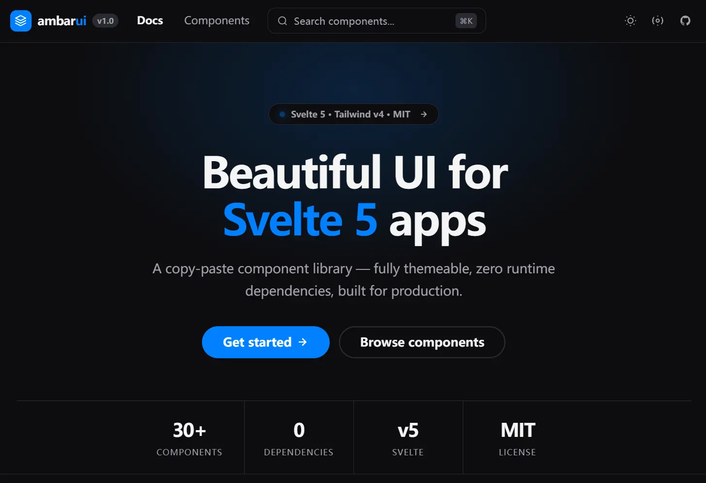
Ambar UI is a Svelte component library that provides 45+ UI components for Svelte + Tailwind CSS web projects, including form controls, overlays, layout primitives, display elements, and charts.
Each component lives as a single .svelte file. You can add selected components with the CLI, edit the source inside your project, and customize visual tokens through Tailwind CSS variables.
Features
- Copy individual Svelte components into your project.
- Install selected components with the CLI.
- Build forms with buttons, inputs, selects, switches, and textareas.
- Render charts for bars, lines, donuts, heatmaps, candlesticks, live prices, and sparklines.
- Add overlays such as dialogs, drawers, dropdowns, popovers, sheets, toasts, and tooltips.
- Create layouts with accordions, sidebars, tabs, breadcrumbs, avatars, and stack primitives.
- Customize themes through Tailwind CSS variables.
- Use Svelte runes inside single-file components.
- Keep runtime dependencies at zero.
- Support keyboard interaction, ARIA roles, and focus handling.
Use Cases
- Building admin dashboards that combine a collapsible sidebar, data tables, and interactive charts in a SvelteKit application.
- Quickly scaffolding a form‑heavy interface with styled inputs, selects, checkboxes, and validation hints.
- Adding real‑time data visualisation to a monitoring panel by connecting a WebSocket feed to the candlestick or sparkline chart.
- Implementing overlay workflows such as confirmation dialogs, slide‑out drawers, and tooltip help across multiple pages.
How To Use It
Installation
Use the CLI path for the copy-paste workflow. It initializes theme files, stores, and component files in your SvelteKit project.
# Add Ambar UI theme files and stores to the project.
npx ambar-ui@latest init
# Copy selected components into src/lib/components/.
npx ambar-ui@latest add button input select dialog toast realtime
Ambar UI uses Tailwind CSS v4. Your app.css should import Tailwind and define theme variables through @theme inline.
/* src/app.css */
/* Load Tailwind CSS v4. */
@import 'tailwindcss';
/* Define the design tokens used by Ambar UI components. */
@theme inline {
  --color-accent: oklch(0.62 0.19 260);
}
Some components depend on other files. For example, Button uses Spinner, and Toast uses the toast store. The CLI handles these dependencies when you add components.
Basic Usage
This example renders a small account form with Input, Select, and Button components copied into the local component folder.
<script lang="ts">
  // Import local component files copied by the Ambar UI CLI.
  import Button from '$lib/components/Button.svelte';
  import Input from '$lib/components/Input.svelte';
  import Select from '$lib/components/Select.svelte';
  // Svelte 5 runes keep form state local and reactive.
  let email = $state('');
  let role = $state('editor');
  // Select options use value and label pairs.
  const roleOptions = [
    { value: 'editor', label: 'Editor' },
    { value: 'manager', label: 'Manager' },
    { value: 'owner', label: 'Owner' }
  ];
  function saveProfile() {
    console.log({ email, role });
  }
</script>
<section class="max-w-md space-y-4">
  <Input
    label="Work email"
    type="email"
    placeholder="[email protected]"
    bind:value={email}
  />
  <Select
    label="Team role"
    options={roleOptions}
    bind:value={role}
  />
  <Button onclick={saveProfile}>
    Save profile
  </Button>
</section>
Example 1: Build a Settings Drawer
Use Drawer, Switch, Select, and Button for compact settings panels in dashboards or account pages.
<script lang="ts">
  import Button from '$lib/components/Button.svelte';
  import Drawer from '$lib/components/Drawer.svelte';
  import Select from '$lib/components/Select.svelte';
  import Switch from '$lib/components/Switch.svelte';
  let open = $state(false);
  let emailAlerts = $state(true);
  let themeMode = $state('system');
  const themeOptions = [
    { value: 'light', label: 'Light' },
    { value: 'dark', label: 'Dark' },
    { value: 'system', label: 'System' }
  ];
</script>
<Button onclick={() => (open = true)}>
  Open settings
</Button>
<Drawer
  open={open}
  onClose={() => (open = false)}
  title="Workspace settings"
  side="right"
  size="md"
>
  <div class="space-y-5">
    <!-- Bind the switch to a local boolean setting. -->
    <Switch
      bind:checked={emailAlerts}
      label="Email alerts"
      hint="Send updates for billing and team activity."
    />
    <!-- Use a searchable select when the option list grows. -->
    <Select
      bind:value={themeMode}
      label="Theme mode"
      options={themeOptions}
    />
    <Button fullWidth onclick={() => (open = false)}>
      Apply changes
    </Button>
  </div>
</Drawer>
Example 2: Add Toast Feedback to a Form
Use the Toast component once in your root layout and call the toast store from any form or action handler.
<!-- src/routes/+layout.svelte -->
<script lang="ts">
  // Render the toast container once near the app root.
  import Toast from '$lib/components/Toast.svelte';
</script>
<slot />
<Toast />
<!-- src/routes/account/+page.svelte -->
<script lang="ts">
import Button from '$lib/components/Button.svelte';
import Input from '$lib/components/Input.svelte';
import { toastStore } from '$lib/stores/toast.svelte';
let displayName = $state('');
function updateAccount() {
if (!displayName.trim()) {
// Show an error message for invalid form state.
toastStore.show('Add a display name before saving.', 'error');
return;
}
// Show success feedback after local validation.
toastStore.show('Account details saved.', 'success');
}
</script>
<div class="max-w-sm space-y-4">
<Input
label="Display name"
bind:value={displayName}
placeholder="Taylor Morgan"
/>
<Button onclick={updateAccount}>
Update account
</Button>
</div>Example 3: Stream Live Data into a Realtime Chart
Use RealtimeLineChart for live metrics from WebSocket, REST polling, or simulated data. The chart accepts a latestPrice prop for external values and tickMs for the update interval. ([Ambar UI][2])
<script lang="ts">
  import { onMount } from 'svelte';
  import RealtimeLineChart from '$lib/components/RealtimeLineChart.svelte';
  let activeUsers = $state(1280);
  onMount(() => {
    // Replace this timer with a WebSocket or polling call in production.
    const timer = setInterval(() => {
      activeUsers = Math.max(900, activeUsers + Math.round(Math.random() * 80 - 35));
    }, 1000);
    // Clean up the data source when the component leaves the page.
    return () => clearInterval(timer);
  });
</script>
<RealtimeLineChart
  label="Active users"
  initialPrice={1280}
  latestPrice={activeUsers}
  tickMs={1000}
  points={90}
  height={260}
/>
Available UI Components
Charts: Bar, Candlestick, Donut, Heatmap, Line, Realtime (WebSocket‑ready), Sparkline
Inputs: Button, Checkbox, Input, OTP Input, Radio, Search, Select, Slider, Switch, Textarea
Overlay: Dialog, Drawer, Dropdown, Popover, Sheet, Toast, Tooltip
Layout: Accordion, Avatar, Breadcrumb, Sidebar, Tabs, Flex, Grid, HStack, VStack
Display: Empty State, Link, List, Progress, Skeleton, Spinner, Typography
Alternatives and Related Resources
- Build Accessible Svelte UIs with Bits UI Headless Components
- 200+ Components for Building Interactive Svelte Apps
- 50+ Svelte 5 UI Blocks with Tailwind CSS and shadcn/ui
- Advanced Svelte UI Components – more-shadcn-svelte
- Enhance Shadcn-Svelte with Additional UI Components
FAQs
Q: Should I use the CLI or npm package?
A: Use the CLI when you want local component files in src/lib/components/. The repository also lists an npm package path, but the copy-paste workflow gives you direct control over the source.
Q: Why do my components look unstyled?
A: Check src/app.css first. Ambar UI expects Tailwind CSS v4 and theme variables declared through @theme inline.
Q: How do I use Ambar UI in SvelteKit layouts?
A: Put shared components such as Toast, theme controls, and navigation components in +layout.svelte. Page-level forms, charts, and overlays can stay inside route components.
Q: Can I feed real WebSocket data into the real-time chart?
A: Yes. Pass the latest numeric value into latestPrice, set tickMs to match your feed interval, and close the WebSocket inside the onMount cleanup function.