The Future of Web Dev
The Future of Web Dev
Fluid Tailwind CSS: Responsive Design Made Easy
Enhance your Tailwind CSS projects with Fluid. Master responsive design techniques and create adaptive layouts easily.
Fluid Tailwind CSS is a plugin that extends Tailwind’s utility-first approach with smooth scaling between breakpoints. It uses modern CSS clamp() functions to create fluid responsive designs without writing complex media queries or custom CSS.
TailwindCSS V4 Version is now available here.
This plugin allows developers to create designs where spacing, font sizes, and other properties scale smoothly. You gain more control over the user interface across various devices. Instead of manually adjusting styles for every breakpoint, you can define a range, and Fluid handles the transitions.
Features
🔄 Universal Compatibility – Works with every utility in Tailwind CSS, including those from other plugins.
🔗 First-Class tailwind-merge Support – Integrates with tailwind-merge through an official plugin.
⚙️ Advanced Flexibility – Handles complex use cases with custom breakpoints and container queries
🧠 Full IntelliSense Support – Get code completion and suggestions in your editor for all fluid utilities.
🔍 Accessibility Compliance – Ensures fluid typography meets WCAG Success Criterion 1.4.4 requirements.
Use Cases
Responsive Typography System
Create a typography system that scales text sizes smoothly between mobile and desktop. Instead of text jumping from small to large at specific breakpoints, text grows proportionally as the viewport expands. This creates a more polished user experience and maintains visual harmony across all screen sizes.
Adaptive UI Components
Build UI components like buttons, cards, and navigation elements that maintain their visual proportions across devices. Padding, margins, and other spacing values can scale fluidly, ensuring components never look too cramped on small screens or too sparse on large displays.
Container-Aware Layouts
With the container query support, you can create layouts that respond to their parent container’s width rather than the viewport. This is particularly useful for reusable components that need to adapt to different contexts within your application, such as sidebars, widgets, or content sections.
Responsive Data Visualizations
Data visualizations often need precise spacing adjustments at different screen sizes. Fluid utilities allow charts, graphs, and other data displays to maintain readability and visual clarity across all devices by scaling elements proportionally.
Installation
1. Install the fluid-tailwind package via npm:
npm install -D fluid-tailwind2. Add the plugin to your Tailwind configuration file. The custom extractor enables the new ~ modifier in your Tailwind classes:
import fluid, { extract } from 'fluid-tailwind'
export default {
  content: {
    files: [/* your content files */],
    extract
  },
  plugins: [
    fluid
  ]
}
3. For proper functionality, your configuration should use rem-based measurements:
import fluid, { extract, screens, fontSize } from 'fluid-tailwind'
export default {
  // ...
  theme: {
    screens, // Tailwind's default screens, in rem
    fontSize, // Tailwind's default font sizes, in rem (including line heights)
    extend: {
      screens: {
        xs: '20rem'
      }
    }
  },
  // ...
}
Basic Usage
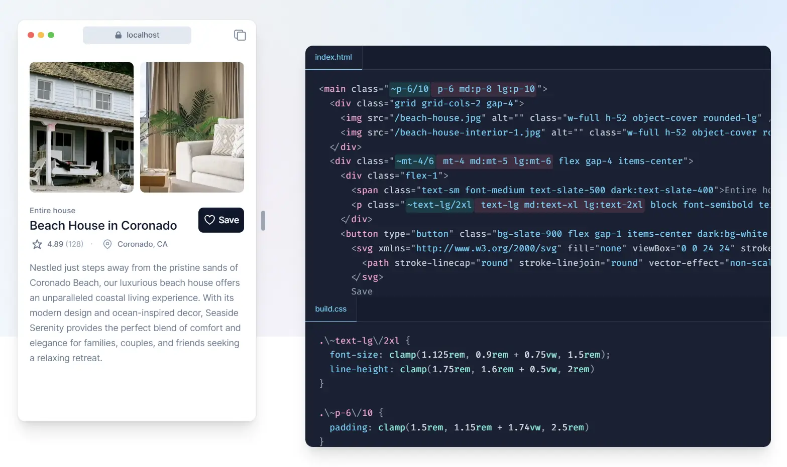
The core concept is simple: use the ~ modifier to make any utility fluid, and specify start/end values with a slash:
<button class="bg-sky-500 ~px-4/8 ~py-2/4 ~text-sm/xl rounded-full font-semibold text-white">
  Fluid button
</button>
In this example:
~px-4/8means padding-x scales from 4 units to 8 units~py-2/4means padding-y scales from 2 units to 4 units~text-sm/xlmeans text size scales from sm to xl
The plugin automatically handles the scaling between your smallest and largest screen breakpoints.
Custom Breakpoints
You can customize when the scaling begins and ends:
<h1 class="~md/lg:~text-base/4xl">Quick increase</h1>This scales text from base size to 4xl between the md and lg breakpoints.
You can also set just one breakpoint, letting the other default:
<div class="~md:~text-base/4xl">
<!-- Start at md, end at default largest breakpoint -->
<div class="~/lg:~text-base/4xl">
<!-- Start at default smallest breakpoint, end at lg -->Container Queries
For components that should respond to their container rather than the viewport:
<h1 class="~@md/lg:~text-base/4xl">Relative to container</h1>This scales text between container sizes rather than viewport sizes.
Related Resources
- Tailwind CSS Official Documentation: (https://tailwindcss.com/docs): Get the complete guide to Tailwind CSS.
- tailwindcss-container-queries: (https://github.com/tailwindlabs/tailwindcss-container-queries): If you have this official container query, you can make fluid utilities scale between the nearest
@containerwidths. - tailwind-merge: (https://github.com/dcastil/tailwind-merge):
fluid-tailwindofficially supportstailwind-mergevia a plugin.
FAQs
Q: How does Fluid handle accessibility?
A: By default, the plugin checks if fluid type settings would fail WCAG Success Criterion 1.4.4. You can disable this with checkSC144: false.
Q: Does Fluid support container queries?
A: Yes, if you use the official Tailwind CSS container queries plugin, Fluid can scale utilities relative to container widths.
Q: What units does Fluid support?
A: Due to CSS restrictions, use only length literals, i.e. 1rem, with the same unit.
Q: What are the limitations of fluid utilities?
A: Fluid utilities require that start/end values and breakpoints use the same unit (e.g., all rem or all px). You cannot mix units, use calc() expressions, or apply fluid scaling to non-length properties like colors.
Q: How do I debug fluid utility issues?
A: When a fluid utility fails, it outputs an empty rule with a comment explaining the reason. You can see these by hovering over classes with the Tailwind IntelliSense plugin or by inspecting the empty rules in your browser’s developer tools.
Q: Can I use negative values with fluid utilities?
A: Yes. To negate fluid utilities, place the dash after the fluid ~ modifier, like ~-mt-3/5 which would scale a negative margin-top from -3 to -5 units.
Q: Does this work with arbitrary values?
A: Yes, but with some syntax considerations. For arbitrary breakpoints, use ~min-[] syntax, like ~min-[20rem]/lg:~text-base/4xl.
See It In Action
