The Future of Web Dev
The Future of Web Dev
React & Next.js Toast Notifications Made Easy with Vyrn Toast
Vyrn Toast is a modern, customizable toast notification library built for React and Next.js projects.
The library allows you to implement user-friendly, non-intrusive notifications in your web applications. It supports six screen positions, four built-in toast types, and three animation types while maintaining a 5KB bundle size.
Features
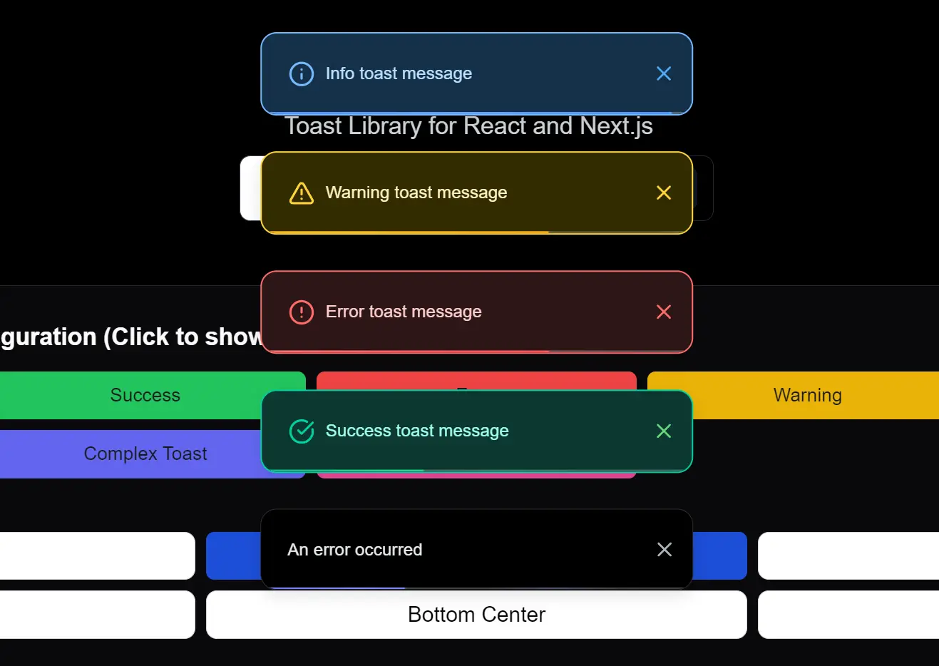
🎨 Extensive Customization: Modify styles, positions, and toast types to match your application’s aesthetic. Choose from pre-built types like success, error, warning, and info, or create fully custom designs.
♿ Accessibility Focused: Built with accessibility in mind, ensuring notifications are usable for all users.
⚡ Lightweight Footprint: Vyrn Toast is designed to be lightweight, minimizing any impact on your application’s performance.
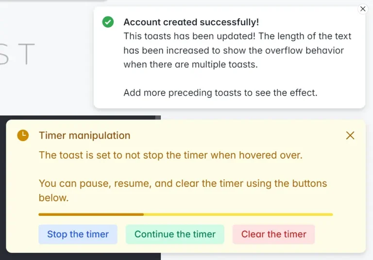
⏳ Progress Indication: Optionally display a countdown progress bar within toasts to visually indicate their duration.
📍 Flexible Positioning: Display toasts in various screen locations, including top-left, top-center, top-right, bottom-left, bottom-center, and bottom-right.
💪 TypeScript Support: Enjoy the benefits of type safety and improved developer experience with comprehensive TypeScript support.
🎬 Smooth Animations: Incorporate subtle and smooth animations for toast appearance and disappearance, enhancing the user experience.
🗂️ Toast Stacking: Manage multiple notifications effectively with stackable or non-stackable layouts. Control how toasts appear when multiple are triggered.
Use Cases
- Form Submission Feedback: Inform users about the status of form submissions. Display a success toast upon successful submission or an error toast if there are issues, guiding them to correct errors.
- Action Confirmation: Provide immediate visual confirmation after user actions, such as saving data, deleting items, or adding products to a cart. Use success toasts to reinforce positive interactions.
- System Notifications: Deliver important system-level messages, warnings, or information updates to users in a non-intrusive manner. Employ warning or info toasts for these scenarios.
- Real-time Updates: Show real-time updates or notifications, such as new messages in a chat application or changes in data, keeping users informed without interrupting their workflow.
- Custom Interactive Notifications: Create complex toasts with interactive elements like buttons or input fields for more engaging user interactions, going beyond simple informational messages.
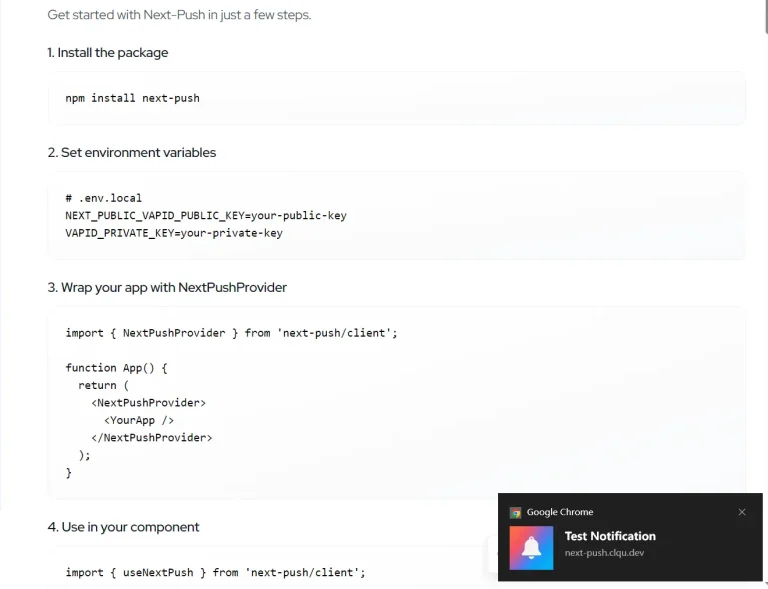
Installation
Install Vyrn Toast using npm or yarn:
npm install vyrnor
yarn add vyrnUsage
1. Set up the Provider: Wrap your application layout with the ClientToastProvider. This initializes the toast context for your application.
// In your app/layout.tsx
"use client";
import { ClientToastProvider } from "vyrn";
export default function RootLayout({ children }) {
  return (
    <ClientToastProvider
      position="bottom-center"
      swipeDirection="left"
      maxToasts={5}
      layout="stack"
      showCloseButton={false}
      showProgressBar={true}
      color={true}
    >
      {children}
    </ClientToastProvider>
  );
}
2. Implement Toasts in Components: Utilize the useToast hook in your React components to trigger toast notifications.
// Example component file (e.g., app/components/MyComponent.tsx)
"use client";
import { useToast } from "vyrn";
export default function MyComponent() {
  const toast = useToast();
  const showToasts = () => {
    toast.success("Success message");
    toast.error("Error message");
    toast.warning("Warning message");
    toast.info("Info message");
    toast.custom(
      <div className="font-bold">Custom styled toast</div>,
      {
        className: "bg-white text-black border-l-4 border-purple-500",
        duration: 5000
      }
    );
    toast.custom(
      <div>
        <h3>Complex Toast</h3>
        <p>With actions and input</p>
      </div>,
      {
        className: "bg-gray-100 text-gray-800 border-l-4 border-blue-500",
        duration: 0,
        actions: [
          {
            label: "Action",
            onClick: () => console.log("Action clicked"),
            className: "bg-blue-500 text-white px-2 py-1 rounded"
          }
        ]
      }
    );
  };
  return (
    <button onClick={showToasts}>
      Show Toasts
    </button>
  );
}
Provider Configuration
| Prop | Type | Default | Description |
|---|---|---|---|
position | 'top-left' | 'top-center' | 'top-right' | 'bottom-left' | 'bottom-center' | 'bottom-right' | 'bottom-center' | Position where toasts appear. |
swipeDirection | 'right' | 'left' | 'up' | 'down' | 'left' | Swipe direction to dismiss toast. |
maxToasts | number | 5 | Maximum number of visible toasts. |
layout | 'stack' | 'normal' | 'stack' | Display mode for multiple toasts. |
showCloseButton | boolean | false | Show a close button on toasts. |
showProgressBar | boolean | true | Show a countdown progress bar. |
color | boolean | true | Enable color styling for toasts. |
Toast Methods
| Method | Arguments | Description |
|---|---|---|
toast.success | (content, options?) | Shows a success toast with green styling. |
toast.error | (content, options?) | Shows an error toast with red styling. |
toast.warning | (content, options?) | Shows a warning toast with yellow styling. |
toast.info | (content, options?) | Shows an info toast with blue styling. |
toast.custom | (content, options?) | Displays a custom styled toast. |
Toast Options
| Option | Type | Default | Description |
|---|---|---|---|
duration | number | 5000 | Duration in ms before auto-dismiss (0 = no auto-dismiss). |
className | string | - | Custom CSS classes for styling. |
animation | 'slide' | 'fade' | 'zoom' | 'slide' | Choose an animation effect. |
Related Resources
- react-toastify: A popular React toast notification library offering a wide range of features and customization options. https://github.com/fkhadra/react-toastify
- Sonner: A simple and opinionated toast component for React. Focuses on ease of use and a clean API. https://github.com/emilkowalski/sonner
- MUI Snackbar: Material UI’s Snackbar component provides a simple way to display brief messages. Part of a comprehensive UI component library. https://mui.com/material-ui/react-snackbar/
- Chakra UI Alert: Chakra UI’s Alert component can be used for toast-like notifications, offering style consistency within the Chakra UI ecosystem. https://chakra-ui.com/docs/components/alert
FAQs
Q: Can I customize the appearance of the toasts?
A: Yes, Vyrn Toast offers extensive customization. You can modify styles using CSS classes, customize pre-built toast types, and create completely custom toast designs to match your application’s branding.
Q: Is Vyrn Toast compatible with Next.js server-side rendering?
A: Vyrn Toast is designed for client-side rendering in Next.js. Ensure you use "use client"; directive in components utilizing the useToast hook and ClientToastProvider as shown in the usage examples.
Q: Can I control how long notifications stay visible?
A: Yes, duration is customizable per toast, with options for permanent display and manual dismissal.
Q: Can I control the position and stacking behavior of toasts?
A: Yes, you have full control over toast positioning using the position prop in ClientToastProvider. You can also manage how multiple toasts are displayed using the layout prop, choosing between stacked or normal layouts.
Preview