The Future of Web Dev
The Future of Web Dev
Accessible React Component Library with shadcn – Pittaya UI
React/Next.js component library for Tailwind projects with CLI install, accessible UI components, and local source files.
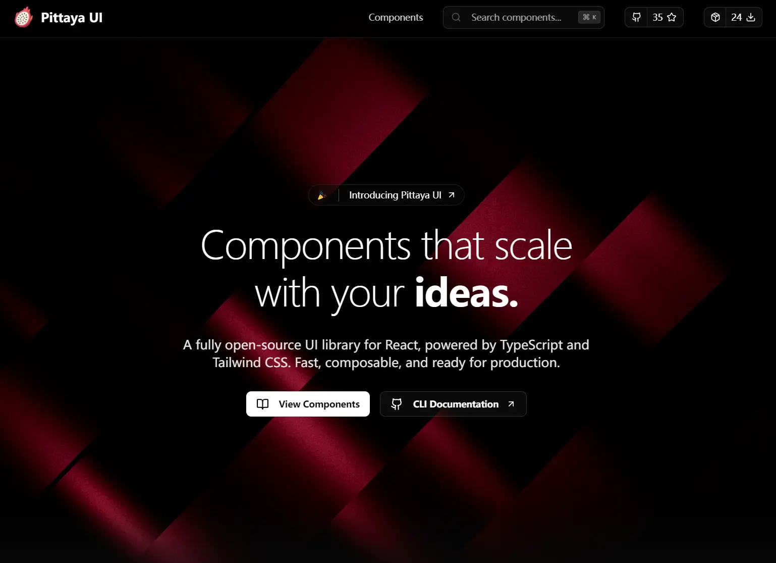
Pittaya UI is an open-source collection of 20+ production-ready UI components built on TypeScript, Tailwind CSS, Shadcn UI, and Next.js.
You can initialize the UI component library through a CLI that records your global CSS path, component alias, utils alias, and React Server Components setting.
Each component arrives in your source tree as an editable file.
Features
🧩 23+ UI Components: Buttons, Badges, Carousels, Multi-Select, Copy Button, Orbit Images, and more are copy-ready for any project.
⚡ CLI Installation: One command adds any component with its dependencies and styles pre-configured.
♿ Accessibility Built-In: All components sit on Radix UI primitives with full ARIA attributes, keyboard navigation, and screen reader support.
🔷 Full TypeScript Coverage: Every component and variant ships with complete type definitions and IntelliSense autocomplete.
🎨 Tailwind CSS: All styles run through Tailwind utility classes and stay fully editable from your own project files.
🔀 Multi-Variant System: Class Variance Authority handles multiple visual and behavioral variants per component.
📱 Mobile-First Layout: Every component is built on a mobile-first approach and scales across screen sizes.
🌙 Theme Management: Next Themes handles dark and light mode switching across the full component set.
Use Cases
- Launch a marketing site with badges, cards, buttons, and orbit image sections.
- Create an admin panel with tabs, selects, progress bars, and popovers.
- Add typed form controls to a React product app with inputs, checkboxes, switches, and textareas.
- Publish a component docs site with preview panels, code snippets, and copy actions.
How to Use It
1. Check these prerequisites before running the CLI:
- Node.js 14 or higher
- npm, yarn, or pnpm
- React 16.8 or higher
2. Pittaya UI builds on top of Shadcn UI. Start by following the Shadcn installation guide to scaffold your project. If your project already runs Shadcn, skip this step.
3. Run the Pittaya CLI from your project root:
npx pittaya init4. The CLI walks you through several configuration prompts:
Welcome to Pittaya UI!
✔ Which style would you like to use? › Default
✔ Where is your globals.css file? … app/globals.css
✔ Use React Server Components? … yes
✔ Path for components? … @/components
✔ Path for utils? … @/lib/utils
✔ components.json created successfully!
✔ Dependencies installed!
✅ Pittaya UI configured successfully!
5. Add a specific component by name:
npx pittaya add button6. Or add the entire component set at once:
npx pittaya add --all7. Import a component directly from its local path:
import { Button } from "@/components/pittaya/ui/button";
export default function App() {
  return <Button>Click me</Button>;
}
8. Customizing Component Styles. All components use Tailwind CSS utility classes. Open any component file under @/components/pittaya/ui/ and edit the class strings directly. Tailwind Merge prevents class conflicts when you add utilities on top of the defaults.
9. All UI components included:
| Component | Description |
|---|---|
| Announcement Badge | Displays short highlight text near headings or hero content. |
| Avatar | Renders profile or brand images. |
| Badge | Renders compact status labels. |
| Button | Renders clickable actions. |
| Card | Groups related content in a bordered container. |
| Carousel | Cycles through slide based content. |
| Checkbox | Renders boolean form input. |
| Command | Renders command style search or action panels. |
| Copy Button | Copies snippet content to the clipboard. |
| Installation Section | Renders install steps for docs pages or landing pages. |
| Input | Renders single line text entry. |
| Label | Renders text labels for form controls. |
| Multi Select | Renders multi choice selection input. |
| Orbit Images | Renders orbit style image compositions. |
| Popover | Renders anchored floating content. |
| Progress | Renders progress feedback. |
| Radio Group | Renders exclusive option selection. |
| Select | Renders dropdown selection. |
| Skeleton | Renders loading placeholders. |
| Switch | Renders binary toggle input. |
| Tabs | Renders tab based content sections. |
| Textarea | Renders multi line text entry. |
| Tooltip | Renders small contextual hints |
Related Resources
- Shadcn UI: The copy-paste component system that Pittaya UI extends with additional components and CLI tooling.
- Class Variance Authority: The variant management library that handles multiple visual states per component without class conflicts.
- Tailwind CSS: The utility-first CSS framework that covers all styling in the component set.
FAQs
Q: Can you use Pittaya components without the CLI?
A: Yes. Each component page on the official documentation site has a copy button. Copy the source code, paste it into your project manually, and install any missing Radix UI or utility dependencies listed in the component file.
Q: Will the init command overwrite an existing Shadcn configuration?
A: No. The CLI detects an existing components.json and skips the Shadcn setup step.
Q: How do you update a component after it has been added?
A: Re-run npx pittaya add [component]. The CLI will prompt you to confirm before overwriting the existing file in your source tree.