The Future of Web Dev
The Future of Web Dev
Mekai UI: Animated UI Component Library for Apps & Games
A free animated React UI component library for landing pages, apps, and game-inspired products.
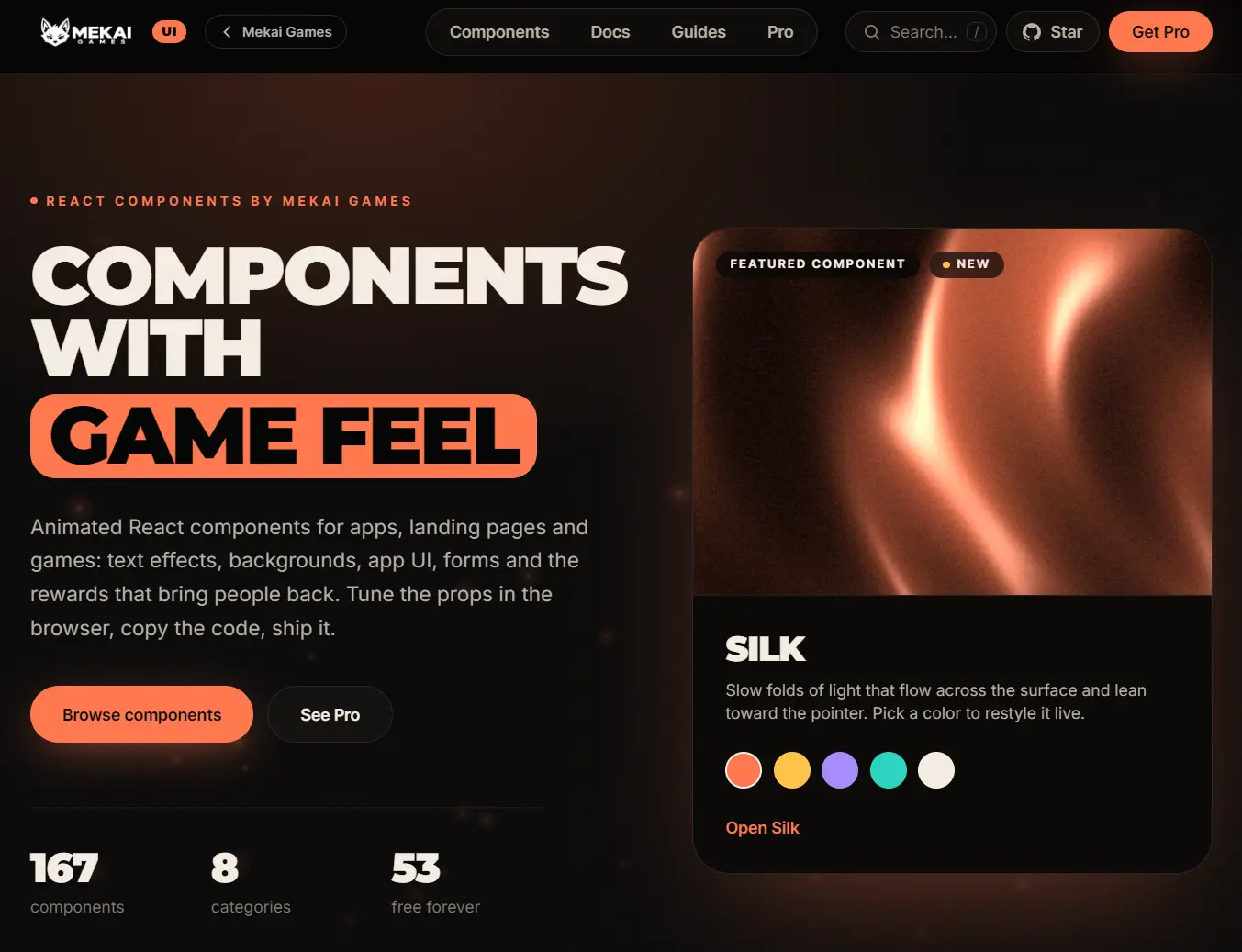
Mekai UI is an animated React UI component library for landing pages, app screens, and game-inspired products.
Animated text, interactive controls, XP bars, and health meters are available as free, editable TypeScript components through the shadcn CLI.
Features
- 50+ free components for landing pages, application UI, and game-style widgets.
- Scroll-triggered reveals, pointer-responsive backgrounds, and interactive cards.
- Animated tabs, dialogs, form controls, loaders, and progress indicators.
- Live previews with adjustable component props.
- Motion animations and Tailwind CSS 4 theme tokens.
- MIT-licensed free source for personal and commercial use.
Installation
Initialize shadcn if components.json is missing:
npx shadcn@latest initInstall components (XP bar in this example) from Mekai’s registry. The CLI adds dependencies and theme styles, then writes components/ui/xp-bar.tsx when you use the default shadcn aliases:
npx shadcn@latest add https://ui.mekaigames.com/r/xp-bar.jsonManual Installation
Install Motion, then copy the component code from the official Code tab into components/ui:
npm install motionCopy theme.css beside your global stylesheet and import it after Tailwind CSS:
@import "tailwindcss";
@import "./theme.css";
Use the Component in Your App
This Next.js App Router example updates the bar when a user earns XP:
"use client";
import { useState } from "react";
import { XpBar } from "@/components/ui/xp-bar";
export default function ProgressDemo() {
  const [xp, setXp] = useState(240);
  return (
    <div className="max-w-sm space-y-4">
      <XpBar xp={xp} perLevel={100} color="#ffc24a" />
      <button
        type="button"
        onClick={() => setXp((current) => current + 35)}
        className="rounded-md border px-4 py-2"
      >
        Earn 35 XP
      </button>
    </div>
  );
}
Available UI Components
Text Animations
| Component | Description |
|---|---|
| Scramble Text | Random characters resolve into text on hover or focus. |
| Blur Text | Words sharpen in sequence on scroll. |
| Split Text | Individual letters spring into place on scroll. |
| Shiny Text | A repeating light sweep across text. |
| Typewriter | Types, deletes, and cycles through phrases. |
| Circular Text | Rotating text ring with space for a center icon. |
| True Focus | Focus brackets move between words. |
| Echo Text | Layered text trails react to the pointer. |
| Masked Reveal | Heading lines slide up from masks. |
| Stroke Text | Outlined text fills on hover or focus. |
| Highlighter Text | Marker strokes appear behind selected words on scroll. |
Animations
| Component | Description |
|---|---|
| Magnetic Button | Button moves toward the pointer and springs back. |
| Tilt Card | Pointer-driven 3D tilt and glare. |
| Click Spark | Click-triggered spark lines around wrapped content. |
| Ripple Button | Ripples expand from the press location. |
| Logo Marquee | Continuous logo strip that pauses on hover. |
| Flip Card | Two-sided card with hover or click rotation. |
| Glare Hover | Light sweep on hover or keyboard focus. |
| Reveal | Fade, slide, blur, or scale on scroll. |
| Gradual Blur | Progressive blur along a scrolling area’s edge. |
| Orbit | Content circles a center point on one or more rings. |
| Scroll Progress Ring | Reading progress with an end-of-page back-to-top action. |
Backgrounds
| Component | Description |
|---|---|
| Aurora | Slowly drifting, blurred color fields. |
| Dot Grid | Canvas dots ripple around the pointer. |
| Meteors | Random diagonal streaks across a starry background. |
| Plasma | Flowing color field distorted by pointer movement. |
| Grainient | Animated grainy gradient mesh with a fixed seed option. |
| Orb | Glowing orb that responds to pointer movement. |
| Magnet Lines | Lines rotate toward the pointer. |
| Constellation | Moving points connect when they approach one another. |
Cards & Galleries
| Component | Description |
|---|---|
| Carousel | Swipeable slides with momentum snapping. |
| Bounce Cards | Fanned cards that shift on hover or focus. |
| Expand Gallery | Panels expand to reveal captions on hover or focus. |
| Glass Card | Frosted card with pointer-following shine. |
| Before / After | Draggable, tappable, and keyboard-controlled image comparison. |
App UI
| Component | Description |
|---|---|
| Animated Tabs | Sliding active indicator and directional panel transitions. |
| Segmented Control | Single-selection control with an animated thumb. |
| Dialog | Spring-animated modal with focus restoration. |
| Accordion | Expandable sections with animated height. |
| Animated Tooltip | Tooltip responds to hover, focus, and pointer movement. |
| Avatar Stack | Overlapping avatars fan out on hover. |
| Pill Nav | Active navigation pill slides between links. |
| Animated List | Rows animate into view with keyboard selection. |
| Rolling Counter | Odometer-style numbers with decimals and negatives. |
| Folder | Folder expands to fan out paper previews. |
| Skeleton Loader | Shimmering placeholders transition into loaded content. |
Forms & Inputs
| Component | Description |
|---|---|
| Toggle Switch | Switch knob stretches and springs between states. |
| Floating Input | Floating label with animated focus and error states. |
| Animated Checkbox | Animated checkmark and indeterminate state. |
| Star Rating | Interactive star ratings with keyboard controls. |
Game UI
| Component | Description |
|---|---|
| XP Bar | Level badge and animated experience progress. |
| Pixel Button | 8-bit-style button with pressed-down feedback. |
| Health Bar | Damage indicator with a trailing health bar. |
Theme Customization
Mekai UI’s theme.css defines Tailwind CSS 4 colors and fonts. To change the shared accent colors, add these overrides after the Mekai theme in your global CSS:
@theme {
  --color-ember: #f97316;
  --color-gold: #fbbf24;
}
Related Resources