The Future of Web Dev
The Future of Web Dev
Ruixen UI: React UI Component Library for shadcn/ui
A React UI component library featuring marketing-page sections, animated controls, and app UI components.
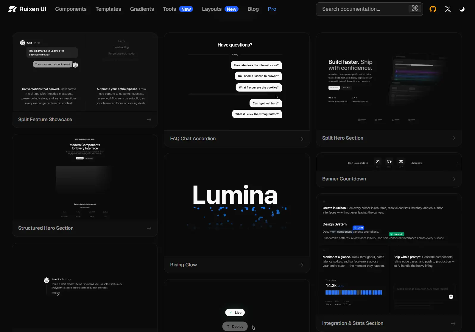
Ruixen UI is a React UI component library for building marketing pages in React and Next.js projects using shadcn/ui.
It offers hero sections, pricing tables, FAQs, testimonials, navigation, and footers, along with animated controls and app UI components installed as editable TSX source.
Features
- 200+ free React components and sections.
- Animated buttons, badges, text effects, backgrounds, and other interactive controls.
- App UI components for calendars, event scheduling, file management, and notifications.
- 4 shadcn registry variants for Tailwind CSS v3/v4 and Radix UI or Base UI.
- Local TypeScript components styled with Tailwind classes and shadcn theme tokens.
How to Use It
Initialize shadcn/ui:
pnpm dlx shadcn@latest initInstall a UI component or section of your choice:
# Tailwind CSS v4 + Radix UI
npx shadcn@latest add "https://ruixen.com/r/staggered-faq-section"
# Tailwind CSS v3 + Radix UI
npx shadcn@latest add "https://ruixen.com/r/tw3/staggered-faq-section"
# Tailwind CSS v4 + Base UI
npx shadcn@latest add "https://ruixen.com/r/baseui/staggered-faq-section"
# Tailwind CSS v3 + Base UI
npx shadcn@latest add "https://ruixen.com/r/baseui/tw3/staggered-faq-section"Render the component
In app/pricing/page.tsx, import the installed component and provide your own content:
import StaggeredFAQSection from "@/components/ruixen/staggered-faq-section";
const faqItems = [
  {
    id: "billing",
    question: "Can I change my plan later?",
    answer: "Yes. You can change your subscription from billing settings.",
  },
  {
    id: "invoice",
    question: "Where can I find invoices?",
    answer: "Open Billing and select an invoice from your payment history.",
  },
];
export default function PricingFAQ() {
  return (
    <StaggeredFAQSection
      title="Billing FAQs"
      subtitle="Answers about plans and payments"
      faqItems={faqItems}
      supportText="Need help with billing? Contact"
      supportLink="/contact"
      supportLinkText="support"
    />
  );
}
Customize the Installed Component
Edit the generated TSX files in components/ruixen/ to change markup, Tailwind classes, and interactions. Shared colors use shadcn theme tokens such as bg-card, border-border, and text-foreground.
Available UI Components
Sections
- Navbars: Navbar Simple, Navbar Centered, Navbar With Search, Navbar User Menu, Navbar Status, Navbar Breadcrumb, Navbar Floating, Navbar Tabs, Navbar Minimal, Navbar Split, Navbar Icon Links, Hover Gradient Navbar, Floating Navbar, Expandable Menu Navbar, Luma Bar, Promote Header.
- Hero Sections: Card Carousel Hero, Gradient Hero Showcase, Video Hero Showcase, Structured Hero Section, Grid Frame Hero, Sales AI Hero, Scroll Over Hero, Phone Scroll Hero, Preview Switch Hero, Arc Reveal Hero, Image Stream Hero, Pricing Landing Hero, Tabbed Hero Section, Split Hero Section, Hero Title Animation.
- Testimonials: Case Study Tabs, Customer Story Stack, Featured Portrait Testimonial, Multi-Media Testimonial.
- Service Sections: Service Ledger.
- Client Section: Trusted Clients Showcase, Client Carousel Showcase, Auto Scrolling Client Carousel, Bordered Clients Grid.
- Featured Section: Product Feature Hero, Product Card Hero, Split Feature Showcase, Integration And Stats Section, Rotating Gradient Right, Automated Tasks Panel.
- Pricing Section: Pricing Plans, Pricing Comparison, Pricing Feature Matrix, Subscription Plans, Pricing Flow, Pricing with User Scaling, Pricing Tiers, Pricing Section Vertical, Pricing Cards Tooltip, Staged Pricing.
- FAQs: StaggeredFAQSection, FeatureHighlights, FAQ Scroll Accordion, FAQ Auto Accordion, FAQ Chat Accordion, Grouped FAQ Section.
- Footer Section: Footer Pro, Corporate Footer, Footer Enterprise, Wordmark Footer.
Components
- Accordions: Editorial Accordion, Indexed Accordion.
- Comments: Comment Thread.
- AI Chat Inputs: AI Chat Input, Claude Chat Input, Gradient Chat Input, Smart Paste Input.
- Audio & Media: Music Player Card, Live Waveform, Visualizer Button.
- Avatars: Avatar Spring Stack, Avatar Hover Card, Avatar Quick Actions.
- Backgrounds: Cloud Background, Ripple Distortion, Dual Tone Rain Background, Mouse Spark, Neon Circle Grid, Ruixen Gradient Footer.
- Text: Scroll Burn Text, Receding Text Plane, Perspective Text, Animated Highlight Text, Animated Link, Scroll Text Rise, Rising Glow, Particle Text Dots, Container Text Scroll, Variable Text, Scramble Text.
- Badges: Badge Morph.
- Banners: Banner Announcement, Banner Cookie, Banner Newsletter, Banner Countdown.
- Buttons: Button Copy, Button Dropdown, Button Split, Button Badge, Slide To Delete Button, Glow Link Button, Hover Preview Button, Confetti Button, Badge Button Combo, Progress Button, Icon Label Subtext Button, Add To Cart Button, Share Button.
- Charts: Spark Chart.
- Cards: Image Card Fan, Region Globe, Glass AI Card, Glass Shipment Flow, Phone Mockup Card, Profile Card.
- Carousels: Coverflow Carousel, Scroll Image Tunnel, Scroll Tilted Grid, Scroll Portrait Wall, Card Stack.
- Checkboxes: Checkbox Simple, Checkbox Indeterminate, Checkbox Colored, Checkbox Todo, Checkbox Terms, Checkbox Group, Checkbox Tree.
- Dialogs: Credit Card Dialog, Add Task Sheet.
- Docks: Social Preview Dock, Gooey Dock, Morphing Expandable Menu.
- Forms: Glass Form.
- Image Tools: Glass Image Editor, Glass Image Compare.
- Inputs: Circular Stepper Input, Verification Input, Color Picker Input, Gravatar Email Input, Correct Number Input, Better Time Picker, Inline Copy Input, Clean Tag Input, Input With Select, URL Input, Password Field.
- Loaders: Loading Circle, Load Ripple, Ripple Circles, Solar Loader, Progressive Flux Loader.
- Sliders: Fine Tune Slider, Scroll Ruler.
- Stepper: Wizard Stepper, Milestone Stepper.
- Timelines: Chapter Scrubber.
- Select Components: Halo Reel, Color Emotion Select, Tag Cloud Select.
- Tabs: Invert Tabs, Magnetic Tabs, Drag And Drop Tabs.
- Video Players: Video Player Pro.
App UI
- Breadcrumbs: Breadcrumb Separator, Breadcrumb Icon, Breadcrumb Dropdown.
- Calendars: Range Calendar, Calendar Wave, Calendar Crest.
- Date Pickers: Drum Picker, Scrub Datetime.
- Drawer: Drawer Inner Content, Centered Feedback Drawer, Bottom Drawers.
- Event Calendars: Event Scheduler, Three D Wall Calendar, Calendar Planner, Calendar Twin, Chrono Select, Calendar Scheduler, Calendar Lume.
- File Management: Motion File Tree, Magic Tree, Tree Node Tooltip.
- Menu: Drilldown Menu, Nested Dashboard Menu, App Menu Bar, Account Menu, Action Toolbar, Toolbar Dock, Floating Toolbar.
- Notifications: Notification Inbox Popover, Notification, Notifications Carousel, Notifications Filter.
- Pagination: Wheel Pagination, Scroll Pagination, Icon Pagination, Gooey Pagination, Stack Pagination, Animated Number Flip, Morphing Page Dots, Sliding Pagination.
Alternatives and Related Resources