The Future of Web Dev
The Future of Web Dev
Animated UI Components & Blocks for shadcn/ui – Uai
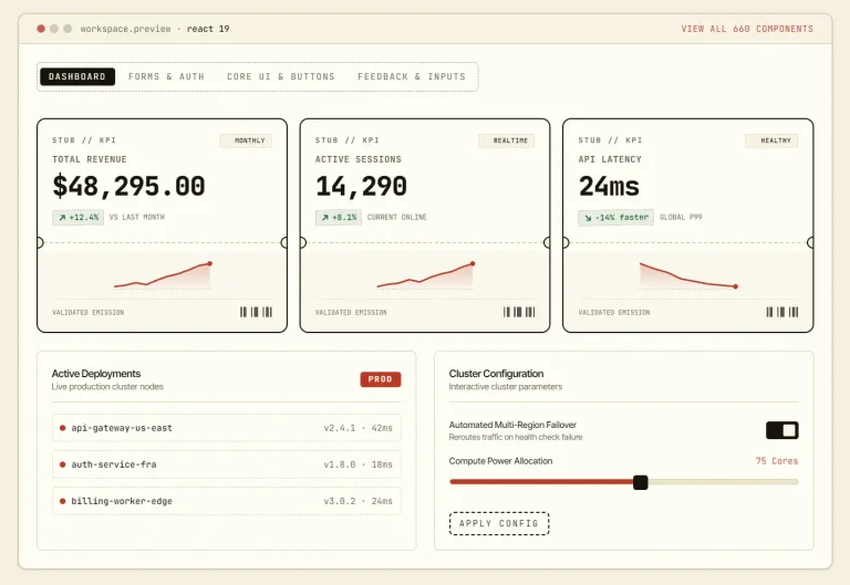
A React UI component library with animated controls and workflow blocks for dashboards, account screens, storefronts, marketing pages, and AI apps.
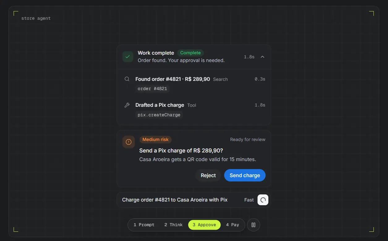
Uai is a React UI component library with animated shadcn components and workflow blocks for dashboards, forms, storefronts, AI apps, and marketing pages.
It uses shadcn CLI to install individual items as editable TypeScript files, including state handling and Tailwind styling.
Features
- Animated input, loading, drag-and-drop, and approval interactions.
- Compound AI controls for prompts, citations, tool calls, and agent runs.
- App blocks for dashboards, account management, checkout, and onboarding.
- Individual shadcn CLI installs with editable TSX source and declared dependencies.
- Tailwind CSS styling, light and dark palettes, and semantic status colors.
- Interactive component previews with multiple state and layout variants.
How to Install Uai
Initialize shadcn/ui in your project:
npx shadcn@latest initInstall UI components using shadcn/ui CLI as follows. The registry installs each item’s required shadcn primitives, uai-utils, and uai-theme. Files use the destinations configured in components.json.
npx shadcn@latest add https://uaiblocks.dev/r/prompt-composer.json
npx shadcn@latest add https://uaiblocks.dev/r/thinking.json
Install Agent Run to add a composite workflow block for task progress, tool calls, approvals, and the final run summary:
npx shadcn@latest add https://uaiblocks.dev/r/agent-run.jsonBasic Usage: Prompt Composer
Create components/order-assistant.tsx to capture a prompt, selected files, and the chosen model.
"use client";
import { useState } from "react";
import {
  PromptComposer,
  PromptComposerAdd,
  PromptComposerActions,
  PromptComposerFileItem,
  PromptComposerInput,
  PromptComposerModelSelect,
  PromptComposerSubmit,
} from "@/components/ui/uai/prompt-composer";
const models = [
  { id: "fast", label: "Fast" },
  { id: "detailed", label: "Detailed" },
] as const;
export function OrderAssistant() {
  const [model, setModel] = useState("fast");
  const [lastSubmission, setLastSubmission] = useState("");
  return (
    <section className="mx-auto grid max-w-xl gap-3">
      <PromptComposer
        variant="rounded"
        onSubmit={(prompt, files) => {
          setLastSubmission(
            `${model}: ${prompt} (${files.length} attachments)`,
          );
        }}
      >
        <PromptComposerAdd>
          <PromptComposerFileItem accept=".pdf,.png,.jpg" />
        </PromptComposerAdd>
        <PromptComposerInput placeholder="Ask about an order…" />
        <PromptComposerActions>
          <PromptComposerModelSelect
            models={models}
            value={model}
            onValueChange={setModel}
          />
          <PromptComposerSubmit />
        </PromptComposerActions>
      </PromptComposer>
      <p aria-live="polite">{lastSubmission}</p>
    </section>
  );
}
Example: Inspectable Agent Activity
Render the installed Thinking component with an application-managed status and typed activity entries:
"use client";
import {
  Thinking,
  ThinkingActivity,
  ThinkingContent,
  ThinkingTrigger,
  type ThinkingStatus,
} from "@/components/ui/uai/thinking";
export function OrderLookupActivity({
  status,
}: {
  status: ThinkingStatus;
}) {
  return (
    <Thinking variant="compact" status={status} defaultOpen>
      <ThinkingTrigger
        summary="Checking the order"
        duration="0.8s"
      />
      <ThinkingContent>
        <ThinkingActivity
          type="search"
          query="Order #4821"
          elapsed="0.3s"
        >
          Found the matching order
        </ThinkingActivity>
        <ThinkingActivity
          type="tool"
          tool="orders.lookup"
          elapsed="0.5s"
        >
          Retrieved fulfillment details
        </ThinkingActivity>
      </ThinkingContent>
    </Thinking>
  );
}
Available UI Components and Blocks
AI
Thinking, Message, Citation, Attachment, Tool Call, Agent Question, Response Status, Run Summary, Context Meter, Conversation Thread (block), Research Session (block), File Analysis (block), Agent Run (block).
Feedback
Approval Card, Empty State, Status Banner, Progress Summary, Inline Feedback, Confirmation Dialog, Activity Timeline, Skeleton Group.
Forms
Prompt Composer, Form Field, Search Field, Filter Bar, File Upload, Date Range Picker, Form Error Summary, Unsaved Changes Bar, Step Indicator.
Data Display
Task List, Data Table Toolbar, Metric Card, Description List, Comparison Table, Kanban Board, Calendar View, Audit Log.
App Header, App Sidebar, Breadcrumb Trail, Page Tabs, Command Menu, Split Pane.
Authentication
Sign-in Card, Sign-up Card, Password Recovery, Code Verification (block), Onboarding Wizard (block), Workspace Setup (block).
Commerce
Coupon Field, Quantity Picker, Cart Item, Price Summary, Order Status, Product Detail (block), Product Listing (block), Cart Drawer (block), Checkout (block), Order Tracking (block), Subscription Management (block).
Marketing
Announcement Bar, Pricing Toggle, Testimonial Card, Product Gallery, Trust Panel, Newsletter Form, Hero Section (block), Feature Showcase (block), Pricing Section (block), Testimonials Section (block), FAQ Section (block), Call to Action (block), Waitlist Section (block), Contact Section (block).
Content
Author Card, Comment, Reaction Bar, Share Menu, Changelog Entry, Article Page (block), Documentation Page (block), Changelog Page (block), Comment Thread (block), Community Feed (block), Public Profile (block).
Maps
Map Frame, Map Controls, Map Marker, Map Legend, Place Card, Route Summary.
Application
Dashboard Shell (block), Settings Page (block), Profile Page (block), Team Management (block), Notification Center (block), Billing Portal (block), Search Results (block).
Operations
Resource Manager (block), Data Explorer (block), Import Workflow (block), Approval Queue (block), Audit Log Viewer (block), Incident Dashboard (block), Report Builder (block).
Brazil
Document Field, CEP Field, Pix Payment, Boleto Payment, Installment Picker, Pix Automático.
Styling and Theming
The uai-theme registry item supplies light and dark palettes for shadcn tokens such as background, card, primary, border, and ring. It adds subtle-foreground, border-strong, success, and warning tokens, plus shared motion utilities and the tw-animate-css dependency.
Adjust the installed components through className or their local TSX files. To change the primary color and radius globally, override the theme tokens in your stylesheet:
:root {
  --primary: oklch(0.6 0.2 300);
  --radius: 0.5rem;
}
.dark {
  --primary: oklch(0.7 0.18 300);
}
Alternatives and Related Resources