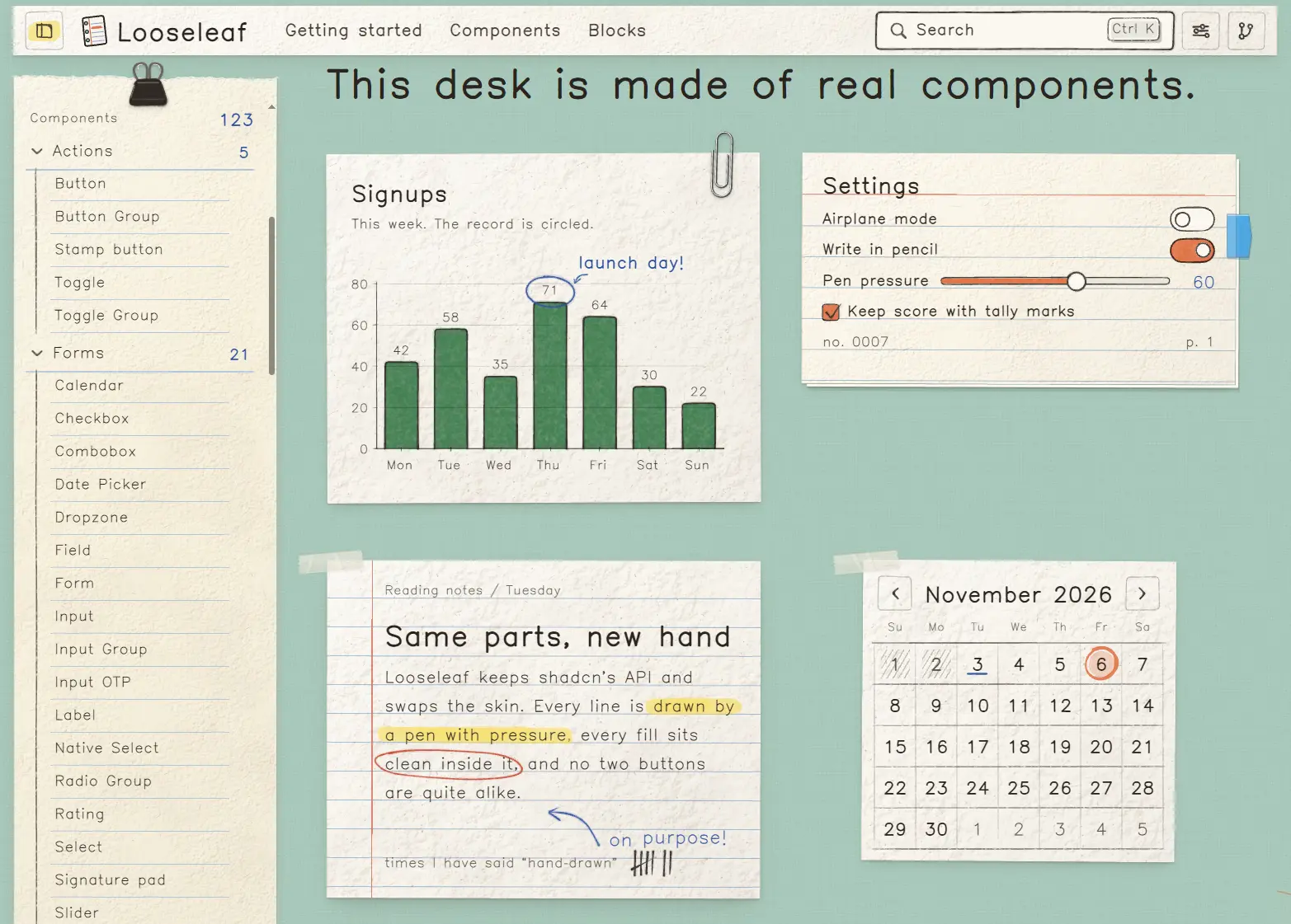
A React UI component library with handwritten typography, pen-drawn controls, stationery-style elements, and ready-made app blocks.
Looseleaf is a hand-drawn React UI component library for notebook-style forms, dashboards, and chat apps with matching controls, paper objects, and ready-made app blocks.
Built with React, Tailwind CSS, and Radix UI, it installs editable TSX through a shadcn registry and retains familiar shadcn/ui props and data-slot names.
Joined buttons and inputs with continuous hand-drawn borders.
button
Ink-drawn buttons with shadcn variants and size options.
stamp-button
Rubber-stamp button that leaves an inked impression.
toggle-group
Single- or multi-selection toggles with shared sketched borders.
toggle
Two-state button with a highlighter-style pressed state.
Forms
Component
Description
calendar
Planner-style date calendar with single, multiple, and range selection.
checkbox
Marker-filled checkboxes with checked and indeterminate states.
combobox
Searchable selection field with single, multiple, and creatable options.
date-picker
Date input with a popover calendar, presets, and range selection.
dropzone
File picker with drag-and-drop, validation, previews, and progress states.
field
Labels, help text, errors, and grouped form control layouts.
form
React Hook Form bindings and sketched field validation states.
input-group
Unified input, icon, text, and button inside one frame.
input-otp
Individual code boxes with paste and autofill support.
input
Single-line input with drawn focus, error, and disabled states.
label
Handwritten form label with optional required-field mark.
native-select
Native HTML select inside a sketched input frame.
radio-group
Single-choice radio buttons with ink-filled selection marks.
rating
Selectable or read-only star, heart, and sun ratings.
select
Radix select menu with highlighted options and keyboard navigation.
signature-pad
Pressure-sensitive drawing field with a typed-name fallback.
slider
Single-value or range slider with a paper thumb and marker track.
stepper
Numeric input with increment, decrement, and keyboard controls.
sticker-picker
Searchable sticker selection popover with category filters.
switch
On/off control with a colored marker track and paper thumb.
textarea
Auto-growing multiline input with optional ruled lines and character count.
Feedback
Component
Description
alert
Status messages with distinct ink colors and margin marks.
empty
Illustrated empty states with titles, descriptions, and actions.
progress
Marker-filled progress bar with determinate and indeterminate states.
skeleton
Pencil-sketched loading placeholders with subtle line animation.
sonner
Paper-style toast notifications using the Sonner API.
spinner
Animated pencil spiral with reduced-motion behavior.
Overlays
Component
Description
alert-dialog
Confirmation modal with explicit response and safe initial focus.
command
Searchable command palette with fuzzy matching and highlighted results.
context-menu
Paper-style context menu for right-click and touch interactions.
dialog
Paper-sheet modal with a drawn close control and optional fastening.
drawer
Draggable paper drawer with edge positions and snap points.
dropdown-menu
Dropdown with sketched selection marks, shortcuts, and submenus.
hover-card
Polaroid-style preview triggered by hover or keyboard focus.
popover
Floating paper panel with optional pin, tape, and arrow.
sheet
Sliding notebook panel with spiral, perforated, or torn edges.
tooltip
Sticky-note hint shown on hover or keyboard focus.
Navigation
Component
Description
breadcrumb
Page-path links with handwritten separators and current-page styling.
menubar
Desktop-style menu strip with keyboard navigation and nested menus.
navigation-menu
Tab-like site navigation with expandable paper panels.
pagination
Page-number links drawn as buttons with current-page highlighting.
sidebar
Collapsible notebook-style navigation with responsive mobile presentation.
tabs
Index-divider tabs with highlighter, line, and vertical styles.
Layout
Component
Description
accordion
Expandable ruled sections with handwritten open-state details.
aspect-ratio
Responsive container that maintains a fixed width-to-height ratio.
card
Paper card with structured content, actions, and fastening options.
collapsible
Expandable panel with a folding animation and optional margin brace.
direction
Direction provider for right-to-left layouts and Radix interactions.
resizable
Drag-resizable panels with sketched handles and keyboard support.
scroll-area
Scrollable container with a pencil-drawn scrollbar.
separator
Horizontal or vertical dividers in pencil, stitch, tape, and tear styles.
Data display
Component
Description
avatar
Portraits or initials with sketched outlines and status indicators.
badge
Compact status labels styled as stamps, highlights, or tally marks.
carousel
Swipeable Embla carousel with drawn arrows and optional tally indicators.
item
Ruled list rows with media, text, and action areas.
table
Tabular data with pencil rules and highlighted row states.
Charts
Component
Description
chart
Hand-drawn bar, line, area, pie, radar, and other charts.
Paper
Component
Description
bookmark
Toggleable ribbon bookmark with an ink-drawn pressed state.
clipboard
Clipped writing board that can hold forms or notes.
desk
Textured tabletop backdrop with optional stationery decorations.
envelope
Interactive envelope with an opening flap and sliding letter.
folder
Tabbed file-folder container built on Radix Tabs.
index-card
Ruled index card with optional flags, holes, and stacked cards.
label-tag
Paper hang tag with eyelet, twine, and button or link behavior.
napkin
Folded tissue-paper container with a pressed border.
notebook
Ruled notebook with configurable binding and page details.
page
Main paper-page layout with header, content, and footer.
paper
Paper container with configurable stock, edges, rules, and tape.
polaroid
Instant-photo frame with an image or illustrated scene and caption.
receipt
Thermal-paper receipt with line items, totals, and barcode.
sticky-note
Colored adhesive note with optional folds, pins, and checkboxes.
tape
Decorative strips of masking, washi, kraft, or clear tape.
ticket
Perforated ticket with a detachable-style stub and serial number.
Marks
Component
Description
annotate
Animated highlights, circles, brackets, and strike marks on text.
arrow
Drawn arrows with configurable direction, curves, heads, and labels.
asterisk
Illustrated footnote symbols that can link to notes.
bracket
Square, round, or curly annotation beside grouped content.
callout
Margin note with a hand-drawn arrow pointing to content.
circled
Hand-drawn circle, box, or brackets around text.
highlight
Marker swipe behind selectable text, including wrapped lines.
quote
Pull quote with oversized ink quotation marks and attribution.
ribbon
Folded paper ribbon for section labels and badges.
scribble
Dense pen strokes drawn across existing text.
signature
Script-style name with an animated pen flourish.
squiggle
Decorative wave, zigzag, loop, or dotted divider.
strike
Single, double, or cross-out pencil lines over text.
tally
Numbers displayed as grouped hand-drawn tally marks.
underline
Single, double, wavy, or scribbled lines beneath text.
Stickers & doodles
Component
Description
doodle
Hand-drawn stars, flowers, suns, and other margin decorations.
mascot
Stubby pencil character for welcome screens and empty states.
seal
Rosette, medal, ringed, and wax-style decorative seals.
stamp
Text-based rubber-stamp impressions with worn ink styling.
sticker-sheet
Peelable sticker collection on backing paper.
sticker
Die-cut sticker artwork with outlines and optional peeled corners.
Chat
Component
Description
attachment
Chat file attachment with upload, processing, error, and completion states.
bubble
Message bubble with inked outline, fill, and sender-side tail.
code-block
Syntax-highlighted code slip with filenames, line numbers, and diffs.
marker
Chat transcript separators for dates, unread messages, and events.
message-scroller
Message timeline with sticky-bottom behavior and jump-to-latest controls.
message
Chat message layout with avatars, bubbles, and streaming text.
prompt-input
Chat composer with growing textarea, attachments, and send controls.
typing-indicator
Animated handwritten typing status with live-region text.
Interactive
Component
Description
boil
Frame-by-frame wobble animation for hand-drawn UI elements.
confetti
Illustrated paper confetti triggered by clicks or state changes.
corkboard
Draggable, keyboard-movable notes on a framed corkboard.
flip-card
Two-sided index card that rotates on click or keyboard activation.
marquee
Scrolling text on a washi-tape strip with pause controls.
peel-corner
Interactive page corner that reveals content underneath.
reveal
Scroll-triggered draw-on, stamp, and paper entrance effects.
sketchpad
Drawing canvas with pen input, undo, redo, and SVG export.
sticker-board
Moveable, resizable stickers with JSON state and SVG export.
tear-off
Interactive perforated coupon or ticket stub.
Typography
Component
Description
handwritten
Seeded handwritten text variation that preserves real inline text.
kbd
Pencil-drawn keyboard keycap for shortcuts and inline hints.
lettering
Script-style display text with an offset print effect.
typewriter
Type-on text animation with ink caret and variable typing speed.
typography
Notebook text styles and a Prose wrapper for rich content.
Icons
Component
Description
icon
Hand-drawn icons addressed by familiar Lucide names.
Ready-Made Blocks
Install a block by its registry name, such as npx shadcn@latest add @looseleaf/login-01. Block files go into components/blocks/ with their declared component dependencies.
Authentication
Block
Description
forgot-password-01
Password-reset request with a neutral confirmation state and resend action.
login-01
Taped login form with email, password visibility, remember-me, and Google sign-in.
login-02
Two-column login page with a paper form and illustrated desktop cover.
login-03
Minimal login card with Apple and Google buttons and email/password fields.
login-04
Split login page with a kraft-paper photo collage and provider buttons.
login-05
Email-link sign-in screen with Apple and Google options and sent confirmation.
otp-01
Six-digit verification screen with paste support, resend timer, and error states.
reset-password-01
Password reset form with live requirement checks and completion state.
signup-01
Receipt-style signup form with name, email, password confirmation, and validation.
signup-02
Two-column signup layout with a paper form and illustrated ticket panel.
signup-03
Signup card with password confirmation and an illustrated strength indicator.
signup-04
Split signup page with provider buttons and an interactive sticker sheet.
signup-05
Email-first signup screen with a sign-in link and provider options.
Sidebars
Block
Description
sidebar-01
Grouped navigation with an edition switcher, search, and active-page highlighting.
sidebar-02
Collapsible navigation sections with a sticky page header.
sidebar-03
Sidebar with nested navigation links and pencil-ruled submenus.
sidebar-04
Floating sidebar beside a separate paper-style content page.
sidebar-05
Sidebar with expandable submenus and plus/minus indicators.
sidebar-06
Sidebar with dropdown submenus and a signup card near the footer.
sidebar-07
Icon-collapsible sidebar with a team switcher and tooltips.
sidebar-08
Inset sidebar with expandable links and secondary project navigation.
sidebar-09
Two-level mail sidebar with folder icons, message lists, and unread filtering.
sidebar-10
Notes navigation with favorites, workspaces, and a popover action menu.
sidebar-11
Collapsible file-tree navigation with file status and breadcrumb updates.
sidebar-12
Calendar sidebar with calendar filters and selected-day content.
sidebar-13
Application settings dialog with its own sidebar and breadcrumb navigation.
sidebar-14
Right-aligned collapsible sidebar serving as a page table of contents.
sidebar-15
Two-sidebar notes layout with navigation on the left and calendar on the right.
sidebar-16
Sidebar beneath a sticky site header with search and breadcrumbs.
Dashboards
Block
Description
dashboard-01
Admin dashboard with summary metrics, a date-filtered area chart, and data table.
dashboard-analytics
Traffic dashboard with sparklines, source breakdowns, and conversion funnel.
dashboard-finance
Personal finance dashboard with balances, transactions, and budget progress.
Apps
Block
Description
calendar-planner
Calendar with marked event days, daily agenda, and event editing dialog.
chat-app
Two-pane messaging app with conversation search and streaming message view.
file-explorer
Tabbed file browser with search, sorting, list/grid views, and selection.
inbox
Two-pane mail layout with folders, search, unread state, and message preview.
kanban-board
Sticky-note task board with keyboard-accessible column moves.
notes-app
Notebook editor with section tabs, page list, and text annotation tools.
profile-page
Profile screen with photo, user details, activity tabs, and follow actions.
Settings
Block
Description
settings-appearance
Drawing and page-theme settings for density, motion, direction, and paper.
settings-billing
Plan management page with pricing changes, payment details, and invoices.
settings-notifications
Notification preferences with channels, quiet hours, and summaries.
settings-profile
Profile editor with photo upload, username checks, and personal details.
Marketing
Block
Description
announcement-bar
Dismissible kraft-paper announcement strip with label and link.
cta-01
Ticket-style call-to-action panel with two buttons and illustrated stub.
faq-01
Ruled-paper FAQ accordion with a follow-up support card.
features-01
Feature section using index cards or a paper-and-stationery bento layout.
footer-01
Stitched kraft-paper footer with link groups, social buttons, and status.
landing-hero-01
Split hero with headline, calls to action, and stationery collage.
landing-hero-02
Centered hero with interactive checklist and progress indicators.
logos-01
Two animated washi-tape logo tickers with a shared pause control.
newsletter-01
Email signup card with validation and an animated envelope confirmation.
onboarding-01
Five-step checklist with progress, completion stamp, and confetti.
pricing-01
Three pricing cards with monthly/annual switching and a featured plan.
testimonials-01
Customer quotes displayed on taped, pinned, and clipped paper notes.
Feedback
Block
Description
empty-inbox
Tabbed inbox empty states with different illustrated messages.
empty-search
Search-results empty state with query feedback and reset action.
error-404
Not-found screen with search field and navigation back to the site.
error-500
Server-error screen with incident reference, copy action, and retry link.
Commerce
Block
Description
checkout-01
Single-page checkout with delivery options and client-side card validation.
To install the full library, including the Notebook theme, fonts, ink engine, and UI components, use the umbrella item. This replaces your shadcn color tokens with Looseleaf’s palette:
npx shadcn@latest add @looseleaf/looseleaf
Basic Usage in Next.js
Wrap the app with InkProvider in a client component. The example below uses the button and paper components.
app/providers.tsx
"use client"
import { InkProvider } from "@/lib/ink/react"
export function Providers({ children }: { children: React.ReactNode }) {
  return <InkProvider density="comfortable">{children}</InkProvider>
}
app/layout.tsx
import { Providers } from "./providers"
import "./globals.css"
export default function RootLayout({ children }: { children: React.ReactNode }) {
  return (
    <html lang="en">
      <body>
        <Providers>{children}</Providers>
      </body>
    </html>
  )
}
app/page.tsx
import { Button } from "@/components/ui/button"
import { Paper } from "@/components/ui/paper"
export default function HomePage() {
  return (
    <Paper stock="index-card" tape="both" className="max-w-md p-6">
      <h1 className="font-script text-2xl font-bold">Project notes</h1>
      <p className="my-4">Draft the next dashboard layout.</p>
      <Button variant="secondary">Save note</Button>
    </Paper>
  )
}
InkProvider and Theme Configuration
InkProvider is the root context for pen drawings. It provides props to control rendering quality, density, themes, direction, and paper textures.
Prop
Values and behavior
tier
"lo" (default) or "hi" drawing quality.
density
"comfortable", "compact", or "calm"; inherits data-density when unset.
motion
"system" (default) or "reduced".
theme
Optional theme name applied through data-theme.
dir
"ltr" or "rtl"; inherits the document direction when unset.
knobs
Optional wobble, bleed, width, and misreg pen settings.
textures
false (default), true, or a list of paper texture tiles.