The Future of Web Dev
The Future of Web Dev
Animated shadcn/ui Button Registry for React – Evil Buttons
Add expressive animations and unconventional controls to React projects through a shadcn/ui registry.
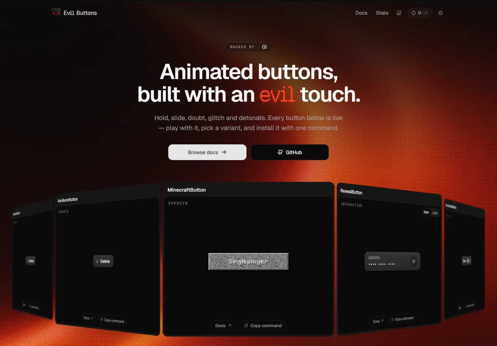
Evil Buttons is a shadcn/ui registry of animated React button components with playful effects and unconventional click interactions.
You can use these buttons to handle confirmations, async action feedback, keyboard shortcuts, and cursor-driven animations in your web apps.
Features
- Hold-to-confirm, slide-to-confirm, and escalating confirmation controls.
- Promise-driven loading, success, and error states in a single button.
- Magnetic pointer tracking, glitches, dithering, metallic effects, and press animations.
- Global keyboard shortcuts, clipboard feedback, and timed click cooldowns.
- Canvas particles, Matter.js physics, and WebGL effects in selected components.
- Individually installable React/TypeScript source with editable Tailwind CSS classes.
- Apache-2.0 licensed source code.
Available Button Components
Interactive
| Component | Description |
|---|---|
CooldownButton | Locks after a click until its radial cooldown timer finishes. |
DoubtButton | Requires a series of increasingly absurd confirmation clicks before triggering an action. |
HoldButton | Completes an action after a sustained press; releasing early cancels it. |
MorphStatusButton | Animates between idle, loading, success, and error states. |
RevealButton | Reveals hidden text on hold or toggle with a blur animation. |
SlideToDetonate | Requires dragging a handle across a fuse to confirm an action. |
Mischief
| Component | Description |
|---|---|
DemonicButton | Raises animated horns and builds a canvas flame effect during a sustained press. |
StickyButton | Pulls the button and label toward the pointer with tilt and parallax. |
ThrusterButton | Flies toward the pointer inside its container with jet and smoke effects. |
TrollButton | Dodges the pointer until its stamina runs out and it becomes clickable. |
Effects
| Component | Description |
|---|---|
AshBurstButton | Emits ash particles that collide with the button using Matter.js physics. |
ChromeButton | Displays a moving liquid-chrome border around a theme-aware button. |
ConfettiButton | Fires a confetti burst on click. |
DitherButton | Animates an ordered-dither wave behind a knockout label. |
EvilEyeButton | Tracks the pointer with an animated eye behind the label. |
FrameButton | Moves corner markers on hover and adds a scan effect when pressed. |
GlitchButton | Triggers RGB-split glitch bursts, scanlines, and label flicker. |
HighlightButton | Adds a pointer spotlight, glowing border, and click-position ripple. |
MinecraftButton | Cracks and shatters a pixel-style button, then lets it respawn. |
Styles
| Component | Description |
|---|---|
AquaButton | Uses layered gloss and inner highlights inspired by Apple Aqua. |
BrutalButton | Uses heavy shadows, high-contrast borders, and NeoBrutalist styling. |
MinimalButton | Adds a hairline border, subtle highlights, and a hover chevron. |
MoviePassButton | Animates a cinema-ticket tear along a perforated edge on click. |
ShinyButton | Sweeps a glint over a glossy gradient button when clicked. |
ThreeDButton | Adds a raised deck-style press animation and sliding sheen. |
Utility
| Component | Description |
|---|---|
ClickPowerUp | Arms a bracketed button on hover and flashes on click. |
CommandButton | Runs an action from a global keyboard shortcut with animated keycaps. |
CopyButton | Displays the copied text above the button after a clipboard action. |
RealisticSwitch | Latches a raised push switch into its socket and toggles its glow. |
How to Use Evil Buttons
1. Initialize shadcn/ui
Initialize shadcn/ui in your project:
npx shadcn@latest init2. Register the Evil Buttons
Add the Evil Buttons entry to the registries object in components.json:
{
  "registries": {
    "@evilbuttons": "https://www.evilbuttons.com/r/{name}.json"
  }
}Install HoldButton and MorphStatusButton for the examples below:
npx shadcn@latest add @evilbuttons/hold-button @evilbuttons/morph-status-buttonThe CLI adds hold-button.tsx and morph-status-button.tsx under components/evil-buttons/ with their package dependencies.
Registry item names are not always identical to their component exports. For example,
@evilbuttons/click-powerup,@evilbuttons/minimal, and@evilbuttons/movie-passinstallClickPowerUp,MinimalButton, andMoviePassButton, respectively.
4. Hold-to-confirm action
// components/delete-confirm-button.tsx
"use client";
import { HoldButton } from "@/components/evil-buttons/hold-button";
type DeleteConfirmButtonProps = {
  onDelete: () => void;
};
export function DeleteConfirmButton({ onDelete }: DeleteConfirmButtonProps) {
  return (
    <HoldButton
      duration={1800}
      label="Hold to delete"
      holdingLabel="Keep holding…"
      successLabel="Confirmed"
      onConfirm={onDelete}
    />
  );
}
5. Show the state of an async action
// components/save-changes-button.tsx
"use client";
import { MorphStatusButton } from "@/components/evil-buttons/morph-status-button";
type SaveChangesButtonProps = {
  save: () => Promise<void>;
};
export function SaveChangesButton({ save }: SaveChangesButtonProps) {
  return (
    <MorphStatusButton
      loadingLabel="Saving…"
      successLabel="Saved"
      errorLabel="Save failed"
      onClick={save}
    >
      Save changes
    </MorphStatusButton>
  );
}
Related Resources