The Future of Web Dev
The Future of Web Dev
Radix UI Inspired Modern Key-Value Display – Shadcn data-list
Display data elegantly with Shadcn Data List, a customizable UI component inspired by Radix UI.
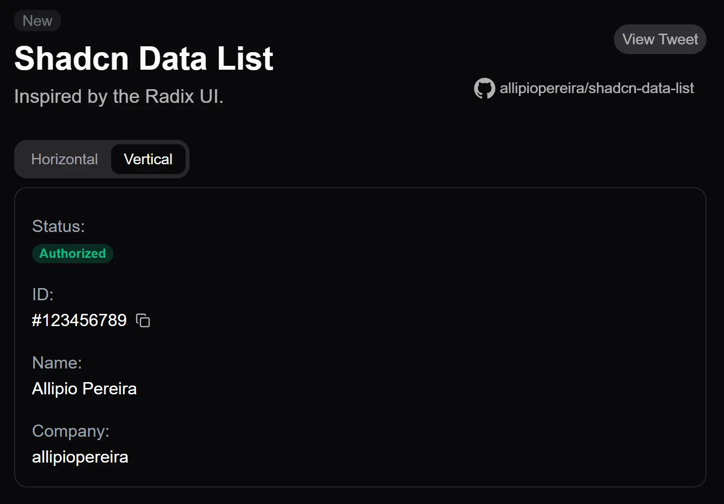
Shadcn data-list is a UI component Shadcn/UI that provides an elegant way to present data in both horizontal and vertical arrangements.
Inspired by Redux UI, this component allows you to display key-value pairs in a clean, accessible format.
Features
🔄 Flexible Orientation: Switch between horizontal and vertical layouts
⚡️ Easy Integration: Direct installation through shadcn CLI. Compatible with existing shadcn/ui components
🎨 Customizable Styling: Full compatibility with Tailwind CSS classes
🎯 Accessibility: Semantic HTML structure. Screen reader friendly. Keyboard navigation support.
Use Cases
- User Profile Display: Present key user information, such as name, ID, status, and associated company, in a clear and organized format on a profile page.
- Settings Panels: Display application or system settings, pairing setting names with their current values. This enables users to quickly understand and manage configurations.
- Product Specifications: Showcase product details like dimensions, materials, and other attributes in an easy-to-read list on e-commerce platforms.
- Order Details: Present crucial order information, including order ID, status, customer details, and shipping address, in a structured manner.
- API Response Visualization: Display structured data received from APIs in a human-readable format.
How To Use It
1. Use the shadcn CLI to add the component:
npx shadcn add https://shadcn-data-list.vercel.app/api/r/data-list2. Create a basic horizontal data list. The core components are DataList, which acts as the container, DataListItem for each data entry, DataListLabel for the key, and DataListValue for the corresponding value. The orientation prop controls the layout. You can apply standard Tailwind CSS classes for styling through the className prop.
<DataList orientation="horizontal" className="gap-4">
  <DataListItem>
    <DataListLabel className="w-32">Status:</DataListLabel>
    <DataListValue>
      <Badge>Active</Badge>
    </DataListValue>
  </DataListItem>
</DataList>
3. To create a vertical data list, modify the orientation property:
<DataList orientation="vertical" className="gap-4">
  {/* ... DataListItem components ... */}
</DataList>
FAQs
Q: CAN I CUSTOMIZE THE APPEARANCE OF THE DATA LIST?
A: Yes, you can apply Tailwind CSS classes to the component and its sub-components using the className prop.
Q: Does the component support responsive layouts?
A: Yes, the orientation can be changed based on screen size using Tailwind’s responsive modifiers.
Q: Can I nest other shadcn components inside DataListValue?
A: Yes, the component accepts any valid React children, including other shadcn components.
Related Resources
- Shadcn UI: The foundational UI library for this component. https://ui.shadcn.com/docs
- Radix UI Data List: Displays metadata as a list of key-value pairs. https://www.radix-ui.com/themes/docs/components/data-list
- Tailwind CSS: The utility-first CSS framework used by Shadcn UI for styling. Familiarize yourself with its classes for customization. https://tailwindcss.com/docs
Preview