The Future of Web Dev
The Future of Web Dev
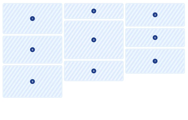
Build Complex Layouts with Tailwind Jun Layout Plugin
Build flexible, maintainable layouts with Tailwind Jun Layout. A CSS-first plugin that helps you create complex layouts without JavaScript overhead.

Tailwind Jun Layout is a Tailwind CSS plugin that helps you build complex, flexible and maintainable layouts for projects of all sizes. From simple website components to large enterprise applications, this plugin has you covered.
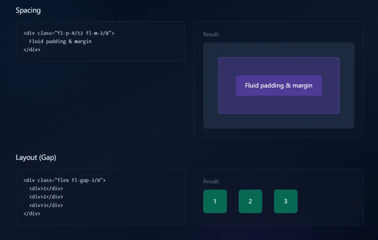
The goal of this plugin is to help developers create web layouts using a “CSS-first” approach. It uses modern CSS features like Grid and Flexbox for layouts, which makes your web apps work well across different browsers. You can choose between traditional media queries or container queries for responsive design.
Features
🌐 Universal Compatibility: Works perfectly with any project size.
📱 Responsive Flexibility: Offers a choice between traditional media queries and container queries.
🤝 Shadcn Integration: You can combine it with Shadcn Sidebar components.
🚀 Performance-Oriented: Built on pure CSS layout principles, it avoids JavaScript overhead.
🖥️ Modern and Compatible: Uses features like Grid and Flexbox but still works with all major browsers.
Use Cases
- E-commerce Dashboards: Build interactive dashboards with sortable product lists, revenue charts, and customer management sections.
- Social Media Feeds: Create dynamic feeds with posts, images, and user interactions, all while maintaining responsiveness across devices.
- Content Management Systems: Develop admin panels that adapt to different screen sizes, making content creation simple on both desktops and tablets.
- Marketing Landing Pages: Design landing pages that work on any device.
- Complex Web Applications: Build apps with many features and layouts easily.
Installation
1Prerequisites:
- Make sure you have Tailwind CSS installed in your project.
- Install Tailwind CSS IntelliSense for autocompletion support.
Install the Plugin:
Run the following command in your terminal:
npm install -D tailwindcss-jun-layoutAdd the Plugin to Your Configuration:
In your tailwind.config.js file, include the plugin:
// tailwind.config.js
module.exports = {
   content: [
     // your content paths
   ],
   plugins: [
     require("tailwindcss-jun-layout"),
   ],
};
Start Using the Classes:
Once the installation is complete, you can begin using the plugin by typing jun- in your class names. If you’ve set up Tailwind CSS IntelliSense correctly, you should see autocompletion for the available classes.
FAQs
Q: Can I use Tailwind Jun Layout without JavaScript?
A: Yes, the plugin is built with a CSS-first philosophy and requires minimal JavaScript. The core layout functionality operates entirely on CSS.
Q: Does Tailwind Jun Layout support older browsers?
A: The plugin leverages modern CSS features like Grid and Flexbox but ensures full compatibility with all major browsers, making it a reliable option for most projects.
Q: How do I make my layouts responsive with this plugin?
A: You can choose between using traditional media queries or modern container queries for your responsive layouts. This gives you flexibility in how your designs adapt to different screen sizes.
Q: Is Tailwind Jun Layout compatible with other Tailwind plugins?
A: Yes, it integrates smoothly with other Tailwind plugins, including the Shadcn Sidebar component, to enhance the functionality of your layouts.
Q: Do I need any extra setup for responsiveness?
A: No extra setup is needed. The plugin provides utility classes that automatically adapt your layouts to different screen sizes, allowing for responsive design with minimal configuration.
Related Resources
- Tailwind CSS Documentation: The official Tailwind CSS documentation provides in-depth information about the framework.
- Shadcn UI: Component library built on top of Tailwind CSS.
- MDN Web Docs – CSS Grid Layout: Learn all about CSS Grid, a powerful layout system.
Preview