The Future of Web Dev
The Future of Web Dev
Motion-Powered Animated Components for Modern UIs – Animate UI
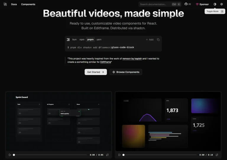
A collection of animated UI components built with Motion and Tailwind CSS. Copy, customize, and integrate animation-rich UI elements directly into your projects.

Animate UI is an open-source collection of fully animated UI components built with TypeScript, Tailwind CSS, and Motion.
You get complete control over styling and functionality since all these UI components live in your codebase rather than being hidden in node_modules.
Features
🎨 Open Source Components – Copy and modify source code directly without package dependencies
⚡ Built-in Animations – Every component includes Motion-powered animations out of the box
🛠️ TypeScript Support – Full type safety with TypeScript definitions
📦 shadcn CLI Compatible – Install components using shadcn CLI commands
🔧 Framework Flexible – Works with Next.js, Vite, Astro, React Router, and Remix
📱 Responsive Design – Components adapt to different screen sizes automatically
🎨 70+ UI Components: Includes UI elements, effects, base UI components, headless UI options, buttons, text animations, and backgrounds.
Use Cases
- Marketing Websites – Create engaging landing pages with animated hero sections, background effects, and interactive buttons that capture visitor attention
- Dashboard Applications – Build dynamic admin panels with animated progress bars, hover effects, and smooth transitions between data views
- Portfolio Sites – Showcase work with animated text reveals, gradient backgrounds, and interactive preview cards that highlight projects
- E-commerce Platforms – Enhance product pages with animated buttons, hover states, and visual feedback that guides users through purchasing flows
- SaaS Applications – Improve user experience with smooth form interactions, loading animations, and contextual tooltips that make complex interfaces feel intuitive
Installation
Animate UI uses the shadcn/ui CLI for adding components to your project.
1. Use the init command to set up the necessary configuration and dependencies in your project.
npx shadcn@latest init2. Use the add command to select and install specific Animate UI components into your project.
npx shadcn@latest add [component-name]For example, to add the button component:
npx shadcn@latest add button3. You can also add components by providing a direct URL to the component on the Animate UI website, for example:
npx shadcn@latest add "https://animate-ui.com/r/install-tabs"Usage
After installing a component, you can import it directly into your React files.
Here’s an example of how to use an Animate UI component (e.g., a Button) in a Next.js project:
import { Button } from '@/components/ui/button'; // Adjust path if necessary
export default function MyPage() {
  return (
    <div>
      <Button>Click Me</Button>
    </div>
  );
}
Related Resources
- shadcn/ui – The foundation component library that inspired Animate UI’s distribution approach.
- Motion – The animation library powering Animate UI’s motion effects, offering extensive documentation for custom animations
- Tailwind CSS – The utility-first CSS framework used for styling all Animate UI components
FAQs
Q: Can I modify the components after adding them?
A: Yes, since you get direct access to the source code, you have complete freedom to adapt, modify, and repurpose each component to fit your project’s design system and requirements.
Q: How does Animate UI differ from traditional component libraries?
A: Animate UI operates as a component distribution rather than an npm package. You copy source code directly into your project, giving you complete control over customization without dependency management.
Q: Are the components responsive?
A: Yes, components are built with responsiveness in mind, leveraging Tailwind CSS’s utility classes.