The Future of Web Dev
The Future of Web Dev
Speed Up Web Dev with Reusable shadcn/ui Blocks – ShapeX UI
Speed up your React development with ShapeX UI's 50+ pre-built blocks. Built on shadcn/ui with Framer Motion animations, create modern web applications faster.

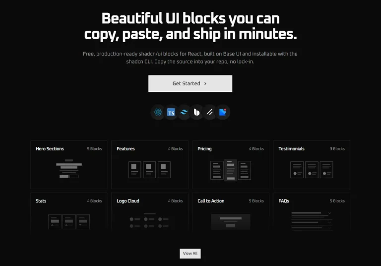
ShapeX UI is a collection of pre-built, resuable UI blocks for rapid web application development. It currently contains over 50 blocks across 20 categories, including headers, footers, pricing sections, and testimonials.
Built with performance and scalability in mind, ShapeX UI combines the power of shadcn/ui’s customizable components with Framer Motion’s animation capabilities. Each block follows established design patterns and implements responsive layouts, reducing development time and technical debt.
Features
⚡ Super Fast & Easy: Quickly implement components by copying and pasting, drastically reducing development time.
🧩 Ready-to-Use Blocks: Access a comprehensive selection of essential components required for building modern web applications.
🎨 Eye-Catching Designs: Utilize visually appealing blocks, from hero sections to testimonials, that are simple to customize.
✨ Smooth Animations: Incorporate polished, pre-built animations to enhance user interaction without extra effort.
Use Cases
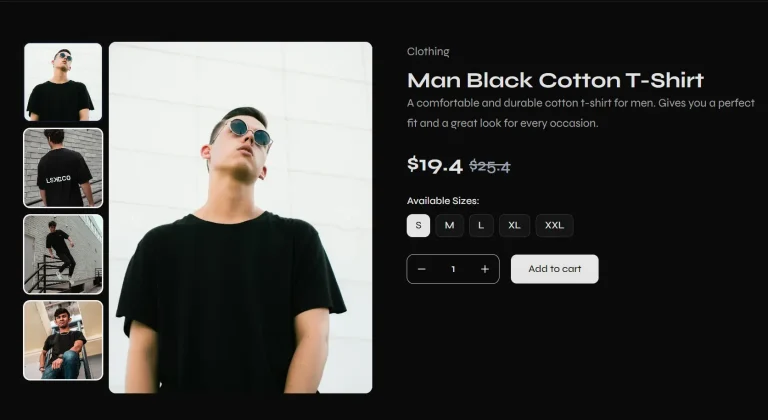
- E-commerce Platforms. Implement product galleries, pricing tables, and checkout flows. The responsive design ensures a seamless shopping experience across devices.
- Marketing Websites. Create engaging landing pages using hero sections, feature blocks, and testimonials. The pre-built animations help capture user attention and guide them through the content.
- SaaS Applications. Build consistent user interfaces across dashboard layouts, settings pages, and authentication flows. The modular nature of blocks supports scaling applications as features grow.
UI Blocks Included
- Article
- Blog
- Contact
- CTA
- FAQs
- Feature
- Footer
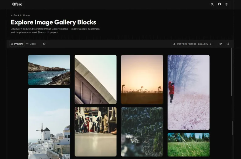
- Gallery
- Header
- Login
- Logo
- Newsletter
- Pricing
- Rating
- Roadmap
- SignUp
- Stats
- Steps
- Teams
- Testimonial
Related Resources
- shadcn/ui: The foundation upon which ShapeX UI is built. Explore its documentation for deeper customization options and component variations. https://ui.shadcn.com/docs
- Framer Motion: The animation library powering the smooth transitions in ShapeX UI. Consult its documentation to understand and extend the existing animations. https://www.framer.com/motion/
- Tailwind CSS: The utility-first CSS framework used by shadcn/ui and, by extension, ShapeX UI. Familiarize yourself with its classes for efficient styling. https://tailwindcss.com/docs
FAQs
Q: Who is ShapeX UI for?
A: ShapeX UI is beneficial for frontend developers, backend developers, development teams, and UI enthusiasts looking for ready-to-use, customizable components.
Q: How do I use ShapeX UI?
A: You can use ShapeX UI by copying and pasting the code for the desired blocks directly into your React project.
Q: Can I customize the styling of ShapeX UI blocks?
A: Yes, all blocks use Tailwind CSS classes and can be customized through theme configuration or direct class overrides.
Q: Do the blocks work with Next.js?
A: Yes, ShapeX UI is fully compatible with Next.js and supports both client and server components.