The Future of Web Dev
The Future of Web Dev
Animated UI Components/Blocks for React & Next.js – beUI
Add Framer Motion animation to React and Next.js UI with source-owned components & blocks.
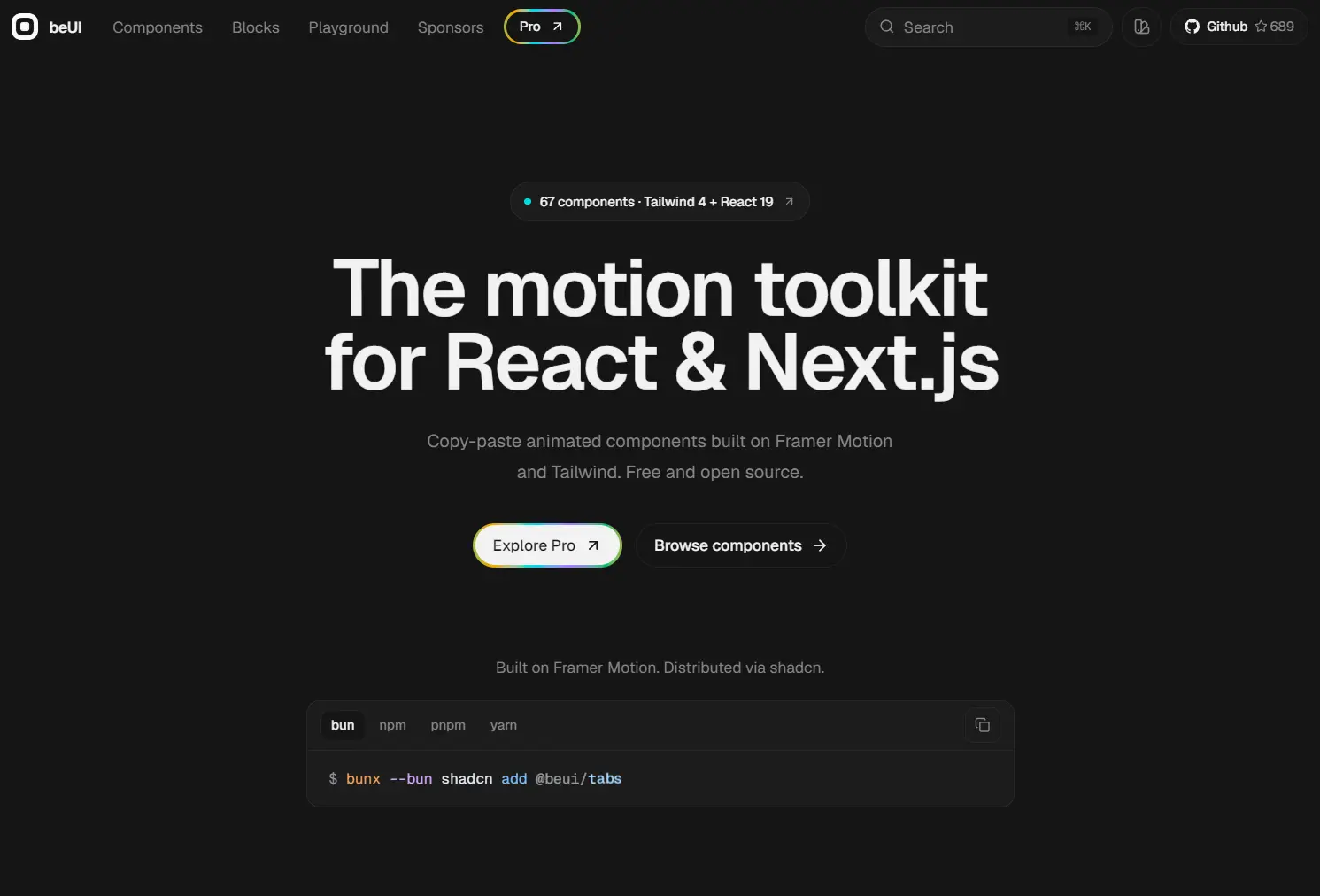
beUI is a React and Next.js component library that adds animated controls, interaction components, and product UI blocks to your web applications.
It currently contains 30+ UI components and 16+ UI blocks for forms, navigation, overlays, feedback, data interfaces, file uploads, scheduling, and other product UI.
The components use React, TypeScript, Tailwind CSS, and Motion. You can install each item through the @beui shadcn registry namespace, use a direct registry URL, or copy the source from its component page.
Features
- Installs individual components and blocks through a shadcn-compatible registry.
- Includes editable React and TypeScript source files.
- Uses Motion for animated states, transitions, and shared layout effects.
- Styles components with Tailwind CSS and shadcn semantic tokens.
- Covers small UI primitives and complete product interaction patterns.
- Supports direct registry URLs and manual source copying.
- Bundles required internal helper files with registry items.
Use Cases
- Settings and account screens can combine tabs, switches, selects, drawers, and feedback states from the same component collection.
- Use Morphing Modal or Shared Layout Background when users move between related interface states and visual continuity matters.
- File Upload, OTP Input, Command Palette, and Availability Scheduler provide larger starting points for task-focused application flows.
- Add selected components to an existing design system, then adapt their Tailwind classes, motion values, and interaction logic to local conventions.
- Product dashboards can mix animated controls with Table, Loader, Animated Toast Stack, and other status or data interface components.
Available UI Components & Blocks
| Category | Components | Practical Use |
|---|---|---|
| Forms and selection | Tabs, Switch, Input, Select, Checkbox, Radio Group, Range Slider, Wheel Picker | Settings, filters, forms, preferences, and structured input |
| Overlays and navigation | Bottom Sheet, Dock, Tooltip, Popover, Morphing Modal, Drawer | Contextual actions, mobile panels, layered views, and navigation |
| Motion and feedback | Shared Layout Background, Preview Rail, Text Animation, Number Animation, Animated Badge, Action Swap, Animated Toast Stack, Theme Toggle, Bouncy Accordion, Scroll Animation, Loader, Tilt Card, Button, Marquee | State changes, transitions, loading states, and interaction feedback |
| Data and visual UI | Table, Shader Background, Cylinder Carousel | Data views, animated backgrounds, and visual browsing |
| Product UI blocks | Dynamic Island, Command Palette, Expandable Action Bar, Overflow Actions, Expandable Tabs, Swipeable List, File Upload, Prediction Market, Wallet Card, OTP Input, Bloom Menu, Feedback Widget, 404 / Not Found, Knockout Bracket, Availability Scheduler, Multi-chain Swap | Larger application workflows and complete interface sections |
How To Use It
Set Up shadcn and the Theme
For a new setup, initialize shadcn:
npx shadcn@latest initProjects that do not use shadcn can add the beUI theme CSS below the Tailwind import in globals.css. That manual setup requires Tailwind CSS v4.
@import "tailwindcss";
/* Add the beUI theme definitions below this import. */
Install a Component
Install Tabs through the registry namespace:
npx shadcn@latest add @beui/tabsA direct registry URL works too:
npx shadcn@latest add https://beui.dev/r/tabs.jsonAI Coding Agent Support
beUI also exposes an MCP endpoint for component search, source retrieval, and install commands:
https://mcp.beui.dev/mcpFor Codex:
codex mcp add beui --url https://mcp.beui.dev/mcpStatic registry endpoints are available for direct tooling access:
https://beui.dev/r/{slug}.json
https://beui.dev/r/{slug}/raw
The JSON endpoint returns a shadcn registry item. The raw endpoint returns plain TSX source.
Alternatives and Related Resources
- 20+ Animated UI Components with shadcn/ui & Framer Motion – Indie UI
- Animated UI Components with Tailwind & Framer Motion – Berlix UI
- Motion-First UI Components with Smooth Animations – SHSF UI
- Copy-paste UI Components with Smooth Motion Effects – Spectrum UI
- 100+ Shadcn and Framer Motion Components for Next.js – UI TripleD
FAQs
Q: Why do a beUI component’s styles look wrong after installation?
A: Check the theme setup and Tailwind version first. The manual beUI theme requires Tailwind CSS v4, and the components expect shadcn-style semantic tokens such as bg-primary and text-muted-foreground.
Q: Why does an installed component have broken @/lib/... imports?
A: Compare the generated imports with the aliases in your shadcn configuration. Registry items may include internal helpers such as lib/utils.ts and lib/ease.ts, so moved files also need matching import paths.
Q: Can beUI components run inside Next.js Server Components?
A: Interactive components that use React state or motion/react need a Client Component boundary. Server Components can render those client components as children.
Q: Do all beUI components use the same dependencies?
A: No. Dependencies and helper files vary by registry item. Check the component’s registry metadata or install it through the shadcn CLI so its declared files and packages are included.