The Future of Web Dev
The Future of Web Dev
20+ Animated UI Components with shadcn/ui & Framer Motion – Indie UI
Build modern apps faster with Indie UI. Features 20+ UI components, dark mode, TypeScript support, and Framer Motion animations.
The Indie UI component library combines React, shadcn/ui, and Framer Motion to deliver animated, responsive components that help you build modern web UI faster.
Features
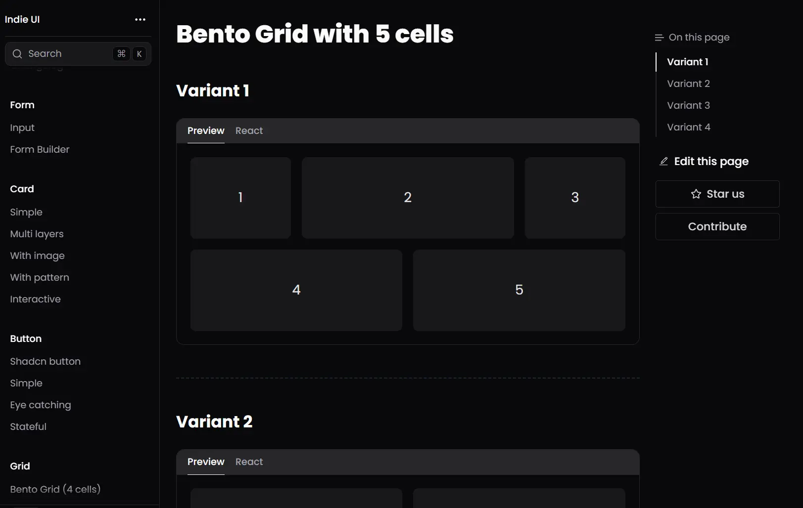
🎨 20+ Pre-built Components – Cards, inputs, buttons, loaders, and grid layouts ready for production use
🌙 Built-in Dark Mode – Automatic dark theme support without additional configuration
⚡ Framer Motion Integration – Smooth animations and transitions built into every component
📱 Responsive Design – Mobile-first approach with breakpoint-aware components
🔧 TypeScript Support – Full type definitions for better development experience
🎯 Tailwind CSS Based – Utility-first styling with easy customization options
📋 Form Builder Included – Complete form creation system using React Hook Form and Zod validation
🔄 Regular Updates – Continuous additions of new components and improvements
📚 Zero Learning Curve – Familiar React patterns with standard prop interfaces
🎪 Multiple Variants – Each component offers different styles and sizes
Use Cases
- Admin Dashboards: Construct data-heavy admin panels using components like bento grids, cards, and various input fields.
- Portfolio Websites: Create interactive elements and animated sections for personal or agency portfolio sites.
- Small to Medium Web Applications: Develop the front-end for applications that benefit from a modern React-based UI toolkit with animation capabilities.
- Landing Page Creation – Build marketing websites with eye-catching buttons, interactive cards, and animated elements
- E-commerce Interfaces – Develop product catalogs and shopping experiences using grid layouts and interactive components
- Form-Heavy Applications – Build complex forms for data collection, surveys, or user onboarding with the included form builder system
Installation
To begin using Indie UI, you must have Tailwind CSS configured in your project. You also need clsx and tailwind-merge.
1. Follow the official Tailwind CSS documentation to install and configure Tailwind CSS for your project environment.
2. Open your project directory in a terminal and run the following command to install clsx and tailwind-merge:
pnpm add clsx tailwind-merge3. Create a file named cn.ts (typically in a lib or utils folder). Paste the following code into this file. This function helps merge Tailwind CSS classes with conditional classes.
import { type ClassValue, clsx } from 'clsx';
import { twMerge } from 'tailwind-merge';
export function cn(...inputs: ClassValue[]) {
  return twMerge(clsx(inputs));
}
How to use it
The example below demonstrates how to use the Input component.
1. Import the necessary libraries & components into your React project:
import * as React from 'react';
import { cva, type VariantProps } from 'class-variance-authority';
import { cn } from '@/lib/utils'; // Adjust the path to your cn.ts file
2. Here is an example of how to define and use an Input component and its InputBlock container:
// Define InputProps interface
export interface InputProps extends React.InputHTMLAttributes<HTMLInputElement> {}
// Input component definition
const Input = React.forwardRef<HTMLInputElement, InputProps>(
  ({ className, type, ...props }, ref) => {
    return (
      <input
        type={type}
        className={cn(
          'size-full bg-transparent ring-offset-background file:border-0 file:bg-transparent file:text-sm file:font-medium dark:placeholder:text-zinc-600 placeholder:text-zinc-400 disabled:cursor-not-allowed disabled:opacity-50 focus-visible:outline-none text-base',
          className,
        )}
        ref={ref}
        {...props}
      />
    );
  },
);
Input.displayName = 'Input';
// Define variants for the InputBlock container
const rootVariants = cva(
  'py-1 px-2 flex rounded gap-1 items-center transition duration-200',
  {
    variants: {
      variant: {
        default:
          'border ring-zinc-800 ring-zinc-300 focus-within:ring-2 focus-within:ring-offset-2 dark:focus-within:ring-zinc-400 focus-within:ring-offset-white dark:focus-within:ring-offset-black focus-within:ring-zinc-600',
        underlined:
          'border-b-[1px] dark:border-zinc-800 focus-within:border-b-2 dark:focus-within:border-zinc-400 focus-within:border-zinc-500 rounded-none px-0',
        filled:
          'bg-zinc-100 dark:bg-zinc-900 dark:text-zinc-100 focus-within:bg-zinc-200 dark:focus-within:bg-zinc-800',
        ghost:
          'bg-transparent dark:bg-transparent dark:text-zinc-100 focus-within:bg-zinc-100 dark:focus-within:bg-zinc-900',
        neubrutalism:
          'border border-zinc-700 rounded-sm shadow-[2px_2px_0px_rgb(82,82,91)] dark:shadow-[2px_2px_0px_rgb(113,113,122)] focus-within:bg-yellow-50 dark:focus-within:bg-zinc-900/40',
      },
      size: {
        sm: 'h-8',
        default: 'h-10',
        lg: 'h-12',
      },
    },
    defaultVariants: {
      variant: 'default',
      size: 'default',
    },
  },
);
// Define InputBlockProps interface
type InputBlockProps = {
  className?: string;
  leftSection?: React.ReactNode;
  rightSection?: React.ReactNode;
  children: React.ReactNode;
} & VariantProps<typeof rootVariants>;
// InputBlock component definition
const InputBlock = ({
  size,
  variant,
  className = '',
  leftSection,
  rightSection,
  children,
}: InputBlockProps) => (
  <div className={cn('w-full', rootVariants({ variant, size, className }))}>
    {leftSection && leftSection}
    {children}
    {rightSection && rightSection}
  </div>
);
InputBlock.displayName = 'InputBlock';
// Export the components
export { Input, InputBlock };
// Example of how to use InputBlock and Input in your application
// const MyFormComponent = () => {
//   return (
//     <InputBlock variant="filled" size="lg">
//       <Input type="email" placeholder="Enter your email" />
//     </InputBlock>
//   );
// }
Related Resources
- shadcn/ui: A collection of re-usable components that you can copy and paste into your apps. Indie UI is built with shadcn. https://ui.shadcn.com/
- Tailwind CSS: A utility-first CSS framework for rapidly building custom user interfaces. Essential for Indie UI. https://tailwindcss.com/
- Framer Motion: A production-ready motion library for React. Used by Indie UI for animations. https://www.framer.com/motion/
- React Hook Form: Performant, flexible and extensible forms with easy-to-use validation. Used in Indie UI’s form builder. https://react-hook-form.com/
FAQs
Q: Can I customize the appearance of Indie UI components?
A: Yes, all components accept className props and are built with Tailwind CSS, making them fully customizable through utility classes or custom CSS.
Q: Does Indie UI work with Next.js and other React frameworks?
A: Indie UI works with any React-based framework including Next.js, Gatsby, Vite, and Create React App, as long as Tailwind CSS is properly configured.
Q: Are the components accessible?
A: The components follow basic accessibility guidelines and include proper ARIA attributes.
Q: Is Indie UI free to use in commercial projects?
A: Yes, Indie UI is open-source and free to use in both personal and commercial projects.