The Future of Web Dev
The Future of Web Dev
Animated React/TailwindCSS Components for Next.js – Componentry
Build animated Next.js apps with Componentry text effects, scroll interactions, WebGL backgrounds, cards, and visual experiments.
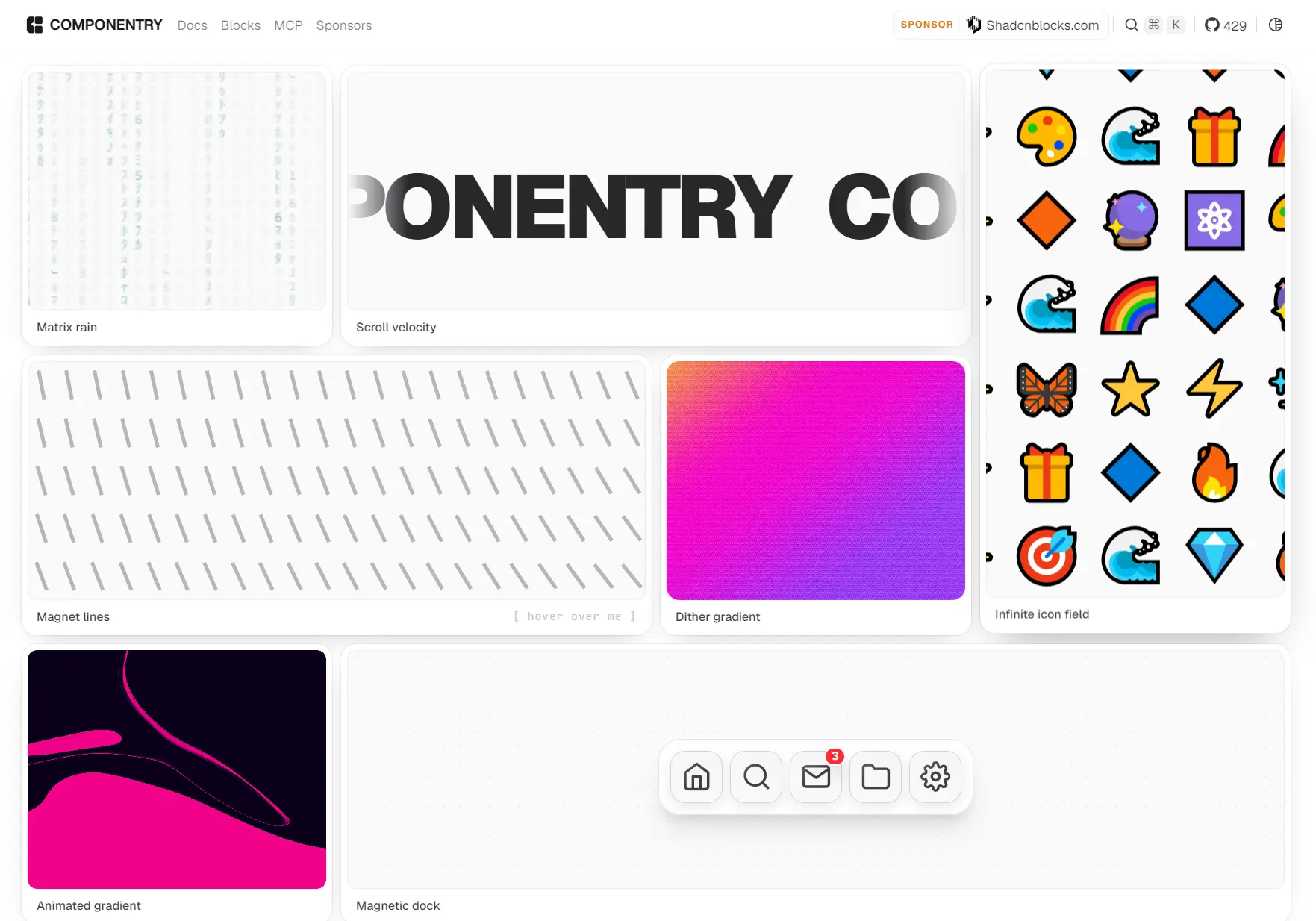
Componentry is a collection of interactive React and Tailwind CSS UI components powered by Framer Motion.
It’s ideal for landing pages, portfolios, product showcases, dashboards, and editorial experiences that need motion beyond standard form controls.
Features
- Copy-paste delivery.
- Motion-rich interactions: cursor tracking, spring physics, 3D transforms, scroll choreography.
- Dark mode built in.
- Fully typed with TypeScript.
- CLI installation.
- Works alongside shadcn/ui.
Available Components
| Category | Components |
|---|---|
| Text animations | Velocity Scroll, Letter Cascade, Text Repel, Text Morph, Kinetic Text Reveal, Particle Typography |
| Interactive components | Sticky Scroll Cards, Music Player, Scroll Split Card, Mac Keyboard, Circuit Board, Flight Status Card, Magnetic Dock, Collection Surfer, GitHub Calendar, Scroll Choreography, Scroll Tilted Grid, Layered Stack, Orbit Card Stack, Split Flap Display, Eye Tracking, Signature |
| Hero backgrounds | Hero Geometric, Dither Prism Hero, WebGL Liquid, Silk Aurora, Aurora Flow, Closing Plasma, Animated Gradient, Prism Gradient, Liquid Chrome |
| Visual effects | Dithered Logo, Image Trail, Image Ripple Effect, Ripple Transition, Infinite Image Field, Dither Gradient, Magnet Lines, Pixel Canvas, Matrix Rain |
| ASCII effects | ASCII Effect |
| Registry blocks | Gradient Hero 01, Pricing 01, Pricing 02 |
How To Use Componentry
1. The shadcn CLI requires a components.json file. Run the initializer in an existing Next.js or React project when that file is absent.
The command installs the base dependencies, creates the cn utility, and records local import aliases.
pnpm dlx shadcn@latest init2. Merge the registries key into the existing components.json file. Keep the other shadcn settings already present in the file.
{
  "registries": {
    "@componentry": "https://componentry.fun/r/{name}.json"
  }
}
3. The following command adds Scroll Based Velocity and its declared framer-motion dependency. The registry writes the component to components/ui/scroll-based-velocity.tsx.
pnpm dlx shadcn@latest add @componentry/scroll-based-velocity4. The installed file already declares "use client". A Next.js Server Component can render it with serializable props. Add "use client" to the parent only when the parent owns state, refs, event handlers, or browser APIs.
import { ScrollBasedVelocity } from "@/components/ui/scroll-based-velocity";
export function ProductLaunchBand() {
  return (
    <div className="overflow-hidden py-12">
      <ScrollBasedVelocity
        text="BUILD. TEST. SHIP."
        default_velocity={4}
        className="text-4xl font-semibold tracking-tight md:text-7xl"
      />
    </div>
  );
}
MCP Setup
Componentry’s MCP route connects the registry to coding environments such as Claude Code and Cursor. Initialize shadcn MCP after the registry entry exists in components.json, then request components from the configured namespace.
pnpm dlx shadcn@latest mcp initExample request:
Add the Componentry magnetic dock to the current landing page.Alternatives and Related Resources