The Future of Web Dev
The Future of Web Dev
Calamansi UI: Animated React UI Components for Next.js
Animated React UI with liquid transitions, spring motion, dashboard widgets, navigation, inputs, and an AI status orb.
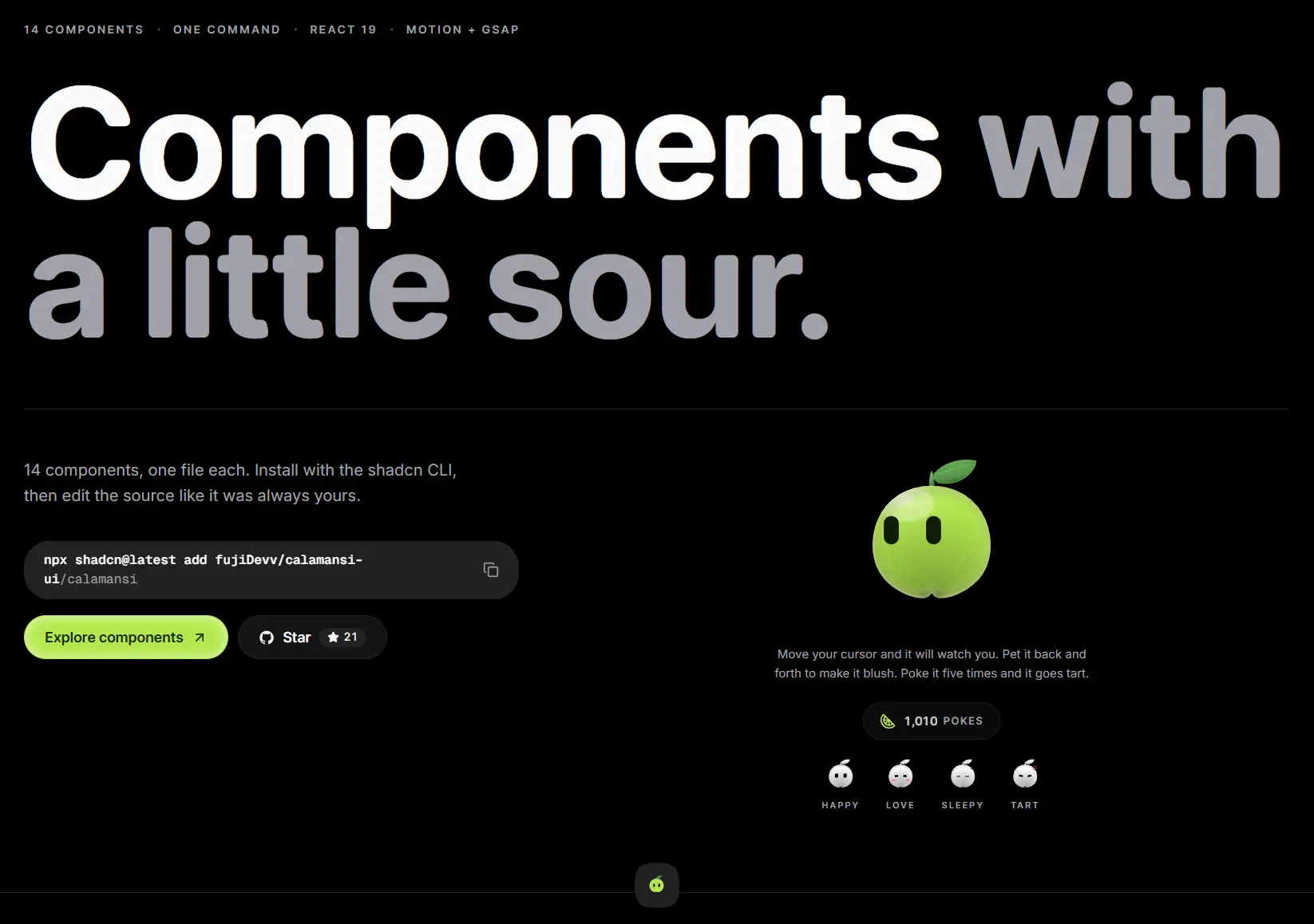
Calamansi UI is a React component registry that adds animated navigation, cards, widgets, inputs, and AI status UI to your Next.js projects.
It focuses on interaction-heavy pieces such as a magnifying Dock, Gooey Nav, Dynamic Island, Duration Picker, and Matrix Orb.
Each item installs as editable TSX source through the shadcn CLI.
Features
- Motion-based spring transitions for navigation, cards, widgets, counters, and liquid effects.
- GSAP animation for the interactive Calamansi mascot.
- Squircle design across many cards and navigation components.
- Four recurring palettes:
white,calamansi,slate, andcitrus. - Controlled and uncontrolled state APIs for Dynamic Island, Duration Picker, Gooey Nav, Sidebar, and GitHub Activity.
- Registry dependencies for shared
utils,squircle, andliquidhelpers. - TypeScript source styled with Tailwind CSS.
Use Cases
- Application navigation with a magnifying Dock, animated Sidebar, Gooey Nav, or compact Dynamic Island.
- Dashboard home screens with task, morning, and GitHub activity widgets.
- Timer controls, session settings, and other hours-and-minutes inputs with Duration Picker.
- AI voice and chat states with a Matrix Orb that reacts to
idle,listening, andthinkingstates.
How To Use It
1. Initialize shadcn
Run the initializer when the project does not already have components.json:
npx shadcn@latest init2. Install a Component
Install the Dock:
npx shadcn@latest add fujiDevv/calamansi-ui/dockUse the following GitHub registry address for other items:
npx shadcn@latest add fujiDevv/calamansi-ui/calamansi
npx shadcn@latest add fujiDevv/calamansi-ui/dynamic-island
npx shadcn@latest add fujiDevv/calamansi-ui/duration-picker
npx shadcn@latest add fujiDevv/calamansi-ui/matrix-orb
Basic Usage
DynamicIsland works in controlled or uncontrolled mode. Its default state is compact, and clicking it expands or collapses the content when interactive is active.
import { DynamicIsland } from "@/components/ui/dynamic-island";
export function FocusTimerIsland() {
  return (
    <DynamicIsland
      title="Focus Timer"
      trailing={<span>24:18</span>}
      expandedContent={
        <div className="space-y-2">
          <p className="text-sm font-medium">Deep work session</p>
          <p className="text-sm opacity-70">24 minutes remaining</p>
        </div>
      }
    />
  );
}
Controlled Duration Picker Example
Use value and onChange when application state owns the duration. onConfirm fires when the tick is pressed or Enter is used in either field.
"use client";
import { useState } from "react";
import { DurationPicker } from "@/components/ui/duration-picker";
export function SessionLengthPicker() {
  const [duration, setDuration] = useState({
    hours: 1,
    minutes: 30,
  });
  return (
    <DurationPicker
      value={duration}
      onChange={setDuration}
      onConfirm={(value) => console.log("Saved duration:", value)}
      maxHours={12}
      variant="calamansi"
    />
  );
}
Available Components
| Category | Components | Main Use |
|---|---|---|
| Display | Calamansi Mascot, Task Widget, Morning Widget, GitHub Activity | Mascot and dashboard content |
| Effects | Spotlight Card, Tilt Card, Marquee, Number Ticker | Animated surfaces and content |
| Navigation | Dock, Dynamic Island, Gooey Nav, Sidebar | Application navigation and compact actions |
| Inputs | Duration Picker | Hours and minutes input |
| AI | Matrix Orb | Listening, thinking, and idle status |
Component API Highlights
| Component | Key API |
|---|---|
| Calamansi | size, texture, variant, mood, interactive, followCursor, pressable |
| Dock / DockItem | reach, size, magnify, panelHeight, variant, label, onClick |
| Dynamic Island | state, defaultState, onStateChange, title, leading, trailing, expandedContent, pulse |
| Duration Picker | value, defaultValue, onChange, onConfirm, editing, maxHours, maxMinutes, variant, size |
| Matrix Orb | state, level, variant, color, size, lobes, gooey, labels, caption |
| GitHub Activity | username, contributions, repos, year, months, showMonths, open, onOpenChange |
Registry Files and Dependencies
| Registry Item | Packages | Purpose |
|---|---|---|
utils | clsx, tailwind-merge | cn() class helper |
squircle | figma-squircle, react-use-measure | Shared squircle surface |
liquid | motion, figma-squircle, react-use-measure | Shared liquid and metaball effects |
Styling and Customization
Edit the installed TSX files directly for deeper style changes. Many components expose variant for the white, calamansi, slate, and citrus palettes, then use Tailwind classes and local constants for component-specific styling.
The Calamansi mascot reads standard theme variables such as --primary, --primary-foreground, and --background. It also recognizes --calamansi-leaf and --calamansi-blush for mascot-specific colors.
Alternatives and Related Resources
- Nexvyn UI: 30+ Animated UI Components for shadcn/ui & React
- Motion-Powered Animated Components for Modern UIs – Animate UI
- 30+ Animated UI Components for Next.js/Shadcn – Joly UI
FAQs
Q: Does Matrix Orb capture microphone audio itself?
A: No. MatrixOrb receives an external value through level. Capture and normalize the audio signal in the application, then pass a value from 0 to 1 to the component.
Q: Can the Calamansi mascot run as a static element?
A: Yes. Set interactive={false} to disable its interactive behavior. followCursor and pressable also control those behaviors individually.
Q: Can application state control whether Duration Picker is open?
A: Yes. Use editing with onEditingChange for controlled editing state. Use defaultEditing for an uncontrolled initial state.
Q: Does GitHub Activity need a backend endpoint?
A: No. Its built-in username mode performs browser-side requests. Pass contributions and repos when the application already owns or fetches that data.