The Future of Web Dev
The Future of Web Dev
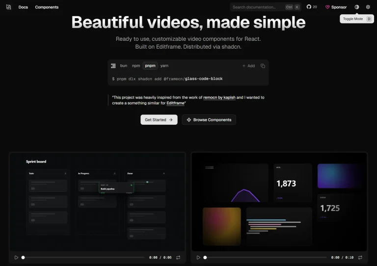
Launch MVPs Faster with MVPBlocks UI Components
Speed up MVP development with MVPBlocks: open-source Next.js & TailwindCSS UI components. Copy, paste, and customize. Launch faster!
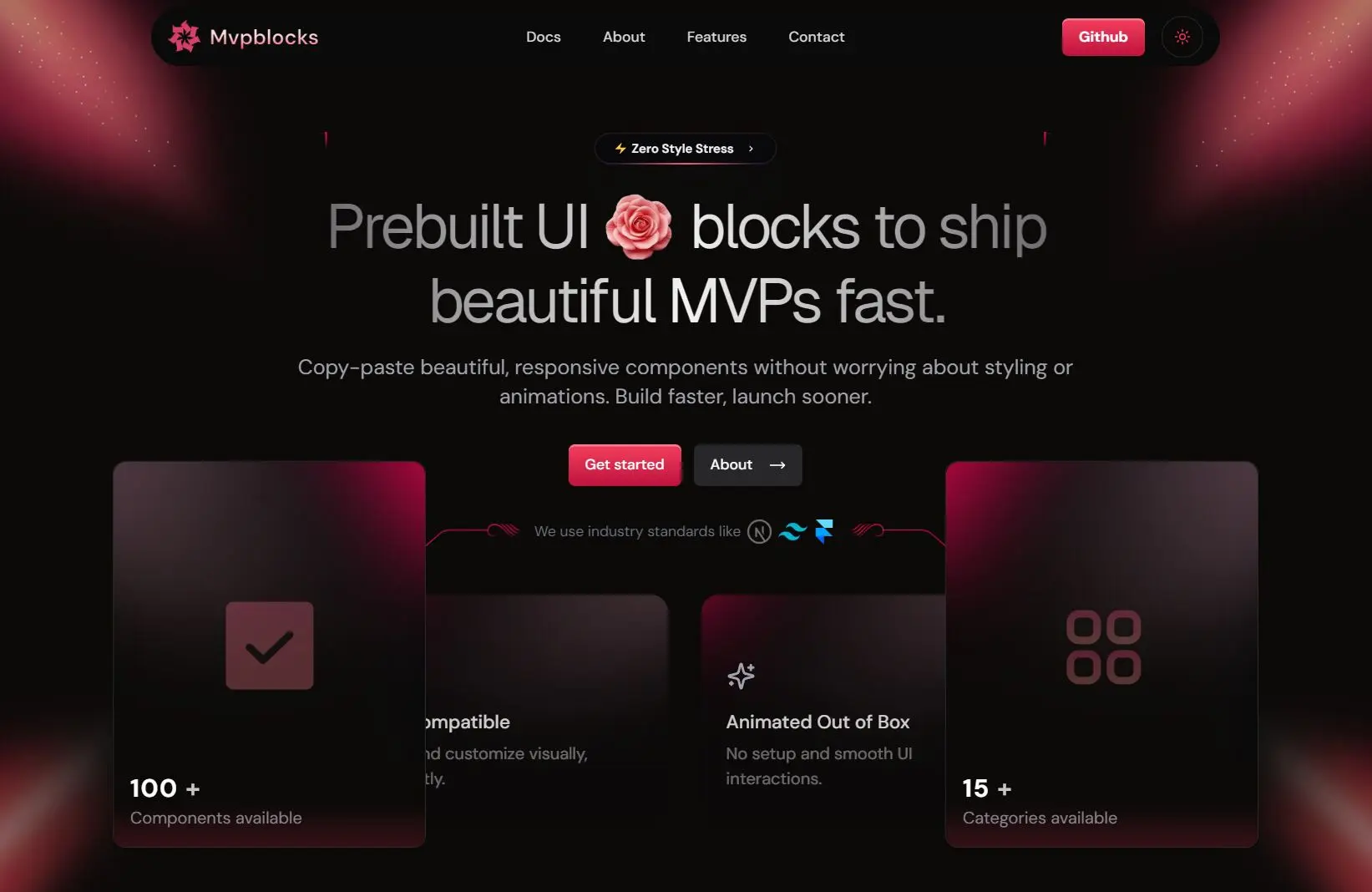
MVPBlocks is an open-source UI component library built with Next.js, TailwindCSS, shadcn/ui, and Framer Motion.
It provides a collection of pre-built UI components and blocks to accelerate the development of Minimum Viable Products (MVPs).
Features
🧑💻 Developer-Friendly Architecture – Built for developers who need to iterate fast with minimal overhead and maximum flexibility
🔧 CLI Integration – Smart command-line interface support for easy workflow integration and automated component management
🎨 Full Customization Control – Every component is designed to be easily modified from layout to logic and styling
🚀 MVP-Ready Components – Production-ready components/blocks that work reliably even in early-stage development
🖥️ Multi-Viewport Optimization – Components tested and optimized for all screen sizes from mobile to ultra-wide displays
📋 One-Click Copy – Instant code copying without complex setup or configuration requirements
Use Cases
- SaaS Dashboard Development – Rapidly build admin panels and user dashboards with pre-built components for data visualization, user management, and analytics displays.
- Landing Page Creation – Construct marketing websites quickly using hero sections, pricing tables, testimonials, and call-to-action blocks that convert visitors.
- E-commerce Storefronts – Build product catalogs and shopping interfaces with product cards, pricing components, and checkout flows.
- Authentication Systems – Implement complete login and registration flows with multi-step forms and secure authentication components.
- Portfolio Websites – Create professional personal or agency websites using gallery grids, team sections, and contact forms.
Installation
1. Create a Next.js app:
npx create-next-app@latestFollow the prompts. Ensure you select “Yes” for Tailwind CSS.
- Project name:
my-app(or your preferred name) - TypeScript: No / Yes
- ESLint: No / Yes
- Tailwind CSS: Yes
src/directory: No / Yes- App Router: Yes (recommended)
- Turbopack for
next dev: No / Yes - Import alias:
@/*(or your preferred alias)
2. Initialize ShadCN in your Next.js project:
npx shadcn-ui@latest initYou will be asked to configure components.json:
- Style: New York / Default
- Base color: Zinc (or your preferred color)
- CSS variables for colors: No / Yes
3. Install Framer Motion:
npm install motion
4. Additional Dependencies:
npm install react-icons
npm install canvas-confetti
npm i --save-dev @types/canvas-confetti
Usage
1. Add a component (example using ShadCN CLI for a button):
npx shadcn@latest add https://blocks.mvp-subha.me/r/star-on-github.json2. Import and use the component in your files:
import { Button } from "@/components/ui/button";
import { GithubIcon } from "lucide-react";

export default function StarOnGithub() {
  return (
    <Button
      type="button"
      className="animate-rainbow before:animate-rainbow group relative inline-flex h-10 cursor-pointer items-center justify-center whitespace-nowrap rounded-md border-0 bg-[linear-gradient(#fff,#fff),linear-gradient(#fff_50%,rgba(255,255,255,0.6)_80%,rgba(0,0,0,0)),linear-gradient(90deg,hsl(0,100%,63%),hsl(90,100%,63%),hsl(210,100%,63%),hsl(195,100%,63%),hsl(270,100%,63%))] bg-[length:200%] px-4 py-2 text-sm font-medium text-foreground ring-offset-background transition-colors transition-transform duration-200 [background-clip:padding-box,border-box,border-box] [background-origin:border-box] [border:calc(0.08*1rem)_solid_transparent] before:absolute before:bottom-[-20%] before:left-1/2 before:z-[0] before:h-[20%] before:w-[60%] before:-translate-x-1/2 before:bg-[linear-gradient(90deg,hsl(0,100%,63%),hsl(90,100%,63%),hsl(210,100%,63%),hsl(195,100%,63%),hsl(270,100%,63%))] before:[filter:blur(calc(0.8*1rem))] hover:scale-105 focus-visible:outline-none focus-visible:ring-2 focus-visible:ring-ring focus-visible:ring-offset-2 active:scale-95 disabled:pointer-events-none disabled:opacity-50 dark:bg-[linear-gradient(#121213,#121213),linear-gradient(#121213_50%,rgba(18,18,19,0.6)_80%,rgba(18,18,19,0)),linear-gradient(90deg,hsl(0,100%,63%),hsl(90,100%,63%),hsl(210,100%,63%),hsl(195,100%,63%),hsl(270,100%,63%))]"
    >
      <div className="flex items-center">
        <GithubIcon className="h-4 w-4" />
        <span className="ml-1 p-1 lg:inline">Star on GitHub</span>
      </div>
      <div className="ml-2 flex items-center gap-1 text-sm md:flex">
        <svg
          className="size-4 text-gray-500 transition-all duration-200 group-hover:text-yellow-300"
          data-slot="icon"
          aria-hidden="true"
          fill="currentColor"
          viewBox="0 0 24 24"
          xmlns="http://www.w3.org/2000/svg"
        >
          <path
            clipRule="evenodd"
            d="M10.788 3.21c.448-1.077 1.976-1.077 2.424 0l2.082 5.006 5.404.434c1.164.093 1.636 1.545.749 2.305l-4.117 3.527 1.257 5.273c.271 1.136-.964 2.033-1.96 1.425L12 18.354 7.373 21.18c-.996.608-2.231-.29-1.96-1.425l1.257-5.273-4.117-3.527c-.887-.76-.415-2.212.749-2.305l5.404-.434 2.082-5.005Z"
            fillRule="evenodd"
          ></path>
        </svg>
        <span className="font-display inline-block font-medium tabular-nums tracking-wider text-black dark:text-white">
          1.2k
        </span>
      </div>
    </Button>
  );
}
Related Resources
- Next.js Documentation: The official documentation for the Next.js MVPBlocks is built upon. (https://nextjs.org/docs)
- Tailwind CSS Documentation: The official guide to the utility-first CSS framework used for styling MVPBlocks. (https://tailwindcss.com/docs)
- ShadCN UI: A collection of re-usable components that you can copy and paste into your apps. MVPBlocks integrates well with its setup. (https://ui.shadcn.com)
- Framer Motion Documentation: For creating fluid animations, often used in conjunction with modern UI components. (https://www.framer.com/motion/)
FAQs
Q: Is MVPBlocks free to use?
A: Yes, MVPBlocks is a fully open-source component library. You can use its components in your projects without any cost.
Q: Do I need to install MVPBlocks as a package dependency?
A: No, MVPBlocks follows a copy-paste approach. You don’t install it as a dependency – you copy individual component codes directly into your project.
Q: Are the components responsive by default?
A: Yes, all MVPBlocks components are built with responsive design principles using TailwindCSS classes and are tested across multiple viewport sizes.
Q: Can I modify the components after copying them?
A: Absolutely. The components are designed to be fully customizable. You can modify styling, functionality, and structure to match your specific requirements.