The Future of Web Dev
The Future of Web Dev
Copy-Paste Accessible Components for React & Shadcn/ui – JollyUI
Build highly accessible UIs using JollyUI, a collection of React Aria components designed for shadcn/ui integration.

JollyUI is an open-source collection of reusable UI components that are compatible with shadcn/ui.
It combines React Aria Components and Tailwind CSS to provide a simple way to integrate accessible UI components into your modern web applications.
Features
✨ shadcn/ui Compatible: Works with your existing shadcn/ui projects and themes.
♿ Accessibility Focused: Built with React Aria Components to create accessible UIs.
🛠️ Customizable: Copy and paste components for full control over the code.
🔧 CLI Integration – Install components via shadcn CLI commands.
🎪 Rich Component Set – 40+ components including forms, navigation, data display, and overlays.
🏗️ TypeScript Support – Full TypeScript definitions included.
Use Cases
- Enhancing Existing shadcn/ui Projects: Integrate JollyUI components into projects already using shadcn/ui to leverage React Aria’s accessibility features.
- Building Accessible Web Applications: Use JollyUI as a foundation for new projects where accessibility is a primary concern from the outset.
- Prototyping UIs with Accessibility: Quickly assemble accessible user interface prototypes by copying and pasting needed components.
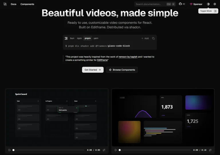
Preview

Installation
You have two main ways to install JollyUI components: using the shadcn CLI (the recommended method) or by manually setting up the configuration files.
If you have already configured shadcn/ui with its CLI, you can skip to step 4 of the JollyUI installation.
Method 1: Using shadcn CLI
1. Create Project: Initialize a new Next.js project or set up an existing one:
npx shadcn@latest init2. Configure components.json: Answer the prompts regarding style, base color, and CSS variables.
3. App Structure: JollyUI suggests a specific app structure, placing UI components in components/ui, other components in components, utility functions in lib, and global CSS in styles.
4. Add Components: You can now add JollyUI components using the CLI by specifying the component’s URL:
npx shadcn@latest add https://jollyui.dev/default/buttonThis command adds the Button component to your components/ui folder.
Method 2: Manual Setup
1. Install Tailwind CSS: Install and configure Tailwind CSS in your project.
2. Install Dependencies:
npm install tailwindcss-animate class-variance-authority clsx tailwind-merge3. Add Icon Library: Install lucide-react for the default style or @radix-ui/react-icons for the new-york style.
4. Configure Path Aliases: Set up path aliases in tsconfig.json (e.g., @/*: ["./*"]).
5. Configure tailwind.config.js: Set up your Tailwind configuration, including darkMode, content paths, theme extensions (colors, borderRadius, fontFamily, keyframes, animation), and plugins like tailwindcss-animate.
6. Configure Styles: Add base styles and theme variables to your global CSS file (e.g., styles/globals.css).
7. Add cn Helper: Define a utility function (cn) in lib/utils.ts using clsx and tailwind-merge for conditional class names.
Usage
Once components are added to your project, you can import and use them like any other React component.
For example, after adding the Button component:
import { Button } from "@/components/ui/button";
export default function Home() {
  return (
    <div>
      <Button>Click me</Button>
    </div>
  );
}
CLI for Adding Components
You can add JollyUI components using the shadcn CLI in two ways:
Using the components URL (Recommended):
npx shadcn@latest add https://jollyui.dev/default/buttonReplace default/button with the desired style and component.
Using the REGISTRY_URL environment variable:
REGISTRY_URL=https://jollyui.dev/r npx shadcn@latest add button
UI Components Included
- Button
- File Trigger
- Toggle Button
- Toggle Button Group
- GridList
- ListBox
- Menu
- Table
- TagGroup
- Tree
- Color Pickers
- Primitives
- Calendar
- DateField
- Date Picker
- Date Range Picker
- Range Calendar
- TimeField
- Dropzone
- Forms
- Checkbox
- Checkbox Group
- NumberField
- Radio Group
- Searchfield
- Slider
- Switch
- TextField
- Breadcrumbs
- Disclosure
- DisclosureGroup
- Link
- Tabs
- Dialog
- Modal
- Popover
- Tooltip
- ComboBox
- Select
- Meter
- Progress Bar
- Group
- Toolbar
Related Resources
- shadcn/ui – The original component library that inspired JollyUI’s design system
- React Aria Components – Adobe’s accessible component library that powers JollyUI’s functionality
- Tailwind CSS – The utility-first CSS framework used for styling all components
- Radix UI – Alternative accessible component library, useful for comparison and additional components
FAQs
Q: Is JollyUI a component library like Material UI or Chakra UI?
A: No, JollyUI is not a traditional component library that you install as a dependency. It’s a collection of components that you copy and paste into your application.
Q: Can I use JollyUI components with my existing shadcn/ui project?
A: Yes, JollyUI is designed to be compatible with shadcn/ui and works with your existing themes and components. It can act as an add-on.
Q: How do I customize the styling of JollyUI components?
A: Components use Tailwind CSS classes and CSS variables, just like shadcn/ui. You can modify the component code directly or adjust your theme variables to change the appearance.