The Future of Web Dev
The Future of Web Dev
Modern Button Components for Deno Fresh & Preact
Build better Deno Fresh interfaces with Shadcn Fresh Buttons. 15+ button variants, animations, and styles for modern web applications.

Shadcn Fresh Buttons is a button component library built for Deno’s Fresh framework and Preact applications.
It brings the popular shadcn button components to the Deno ecosystem, offering a wide range of button styles and variants.
Features
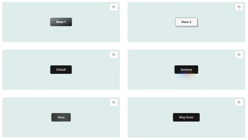
✨ Variety of Styles: Offers a diverse range of button styles, including default, outline, secondary, ghost, destructive, link, and more.
🌈 Animated Variants: Includes dynamic button variants with animations like shine, gooey effects, rainbow gradients, and heartbeat pulsations.
🚀 Easy Integration: Simple setup and usage within Deno Fresh projects.
📦 Customizable: Highly adaptable with various props for size, variant, and custom class names.
🎨 Tailwind CSS Integration: Leverages the power of Tailwind CSS for easy customization and theming.
🎯 Preact Compatibility: Built for Preact, ensuring optimal performance and small bundle sizes.
📱 Responsive Design: Adapts seamlessly to different screen sizes for a consistent user experience.
⚙️ Icon Support: Integrates seamlessly with icon libraries, allowing you to add icons within buttons.
Use Cases
- E-commerce Platforms: Implement visually engaging call-to-action buttons for “Add to Cart,” “Checkout,” and “Buy Now” functionalities.
- Blogs and Content Websites: Use distinct button styles for “Read More,” “Subscribe,” and social media sharing options.
- Dashboards and Web Applications: Enhance user interaction with clear and intuitive buttons for navigation, data submission, and various actions.
- Landing Pages: Employ eye-catching buttons with animations to draw attention to key conversions, such as sign-ups or demo requests.
- Interactive Forms: Use different button styles for form submission, reset actions, and step-by-step navigation within multi-part forms.
Installation Guide
1. Set up a Fresh project:
deno run -A -r https://fresh.deno.dev2. Install dependencies:
deno add jsr:@preact-icons/rx npm:class-variance-authority npm:clsx npm:tailwind-merge npm:tailwindcss-animate3. Configure your project:
- Update tailwind.config.ts with the provided configuration
- Add the required CSS variables to your style.css
- Create the utils.ts file for helper functions
- Add the Button component file
Usage Guide
Basic button implementation:
import { Button } from "../components/Button.tsx";
// Default button
<Button>Click me</Button>
// Variant examples
<Button variant="destructive">Delete</Button>
<Button variant="rainbow">Special Action</Button>
// Size variations
<Button size="sm">Small</Button>
<Button size="lg">Large</Button>
// With icon
<Button variant="expandIcon" Icon={IconComponent} iconPlacement="right">
  Expand
</Button>
Related Resources
- Shadcn UI: The original design system that inspired this component library. https://ui.shadcn.com/
- Deno Fresh: The Deno framework for building fast web applications. https://fresh.deno.dev/
- Preact: A fast and lightweight alternative to React. https://preactjs.com/
- Tailwind CSS: A utility-first CSS framework. https://tailwindcss.com/
FAQs
Q: Is Tailwind CSS required?
A: Yes, the button styles rely on Tailwind CSS utilities and configurations.
Q: Can I customize the button animations?
A: Yes, modify the keyframes and animation properties in the tailwind configuration.
Preview