The Future of Web Dev
The Future of Web Dev
Full-Featured shadcn/ui Data Table with TanStack Table & TailwindCSS
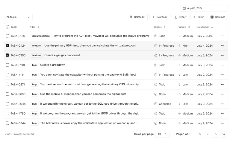
A shadcn/ui data table component with 38 features: sorting, filtering, search, inline editing, export, grouping, virtualization, and server-side mode. Install via shadcn registry.
shadcn-react-table is a shadcn/ui data table component built on TanStack Table and Tailwind CSS.
It packs every feature from Material React Table V3 into a single registry system that installs directly into any shadcn/ui project.
You can use it to replace bulky data table libraries with a lightweight, theme‑aware data grid that handles everything from simple list displays to editable, searchable, and exportable server‑driven tables.
Features
- One CLI command adds the table, its dependencies, and the highlight token to your project.
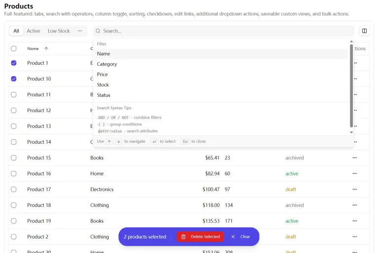
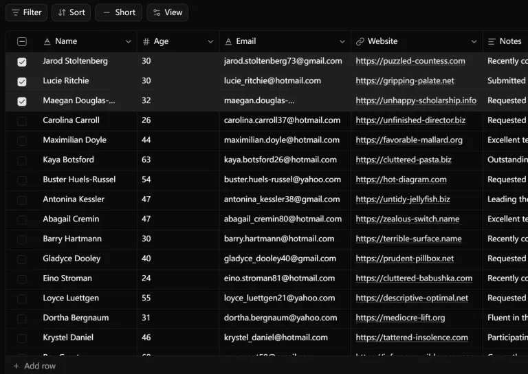
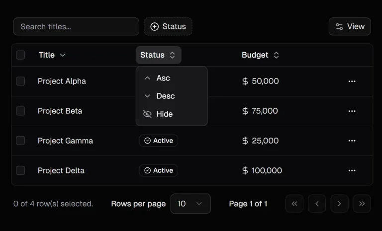
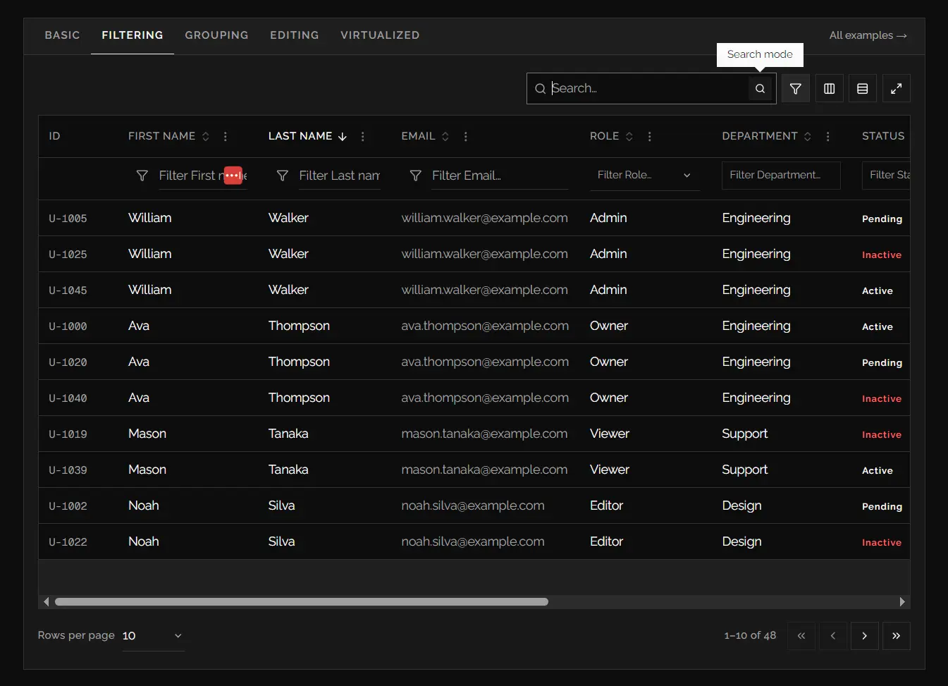
- Sorting, multi‑column filtering (text, select, multi‑select, range, range‑slider, date, date‑range, checkbox), and global fuzzy search.
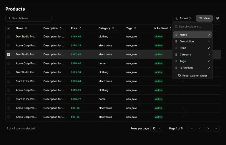
- Column ordering, pinning, resizing, and visibility controls with draggable headers.
- Row selection, row numbers, row drag‑and‑drop ordering, and row pinning.
- Inline cell, row, table, and modal editing. Also supports creating new rows.
- Grouping with aggregation functions and expandable sub‑rows.
- Detail panels that render extra content when a row is expanded.
- Sticky header and footer rows inside a scrollable container.
- Row and column virtualization for smooth scrolling with tens of thousands of records.
- CSV and Excel export buttons (papaparse + xlsx).
- Localization and custom icon sets (Remixicon) replaceable via props.
- Full manual/server‑side mode. Control sorting, pagination, and filtering through TanStack Table’s
manual*flags and controlled state.
Use Cases
- Customer support queues benefit from status filters, row selection, inline assignment actions, and copyable customer details in one review surface.
- Finance and operations dashboards can group records by department, calculate footer totals, and export filtered result sets for offline review.
- Product catalog managers can pin key columns, resize detailed attribute fields, and edit selected values directly inside a table.
- Audit log interfaces need server-side pagination and sorting when records live behind an API or database query layer.
- Data-heavy analytics screens benefit from virtualized rows when long result sets must remain readable inside a bounded panel.
How To Use It
Table Of Contents
Requirements
The registry workflow expects a project that already has:
- React.
- Tailwind CSS.
- shadcn/ui initialization.
- A valid
components.jsonfile. - An alias that resolves
@/components/ui.
For a Next.js App Router project, place the interactive table in a Client Component because useDataTable() uses React state and browser-driven interactions.
Installation
Install the registry item with the shadcn CLI:
pnpm dlx shadcn@latest add https://monabbir-ahmmad.github.io/shadcn-react-table/r/data-table.jsonThe command installs the data table files in:
components/ui/data-table/It also installs the required dependencies and shadcn/ui primitives. The registry adds --highlight and --highlight-foreground tokens to globals.css for matched filter text.
Import the public API from the installed component directory:
import { DataTable, useDataTable } from "@/components/ui/data-table"Basic Usage
Create stable column definitions, pass them into useDataTable(), then render the returned table instance with <DataTable />.
"use client"
import type { ColumnDef } from "@tanstack/react-table"
import { DataTable, useDataTable } from "@/components/ui/data-table"
type Customer = {
  id: string
  name: string
  email: string
  plan: "starter" | "team" | "enterprise"
  monthlySpend: number
}
const columns: ColumnDef<Customer>[] = [
  {
    accessorKey: "name",
    header: "Customer",
  },
  {
    accessorKey: "email",
    header: "Email",
  },
  {
    accessorKey: "plan",
    header: "Plan",
  },
  {
    accessorKey: "monthlySpend",
    header: "Monthly Spend",
    meta: {
      align: "right",
    },
    cell: ({ getValue }) =>
      new Intl.NumberFormat("en-US", {
        style: "currency",
        currency: "USD",
      }).format(getValue<number>()),
  },
]
export function CustomerTable({
  data,
}: {
  data: Customer[]
}) {
  const table = useDataTable({
    data,
    columns,
    getRowId: (customer) => customer.id,
    initialState: {
      pagination: {
        pageSize: 25,
      },
    },
  })
  return <DataTable table={table} />
}
This starting point includes client-side pagination, sorting, global search, column visibility controls, density controls, and the standard toolbar.
Keep data and columns stable. Define columns at module scope, store them in state, or memoize them before passing them to TanStack Table.
Advanced Examples
Add Filter Controls for Customer Records
Set columnDef.meta.variant to match the data type. A select filter works well for subscription plans. A range slider fits numeric values such as spend, score, or quantity.
const columns: ColumnDef<Customer>[] = [
  {
    accessorKey: "name",
    header: "Customer",
    meta: {
      variant: "text",
      filterMode: "contains",
    },
  },
  {
    accessorKey: "plan",
    header: "Plan",
    meta: {
      variant: "multi-select",
      options: [
        { label: "Starter", value: "starter" },
        { label: "Team", value: "team" },
        { label: "Enterprise", value: "enterprise" },
      ],
    },
  },
  {
    accessorKey: "monthlySpend",
    header: "Monthly Spend",
    meta: {
      align: "right",
      variant: "range-slider",
      filterMode: "betweenInclusive",
    },
  },
]
const table = useDataTable({
  data,
  columns,
  getRowId: (customer) => customer.id,
  defaultShowColumnFilters: true,
  enableColumnFilterModes: true,
  enableFilterMatchHighlighting: true,
})
Use meta.options when a select filter needs a controlled list of values. If meta.options is omitted, select and multi-select filters derive values from faceted table data.
Add Inline Editing and a Create-Row Button
Cell mode fits small field updates. Row and modal modes fit workflows that require validation across several values before saving.
"use client"
import * as React from "react"
import type { ColumnDef } from "@tanstack/react-table"
import { Button } from "@/components/ui/button"
import { DataTable, useDataTable } from "@/components/ui/data-table"
type InventoryItem = {
  id: string
  sku: string
  name: string
  quantity: number
  status: "active" | "archived"
}
export function InventoryTable({
  initialData,
}: {
  initialData: InventoryItem[]
}) {
  const [data, setData] = React.useState(initialData)
  const columns = React.useMemo<ColumnDef<InventoryItem>[]>(
    () => [
      {
        accessorKey: "sku",
        header: "SKU",
        meta: {
          enableClickToCopy: true,
        },
      },
      {
        accessorKey: "name",
        header: "Product",
      },
      {
        accessorKey: "quantity",
        header: "Quantity",
        meta: {
          align: "right",
          editVariant: "number",
          validate: (value) =>
            Number(value) < 0 ? "Quantity cannot be negative." : undefined,
        },
      },
      {
        accessorKey: "status",
        header: "Status",
        meta: {
          variant: "select",
          editVariant: "select",
          options: [
            { label: "Active", value: "active" },
            { label: "Archived", value: "archived" },
          ],
          editSelectOptions: [
            { label: "Active", value: "active" },
            { label: "Archived", value: "archived" },
          ],
        },
      },
    ],
    []
  )
  const table = useDataTable({
    data,
    columns,
    getRowId: (item) => item.id,
    enableEditing: true,
    editDisplayMode: "row",
    createDisplayMode: "modal",
    createRowDefaults: {
      quantity: 0,
      status: "active",
    },
    onSaveRow: ({ row, values, exit }) => {
      setData((current) =>
        current.map((item) =>
          item.id === row.id
            ? { ...item, ...values } as InventoryItem
            : item
        )
      )
      exit()
    },
    onCreateRow: ({ values, exit }) => {
      setData((current) => [
        ...current,
        {
          id: crypto.randomUUID(),
          sku: String(values.sku ?? ""),
          name: String(values.name ?? ""),
          quantity: Number(values.quantity ?? 0),
          status: values.status === "archived" ? "archived" : "active",
        },
      ])
      exit()
    },
    renderToolbarActions: ({ table }) => (
      <Button onClick={() => table.cnTable.beginCreate()}>
        Add product
      </Button>
    ),
  })
  return <DataTable table={table} />
}
table.cnTable.beginCreate() opens the create-row workflow programmatically. beginRowEdit(), cancelEdit(), and setRowDraftValue() support custom editing controls.
Connect the Table to Server-Side Pagination, Sorting, and Filters
Use TanStack controlled state with the manual* options when the database or API owns pagination, sorting, and filtering.
"use client"
import * as React from "react"
import type {
  ColumnFiltersState,
  PaginationState,
  SortingState,
} from "@tanstack/react-table"
import { DataTable, useDataTable } from "@/components/ui/data-table"
export function OrdersTable() {
  const [pagination, setPagination] = React.useState<PaginationState>({
    pageIndex: 0,
    pageSize: 25,
  })
  const [sorting, setSorting] = React.useState<SortingState>([])
  const [columnFilters, setColumnFilters] =
    React.useState<ColumnFiltersState>([])
  const [globalFilter, setGlobalFilter] = React.useState("")
  const { rows, totalRows, isLoading } = useOrdersQuery({
    page: pagination.pageIndex + 1,
    pageSize: pagination.pageSize,
    sorting,
    columnFilters,
    globalFilter,
  })
  const table = useDataTable({
    data: rows,
    columns,
    getRowId: (order) => order.id,
    manualPagination: true,
    manualSorting: true,
    manualFiltering: true,
    rowCount: totalRows,
    state: {
      pagination,
      sorting,
      columnFilters,
      globalFilter,
    },
    onPaginationChange: setPagination,
    onSortingChange: setSorting,
    onColumnFiltersChange: setColumnFilters,
    onGlobalFilterChange: setGlobalFilter,
    isLoading,
  })
  return <DataTable table={table} />
}
Manual filtering does not calculate faceted select values or numeric bounds from the current rows. Pass meta.options when a server-side filter needs an explicit select list.
Virtualize a Large Activity Log
Set a bounded scroll height before enabling row virtualization. The table uses its scroll surface as the virtualizer container.
const table = useDataTable({
  data: activityRows,
  columns,
  getRowId: (event) => event.id,
  enableRowVirtualization: true,
  estimateRowHeight: 52,
  virtualOverscan: 10,
})
return (
  <DataTable
    table={table}
    surfaceClassName="max-h-[720px]"
    pageSizeOptions={[25, 50, 100]}
  />
)
Row virtualization and row drag ordering cannot run together. Column virtualization also conflicts with column ordering and pinning.
Filter Variants and Modes
Set a filter control through columnDef.meta.variant.
| Variant | Best For | Available Filter Behavior |
|---|---|---|
text | Names, IDs, titles, notes, email addresses. | Fuzzy, contains, starts with, ends with, equals, empty states. |
select | Single category fields such as status or plan. | Equals, not equals, empty states. |
multi-select | Tags, roles, departments, multiple statuses. | Inclusion-based matching and empty states. |
checkbox | Boolean fields such as active, paid, or verified. | Boolean equals matching. |
range | Prices, scores, quantities, amounts, durations. | Equals, comparison, between, empty states. |
range-slider | Numeric ranges that suit a slider control. | Equals, comparison, between, empty states. |
date | Single date fields. | Equals, before, after, between, empty states. |
date-range | Booking dates, reporting periods, delivery ranges. | Equals, before, after, between, empty states. |
Use meta.filterMode to select the initial mode for a column.
{
  accessorKey: "createdAt",
  header: "Created",
  meta: {
    variant: "date",
    filterMode: "after",
    columnFilterModeOptions: ["after", "before", "betweenDates"],
  },
}
Set enableColumnFilterModes: false to remove filter mode menus across the table. Set meta.enableColumnFilterModes: false when a single column must keep one fixed filter behavior.
useDataTable Options
useDataTable() accepts standard TanStack Table options plus the table-specific options below. TanStack options handle data, columns, state, initialState, row models, getRowId, getSubRows, sorting state, row selection state, pagination state, and manual server-side flags.
Core UI State and Loading Options
| Option | Purpose | ||
|---|---|---|---|
localization | Overrides any subset of user-facing strings for one table instance. | ||
icons | Replaces any subset of table icon components. | ||
defaultDensity | Sets the uncontrolled starting density. Default: "comfortable". | ||
density | Controls density externally. | ||
onDensityChange | Receives density changes from toolbar controls or imperative calls. | ||
isFullscreen | Controls full-screen state externally. | ||
onIsFullscreenChange | Receives full-screen changes. | ||
defaultShowColumnFilters | Opens the filter row on first render. Default: false. | ||
showColumnFilters | Controls filter-row visibility externally. | ||
onShowColumnFiltersChange | Receives filter-row visibility changes. | ||
isLoading | Activates default loading behavior. | ||
isSaving | Shows save progress for mutation workflows. | ||
showProgressBars | Shows or hides the top progress indicator. Defaults to isLoading | | isSaving. | ||
showSkeletons | Replaces empty table rows with skeleton rows during loading. Defaults to isLoading. | ||
showLoadingOverlay | Dims existing table rows during loading. Defaults to isLoading. |
Search, Column Filtering, and Advanced Filter Options
| Option | Purpose |
|---|---|
enableFacetedValues | Calculates unique select values and numeric min-max values from local table data. Default: true. |
enableColumnActions | Shows column action menus and the column visibility control. Default: true. |
enableColumnFilterModes | Shows filter mode menus for compatible column filter inputs. Default: true. |
enableFilterMatchHighlighting | Highlights matched text in table cells. Default: true. |
enableGlobalFilter | Shows global search in the toolbar. Default: true. |
enableGlobalFilterModes | Shows global search mode controls. Default: true. |
enableGlobalFilterRankedResults | Sorts fuzzy search results by relevance until the user applies a sort. Default: false. |
defaultGlobalFilterMode | Sets the uncontrolled global search mode. Default: "fuzzy". |
globalFilterMode | Controls global search mode externally. |
onGlobalFilterModeChange | Receives global search mode changes. |
enableAdvancedFilter | Adds the compound advanced-filter dialog. Default: false. |
advancedFilter | Controls the advanced filter rule group externally. |
defaultAdvancedFilter | Seeds an uncontrolled advanced filter rule group. |
onAdvancedFilterChange | Receives advanced filter state changes. |
renderColumnFilterModeMenuItems | Replaces built-in column filter mode menu items. |
renderGlobalFilterModeMenuItems | Replaces built-in global search mode menu items. |
The advanced filter dialog builds rule objects in this format:
{
  logic: "and",
  rules: [
    {
      columnId: "monthlySpend",
      operator: "greaterThan",
      value: 500,
    },
  ],
}
Advanced filter rules work alongside global search and per-column filters. A row must pass every active filter system before it renders.
Column and Row Display Options
| Option | Purpose |
|---|---|
enableColumnOrdering | Adds drag handles for column reordering. Default: false. |
enableColumnPinning | Adds left and right column pinning controls. Default: false. |
enableColumnResizing | Adds resize handles to table headers. Default: false. |
enableColumnAutosize | Double-clicks resize handles to fit the widest visible cell. Defaults to enableColumnResizing. |
enableRowOrdering | Adds drag handles for row ordering. Default: false. |
onRowOrderChange | Receives active and target row IDs after a row drag action. |
enableRowPinning | Adds row pinning controls. Default: false. |
enableRowNumbers | Adds a row-number column. Default: false. |
rowNumberMode | Uses "static" for page-aware row numbers or "original" for source indexes. |
enableGrouping | Adds grouping controls, a drop zone, and grouped row rendering. Default: false. |
enableExpanding | Activates row expansion. It turns on automatically for grouping, detail panels, or sub-rows. |
renderDetailPanel | Renders expandable content below each row. |
enableStickyFooter | Pins footer and aggregation cells to the bottom of a bounded table surface. Default: true. |
Editing, Row Actions, and Interaction Options
| Option | Purpose |
|---|---|
enableEditing | Activates editing behavior. Default: false. |
editDisplayMode | Uses "cell", "row", "table", or "modal" editing UI. Default: "cell". |
createDisplayMode | Uses "modal", "row", or "custom" for new-row forms. Default: "modal". |
createRowDefaults | Sets values that seed the create-row form. |
enableClickToCopy | Adds a copy action to all cells. Default: false. |
onEditCellSave | Receives a row, column, value, and table instance after a cell edit. |
onSaveRow | Receives a row, draft values, table instance, and exit() callback after row or modal editing. |
onCreateRow | Receives draft values, table instance, and exit() callback for new rows. |
renderRowActions | Renders custom content inside the row actions column. |
renderRowActionMenuItems | Injects a kebab menu and renders its menu items. |
renderCellActionMenuItems | Renders custom actions for a cell. |
renderColumnActionsMenuItems | Adds content to the bottom of each column action menu. |
onRowClick | Receives { row, table, event } after a row click. |
onRowDoubleClick | Receives { row, table, event } after a row double-click. |
onCellClick | Receives { cell, row, table, event } after a cell click. |
onCellDoubleClick | Receives { cell, row, table, event } after a cell double-click. |
Virtualization, Export, and Pagination Options
| Option | Purpose |
|---|---|
enableRowVirtualization | Virtualizes body rows. Default: false. |
enableColumnVirtualization | Virtualizes columns for wide tables. Default: false. |
estimateRowHeight | Sets estimated row height for row virtualization. Default: 52. |
virtualOverscan | Sets extra rendered rows around the viewport. Default: 8. |
rowVirtualizerOptions | Merges custom options into the underlying row virtualizer. |
columnVirtualizerOptions | Merges custom options into the underlying column virtualizer. |
rowVirtualizerInstanceRef | Receives the row virtualizer instance for imperative methods such as scrollToIndex(). |
columnVirtualizerInstanceRef | Receives the column virtualizer instance. |
enableExport | Shows CSV and Excel export controls. Default: false. |
exportFileName | Sets the base file name for exports. Default: "export". |
enableStickyHeader | Pins the table header inside a bounded table surface. Default: true. |
enablePagination | Enables pagination behavior. Default: true. |
positionPagination | Places pagination at "top", "bottom", "both", or "none". Default: "bottom". |
paginationDisplayMode | Uses "default", "pages", or "custom" pagination UI. |
columnFilterDisplayMode | Uses "subheader", "popover", or "custom" filter placement. |
positionGlobalFilter | Places global search on the "left", "right", or "none". Default: "right". |
positionToolbarAlertBanner | Places the row-selection alert at "top", "bottom", or "none". |
positionToolbarDropZone | Places the grouping drop zone at "top", "bottom", "both", or "none". |
positionActionsColumn | Places the generated row actions column at "first" or "last". Default: "last". |
positionExpandColumn | Places the generated expand column at "first" or "last". Default: "first". |
selectAllMode | Selects the current page with "page" or every row with "all". Default: "page". |
enableSelectAll | Shows the select-all checkbox in the selection header. Default: true. |
CSV and Excel export uses selected rows when row selection is active. It exports current filtered rows when no selected-row state exists.
Toolbar, Accessibility, and Rendering Slots
| Option | Purpose |
|---|---|
enableTopToolbar | Shows the top toolbar. Default: true. |
enableBottomToolbar | Shows the bottom toolbar. Default: true. |
enableDensityToggle | Shows the density control. Default: true. |
enableFullscreenToggle | Shows the full-screen control. Default: true. |
enableToolbarInternalActions | Shows the internal toolbar action cluster. Default: true. |
enableKeyboardNavigation | Activates keyboard navigation support. Default: true. |
title | Renders content in the top toolbar title area. |
renderToolbarActions | Renders custom content beside the title. |
renderTopToolbar | Replaces the complete top toolbar. |
renderBottomToolbar | Replaces the complete bottom toolbar. |
renderToolbarInternalActions | Replaces the internal action cluster. |
renderBottomToolbarCustomActions | Renders custom content beside pagination. |
renderCaption | Renders a native table caption. |
renderEmpty | Replaces the default empty-state UI. |
Column Options Reference
Add table-specific column behavior through columnDef.meta.
const columns: ColumnDef<Customer>[] = [
  {
    accessorKey: "plan",
    header: "Plan",
    meta: {
      label: "Subscription plan",
      variant: "multi-select",
      options: PLAN_OPTIONS,
      editVariant: "select",
      editSelectOptions: PLAN_OPTIONS,
    },
  },
]
columnDef.meta Field | Purpose |
|---|---|
variant | Selects the filter UI. Uses text, select, multi-select, checkbox, range, range-slider, date, or date-range. |
options | Defines select and multi-select filter options. |
filterMode | Sets the default filter mode for this column. |
enableColumnFilterModes | Shows or hides the filter-mode menu for this column. |
renderColumnFilter | Replaces the built-in filter UI for this column. |
columnFilterModeOptions | Restricts and orders filter modes for this column. |
enableEditing | Enables or disables editing for this column when table editing is active. |
editVariant | Selects an inline editor variant. |
editSelectOptions | Defines options for select editing. |
renderEditCell | Replaces the built-in cell editor. |
renderGroupedCell | Renders custom grouped-cell content. |
renderAggregatedCell | Renders custom aggregation content for grouped rows. |
renderPlaceholderCell | Renders cells that belong to another grouped column. |
validate | Returns an error string for invalid edits or undefined for valid input. |
enableClickToCopy | Adds click-to-copy behavior to this column. |
align | Aligns header and cell content with left, center, or right. |
disableHighlight | Disables matched-text highlighting for this column. |
disableColumnActions | Hides the column actions menu for this column. |
label | Supplies a human-readable name for menus when the header uses JSX. |
Standard TanStack ColumnDef fields remain available. Common examples include accessorKey, header, cell, footer, size, enableSorting, enableColumnFilter, enableHiding, aggregationFn, aggregatedCell, and sortDescFirst.
DataTable Component Props
<DataTable /> reads table configuration from the instance returned by useDataTable().
| Prop | Purpose |
|---|---|
table | Required DataTableInstance returned by useDataTable(). |
pageSizeOptions | Sets page size choices in the bottom toolbar. |
surfaceClassName | Adds classes to the scrollable table surface. Use this for max-h-* values, sticky table sections, and virtualization bounds. |
<DataTable
  table={table}
  pageSizeOptions={[10, 25, 50, 100]}
  surfaceClassName="max-h-[640px]"
/>
Any additional div props pass to the component root.
table.cnTable Instance API
useDataTable() returns a standard TanStack table instance with a cnTable object. This object exposes table-specific UI state, imperative methods, rendering configuration, icon settings, and local table controls.
const table = useDataTable({
  data,
  columns,
})
table.cnTable.setDensity("compact")
table.cnTable.beginCreate()
table.cnTable.autoSizeAllColumns()
table.cnTable Member | Purpose |
|---|---|
density | Current density state. |
setDensity() | Changes density programmatically. |
isFullscreen | Current full-screen state. |
setIsFullscreen() | Changes full-screen state. |
showColumnFilters | Current filter-row visibility. |
setShowColumnFilters() | Changes filter-row visibility. |
columnFilterModes | Stores active filter mode by column ID. |
setColumnFilterMode() | Changes a column filter mode. |
globalFilterMode | Stores the active global search mode. |
setGlobalFilterMode() | Changes the global search mode. |
advancedFilter | Stores advanced filter rules. |
setAdvancedFilter() | Changes advanced filter rules. |
showAdvancedFilterPanel | Stores advanced filter dialog visibility. |
setShowAdvancedFilterPanel() | Opens or closes the advanced filter dialog. |
autoSizeColumn() | Sizes one visible column to its widest header or data value. |
autoSizeAllColumns() | Sizes all visible resizable columns. |
editingCell | Stores the active editing cell. |
setEditingCell() | Changes the active editing cell. |
editingRowId | Stores the row currently in row or modal edit mode. |
isCreating | Reports active create-row state. |
rowDraft | Stores draft values for row editing and new-row forms. |
setRowDraftValue() | Changes a single draft value. |
beginRowEdit() | Opens row or modal editing for a row. |
beginCreate() | Starts the create-row flow. |
cancelEdit() | Clears editing or creation state and discards draft data. |
refs | Exposes DOM refs for mounted structural table elements. |
rowVirtualizerOptions | Stores active row virtualizer configuration. |
columnVirtualizerOptions | Stores active column virtualizer configuration. |
rowVirtualizerInstanceRef | Holds the row virtualizer instance ref. |
columnVirtualizerInstanceRef | Holds the column virtualizer instance ref. |
localization | Stores resolved localization strings. |
icons | Stores resolved icon components. |
Localization and Icon Overrides
Use localization to replace user-facing strings for one table instance. The localization object supports table labels, filter controls, grouping messages, loading text, pagination text, editing text, export labels, and empty-state content.
const table = useDataTable({
  data,
  columns,
  localization: {
    searchPlaceholder: "Search customers...",
    noResults: "No customer records found.",
    rowsPerPage: "Records per page",
    paginationRange: (start, end, total) =>
      `${start}-${end} of ${total}`,
  },
})
Use icons to replace individual icon slots with components that accept className.
import {
  ArrowDown,
  ArrowUp,
  Download,
  MoreVertical,
} from "lucide-react"
const table = useDataTable({
  data,
  columns,
  icons: {
    sortAscending: ArrowUp,
    sortDescending: ArrowDown,
    columnActions: MoreVertical,
    export: Download,
  },
})
Available icon slots cover sorting, filtering, column actions, visibility, pinning, grouping, density, full screen, search, pagination, expansion, drag handles, editing, saving, export, CSV, Excel, and calendar controls.
Wrap a subtree with DataTableConfigProvider when several table instances share the same icon set or localization strings.
import {
  DataTableConfigProvider,
} from "@/components/ui/data-table"
export function DashboardLayout({
  children,
}: {
  children: React.ReactNode
}) {
  return (
    <DataTableConfigProvider
      localization={{
        searchPlaceholder: "Search records...",
      }}
      icons={{
        export: Download,
      }}
    >
      {children}
    </DataTableConfigProvider>
  )
}
Per-table localization and icons values override provider values.
Alternatives and Related Resources
- Next.js Data Tables with Sorting, Filtering & Pagination
- React Data Table on Drizzle with Search, Filters, and Types
- Server-Side Data Table Component for shadcn/ui & Next.js
FAQs
Q: Does Shadcn React Table work with Next.js App Router?
A: Yes. Render the interactive table inside a Client Component with "use client". A parent Server Component can fetch initial records and pass plain serializable data into the table component.
Q: Where does the shadcn registry command place the table files?
A: The default registry workflow writes the component files to components/ui/data-table/. Your configured import alias may alter the exact path.
Q: Do I need to install every dependency manually?
A: No. The registry command installs the required dependencies and shadcn/ui primitives. Manual installation is only useful when you need to copy the source files yourself.
Q: How do I use server-side pagination and sorting?
A: Set manualPagination and manualSorting to true. Control pagination and sorting state, pass rowCount, and send the current table state to your API or database query layer.
Q: Why does virtualization not activate correctly?
A: The table needs a bounded scrollable surface. Pass a height class through surfaceClassName, such as max-h-[720px], and avoid combining row virtualization with row drag-and-drop.